Willkommen bei den Top‑Schriften – hier treffen Beliebtheit und Qualität aufeinander. Das sind die in diesem Jahr am häufigsten heruntergeladenen und genutzten Fonts. Wenn Sie sichere Optionen für Logo, Web oder Social suchen, starten Sie hier.
Jeder Top‑Font überzeugt durch Balance, Lesbarkeit und Vielseitigkeit. Sie finden moderne Sans‑Serifs, elegante Scripts, Vintage‑Serifs und minimalistische Displays.
-
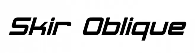
( Fonts by Neale Davidson - www.pixelsagas.com )
A modern oblique font with sharp angles and a sleek, dynamic style.
 Herunterladen 780 Downloads@WebFont
 -
( Fonts by David Kerkhoff - www.hanodedphotography.com )
A playful, hand-drawn font with tall, narrow letterforms and a whimsical style.
![DKPimpernel Frei Schriftart Herunterladen]() Herunterladen 780 Downloads@WebFont
Herunterladen 780 Downloads@WebFont -
( Copyright (c) 2011 by Brian J. Bonislawsky DBA Astigmatic (AOETI) )
A classic, medieval-style font with rounded characters and pointed serifs.
![UncialAntiqua-Regular Frei Schriftart Herunterladen]() Herunterladen 780 Downloads@WebFont
Herunterladen 780 Downloads@WebFont -
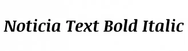
( Copyright (c) 2011, JM Sole (http://jmsole.cl|info@jmsole.cl) )
A bold, italic serif font with a classic and authoritative style.
![Noticia Text Bold Italic Frei Schriftart Herunterladen]() Herunterladen 780 Downloads@WebFont
Herunterladen 780 Downloads@WebFont -
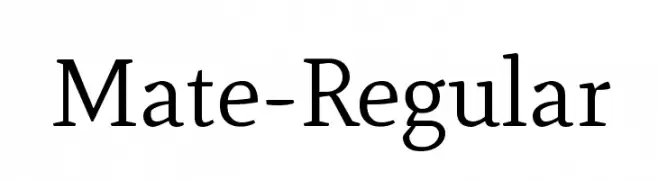
( Copyright (c) 2011, Eduardo Tunni (http://www.tipo.net.ar) )
A classic serif font with a modern touch, offering elegance and readability.
![Mate-Regular Frei Schriftart Herunterladen]() Herunterladen 780 Downloads@WebFont
Herunterladen 780 Downloads@WebFont -
-
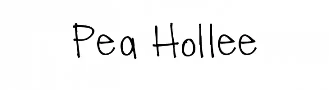
( Free for a personal use. For a commercial use please visit www.kevinandamanda.com )
A playful and casual handwritten font with a whimsical touch.
![Pea Hollee Frei Schriftart Herunterladen]() Herunterladen 780 Downloads@WebFont
Herunterladen 780 Downloads@WebFont -
( Free for a personal use. For a commercial use please visit www.kevinandamanda.com )
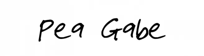
A casual, handwritten font with a playful and informal style.
![Pea Gabe Frei Schriftart Herunterladen]() Herunterladen 780 Downloads@WebFont
Herunterladen 780 Downloads@WebFont -
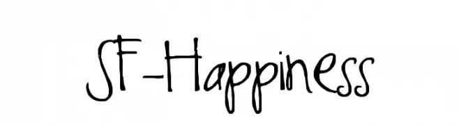
![SF-Happiness Frei Schriftart Herunterladen]() Herunterladen 780 Downloads@WebFont
Herunterladen 780 Downloads@WebFont -
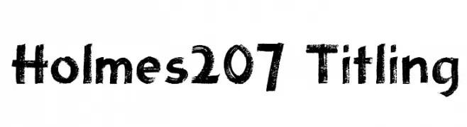
![Holmes207 Titling Frei Schriftart Herunterladen]() Herunterladen 780 Downloads@WebFont
Herunterladen 780 Downloads@WebFont -
( Fonts by Rick Mueller )
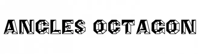
A bold, geometric font with an angular, octagonal design and a three-dimensional effect.
![Angles Octagon Frei Schriftart Herunterladen]() Herunterladen 780 Downloads@WebFont
Herunterladen 780 Downloads@WebFont


Welche Schriften sind gerade am populärsten?
Poppins, Roboto, Montserrat, Open Sans und Lato sind wegen ihrer klaren Formen und breiten Einsetzbarkeit sehr gefragt – von Markenauftritt über Landingpages bis hin zu Postern.
Welche Fonts eignen sich für Logos?
Geometrische Sans‑Serifs (z. B. Poppins, Familien im Gotham‑Stil) sind ein häufiger Griff für sauberes, skalierbares Branding. Für eine persönlichere Note bleiben Scripts und Handschrift‑Stile beliebt. Kombinieren Sie einen prägnanten Headline‑Font mit einer neutralen Brotschrift für Wiedererkennung und Harmonie.
Wie oft wird die Top‑Liste aktualisiert?
Regelmäßig – basierend auf realen Downloads und Interaktionen. Schauen Sie öfter vorbei, um aufstrebende Favoriten früh zu entdecken.
💡 Tipp: Seite bookmarken – Trends wechseln schnell, und heutige Top‑Schriften inspirieren morgen vielleicht das Rebranding.