Willkommen bei den Top‑Schriften – hier treffen Beliebtheit und Qualität aufeinander. Das sind die in diesem Jahr am häufigsten heruntergeladenen und genutzten Fonts. Wenn Sie sichere Optionen für Logo, Web oder Social suchen, starten Sie hier.
Jeder Top‑Font überzeugt durch Balance, Lesbarkeit und Vielseitigkeit. Sie finden moderne Sans‑Serifs, elegante Scripts, Vintage‑Serifs und minimalistische Displays.
-
 Herunterladen 156 Downloads@WebFont
 -
( Fonts by Manfred Klein. Free for private and charity use. Free for commercial with donation to organizations )
A decorative font with artistic flair and structured design.
![GoudamentBricks Frei Schriftart Herunterladen]() Herunterladen 156 Downloads@WebFont
Herunterladen 156 Downloads@WebFont -
( Fonts by Manfred Klein. Free for private and charity use. Free for commercial with donation to organizations )
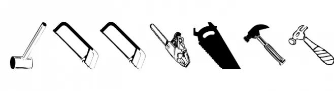
A tool-themed pictogram font with detailed illustrations of hardware and equipment.
![ToolsMK Frei Schriftart Herunterladen]() Herunterladen 156 Downloads@WebFont
Herunterladen 156 Downloads@WebFont -
( Fonts by BrandSemut )
A decorative and elegant font with whimsical swirls and curls.
![Milven Regular Frei Schriftart Herunterladen]() Herunterladen 156 Downloads@WebFont
Herunterladen 156 Downloads@WebFont -
( Fonts by Misti's Fonts )
A bold, brush-like font with an expressive, hand-painted style.
![Wicked Autumn Frei Schriftart Herunterladen]() Herunterladen 156 Downloads@WebFont
Herunterladen 156 Downloads@WebFont -
( Fonts by setyaisiam _type - Personal-use only. For commercial use please contact owner. )
A playful, hand-drawn style font with whimsical, irregular strokes.
![Base Camp Frei Schriftart Herunterladen]() Herunterladen 156 Downloads@WebFont
Herunterladen 156 Downloads@WebFont -
( Fonts by Mans Greback - Personal-use only. For commercial use please contact owner. )
A bold, italicized font with a dynamic and modern style.
![Jumper PERSONAL USE ONLY Black Italic Frei Schriftart Herunterladen]() Herunterladen 156 Downloads@WebFont
Herunterladen 156 Downloads@WebFont -
( Fonts by Mans Greback - Personal-use only. For commercial use please contact owner. )
A bold, geometric font with uniform stroke widths and a modern aesthetic.
![Cubest Bold Frei Schriftart Herunterladen]() Herunterladen 156 Downloads@WebFont
Herunterladen 156 Downloads@WebFont -
( Måns Grebäck - www.mansgreback.com )
A modern, light sans-serif font with geometric influences and a clean, minimalist design.
![Roona Sans Light PERSONAL Frei Schriftart Herunterladen]() Herunterladen 156 Downloads@WebFont
Herunterladen 156 Downloads@WebFont -
( Fonts by Daniel Zadorozny - www.iconian.com - Free for personal use )
A bold, geometric font with a futuristic, outlined style.
![Federal Escort Bullet Frei Schriftart Herunterladen]() Herunterladen 156 Downloads@WebFont
Herunterladen 156 Downloads@WebFont -
( Fonts by http://perso.calixo.net/~uzim/ )
A modern, ultra-thin font with elongated, sleek characters.
![Scrapes Light Frei Schriftart Herunterladen]() Herunterladen 156 Downloads@WebFont
Herunterladen 156 Downloads@WebFont -
( Fonts by weknow - Wino S Kadir )
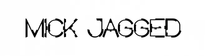
A jagged, edgy font with angular, irregular edges for a dynamic look.
![MICK JAGGED Frei Schriftart Herunterladen]() Herunterladen 156 Downloads@WebFont
Herunterladen 156 Downloads@WebFont -
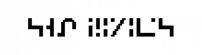
![SGA Pixies Frei Schriftart Herunterladen]() Herunterladen 156 Downloads@WebFont
Herunterladen 156 Downloads@WebFont -
( Fonts by Awansenja Type )
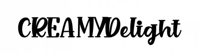
A bold and playful script font with flowing curves and strong presence.
![CREAMY Delight Frei Schriftart Herunterladen]() Herunterladen 156 Downloads@WebFont
Herunterladen 156 Downloads@WebFont -
( Fonts by Vunira Design - Personal-use only. For commercial use please contact owner. )
An ornate, decorative font with vintage elegance and intricate details.
![Vanguard FREE Frei Schriftart Herunterladen]() Herunterladen 156 Downloads@WebFont
Herunterladen 156 Downloads@WebFont -
( Fonts by www.typodermicfonts.com - Ray Larabie )
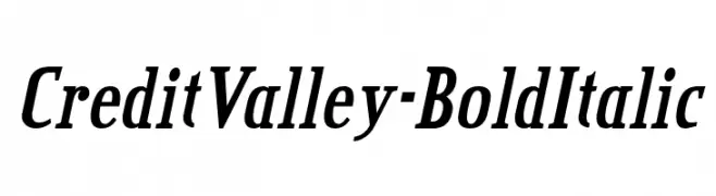
A bold, italicized font with a dynamic and elegant style.
![CreditValley-BoldItalic Frei Schriftart Herunterladen]() Herunterladen 156 Downloads@WebFont
Herunterladen 156 Downloads@WebFont -
( Download for Personal Use. For Commercial: http://www.k-type.com )
A decorative, mixed-style font inspired by mail art and stamp graphics.
![MailartGraphics Frei Schriftart Herunterladen]() Herunterladen 156 Downloads@WebFont
Herunterladen 156 Downloads@WebFont -
( Fonts by Letterena Studios )
A playful, hand-drawn font with tall, narrow characters and a whimsical style.
![Sweet Panda Frei Schriftart Herunterladen]() Herunterladen 156 Downloads@WebFont
Herunterladen 156 Downloads@WebFont -
( Fonts by www.typodermicfonts.com - Ray Larabie )
A bold, geometric font with intricate dazzle patterns in each character.
![DazzleShips-Regular Frei Schriftart Herunterladen]() Herunterladen 156 Downloads@WebFont
Herunterladen 156 Downloads@WebFont -
( Fonts by Khrys Bosland )
A playful, handwritten font with thin, uneven strokes and a whimsical style.
![KBSunshine Frei Schriftart Herunterladen]() Herunterladen 156 Downloads@WebFont
Herunterladen 156 Downloads@WebFont -
( Iconian Fonts - Daniel Zadorozny - www.iconian.com )
A bold, italicized font with a beveled, three-dimensional style.
![Aircruiser Bevel Italic Frei Schriftart Herunterladen]() Herunterladen 156 Downloads@WebFont
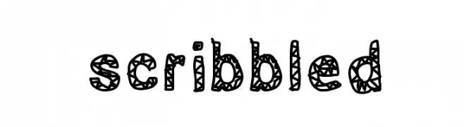
Herunterladen 156 Downloads@WebFont -
![scribbled Frei Schriftart Herunterladen]() Herunterladen 156 Downloads@WebFont
Herunterladen 156 Downloads@WebFont -
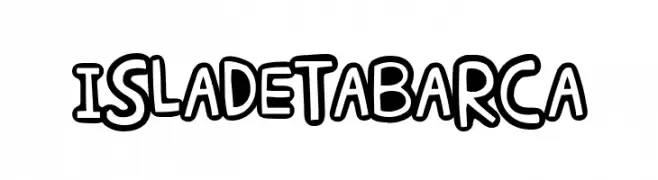
( Fonts by Woodcutter )
A bold, playful font with thick, rounded strokes and outlined letters.
![Isla de Tabarca Frei Schriftart Herunterladen]() Herunterladen 156 Downloads@WebFont
Herunterladen 156 Downloads@WebFont -
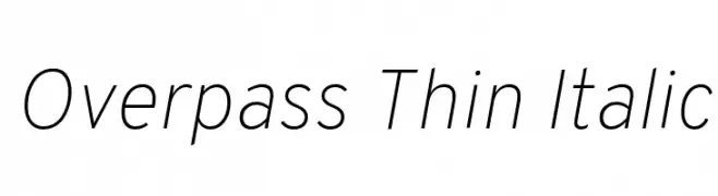
( Copyright (c) 2016 by Red Hat, Inc. All rights reserved. )
A sleek, modern, thin italic font with elegant proportions.
![Overpass Thin Italic Frei Schriftart Herunterladen]() Herunterladen 156 Downloads@WebFont
Herunterladen 156 Downloads@WebFont -
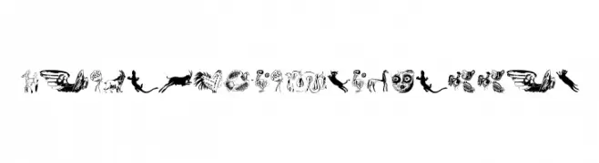
( Fonts by Manfred Klein. Free for private and charity use. Free for commercial with donation to organizations )
A collection of intricate tribal-inspired illustrations with bold, artistic motifs.
![TribalDesignsQuattro Frei Schriftart Herunterladen]() Herunterladen 156 Downloads@WebFont
Herunterladen 156 Downloads@WebFont -
![Zamolxis Frei Schriftart Herunterladen]() Herunterladen 156 Downloads@WebFont
Herunterladen 156 Downloads@WebFont -
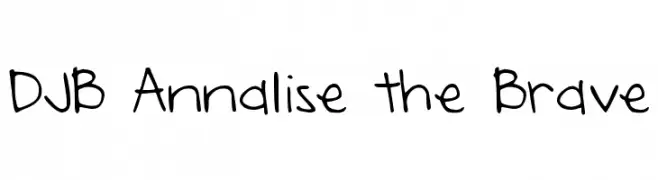
( Fonts by Darcy Baldwin - darcybaldwin.com. Free for personal use only )
A playful handwritten font with a whimsical and creative style.
![DJB Annalise the Brave Frei Schriftart Herunterladen]() Herunterladen 156 Downloads@WebFont
Herunterladen 156 Downloads@WebFont -
( Fonts by Fadlilah Studio - Personal-use only. For commercial use please contact owner. )
A playful and elegant handwritten script font with bold, whimsical flourishes.
![Winter Frei Schriftart Herunterladen]() Herunterladen 156 Downloads@WebFont
Herunterladen 156 Downloads@WebFont -
( Fonts by FONTS BY LYAJKA - Personal-use only. For commercial use please contact owner. )
A dramatic, horror-themed font with jagged, irregular edges and tight spacing.
![Nightmare 5(RUS BY LYAJKA) Frei Schriftart Herunterladen]() Herunterladen 156 Downloads@WebFont
Herunterladen 156 Downloads@WebFont -
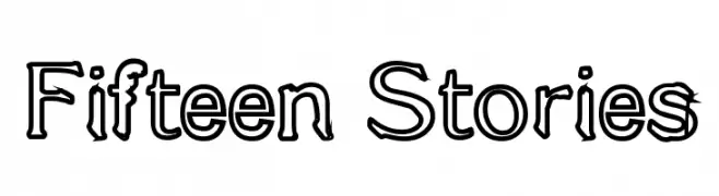
![Fifteen Stories Frei Schriftart Herunterladen]() Herunterladen 156 Downloads@WebFont
Herunterladen 156 Downloads@WebFont -
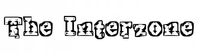
![The Interzone Frei Schriftart Herunterladen]() Herunterladen 156 Downloads@WebFont
Herunterladen 156 Downloads@WebFont -
( Fonts by Woodcutter - woodcutter Manero - Personal-use only. For commercial use please contact owner. )
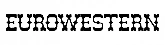
A rugged, vintage font with a bold, distressed Western style.
![Euro Western Frei Schriftart Herunterladen]() Herunterladen 156 Downloads@WebFont
Herunterladen 156 Downloads@WebFont -
( Denis Sherbak - yavlenie.com )
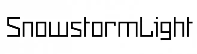
A geometric, modern font with clean lines and sharp angles.
![Snowstorm Light Frei Schriftart Herunterladen]() Herunterladen 156 Downloads@WebFont
Herunterladen 156 Downloads@WebFont -
( Fonts by Darrell Flood - Personal-use only. For commercial use please contact owner. )
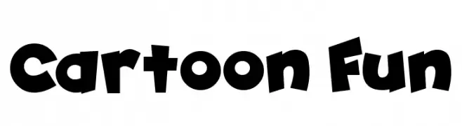
A bold, playful font with cartoonish, uneven strokes and exaggerated curves.
![Cartoon Fun Frei Schriftart Herunterladen]() Herunterladen 156 Downloads@WebFont
Herunterladen 156 Downloads@WebFont -
![SKYfontnews Frei Schriftart Herunterladen]() Herunterladen 156 Downloads@WebFont
Herunterladen 156 Downloads@WebFont


Welche Schriften sind gerade am populärsten?
Poppins, Roboto, Montserrat, Open Sans und Lato sind wegen ihrer klaren Formen und breiten Einsetzbarkeit sehr gefragt – von Markenauftritt über Landingpages bis hin zu Postern.
Welche Fonts eignen sich für Logos?
Geometrische Sans‑Serifs (z. B. Poppins, Familien im Gotham‑Stil) sind ein häufiger Griff für sauberes, skalierbares Branding. Für eine persönlichere Note bleiben Scripts und Handschrift‑Stile beliebt. Kombinieren Sie einen prägnanten Headline‑Font mit einer neutralen Brotschrift für Wiedererkennung und Harmonie.
Wie oft wird die Top‑Liste aktualisiert?
Regelmäßig – basierend auf realen Downloads und Interaktionen. Schauen Sie öfter vorbei, um aufstrebende Favoriten früh zu entdecken.
💡 Tipp: Seite bookmarken – Trends wechseln schnell, und heutige Top‑Schriften inspirieren morgen vielleicht das Rebranding.