Willkommen bei den Top‑Schriften – hier treffen Beliebtheit und Qualität aufeinander. Das sind die in diesem Jahr am häufigsten heruntergeladenen und genutzten Fonts. Wenn Sie sichere Optionen für Logo, Web oder Social suchen, starten Sie hier.
Jeder Top‑Font überzeugt durch Balance, Lesbarkeit und Vielseitigkeit. Sie finden moderne Sans‑Serifs, elegante Scripts, Vintage‑Serifs und minimalistische Displays.
-
( Fonts by Laura Iglesias )
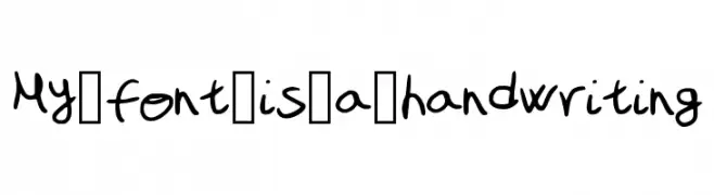
A playful and casual handwritten font with a dynamic, informal style.
 Herunterladen 154 Downloads@WebFont
 -
![Charger Sport Oblique Frei Schriftart Herunterladen]() Herunterladen 154 Downloads@WebFont
Herunterladen 154 Downloads@WebFont -
![SaviaRegular//ANTIPIXEL.COM.AR Frei Schriftart Herunterladen]() Herunterladen 154 Downloads@WebFont
Herunterladen 154 Downloads@WebFont -
( ap6y3rh.narod2.ru/ )
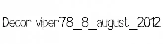
A decorative font made of star and circle shapes, offering a playful and unique style.
![Decor viper78_8_august_2012 Frei Schriftart Herunterladen]() Herunterladen 154 Downloads@WebFont
Herunterladen 154 Downloads@WebFont -
( Fonts by softerviews.org )
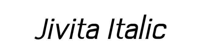
A sleek, modern italic font with consistent stroke width and dynamic style.
![Jivita Italic Frei Schriftart Herunterladen]() Herunterladen 154 Downloads@WebFont
Herunterladen 154 Downloads@WebFont -
( Fonts by Mans Greback - www.mansgreback.com - Personal-use only. For commercial use please contact owner. )
A playful, handwritten font with rounded, smooth strokes.
![Akiona Frei Schriftart Herunterladen]() Herunterladen 154 Downloads@WebFont
Herunterladen 154 Downloads@WebFont -
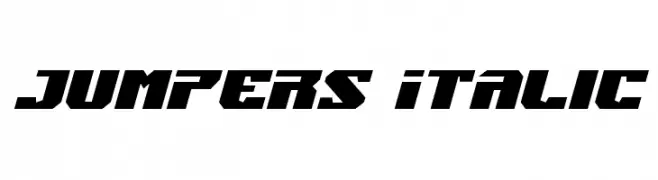
( Fonts by Iconian Fonts )
A bold, angular font with a dynamic, geometric style.
![Jumpers Italic Frei Schriftart Herunterladen]() Herunterladen 154 Downloads@WebFont
Herunterladen 154 Downloads@WebFont -
( www.greatmade.de/ )
A quirky, hand-drawn font with irregular, organic shapes.
![Ute Frei Schriftart Herunterladen]() Herunterladen 154 Downloads@WebFont
Herunterladen 154 Downloads@WebFont -
( Fonts by Spork Thug Typography - Josh Wilhelm - www.lifewithouttaffy.com/taffy/blog )
A playful, hand-drawn style with abstract box shapes.
![Some Boxes Frei Schriftart Herunterladen]() Herunterladen 154 Downloads@WebFont
Herunterladen 154 Downloads@WebFont -
( Fonts by Daniel Zadorozny - www.iconian.com )
A bold, angular, and gothic-inspired font with a leftward slant.
![Empire Crown Leftalic Frei Schriftart Herunterladen]() Herunterladen 154 Downloads@WebFont
Herunterladen 154 Downloads@WebFont -
( Fonts by Manfred Klein. Free for private and charity use. Free for commercial with donation to organizations )
A collection of abstract, circular symbols with bold, modern designs.
![Circularium Frei Schriftart Herunterladen]() Herunterladen 154 Downloads@WebFont
Herunterladen 154 Downloads@WebFont -
![Human Silhouettes Free Frei Schriftart Herunterladen]() Herunterladen 154 Downloads@WebFont
Herunterladen 154 Downloads@WebFont -
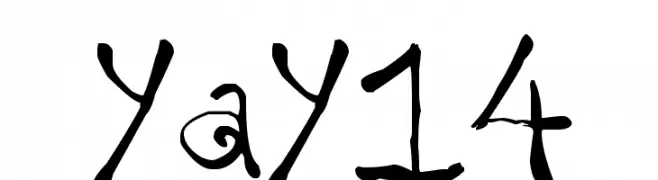
( www.xquizart.blogspot.com )
A whimsical, curly font with a playful, hand-drawn style.
![yay14 Frei Schriftart Herunterladen]() Herunterladen 154 Downloads@WebFont
Herunterladen 154 Downloads@WebFont -
( Fonts by Display Studio )
A bold, angular font with a geometric and edgy design.
![SUPERGAME Frei Schriftart Herunterladen]() Herunterladen 154 Downloads@WebFont
Herunterladen 154 Downloads@WebFont -
( Fonts by a Neale Davidson - www.pixelsagas.com. Personal-use only. For commercial use please contact owner. )
A futuristic, angular, hollow font with a slight italic slant.
![Rapier Zero Hollow Italic Frei Schriftart Herunterladen]() Herunterladen 154 Downloads@WebFont
Herunterladen 154 Downloads@WebFont -
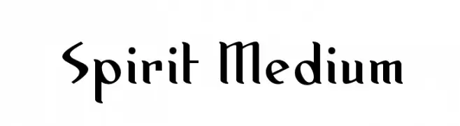
( Blambot - www.blambot.com )
A modern serif font with sharp, angular serifs and a sophisticated style.
![Spirit Medium Frei Schriftart Herunterladen]() Herunterladen 154 Downloads@WebFont
Herunterladen 154 Downloads@WebFont -
![Splintered Frei Schriftart Herunterladen]() Herunterladen 154 Downloads@WebFont
Herunterladen 154 Downloads@WebFont -
( lizalawson.com )
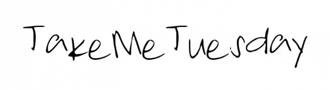
A playful, handwritten font with a casual and informal style.
![TakeMeTuesday Frei Schriftart Herunterladen]() Herunterladen 154 Downloads@WebFont
Herunterladen 154 Downloads@WebFont -
( Fonts by www.kimberlygeswein.com - Kimberly Geswein )
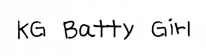
A playful, handwritten font with a whimsical and casual style.
![KG Batty Girl Frei Schriftart Herunterladen]() Herunterladen 154 Downloads@WebFont
Herunterladen 154 Downloads@WebFont -
( Fonts by Vladimir Nikolic - www.creativefabrica.com/designer/vladimirnikolic/ - Personal-use only. For commercial use please contact owner. )
A bold, retro 3D font with halftone interiors and thick outlines.
![Organiser Regular Frei Schriftart Herunterladen]() Herunterladen 154 Downloads@WebFont
Herunterladen 154 Downloads@WebFont -
( Southype - Rodrigo Gonzalez - www.southype.com )
A modern, geometric sans-serif font with consistent line weights and a minimalist design.
![Recoleta-Sans-St Frei Schriftart Herunterladen]() Herunterladen 154 Downloads@WebFont
Herunterladen 154 Downloads@WebFont -
![Designs3 Frei Schriftart Herunterladen]() Herunterladen 154 Downloads@WebFont
Herunterladen 154 Downloads@WebFont -
( Fonts by Manjali Studio - Personal-use only. For commercial use please contact owner. )
A playful, handwritten script font with a dynamic and friendly style.
![Mayones Frei Schriftart Herunterladen]() Herunterladen 154 Downloads@WebFont
Herunterladen 154 Downloads@WebFont -
![The Jewish Bitmap Frei Schriftart Herunterladen]() Herunterladen 154 Downloads@WebFont
Herunterladen 154 Downloads@WebFont -
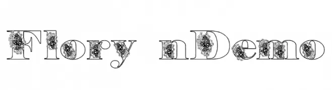
![Floryan Demo Frei Schriftart Herunterladen]() Herunterladen 154 Downloads@WebFont
Herunterladen 154 Downloads@WebFont -
( Fonts by Letterena Studios )
Elegant handwritten script font.
![Antariskalia Signature Frei Schriftart Herunterladen]() Herunterladen 154 Downloads@WebFont
Herunterladen 154 Downloads@WebFont -
( Fonts by Font People - Personal-use only. For commercial use please contact owner. )
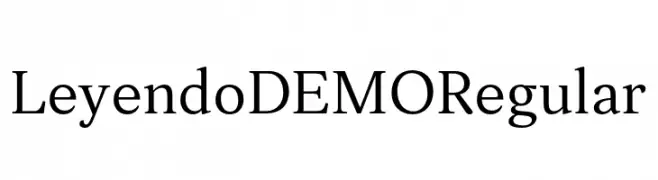
A classic serif font with modern elements and balanced proportions.
![Leyendo DEMO Regular Frei Schriftart Herunterladen]() Herunterladen 154 Downloads@WebFont
Herunterladen 154 Downloads@WebFont -
( Free for personal use - www.imagex-fonts.com )
A bold, playful font with a 3D shadow effect.
![Royal Delight Shad Frei Schriftart Herunterladen]() Herunterladen 154 Downloads@WebFont
Herunterladen 154 Downloads@WebFont -
( Fonts by Blambot Comic Fonts - Personal-use only. For commercial use please contact owner. )
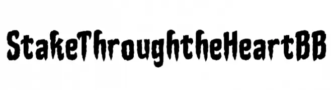
A bold, jagged font with a horror-inspired, hand-drawn style.
![StakeThroughtheHeartBB Frei Schriftart Herunterladen]() Herunterladen 154 Downloads@WebFont
Herunterladen 154 Downloads@WebFont -
( Fonts by Baka - Kyakirun - bakafonts.kyakirun.com )
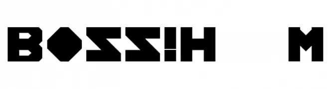
A bold, geometric font with angular shapes and uniform thickness.
![BOSS!HelpMe Frei Schriftart Herunterladen]() Herunterladen 154 Downloads@WebFont
Herunterladen 154 Downloads@WebFont -
( Fonts by a Neale Davidson - www.pixelsagas.com. Personal-use only. For commercial use please contact owner. )
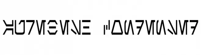
A geometric, angular font with a futuristic, sci-fi aesthetic.
![Aurebesh Condensed Frei Schriftart Herunterladen]() Herunterladen 154 Downloads@WebFont
Herunterladen 154 Downloads@WebFont -
( Fonts by Daniel Zadorozny - www.iconian.com )
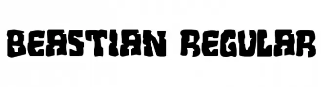
A bold, rugged font with thick, uneven strokes and a handcrafted feel.
![Beastian Regular Frei Schriftart Herunterladen]() Herunterladen 154 Downloads@WebFont
Herunterladen 154 Downloads@WebFont -
( Fonts by www.kimberlygeswein.com - Kimberly Geswein )
A futuristic, narrow font with angular lines and a sci-fi theme.
![KG Attack of the Robots Frei Schriftart Herunterladen]() Herunterladen 154 Downloads@WebFont
Herunterladen 154 Downloads@WebFont -
( Fonts by a Max Infeld - XEROGRAPHER FONTS - xerographer.blogspot.com . Personal-use only. For commercial use please contact owner. )
A bold, scratchy font with a rebellious, hand-drawn style.
![DoctorScratch Frei Schriftart Herunterladen]() Herunterladen 154 Downloads@WebFont
Herunterladen 154 Downloads@WebFont -
( www.helloimflo.net )
A thin, playful handwritten font with smooth, elongated letterforms.
![ThinFont Frei Schriftart Herunterladen]() Herunterladen 154 Downloads@WebFont
Herunterladen 154 Downloads@WebFont


Welche Schriften sind gerade am populärsten?
Poppins, Roboto, Montserrat, Open Sans und Lato sind wegen ihrer klaren Formen und breiten Einsetzbarkeit sehr gefragt – von Markenauftritt über Landingpages bis hin zu Postern.
Welche Fonts eignen sich für Logos?
Geometrische Sans‑Serifs (z. B. Poppins, Familien im Gotham‑Stil) sind ein häufiger Griff für sauberes, skalierbares Branding. Für eine persönlichere Note bleiben Scripts und Handschrift‑Stile beliebt. Kombinieren Sie einen prägnanten Headline‑Font mit einer neutralen Brotschrift für Wiedererkennung und Harmonie.
Wie oft wird die Top‑Liste aktualisiert?
Regelmäßig – basierend auf realen Downloads und Interaktionen. Schauen Sie öfter vorbei, um aufstrebende Favoriten früh zu entdecken.
💡 Tipp: Seite bookmarken – Trends wechseln schnell, und heutige Top‑Schriften inspirieren morgen vielleicht das Rebranding.