Willkommen bei den Top‑Schriften – hier treffen Beliebtheit und Qualität aufeinander. Das sind die in diesem Jahr am häufigsten heruntergeladenen und genutzten Fonts. Wenn Sie sichere Optionen für Logo, Web oder Social suchen, starten Sie hier.
Jeder Top‑Font überzeugt durch Balance, Lesbarkeit und Vielseitigkeit. Sie finden moderne Sans‑Serifs, elegante Scripts, Vintage‑Serifs und minimalistische Displays.
-
( Copyright 2010, 2012 Adobe Systems Incorporated (http://www.adobe.com/), with Reserved Font Name 'Source'. All Rights Reserved. Source is a trademark of Adobe Systems Incorporated in the United States and/or other countries. )
A clean, modern monospaced font with medium contrast and excellent readability.
 Herunterladen 2474 Downloads@WebFont
 -
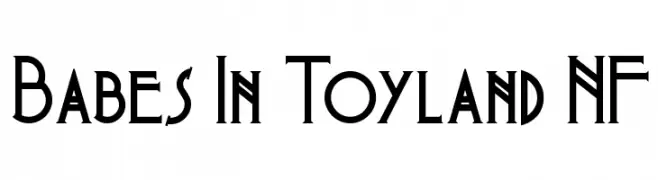
( Fonts by Nick Curtis - www.nicksfonts.com )
A vintage-inspired font with sharp serifs and art deco elements.
![Babes In Toyland NF Frei Schriftart Herunterladen]() Herunterladen 2474 Downloads@WebFont
Herunterladen 2474 Downloads@WebFont -
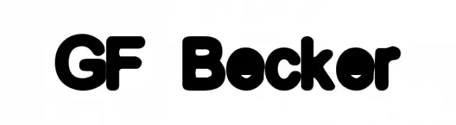
![GF Becker Frei Schriftart Herunterladen]() Herunterladen 2474 Downloads@WebFont
Herunterladen 2474 Downloads@WebFont -
( Roger White - web.archive.org/web/20120416090521/www.rogersfonts.org.uk/ )
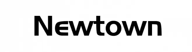
A modern, geometric sans-serif font with bold, slightly condensed characters.
![Newtown Frei Schriftart Herunterladen]() Herunterladen 2473 Downloads@WebFont
Herunterladen 2473 Downloads@WebFont -
( Fonts by Clement Nicolle - www.stereo-type.fr - Personal-use only. For commercial use please contact owner. )
A playful, flowing script font with a handwritten style.
![StrawberryBlossom Frei Schriftart Herunterladen]() Herunterladen 2473 Downloads@WebFont
Herunterladen 2473 Downloads@WebFont -
( Fonts by Andrew McCluskey - nalgames.com )
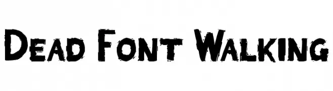
A bold, distressed font with a rugged, textured appearance.
![Dead Font Walking Frei Schriftart Herunterladen]() Herunterladen 2473 Downloads@WebFont
Herunterladen 2473 Downloads@WebFont -
![UVN Ke Chuyen1 Frei Schriftart Herunterladen]() Herunterladen 2472 Downloads@WebFont
Herunterladen 2472 Downloads@WebFont -
( Fonts by Intellecta Design )
A traditional blackletter font with ornate, gothic-style characters.
![Laandbrau Regular Frei Schriftart Herunterladen]() Herunterladen 2472 Downloads@WebFont
Herunterladen 2472 Downloads@WebFont -
( Fonts by a Max Infeld - XEROGRAPHER FONTS - xerographer.blogspot.com . Personal-use only. For commercial use please contact owner. )
A bold, cracked texture font with a rugged, edgy appearance.
![electrical Frei Schriftart Herunterladen]() Herunterladen 2472 Downloads@WebFont
Herunterladen 2472 Downloads@WebFont -
![BalletEngraved Frei Schriftart Herunterladen]() Herunterladen 2472 Downloads
Herunterladen 2472 Downloads -
![StahlbetontrŠger-Compressed Frei Schriftart Herunterladen]() Herunterladen 2471 Downloads@WebFont
Herunterladen 2471 Downloads@WebFont -
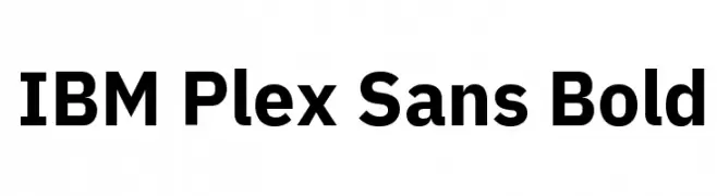
( Copyright © 2017 IBM Corp. with Reserved Font Name "Plex" )
A bold, modern sans-serif font with a clean and uniform appearance.
![IBM Plex Sans Bold Frei Schriftart Herunterladen]() Herunterladen 2470 Downloads@WebFont
Herunterladen 2470 Downloads@WebFont -
![Zag Regular Frei Schriftart Herunterladen]() Herunterladen 2470 Downloads@WebFont
Herunterladen 2470 Downloads@WebFont -
![KZ GRAVItY Frei Schriftart Herunterladen]() Herunterladen 2470 Downloads@WebFont
Herunterladen 2470 Downloads@WebFont -
( Fonts by www.peter-wiegel.de. Personal-use only. For commercial use please contact owner. )
A modern, geometric sans-serif font with clean lines and uniform stroke widths.
![Fibel Nord Frei Schriftart Herunterladen]() Herunterladen 2470 Downloads@WebFont
Herunterladen 2470 Downloads@WebFont -
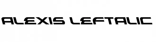
( Fonts by Daniel Zadorozny - www.iconian.com - Free for personal use )
A bold, futuristic font with angular, slanted characters.
![Alexis Leftalic Frei Schriftart Herunterladen]() Herunterladen 2470 Downloads@WebFont
Herunterladen 2470 Downloads@WebFont -
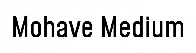
( Copyright 2019 The Mohave Project Authors (https://github.com/bghryct/Mohave-Typefaces) )
A modern sans-serif font with a clean, geometric design.
![Mohave Medium Frei Schriftart Herunterladen]() Herunterladen 2469 Downloads@WebFont
Herunterladen 2469 Downloads@WebFont -
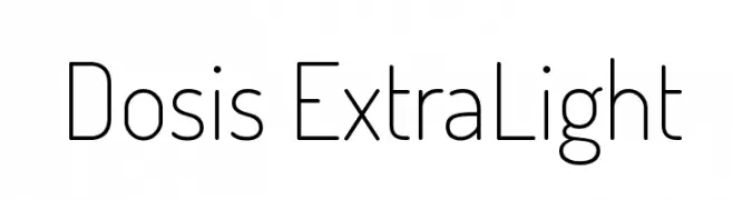
( Copyright (c) 2011, Edgar Tolentino and Pablo Impallari (www.impallari.com|impallari@gmail.com) )
A modern, extra-light sans-serif font with a geometric and minimalist design.
![Dosis ExtraLight Frei Schriftart Herunterladen]() Herunterladen 2469 Downloads@WebFont
Herunterladen 2469 Downloads@WebFont -
( Copyright (c) 2010, Kimberly Geswein (kimberlygeswein.com) )
A lively cursive font with smooth, flowing strokes and a playful, elegant style.
![Cedarville Cursive Frei Schriftart Herunterladen]() Herunterladen 2469 Downloads@WebFont
Herunterladen 2469 Downloads@WebFont -
![AA-Hansika. Frei Schriftart Herunterladen]() Herunterladen 2469 Downloads@WebFont
Herunterladen 2469 Downloads@WebFont -
![04b 31 Frei Schriftart Herunterladen]() Herunterladen 2469 Downloads@WebFont
Herunterladen 2469 Downloads@WebFont -
( Fonts by Attype Studio )
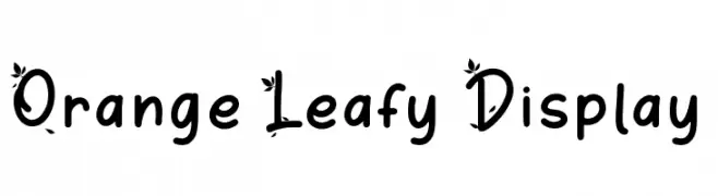
A playful, decorative font with leaf embellishments on uppercase letters.
![Orange Leafy Display Frei Schriftart Herunterladen]() Herunterladen 2468 Downloads@WebFont
Herunterladen 2468 Downloads@WebFont -
![The Outbox St Frei Schriftart Herunterladen]() Herunterladen 2468 Downloads@WebFont
Herunterladen 2468 Downloads@WebFont -
![advent Rounded Frei Schriftart Herunterladen]() Herunterladen 2468 Downloads@WebFont
Herunterladen 2468 Downloads@WebFont -
![Lohit Punjabi Frei Schriftart Herunterladen]() Herunterladen 2467 Downloads@WebFont
Herunterladen 2467 Downloads@WebFont -
( Fonts by Cadson Demak - Personal-use only. For commercial use please contact owner. )
A bold, rounded font with a modern and friendly style.
![Mitr-Bold Frei Schriftart Herunterladen]() Herunterladen 2466 Downloads@WebFont
Herunterladen 2466 Downloads@WebFont -
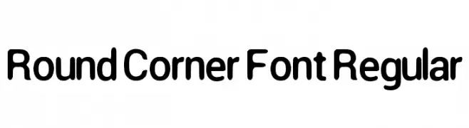
![Round Corner Font Regular Frei Schriftart Herunterladen]() Herunterladen 2466 Downloads@WebFont
Herunterladen 2466 Downloads@WebFont -
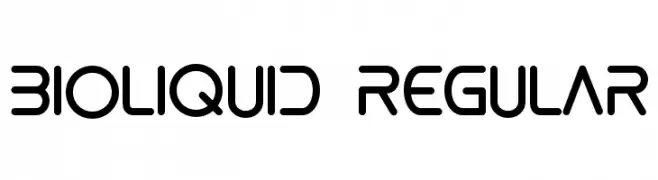
![bioliquid Regular Frei Schriftart Herunterladen]() Herunterladen 2466 Downloads@WebFont
Herunterladen 2466 Downloads@WebFont -
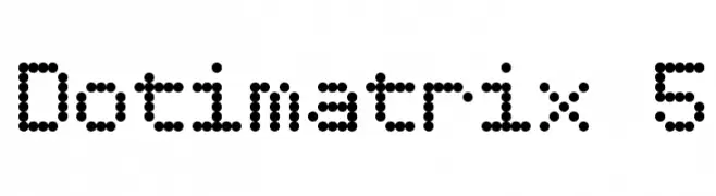
( Fonts by www.tepidmonkey.net )
A dot matrix style font with a modern, playful appearance.
![Dotimatrix 5 Frei Schriftart Herunterladen]() Herunterladen 2466 Downloads@WebFont
Herunterladen 2466 Downloads@WebFont -
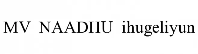
![MV NAADHU ihugeliyun Frei Schriftart Herunterladen]() Herunterladen 2465 Downloads@WebFont
Herunterladen 2465 Downloads@WebFont -
( Copyright (c) 2012, Brian J. Bonislawsky DBA Astigmatic (AOETI) (astigma@astigmatic.com), with Reserved Font Names "McLaren" )
A modern, geometric sans-serif font with balanced spacing and clear characters.
![McLaren Frei Schriftart Herunterladen]() Herunterladen 2465 Downloads@WebFont
Herunterladen 2465 Downloads@WebFont -
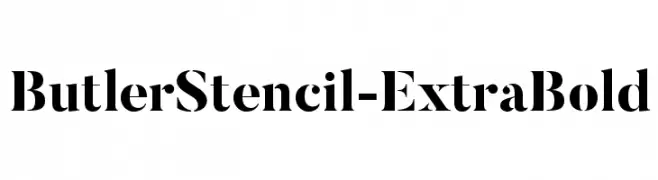
( Fonts by fabiandesmet.com )
A bold stencil font with high contrast and geometric shapes.
![ButlerStencil-ExtraBold Frei Schriftart Herunterladen]() Herunterladen 2464 Downloads@WebFont
Herunterladen 2464 Downloads@WebFont -
( Fonts by wep )
A playful, handwritten-style font with a casual and friendly vibe.
![Frensya Frei Schriftart Herunterladen]() Herunterladen 2463 Downloads@WebFont
Herunterladen 2463 Downloads@WebFont -
( Fonts by Fran Fernandez - Personal-use only. For commercial use please contact owner. )
A dramatic, gothic-style font with sharp, jagged edges and a distressed look.
![Crimes of Grindelwald Frei Schriftart Herunterladen]() Herunterladen 2463 Downloads@WebFont
Herunterladen 2463 Downloads@WebFont -
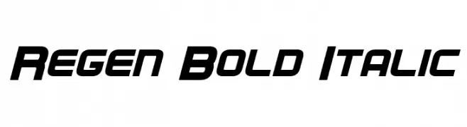
( Fonts by a Neale Davidson - www.pixelsagas.com. Personal-use only. For commercial use please contact owner. )
A bold, italicized font with a modern, angular design and tight spacing.
![Regen Bold Italic Frei Schriftart Herunterladen]() Herunterladen 2463 Downloads@WebFont
Herunterladen 2463 Downloads@WebFont


Welche Schriften sind gerade am populärsten?
Poppins, Roboto, Montserrat, Open Sans und Lato sind wegen ihrer klaren Formen und breiten Einsetzbarkeit sehr gefragt – von Markenauftritt über Landingpages bis hin zu Postern.
Welche Fonts eignen sich für Logos?
Geometrische Sans‑Serifs (z. B. Poppins, Familien im Gotham‑Stil) sind ein häufiger Griff für sauberes, skalierbares Branding. Für eine persönlichere Note bleiben Scripts und Handschrift‑Stile beliebt. Kombinieren Sie einen prägnanten Headline‑Font mit einer neutralen Brotschrift für Wiedererkennung und Harmonie.
Wie oft wird die Top‑Liste aktualisiert?
Regelmäßig – basierend auf realen Downloads und Interaktionen. Schauen Sie öfter vorbei, um aufstrebende Favoriten früh zu entdecken.
💡 Tipp: Seite bookmarken – Trends wechseln schnell, und heutige Top‑Schriften inspirieren morgen vielleicht das Rebranding.