Willkommen bei den Top‑Schriften – hier treffen Beliebtheit und Qualität aufeinander. Das sind die in diesem Jahr am häufigsten heruntergeladenen und genutzten Fonts. Wenn Sie sichere Optionen für Logo, Web oder Social suchen, starten Sie hier.
Jeder Top‑Font überzeugt durch Balance, Lesbarkeit und Vielseitigkeit. Sie finden moderne Sans‑Serifs, elegante Scripts, Vintage‑Serifs und minimalistische Displays.
-
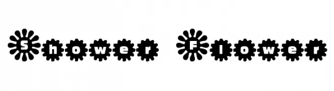 Herunterladen 763 Downloads@WebFont
 -
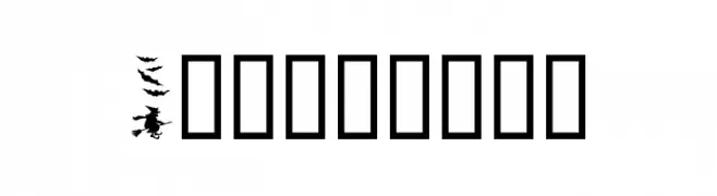
![Helloween Frei Schriftart Herunterladen]() Herunterladen 763 Downloads@WebFont
Herunterladen 763 Downloads@WebFont -
( Fonts by www.kiwi-media.com )
A bold, geometric font with a modern and futuristic style.
![Chyelovek Frei Schriftart Herunterladen]() Herunterladen 763 Downloads@WebFont
Herunterladen 763 Downloads@WebFont -
( Fonts by Din Studio - Donis Miftahudin - Personal-use only. For commercial use please contact owner. )
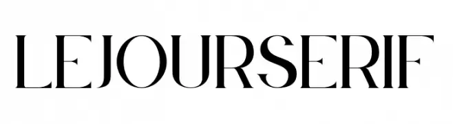
A high-contrast serif font with elegant, refined strokes and sharp serifs.
![Le Jour Serif Frei Schriftart Herunterladen]() Herunterladen 762 Downloads@WebFont
Herunterladen 762 Downloads@WebFont -
( Fonts by wep )
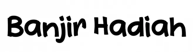
A bold, playful, hand-drawn font with a whimsical and lively style.
![Banjir Hadiah Frei Schriftart Herunterladen]() Herunterladen 762 Downloads@WebFont
Herunterladen 762 Downloads@WebFont -
-
( Fonts by Syaf Rizal - www.creativefabrica.com/ref/53/ - Personal-use only. For commercial use please contact owner. )
A dynamic, fluid script font with an elegant, handwritten style.
![Anjhay Frei Schriftart Herunterladen]() Herunterladen 762 Downloads@WebFont
Herunterladen 762 Downloads@WebFont -
( Fonts by Zamroni Hamzah )
A bold, playful font with a slight italic slant and rounded characters.
![Baby School Italic Frei Schriftart Herunterladen]() Herunterladen 762 Downloads@WebFont
Herunterladen 762 Downloads@WebFont -
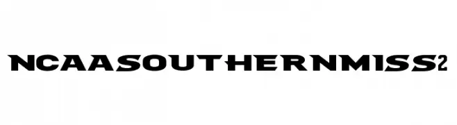
![NCAA Southern Miss 2 Frei Schriftart Herunterladen]() Herunterladen 762 Downloads@WebFont
Herunterladen 762 Downloads@WebFont -
( Fonts by Nur Solikh )
A playful, bold, and rounded font with a whimsical style.
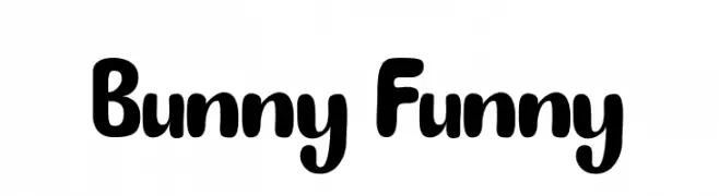
![Bunny Funny Frei Schriftart Herunterladen]() Herunterladen 762 Downloads@WebFont
Herunterladen 762 Downloads@WebFont -
( Billy Argel - billyargel.com/ )
A bold, cursive font with interconnected letters and a modern script style.
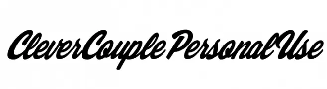
![Clever Couple Personal Use Frei Schriftart Herunterladen]() Herunterladen 762 Downloads@WebFont
Herunterladen 762 Downloads@WebFont


Welche Schriften sind gerade am populärsten?
Poppins, Roboto, Montserrat, Open Sans und Lato sind wegen ihrer klaren Formen und breiten Einsetzbarkeit sehr gefragt – von Markenauftritt über Landingpages bis hin zu Postern.
Welche Fonts eignen sich für Logos?
Geometrische Sans‑Serifs (z. B. Poppins, Familien im Gotham‑Stil) sind ein häufiger Griff für sauberes, skalierbares Branding. Für eine persönlichere Note bleiben Scripts und Handschrift‑Stile beliebt. Kombinieren Sie einen prägnanten Headline‑Font mit einer neutralen Brotschrift für Wiedererkennung und Harmonie.
Wie oft wird die Top‑Liste aktualisiert?
Regelmäßig – basierend auf realen Downloads und Interaktionen. Schauen Sie öfter vorbei, um aufstrebende Favoriten früh zu entdecken.
💡 Tipp: Seite bookmarken – Trends wechseln schnell, und heutige Top‑Schriften inspirieren morgen vielleicht das Rebranding.