Willkommen bei den Top‑Schriften – hier treffen Beliebtheit und Qualität aufeinander. Das sind die in diesem Jahr am häufigsten heruntergeladenen und genutzten Fonts. Wenn Sie sichere Optionen für Logo, Web oder Social suchen, starten Sie hier.
Jeder Top‑Font überzeugt durch Balance, Lesbarkeit und Vielseitigkeit. Sie finden moderne Sans‑Serifs, elegante Scripts, Vintage‑Serifs und minimalistische Displays.
-
( Fonts by www.fontpanda.com. Personal-use only. For commercial use please contact owner. )
A bold, handwritten font with a playful and dynamic style.
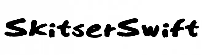 Herunterladen 152 Downloads@WebFont
 -
Schriftart von NicholasJudy456. For commercial use please contact the owner.
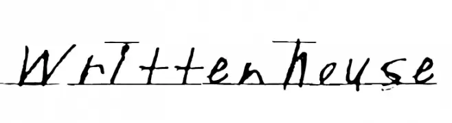
( Here's More of the House Fonts )
A casual handwritten font with fluid, uneven strokes.
![Writtenhouse Frei Schriftart Herunterladen]() Herunterladen 152 Downloads@WebFont
Herunterladen 152 Downloads@WebFont -
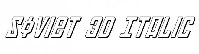
( Fonts by Daniel Zadorozny - www.iconian.com )
A bold, 3D italic font with a futuristic and dynamic style.
![Soviet 3D Italic Frei Schriftart Herunterladen]() Herunterladen 152 Downloads@WebFont
Herunterladen 152 Downloads@WebFont -
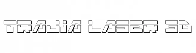
( Fonts by Daniel Zadorozny - www.iconian.com - Free for personal use )
A futuristic, geometric font with a 3D effect and bold, angular lines.
![Trajia Laser 3D Frei Schriftart Herunterladen]() Herunterladen 152 Downloads@WebFont
Herunterladen 152 Downloads@WebFont -
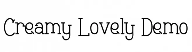
( Fonts by Noah Type - noahtype.com - Personal-use only. For commercial use please contact owner. )
A playful serif font with decorative heart embellishments and medium contrast.
![Creamy Lovely Demo Frei Schriftart Herunterladen]() Herunterladen 152 Downloads@WebFont
Herunterladen 152 Downloads@WebFont -
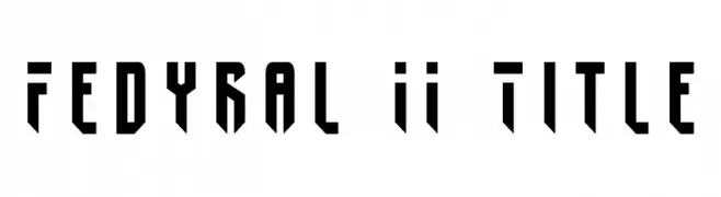
![Fedyral II Title Frei Schriftart Herunterladen]() Herunterladen 152 Downloads@WebFont
Herunterladen 152 Downloads@WebFont -
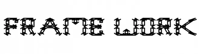
![frame work Frei Schriftart Herunterladen]() Herunterladen 152 Downloads@WebFont
Herunterladen 152 Downloads@WebFont -
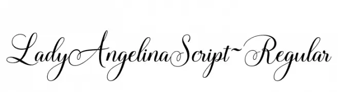
![LadyAngelinaScript-Regular Frei Schriftart Herunterladen]() Herunterladen 152 Downloads@WebFont
Herunterladen 152 Downloads@WebFont -
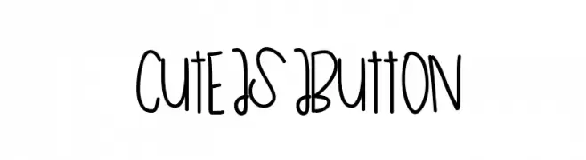
( Fonts by a Des Gomez. Personal-use only. For commercial use please contact owner. )
A playful, handwritten font with a whimsical and casual style.
![CuteAsAButton Frei Schriftart Herunterladen]() Herunterladen 152 Downloads@WebFont
Herunterladen 152 Downloads@WebFont -
( Fonts by blue studio09 - Personal-use only. For commercial use please contact owner. )
A lively, cursive script font with interconnected letters and a natural handwriting style.
![Vanilla Twilight Script Frei Schriftart Herunterladen]() Herunterladen 152 Downloads@WebFont
Herunterladen 152 Downloads@WebFont -
![Bunda Italic Frei Schriftart Herunterladen]() Herunterladen 152 Downloads@WebFont
Herunterladen 152 Downloads@WebFont -
( Fonts by Din Studio - Donis Miftahudin - Personal-use only. For commercial use please contact owner. )
An elegant and flowing script font with ornate uppercase and smooth lowercase letters.
![Royale Dreams Personal use Frei Schriftart Herunterladen]() Herunterladen 152 Downloads@WebFont
Herunterladen 152 Downloads@WebFont -
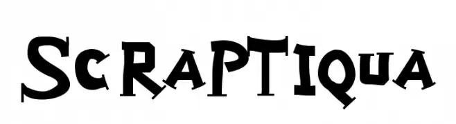
![ScrapTiqua Frei Schriftart Herunterladen]() Herunterladen 152 Downloads@WebFont
Herunterladen 152 Downloads@WebFont -
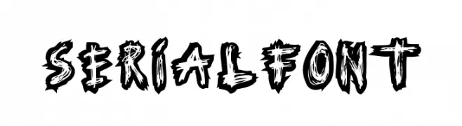
( Fonts by www.woodcutter.es - woodcutter Manero - Personal-use only. For commercial use please contact owner. )
A bold, jagged, and energetic font with a graffiti-like style.
![Serial Font Frei Schriftart Herunterladen]() Herunterladen 152 Downloads@WebFont
Herunterladen 152 Downloads@WebFont -
Schriftart von Eitiqad. For commercial use please contact the owner.
( Drexs is a simple, thin and futuristic display font. Whether you use it for designs related to web or sci-fi projects, this font will easily stand out from the crowd. Great for branding, wordmark, logotype, logo design, header, ui design, etc Hello, Tha )
A bold, modern font with clean lines and geometric structure.
![Drexs Frei Schriftart Herunterladen]() Herunterladen 152 Downloads
Herunterladen 152 Downloads -
( Fonts by Almarkhatype - Abdul Malik Wisnu - Personal-use only. For commercial use please contact owner. )
A romantic, cursive font with elegant, flowing strokes and dynamic contrast.
![The Romantica Frei Schriftart Herunterladen]() Herunterladen 152 Downloads@WebFont
Herunterladen 152 Downloads@WebFont -
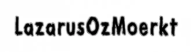
( Fonts by www.junkohanhero.com - Personal-use only. For commercial use please contact owner. )
A bold, hand-drawn font with a playful and artistic style.
![Lazarus Oz Moerkt Frei Schriftart Herunterladen]() Herunterladen 152 Downloads@WebFont
Herunterladen 152 Downloads@WebFont -
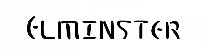
( Fonts by a Neale Davidson - www.pixelsagas.com. Personal-use only. For commercial use please contact owner. )
A bold, artistic font with dynamic strokes and a modern, playful style.
![Elminster Frei Schriftart Herunterladen]() Herunterladen 152 Downloads@WebFont
Herunterladen 152 Downloads@WebFont -
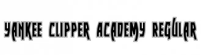
( Fonts by Daniel Zadorozny - www.iconian.com - Free for personal use )
A bold, outlined font with a strong, athletic style.
![Yankee Clipper Academy Regular Frei Schriftart Herunterladen]() Herunterladen 152 Downloads@WebFont
Herunterladen 152 Downloads@WebFont -
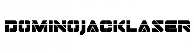
( Fonts by Iconian Fonts )
A bold, geometric font with a futuristic, industrial design and stencil-like appearance.
![Domino Jack Laser Frei Schriftart Herunterladen]() Herunterladen 152 Downloads@WebFont
Herunterladen 152 Downloads@WebFont -
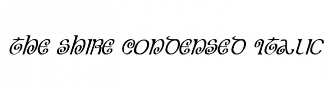
( Fonts by Daniel Zadorozny - www.iconian.com - Free for personal use )
A whimsical, decorative font with condensed italicized letters and playful curves.
![The Shire Condensed Italic Frei Schriftart Herunterladen]() Herunterladen 152 Downloads@WebFont
Herunterladen 152 Downloads@WebFont -
( Fonts by Apostrophic Lab )
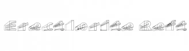
A bold, 3D geometric font with intricate wireframe designs.
![Erectlorite Reft Frei Schriftart Herunterladen]() Herunterladen 152 Downloads@WebFont
Herunterladen 152 Downloads@WebFont -
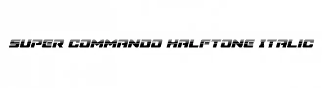
( Fonts by Daniel Zadorozny - www.iconian.com )
A bold, italicized font with a futuristic, industrial design and halftone texture.
![Super Commando Halftone Italic Frei Schriftart Herunterladen]() Herunterladen 152 Downloads@WebFont
Herunterladen 152 Downloads@WebFont -
( Fonts by www.woodcutter.es - woodcutter Manero - Personal-use only. For commercial use please contact owner. )
Surf-inspired pictogram font with bold, silhouette icons.
![Surf Frei Schriftart Herunterladen]() Herunterladen 152 Downloads@WebFont
Herunterladen 152 Downloads@WebFont -
( Fonts by www.junkohanhero.com - Personal-use only. For commercial use please contact owner. )
A bold, hand-drawn font with a rustic, distressed appearance.
![Sekunda Frei Schriftart Herunterladen]() Herunterladen 152 Downloads@WebFont
Herunterladen 152 Downloads@WebFont -
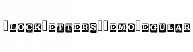
( Graphics Bam - Benjamin Melville - www.creativefabrica.com/ref/186/ )
A bold, vintage-style font with distressed uppercase letters in block format.
![Block Letters _ Demo Regular Frei Schriftart Herunterladen]() Herunterladen 152 Downloads@WebFont
Herunterladen 152 Downloads@WebFont -
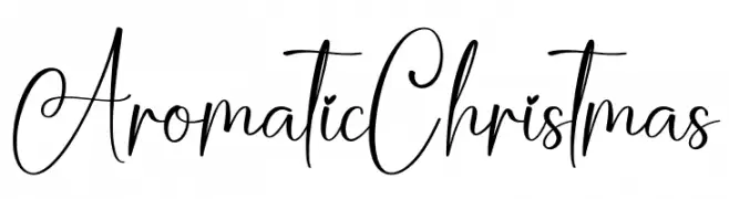
( Personal-use only. For commercial use please contact owner. )
Elegant, whimsical handwritten script with tall, looping forms.
![Aromatic Christmas Frei Schriftart Herunterladen]() Herunterladen 152 Downloads@WebFont
Herunterladen 152 Downloads@WebFont -
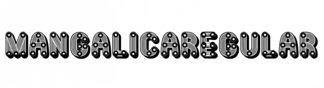
( Fonts by Vladimir Nikolic )
A bold, decorative font with mechanical and industrial elements.
![Mangalica Regular Frei Schriftart Herunterladen]() Herunterladen 152 Downloads@WebFont
Herunterladen 152 Downloads@WebFont -
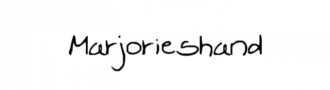
![Marjorieshand Frei Schriftart Herunterladen]() Herunterladen 152 Downloads@WebFont
Herunterladen 152 Downloads@WebFont -
![Come To Fonty Frei Schriftart Herunterladen]() Herunterladen 152 Downloads@WebFont
Herunterladen 152 Downloads@WebFont -
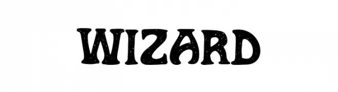
( Fonts by Alpaprana Studio )
A whimsical, hand-drawn font with a playful and textured design.
![Wizard Frei Schriftart Herunterladen]() Herunterladen 152 Downloads@WebFont
Herunterladen 152 Downloads@WebFont -
Schriftart von NicholasJudy456. For commercial use please contact the owner.
![HeadsoftheHousehold Frei Schriftart Herunterladen]() Herunterladen 152 Downloads@WebFont
Herunterladen 152 Downloads@WebFont -
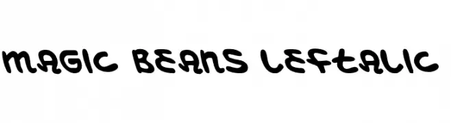
( Fonts by Daniel Zadorozny - www.iconian.com - Free for personal use )
A bold, rounded, and playful font with a leftward slant.
![Magic Beans Leftalic Frei Schriftart Herunterladen]() Herunterladen 152 Downloads@WebFont
Herunterladen 152 Downloads@WebFont -
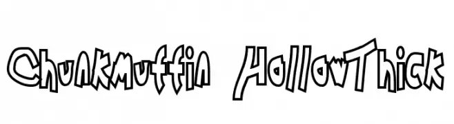
![Chunkmuffin HollowThick Frei Schriftart Herunterladen]() Herunterladen 152 Downloads@WebFont
Herunterladen 152 Downloads@WebFont -
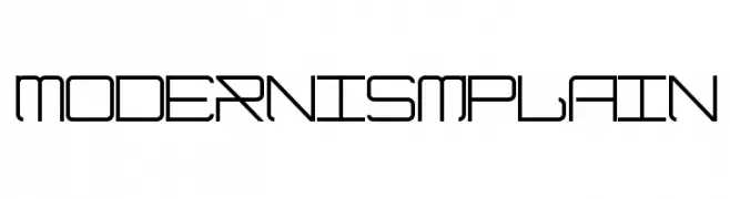
( Fonts by a Max Infeld - XEROGRAPHER FONTS - xerographer.blogspot.com . Personal-use only. For commercial use please contact owner. )
A modern, geometric font with angular lines and a sleek, technical appearance.
![ModernismPlain Frei Schriftart Herunterladen]() Herunterladen 152 Downloads@WebFont
Herunterladen 152 Downloads@WebFont


Welche Schriften sind gerade am populärsten?
Poppins, Roboto, Montserrat, Open Sans und Lato sind wegen ihrer klaren Formen und breiten Einsetzbarkeit sehr gefragt – von Markenauftritt über Landingpages bis hin zu Postern.
Welche Fonts eignen sich für Logos?
Geometrische Sans‑Serifs (z. B. Poppins, Familien im Gotham‑Stil) sind ein häufiger Griff für sauberes, skalierbares Branding. Für eine persönlichere Note bleiben Scripts und Handschrift‑Stile beliebt. Kombinieren Sie einen prägnanten Headline‑Font mit einer neutralen Brotschrift für Wiedererkennung und Harmonie.
Wie oft wird die Top‑Liste aktualisiert?
Regelmäßig – basierend auf realen Downloads und Interaktionen. Schauen Sie öfter vorbei, um aufstrebende Favoriten früh zu entdecken.
💡 Tipp: Seite bookmarken – Trends wechseln schnell, und heutige Top‑Schriften inspirieren morgen vielleicht das Rebranding.