Willkommen bei den Top‑Schriften – hier treffen Beliebtheit und Qualität aufeinander. Das sind die in diesem Jahr am häufigsten heruntergeladenen und genutzten Fonts. Wenn Sie sichere Optionen für Logo, Web oder Social suchen, starten Sie hier.
Jeder Top‑Font überzeugt durch Balance, Lesbarkeit und Vielseitigkeit. Sie finden moderne Sans‑Serifs, elegante Scripts, Vintage‑Serifs und minimalistische Displays.
-
( Fonts by Typography in Decay )
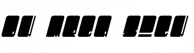
A bold, modern font with geometric shapes and a dynamic slant.
 Herunterladen 151 Downloads@WebFont
 -
( Fonts by Rantau Type - rantaustudio.com - Personal-use only. For commercial use please contact owner. )
A playful, whimsical handwritten font with flowing cursive letters.
![Rietha Frei Schriftart Herunterladen]() Herunterladen 151 Downloads@WebFont
Herunterladen 151 Downloads@WebFont -
( Fonts by Manfred Klein. Free for private and charity use. Free for commercial with donation to organizations )
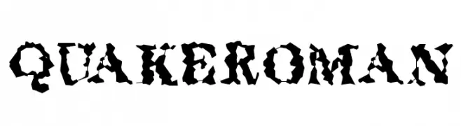
A rugged, distressed font with a jagged, chaotic appearance.
![QuakeRoman Frei Schriftart Herunterladen]() Herunterladen 151 Downloads@WebFont
Herunterladen 151 Downloads@WebFont -
( Fonts by Saridezra - Personal-use only. For commercial use please contact owner. )
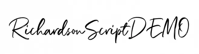
A lively and elegant handwritten script font with fluid connections.
![RichardsonScriptDEMO Frei Schriftart Herunterladen]() Herunterladen 151 Downloads@WebFont
Herunterladen 151 Downloads@WebFont -
( Fonts by Woodcutter Manero - www.woodcutter.es - Personal-use only. For commercial use please contact owner. )
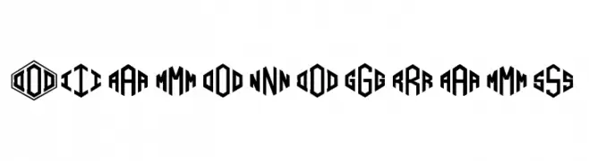
A bold, geometric font with characters in hexagonal shapes, offering a modern and edgy style.
![Diamondgrams Frei Schriftart Herunterladen]() Herunterladen 151 Downloads@WebFont
Herunterladen 151 Downloads@WebFont -
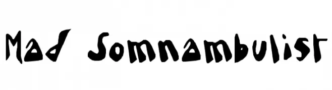
![Mad Somnambulist Frei Schriftart Herunterladen]() Herunterladen 151 Downloads@WebFont
Herunterladen 151 Downloads@WebFont -
( Fonts by a Max Infeld - XEROGRAPHER FONTS - xerographer.blogspot.com . Personal-use only. For commercial use please contact owner. )
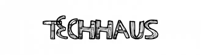
A sketch-like, hand-drawn font with bold outlines and a playful style.
![TechHaus Frei Schriftart Herunterladen]() Herunterladen 151 Downloads@WebFont
Herunterladen 151 Downloads@WebFont -
![ArielRoseJonas Frei Schriftart Herunterladen]() Herunterladen 151 Downloads@WebFont
Herunterladen 151 Downloads@WebFont -
( Fonts by Winter Design Studio - winty5.wixsite.com/noahtheawesome/ - Personal-use only. For commercial use please contact owner. )
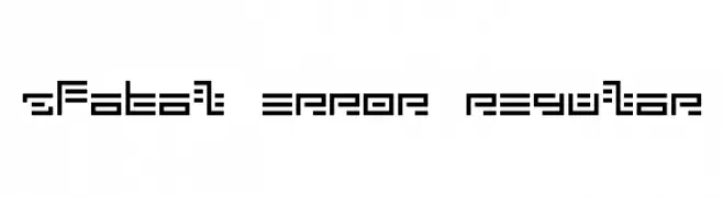
A geometric, futuristic font with blocky, angular letterforms and a digital aesthetic.
![5Fatal Error Regular Frei Schriftart Herunterladen]() Herunterladen 151 Downloads@WebFont
Herunterladen 151 Downloads@WebFont -
![Twisted Circles Regular Frei Schriftart Herunterladen]() Herunterladen 151 Downloads@WebFont
Herunterladen 151 Downloads@WebFont -
![letiskovy flashtrace Frei Schriftart Herunterladen]() Herunterladen 151 Downloads@WebFont
Herunterladen 151 Downloads@WebFont -
( Nur Cholis Majid )
A playful, handwritten font with tall, narrow characters and a lively style.
![NightWork Frei Schriftart Herunterladen]() Herunterladen 151 Downloads@WebFont
Herunterladen 151 Downloads@WebFont -
( Fonts by www.tipografea.com )
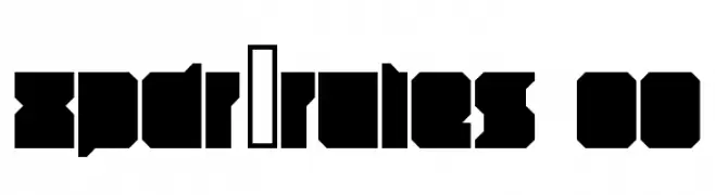
A bold, geometric font with angular shapes and a modern, impactful design.
![xpdr_rules 00 Frei Schriftart Herunterladen]() Herunterladen 151 Downloads@WebFont
Herunterladen 151 Downloads@WebFont -
( Fonts by Brittney Murphy Design )
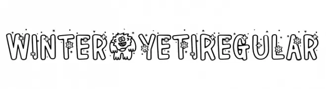
A playful, winter-themed font with snowflakes and stars.
![Winter * Yeti Regular Frei Schriftart Herunterladen]() Herunterladen 151 Downloads@WebFont
Herunterladen 151 Downloads@WebFont -
( Fonts by Storytype Studio )
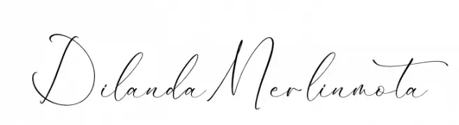
A graceful, calligraphic script font.
![Dilanda Merlinmota Frei Schriftart Herunterladen]() Herunterladen 151 Downloads@WebFont
Herunterladen 151 Downloads@WebFont -
( Chris Vile - www.chrisvile.com )
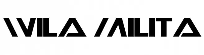
A bold, geometric font with a futuristic and modern aesthetic.
![Wila Milita Frei Schriftart Herunterladen]() Herunterladen 151 Downloads@WebFont
Herunterladen 151 Downloads@WebFont -
( Fonts by Sharkshock - Dennis Ludlow - Personal-use only. For commercial use please contact owner. )
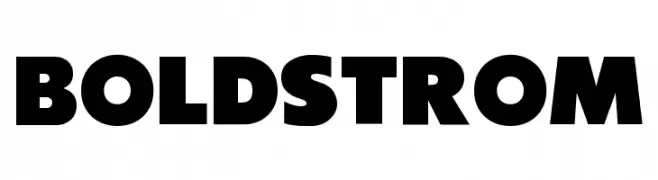
A bold, modern font with thick, uniform strokes for strong visual impact.
![Boldstrom Frei Schriftart Herunterladen]() Herunterladen 151 Downloads@WebFont
Herunterladen 151 Downloads@WebFont -
( Lettersiro Studio - Muhammad Sirojuddin - creativemarket.com/Lettersiro )
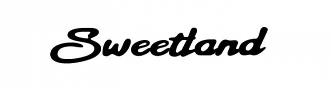
A bold, cursive font with smooth, connected lines and a handwritten feel.
![Sweetland Frei Schriftart Herunterladen]() Herunterladen 151 Downloads@WebFont
Herunterladen 151 Downloads@WebFont -
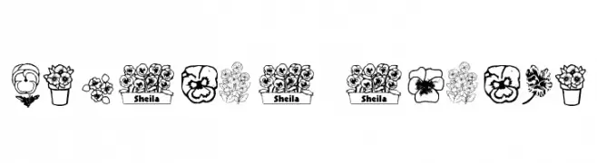
![pansies4sheila Frei Schriftart Herunterladen]() Herunterladen 151 Downloads@WebFont
Herunterladen 151 Downloads@WebFont -
( Fonts by MJType )
A bold, playful font with rounded edges and a chunky appearance.
![Green Sky Frei Schriftart Herunterladen]() Herunterladen 151 Downloads@WebFont
Herunterladen 151 Downloads@WebFont -
( Fonts by Daniel Zadorozny - www.iconian.com )
A bold, 3D italic font with a modern, geometric style.
![October Guard 3D Italic Frei Schriftart Herunterladen]() Herunterladen 151 Downloads@WebFont
Herunterladen 151 Downloads@WebFont -
![JuliaVintage Frei Schriftart Herunterladen]() Herunterladen 151 Downloads@WebFont
Herunterladen 151 Downloads@WebFont -
![BambuC Frei Schriftart Herunterladen]() Herunterladen 151 Downloads@WebFont
Herunterladen 151 Downloads@WebFont -
( Fonts by a Max Infeld - XEROGRAPHER FONTS - xerographer.blogspot.com . Personal-use only. For commercial use please contact owner. )
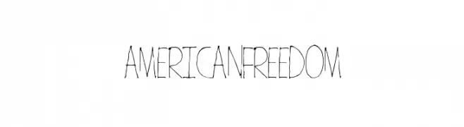
A whimsical, hand-drawn font with thin, elongated strokes and an artistic flair.
![AmericanFreedom Frei Schriftart Herunterladen]() Herunterladen 151 Downloads@WebFont
Herunterladen 151 Downloads@WebFont -
( Fonts by Alex Tomlinson - Skyhaven Fonts - shfonts.com )
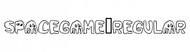
A playful, cartoonish font with bold, rounded letterforms and a whimsical style.
![SpaceGame-Regular Frei Schriftart Herunterladen]() Herunterladen 151 Downloads@WebFont
Herunterladen 151 Downloads@WebFont -
( Fonts by a Max Infeld - XEROGRAPHER FONTS - xerographer.blogspot.com . Personal-use only. For commercial use please contact owner. )
A bold, textured, three-dimensional font with a vintage industrial style.
![SkyLimit Frei Schriftart Herunterladen]() Herunterladen 151 Downloads@WebFont
Herunterladen 151 Downloads@WebFont -
( Fonts by Wei Huang - Personal-use only. For commercial use please contact owner. )
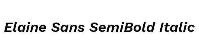
A modern sans-serif font with semi-bold weight and italic style, offering clarity and dynamism.
![Elaine Sans SemiBold Italic Frei Schriftart Herunterladen]() Herunterladen 151 Downloads@WebFont
Herunterladen 151 Downloads@WebFont -
![Nakaryon's Gifts Bold Frei Schriftart Herunterladen]() Herunterladen 151 Downloads@WebFont
Herunterladen 151 Downloads@WebFont -
( Fonts by Daniel Zadorozny - www.iconian.com - Free for personal use )
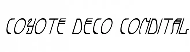
A deco-inspired, condensed italic font with geometric and modern elements.
![Coyote Deco CondItal Frei Schriftart Herunterladen]() Herunterladen 151 Downloads@WebFont
Herunterladen 151 Downloads@WebFont -
( Fonts by Manfred Klein. Free for private and charity use. Free for commercial with donation to organizations )
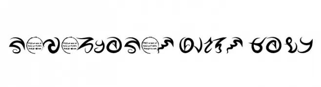
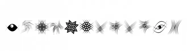
Highly decorative and abstract symbol set with geometric and illustrative motifs.
![TypoElements Frei Schriftart Herunterladen]() Herunterladen 151 Downloads@WebFont
Herunterladen 151 Downloads@WebFont -
( Fonts by Prioritype Co )
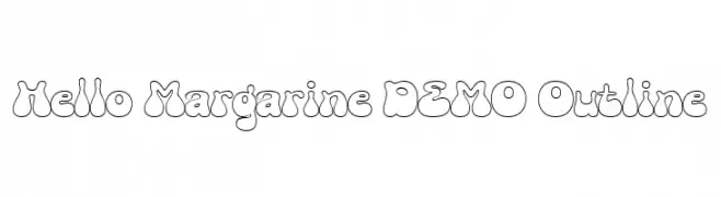
A playful, bubbly outline font with a retro vibe.
![Hello Margarine DEMO Outline Frei Schriftart Herunterladen]() Herunterladen 151 Downloads@WebFont
Herunterladen 151 Downloads@WebFont -
![Dakinizazi Frei Schriftart Herunterladen]() Herunterladen 151 Downloads@WebFont
Herunterladen 151 Downloads@WebFont -
( Fonts by Darrell Flood )
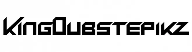
A bold, geometric font with a futuristic and angular design.
![King Dubstepikz Frei Schriftart Herunterladen]() Herunterladen 151 Downloads@WebFont
Herunterladen 151 Downloads@WebFont -
( Fonts by Francesco Fioretto )
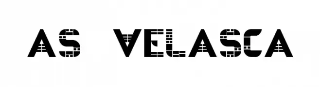
A bold, geometric font with square cutouts, offering a digital and futuristic look.
![AS-VELASCA Frei Schriftart Herunterladen]() Herunterladen 151 Downloads@WebFont
Herunterladen 151 Downloads@WebFont -
![YBTheChosenOne Frei Schriftart Herunterladen]() Herunterladen 151 Downloads@WebFont
Herunterladen 151 Downloads@WebFont


Welche Schriften sind gerade am populärsten?
Poppins, Roboto, Montserrat, Open Sans und Lato sind wegen ihrer klaren Formen und breiten Einsetzbarkeit sehr gefragt – von Markenauftritt über Landingpages bis hin zu Postern.
Welche Fonts eignen sich für Logos?
Geometrische Sans‑Serifs (z. B. Poppins, Familien im Gotham‑Stil) sind ein häufiger Griff für sauberes, skalierbares Branding. Für eine persönlichere Note bleiben Scripts und Handschrift‑Stile beliebt. Kombinieren Sie einen prägnanten Headline‑Font mit einer neutralen Brotschrift für Wiedererkennung und Harmonie.
Wie oft wird die Top‑Liste aktualisiert?
Regelmäßig – basierend auf realen Downloads und Interaktionen. Schauen Sie öfter vorbei, um aufstrebende Favoriten früh zu entdecken.
💡 Tipp: Seite bookmarken – Trends wechseln schnell, und heutige Top‑Schriften inspirieren morgen vielleicht das Rebranding.