Willkommen bei den Top‑Schriften – hier treffen Beliebtheit und Qualität aufeinander. Das sind die in diesem Jahr am häufigsten heruntergeladenen und genutzten Fonts. Wenn Sie sichere Optionen für Logo, Web oder Social suchen, starten Sie hier.
Jeder Top‑Font überzeugt durch Balance, Lesbarkeit und Vielseitigkeit. Sie finden moderne Sans‑Serifs, elegante Scripts, Vintage‑Serifs und minimalistische Displays.
-
( Fonts by Zuzulgo Studio )
A bold, flowing script font with a lively and dynamic handwritten style.
 Herunterladen 151 Downloads@WebFont
 -
( Intellecta Design - Paulo W - new.myfonts.com/foundry/Intellecta_Design/?refby=paulow )
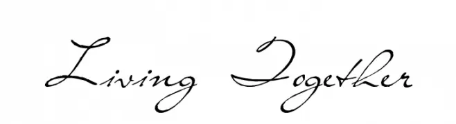
An elegant script font with flowing, interconnected letters and graceful loops.
![Living Together Frei Schriftart Herunterladen]() Herunterladen 151 Downloads@WebFont
Herunterladen 151 Downloads@WebFont -
( Jef Triforce - Francisco Arellano - www.ixipcalli.com )
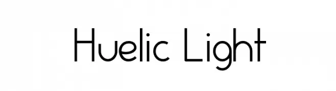
A modern, light sans-serif font with clean lines and balanced spacing.
![Huelic Light Frei Schriftart Herunterladen]() Herunterladen 151 Downloads@WebFont
Herunterladen 151 Downloads@WebFont -
( Levi Szekeres - www.loremipsum.ro )
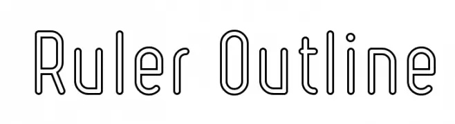
A modern, geometric outline font with uniform strokes and a minimalist design.
![Ruler Outline Frei Schriftart Herunterladen]() Herunterladen 151 Downloads@WebFont
Herunterladen 151 Downloads@WebFont -
( Fonts by EssentialsStudio - Personal-use only. For commercial use please contact owner. )
A cursive, handwritten font with elegant, flowing strokes.
![Janetanice Frei Schriftart Herunterladen]() Herunterladen 151 Downloads@WebFont
Herunterladen 151 Downloads@WebFont -
( Fonts by a Max Infeld - XEROGRAPHER FONTS - xerographer.blogspot.com . Personal-use only. For commercial use please contact owner. )
A bold, distressed font with a rugged and energetic design.
![BoldShake Frei Schriftart Herunterladen]() Herunterladen 151 Downloads@WebFont
Herunterladen 151 Downloads@WebFont -
( Fonts by Adam Rucki - Personal-use only. For commercial use please contact owner. )
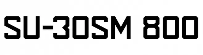
A bold, geometric font with strong, angular lines and a modern aesthetic.
![SU-30SM 800 Frei Schriftart Herunterladen]() Herunterladen 151 Downloads@WebFont
Herunterladen 151 Downloads@WebFont -
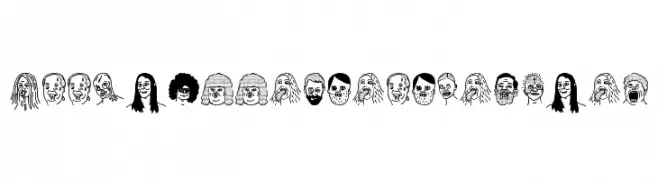
( Fonts by Woodcutter )
Hand-drawn font where each character is a unique cartoon face.
![woodcutter people faces Frei Schriftart Herunterladen]() Herunterladen 151 Downloads@WebFont
Herunterladen 151 Downloads@WebFont -
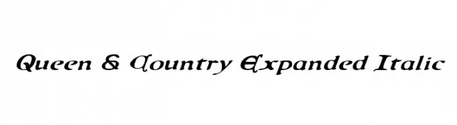
( Fonts by Daniel Zadorozny - www.iconian.com - Free for personal use )
A bold, expanded italic font with decorative serifs and a classic yet modern appeal.
![Queen & Country Expanded Italic Frei Schriftart Herunterladen]() Herunterladen 151 Downloads@WebFont
Herunterladen 151 Downloads@WebFont -
( Fonts by LetterStuff Typefoundry )
A playful, handwritten font with bold, rounded characters.
![Larys Manice Demo Frei Schriftart Herunterladen]() Herunterladen 151 Downloads@WebFont
Herunterladen 151 Downloads@WebFont -
![Clicky Bricks Frei Schriftart Herunterladen]() Herunterladen 151 Downloads@WebFont
Herunterladen 151 Downloads@WebFont -
![Inter-Bureau Semi-Italic Frei Schriftart Herunterladen]() Herunterladen 151 Downloads@WebFont
Herunterladen 151 Downloads@WebFont -
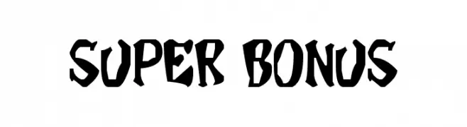
![Super Bonus Frei Schriftart Herunterladen]() Herunterladen 151 Downloads@WebFont
Herunterladen 151 Downloads@WebFont -
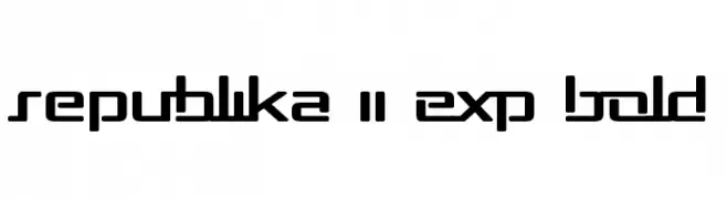
( Fonts by Apostrophic Lab )
A bold, geometric font with a futuristic and modern aesthetic.
![Republika II Exp Bold Frei Schriftart Herunterladen]() Herunterladen 151 Downloads@WebFont
Herunterladen 151 Downloads@WebFont -
![Uberhölme Lazar ExpItalic Frei Schriftart Herunterladen]() Herunterladen 151 Downloads@WebFont
Herunterladen 151 Downloads@WebFont -
![Skulduggery DEMO Regular Frei Schriftart Herunterladen]() Herunterladen 151 Downloads@WebFont
Herunterladen 151 Downloads@WebFont -
( Fonts by Zuzulgo Studio )
A playful, handwritten-style font with irregular, whimsical letterforms.
![Zulfa Notes Frei Schriftart Herunterladen]() Herunterladen 151 Downloads@WebFont
Herunterladen 151 Downloads@WebFont -
( Fonts by Edric Studio www.creativefabrica.com/designer/edricstudio/ - Personal-use only. For commercial use please contact owner. )
A bold, geometric font with a condensed and striking design.
![Uovo Di Drago Frei Schriftart Herunterladen]() Herunterladen 151 Downloads@WebFont
Herunterladen 151 Downloads@WebFont -
( Fonts by Allouse Studio - Personal-use only. For commercial use please contact owner. )
A bold, graffiti-inspired font with a distinctive dripping effect.
![Deardorf Drip Demo Frei Schriftart Herunterladen]() Herunterladen 151 Downloads@WebFont
Herunterladen 151 Downloads@WebFont -
( Fonts by Maulana Creative - Gilang Maulana - Personal-use only. For commercial use please contact owner. )
A dynamic handwritten font with fluid, sweeping strokes and a natural flow.
![Affinities Free Regular Frei Schriftart Herunterladen]() Herunterladen 151 Downloads@WebFont
Herunterladen 151 Downloads@WebFont -
![Victorian Designs Two Frei Schriftart Herunterladen]() Herunterladen 151 Downloads@WebFont
Herunterladen 151 Downloads@WebFont -
( Fonts by Vladimir Nikolic - www.creativefabrica.com/designer/vladimirnikolic/ - Personal-use only. For commercial use please contact owner. )
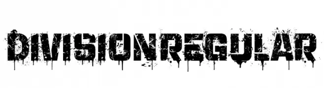
A bold, distressed font with a grunge, graffiti-inspired style.
![Division Regular Frei Schriftart Herunterladen]() Herunterladen 151 Downloads@WebFont
Herunterladen 151 Downloads@WebFont -
( Fonts by deFharo - Fernando Haro - Personal-use only. For commercial use please contact owner. )
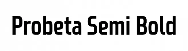
A modern, semi-bold font with clean lines and rounded edges.
![Probeta Semi Bold Frei Schriftart Herunterladen]() Herunterladen 151 Downloads@WebFont
Herunterladen 151 Downloads@WebFont -
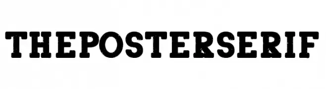
( Fonts by Woodcutter )
A bold, serif font with a classic and authoritative style.
![The Poster Serif Frei Schriftart Herunterladen]() Herunterladen 151 Downloads@WebFont
Herunterladen 151 Downloads@WebFont -
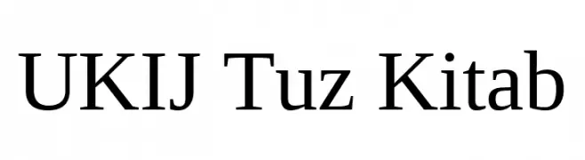
( Fonts by Tursun Sultan - Personal-use only. For commercial use please contact owner. )
A classic serif font with elegant strokes and a professional appearance.
![UKIJ Tuz Kitab Frei Schriftart Herunterladen]() Herunterladen 151 Downloads@WebFont
Herunterladen 151 Downloads@WebFont -
( Fonts by Leonard Posavec - leosupply.co - Personal-use only. For commercial use please contact owner. )
A bold, angular, and sketch-like display font with a dynamic and artistic style.
![Jaoy Frei Schriftart Herunterladen]() Herunterladen 151 Downloads@WebFont
Herunterladen 151 Downloads@WebFont -
![Calliglyphs Frei Schriftart Herunterladen]() Herunterladen 151 Downloads@WebFont
Herunterladen 151 Downloads@WebFont -
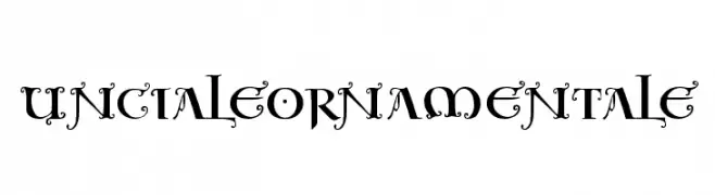
( Fonts by Manfred Klein. Free for private and charity use. Free for commercial with donation to organizations )
An ornate, medieval-inspired decorative font with intricate flourishes.
![UncialeOrnamentale Frei Schriftart Herunterladen]() Herunterladen 151 Downloads@WebFont
Herunterladen 151 Downloads@WebFont -
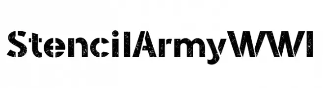
( Fonts by Galdino Otten Fonts - www.galdinootten.com - Personal-use only. For commercial use please contact owner. )
A bold, stencil-style font with a rugged, military-inspired design.
![Stencil Army WW I Frei Schriftart Herunterladen]() Herunterladen 151 Downloads@WebFont
Herunterladen 151 Downloads@WebFont -
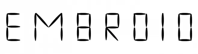
( www.bureaunauta.nl )
A decorative font with an embroidered, cross-stitched style.
![embroid Frei Schriftart Herunterladen]() Herunterladen 151 Downloads@WebFont
Herunterladen 151 Downloads@WebFont -
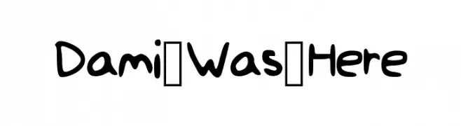
( Fonts by Damilola Oladimeji )
A playful, handwritten-style font with bold, rounded characters.
![Dami_Was_Here Frei Schriftart Herunterladen]() Herunterladen 151 Downloads@WebFont
Herunterladen 151 Downloads@WebFont -
Schriftart von danny91194. For commercial use please contact the owner.
( cawing )
A decorative font with diagonal striped patterns creating a dynamic look.
![Rochilli Regular Frei Schriftart Herunterladen]() Herunterladen 151 Downloads@WebFont
Herunterladen 151 Downloads@WebFont -
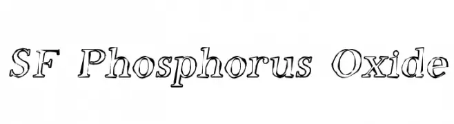
![SF Phosphorus Oxide Frei Schriftart Herunterladen]() Herunterladen 151 Downloads@WebFont
Herunterladen 151 Downloads@WebFont -
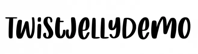
( Fonts by Allouse Studio - Personal-use only. For commercial use please contact owner. )
A bold, playful handwritten font with smooth curves and a dynamic flow.
![Twist Jelly Demo Frei Schriftart Herunterladen]() Herunterladen 151 Downloads@WebFont
Herunterladen 151 Downloads@WebFont -
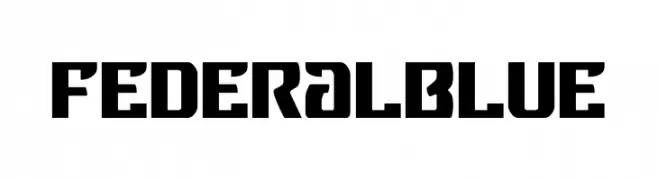
![Federal Blue Frei Schriftart Herunterladen]() Herunterladen 151 Downloads@WebFont
Herunterladen 151 Downloads@WebFont


Welche Schriften sind gerade am populärsten?
Poppins, Roboto, Montserrat, Open Sans und Lato sind wegen ihrer klaren Formen und breiten Einsetzbarkeit sehr gefragt – von Markenauftritt über Landingpages bis hin zu Postern.
Welche Fonts eignen sich für Logos?
Geometrische Sans‑Serifs (z. B. Poppins, Familien im Gotham‑Stil) sind ein häufiger Griff für sauberes, skalierbares Branding. Für eine persönlichere Note bleiben Scripts und Handschrift‑Stile beliebt. Kombinieren Sie einen prägnanten Headline‑Font mit einer neutralen Brotschrift für Wiedererkennung und Harmonie.
Wie oft wird die Top‑Liste aktualisiert?
Regelmäßig – basierend auf realen Downloads und Interaktionen. Schauen Sie öfter vorbei, um aufstrebende Favoriten früh zu entdecken.
💡 Tipp: Seite bookmarken – Trends wechseln schnell, und heutige Top‑Schriften inspirieren morgen vielleicht das Rebranding.