Willkommen bei den Top‑Schriften – hier treffen Beliebtheit und Qualität aufeinander. Das sind die in diesem Jahr am häufigsten heruntergeladenen und genutzten Fonts. Wenn Sie sichere Optionen für Logo, Web oder Social suchen, starten Sie hier.
Jeder Top‑Font überzeugt durch Balance, Lesbarkeit und Vielseitigkeit. Sie finden moderne Sans‑Serifs, elegante Scripts, Vintage‑Serifs und minimalistische Displays.
-
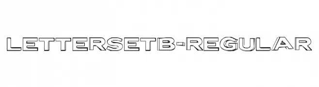
( Fonts by www.typodermicfonts.com - Ray Larabie )
A bold, three-dimensional font with a geometric, block-like appearance.
 Herunterladen 150 Downloads@WebFont
 -
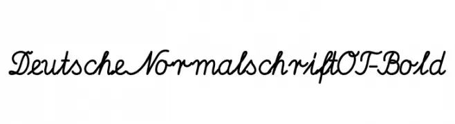
( Fonts by Peter Wiegel - www.peter-wiegel.de - Personal-use only. For commercial use please contact owner. )
A bold, cursive font with interconnected letters and a strong visual presence.
![DeutscheNormalschriftOT-Bold Frei Schriftart Herunterladen]() Herunterladen 150 Downloads@WebFont
Herunterladen 150 Downloads@WebFont -
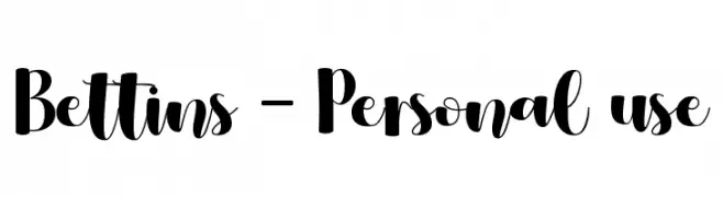
( Fonts by Endri Sulistyawan - Personal-use only. For commercial use please contact owner. )
A bold, playful script font with high contrast and whimsical flair.
![Bettins - Personal use Frei Schriftart Herunterladen]() Herunterladen 150 Downloads@WebFont
Herunterladen 150 Downloads@WebFont -
( Fonts by www.lifewithouttaffy.com )
A playful, hand-drawn font with irregular strokes and a whimsical style.
![Oxalic Frei Schriftart Herunterladen]() Herunterladen 150 Downloads@WebFont
Herunterladen 150 Downloads@WebFont -
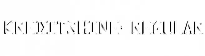
( Typodermic Fonts - Ray Larabie - www.typodermicfonts.com/ )
A modern, stencil-like font with bold, angular lines and high contrast.
![KreditShine-Regular Frei Schriftart Herunterladen]() Herunterladen 150 Downloads@WebFont
Herunterladen 150 Downloads@WebFont -
( Fonts by Daniel Zadorozny - www.iconian.com - Free for personal use )
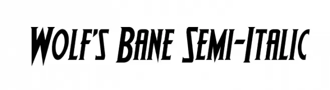
A bold, semi-italic font with angular edges and a dynamic style.
![Wolf's Bane Semi-Italic Frei Schriftart Herunterladen]() Herunterladen 150 Downloads@WebFont
Herunterladen 150 Downloads@WebFont -
( Fonts by Iconian Fonts )
A bold, futuristic font with geometric and angular shapes.
![1968 Odyssey Leftalic Frei Schriftart Herunterladen]() Herunterladen 150 Downloads@WebFont
Herunterladen 150 Downloads@WebFont -
( Fonts by www.peter-wiegel.de. Personal-use only. For commercial use please contact owner. )
A utilitarian symbol set based on German traffic and road signage.
![Zeichen Dreihundert Alt Frei Schriftart Herunterladen]() Herunterladen 150 Downloads@WebFont
Herunterladen 150 Downloads@WebFont -
( Fonts by MJType )
A playful, bold font with rounded, bubbly characters.
![Smile Day Frei Schriftart Herunterladen]() Herunterladen 150 Downloads@WebFont
Herunterladen 150 Downloads@WebFont -
( Fonts by Alex Tomlinson - Skyhaven Fonts - shfonts.com )
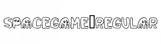
A playful, cartoonish font with bold, rounded letterforms and a whimsical style.
![SpaceGame-Regular Frei Schriftart Herunterladen]() Herunterladen 150 Downloads@WebFont
Herunterladen 150 Downloads@WebFont -
( Copyright (c) 2011-2012, Jonathan Pinhorn (jonpinhorn.typedesign@gmail.com), with Reserved Font Names 'Karla' )
Bold, inclined font with a modern and clean appearance.
![Karla Tamil Bold Inclined Frei Schriftart Herunterladen]() Herunterladen 150 Downloads@WebFont
Herunterladen 150 Downloads@WebFont -
![serious3b Frei Schriftart Herunterladen]() Herunterladen 150 Downloads@WebFont
Herunterladen 150 Downloads@WebFont -
( LJ Design Studios - www.ljdesignstudios.com )
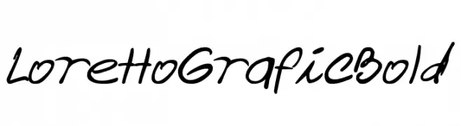
A bold, handwritten font with fluid, energetic strokes.
![Loretto Grafic Bold Frei Schriftart Herunterladen]() Herunterladen 150 Downloads@WebFont
Herunterladen 150 Downloads@WebFont -
( Fonts by www.omniglot.com )
An ornate and decorative font with intricate curves and flourishes.
![Faer Frei Schriftart Herunterladen]() Herunterladen 150 Downloads@WebFont
Herunterladen 150 Downloads@WebFont -
( Fonts by Adien Gunarta - fontasticindonesia.blogspot.com )
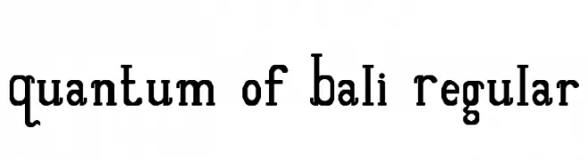
A bold, slab serif font with a modern and vintage blend.
![Quantum of Bali Regular Frei Schriftart Herunterladen]() Herunterladen 150 Downloads@WebFont
Herunterladen 150 Downloads@WebFont -
( Fonts by Shara Weber )
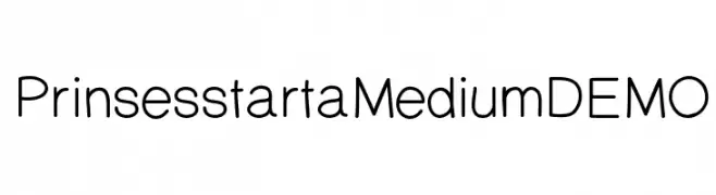
A clean, modern sans-serif font with medium weight and balanced spacing.
![PrinsesstartaMediumDEMO Frei Schriftart Herunterladen]() Herunterladen 150 Downloads@WebFont
Herunterladen 150 Downloads@WebFont -
( Fonts by skomii - Personal-use only. For commercial use please contact owner. )
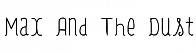
A playful, hand-drawn font with rounded, slightly tilted characters.
![Max And The Dust Frei Schriftart Herunterladen]() Herunterladen 150 Downloads@WebFont
Herunterladen 150 Downloads@WebFont -
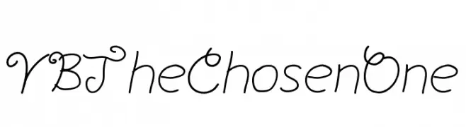
![YBTheChosenOne Frei Schriftart Herunterladen]() Herunterladen 150 Downloads@WebFont
Herunterladen 150 Downloads@WebFont -
( Fonts by Billy Argel - Personal-use only. For commercial use please contact owner. )
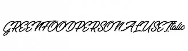
A flowing, cursive italic font with elegant, interconnected letters and a calligraphic style.
![GREENFOOD PERSONAL USE Italic Frei Schriftart Herunterladen]() Herunterladen 150 Downloads@WebFont
Herunterladen 150 Downloads@WebFont -
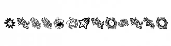
( Fonts by Manfred Klein. Free for private and charity use. Free for commercial with donation to organizations )
A whimsical collection of festive decorative symbols and illustrations.
![HappyXmasBats Frei Schriftart Herunterladen]() Herunterladen 150 Downloads@WebFont
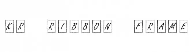
Herunterladen 150 Downloads@WebFont -
![KR Ribbon Frame Frei Schriftart Herunterladen]() Herunterladen 150 Downloads@WebFont
Herunterladen 150 Downloads@WebFont -
( Fonts by Linecreative - ARI JUANDA - Personal-use only. For commercial use please contact owner. )
A bold, geometric font with a futuristic and structured design.
![Qore Frei Schriftart Herunterladen]() Herunterladen 150 Downloads@WebFont
Herunterladen 150 Downloads@WebFont -
( Fonts by Peter Wiegel - www.peter-wiegel.de - Personal-use only. For commercial use please contact owner. )
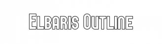
A bold, outlined typeface with a modern, geometric style.
![Elbaris Outline Frei Schriftart Herunterladen]() Herunterladen 150 Downloads@WebFont
Herunterladen 150 Downloads@WebFont -
( Fonts by Arvn - Buminatha Arvin - Personal-use only. For commercial use please contact owner. )
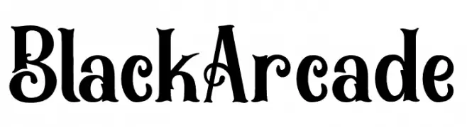
A bold, decorative font with vintage flair and intricate details.
![BlackArcade Frei Schriftart Herunterladen]() Herunterladen 150 Downloads@WebFont
Herunterladen 150 Downloads@WebFont -
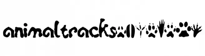
![animaltracksPQSEWVRZ Frei Schriftart Herunterladen]() Herunterladen 150 Downloads@WebFont
Herunterladen 150 Downloads@WebFont -
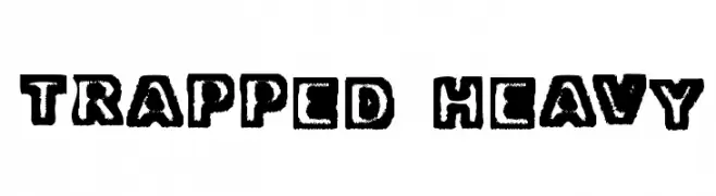
![Trapped Heavy Frei Schriftart Herunterladen]() Herunterladen 150 Downloads@WebFont
Herunterladen 150 Downloads@WebFont -
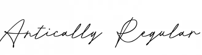
( Fonts by Niskala Huruf )
Elegant script font with fluid, continuous strokes and a modern twist.
![Antically Regular Frei Schriftart Herunterladen]() Herunterladen 150 Downloads@WebFont
Herunterladen 150 Downloads@WebFont -
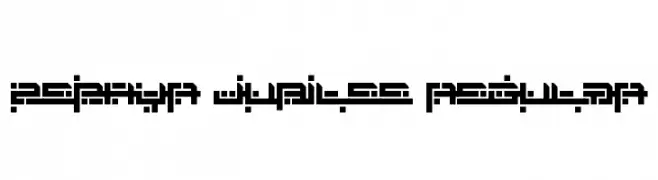
( Fonts by Andrew McCluskey - nalgames.com )
A geometric, pixelated font with a futuristic digital aesthetic.
![Zephyr Jubilee Regular Frei Schriftart Herunterladen]() Herunterladen 150 Downloads@WebFont
Herunterladen 150 Downloads@WebFont -
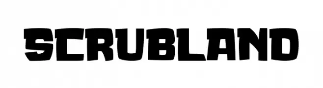
( Fonts by Tokokoo Studio )
A bold, angular, and geometric font ideal for impactful headlines.
![SCRUBLAND Frei Schriftart Herunterladen]() Herunterladen 150 Downloads@WebFont
Herunterladen 150 Downloads@WebFont -
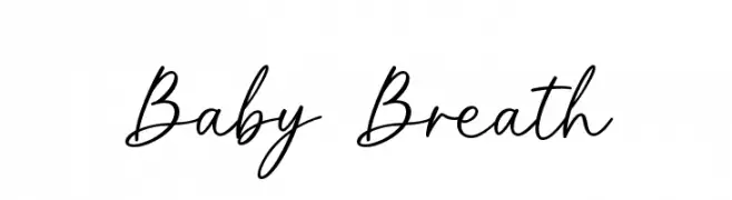
( Fonts by Graphix Line Studio - Personal-use only. For commercial use please contact owner. )
A graceful, elegant handwritten font with fluid, connected letterforms.
![Baby Breath Frei Schriftart Herunterladen]() Herunterladen 150 Downloads@WebFont
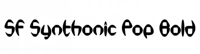
Herunterladen 150 Downloads@WebFont -
![SF Synthonic Pop Bold Frei Schriftart Herunterladen]() Herunterladen 150 Downloads@WebFont
Herunterladen 150 Downloads@WebFont -
( Fonts by Aaron May - Personal-use only. For commercial use please contact owner. )
A bold, hand-drawn font with a dynamic, graffiti-like style.
![ENDLESS BUMMER Frei Schriftart Herunterladen]() Herunterladen 150 Downloads@WebFont
Herunterladen 150 Downloads@WebFont -
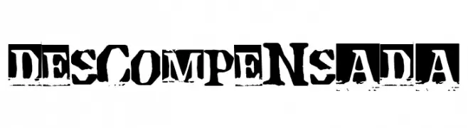
( Fonts by Woodcutter )
A distressed, grunge-style font with a stencil-like appearance.
![Descompensada Frei Schriftart Herunterladen]() Herunterladen 150 Downloads@WebFont
Herunterladen 150 Downloads@WebFont -
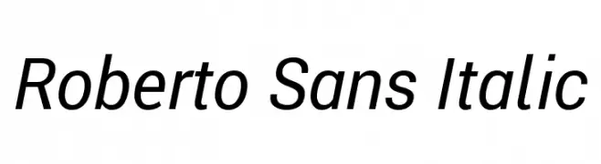
( Fonts by Google - Personal-use only. For commercial use please contact owner. )
A modern sans-serif italic font with clean lines and a professional appearance.
![Roberto Sans Italic Frei Schriftart Herunterladen]() Herunterladen 150 Downloads@WebFont
Herunterladen 150 Downloads@WebFont -
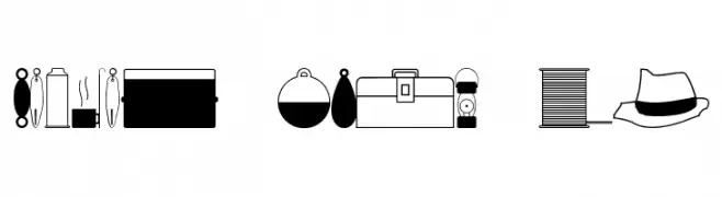
( Fonts by Jeff Levine. FREEWARE )
A collection of fishing-themed icons in a simple, illustrative style.
![Fishin' Gear JL Frei Schriftart Herunterladen]() Herunterladen 150 Downloads@WebFont
Herunterladen 150 Downloads@WebFont


Welche Schriften sind gerade am populärsten?
Poppins, Roboto, Montserrat, Open Sans und Lato sind wegen ihrer klaren Formen und breiten Einsetzbarkeit sehr gefragt – von Markenauftritt über Landingpages bis hin zu Postern.
Welche Fonts eignen sich für Logos?
Geometrische Sans‑Serifs (z. B. Poppins, Familien im Gotham‑Stil) sind ein häufiger Griff für sauberes, skalierbares Branding. Für eine persönlichere Note bleiben Scripts und Handschrift‑Stile beliebt. Kombinieren Sie einen prägnanten Headline‑Font mit einer neutralen Brotschrift für Wiedererkennung und Harmonie.
Wie oft wird die Top‑Liste aktualisiert?
Regelmäßig – basierend auf realen Downloads und Interaktionen. Schauen Sie öfter vorbei, um aufstrebende Favoriten früh zu entdecken.
💡 Tipp: Seite bookmarken – Trends wechseln schnell, und heutige Top‑Schriften inspirieren morgen vielleicht das Rebranding.