Willkommen bei den Top‑Schriften – hier treffen Beliebtheit und Qualität aufeinander. Das sind die in diesem Jahr am häufigsten heruntergeladenen und genutzten Fonts. Wenn Sie sichere Optionen für Logo, Web oder Social suchen, starten Sie hier.
Jeder Top‑Font überzeugt durch Balance, Lesbarkeit und Vielseitigkeit. Sie finden moderne Sans‑Serifs, elegante Scripts, Vintage‑Serifs und minimalistische Displays.
-
( Fonts by zainstudio )
A bold, dynamic font with a playful and aggressive style.
 Herunterladen 150 Downloads@WebFont
 -
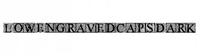
![LowEngravedCapsDark Frei Schriftart Herunterladen]() Herunterladen 150 Downloads@WebFont
Herunterladen 150 Downloads@WebFont -
( Fonts by Manfred Klein. Free for private and charity use. Free for commercial with donation to organizations )
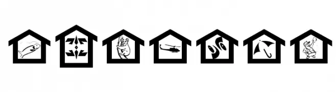
A pictogram dingbat font with diverse icons inside house shapes.
![MyHouse Frei Schriftart Herunterladen]() Herunterladen 150 Downloads@WebFont
Herunterladen 150 Downloads@WebFont -
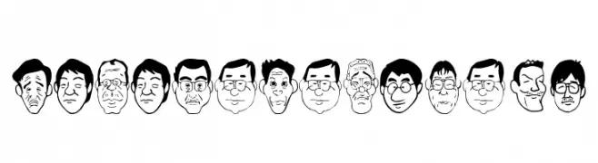
![SakabePeople04 Frei Schriftart Herunterladen]() Herunterladen 150 Downloads@WebFont
Herunterladen 150 Downloads@WebFont -
( OutsideInside Fonts )
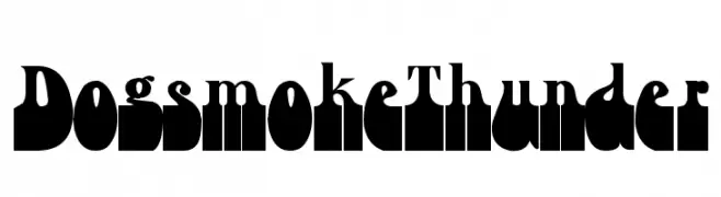
A bold, decorative font with thick, blocky letterforms and unique stylization.
![Dogsmoke Thunder Frei Schriftart Herunterladen]() Herunterladen 150 Downloads@WebFont
Herunterladen 150 Downloads@WebFont -
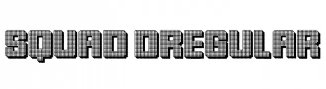
( Fonts by Vladimir Nikolic - www.creativefabrica.com/designer/vladimirnikolic/ - Personal-use only. For commercial use please contact owner. )
A modern, dot-based font with a digital, tech-inspired look.
![Squad Regular Frei Schriftart Herunterladen]() Herunterladen 150 Downloads@WebFont
Herunterladen 150 Downloads@WebFont -
( Fonts by Vladimir Nikolic - www.creativefabrica.com/designer/vladimirnikolic/ - Personal-use only. For commercial use please contact owner. )
A bold, 3D decorative font with a dotted texture and shadowing for a modern look.
![Squad 3D Regular Frei Schriftart Herunterladen]() Herunterladen 150 Downloads@WebFont
Herunterladen 150 Downloads@WebFont -
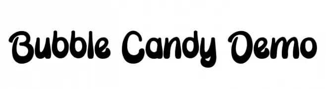
( Fonts by Edric Studio - Personal-use only. For commercial use please contact owner. )
A playful, bubble-like font with rounded, bold characters.
![Bubble Candy Demo Frei Schriftart Herunterladen]() Herunterladen 150 Downloads@WebFont
Herunterladen 150 Downloads@WebFont -
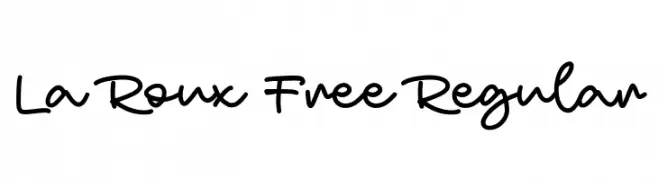
( Fonts by Maulana Creative - Gilang Maulana - Personal-use only. For commercial use please contact owner. )
A playful, casual handwritten font with smooth, flowing lines and medium contrast.
![La Roux Free Regular Frei Schriftart Herunterladen]() Herunterladen 150 Downloads@WebFont
Herunterladen 150 Downloads@WebFont -
( Fonts by Wahyu Eka Prasetya - wepfont.com - Personal-use only. For commercial use please contact owner. )
A bold, handwritten font with a playful and dynamic style.
![Fone Frei Schriftart Herunterladen]() Herunterladen 150 Downloads@WebFont
Herunterladen 150 Downloads@WebFont -
( Fonts by Iconian Fonts - Daniel Zadorozny - Personal-use only. For commercial use please contact owner. )
A bold, geometric font with a modern, futuristic style.
![Singapore Sling Frei Schriftart Herunterladen]() Herunterladen 150 Downloads@WebFont
Herunterladen 150 Downloads@WebFont -
![Shiny Pimple Frei Schriftart Herunterladen]() Herunterladen 150 Downloads@WebFont
Herunterladen 150 Downloads@WebFont -
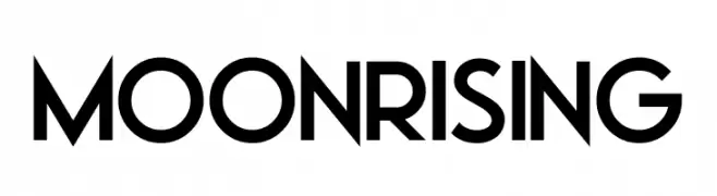
( Fonts by Darrell Flood - Personal-use only. For commercial use please contact owner. )
A bold, geometric sans-serif font with a modern and clean aesthetic.
![Moonrising Frei Schriftart Herunterladen]() Herunterladen 150 Downloads@WebFont
Herunterladen 150 Downloads@WebFont -
( Fonts by Gagegostyle - Syera Syailendra - Personal-use only. For commercial use please contact owner. )
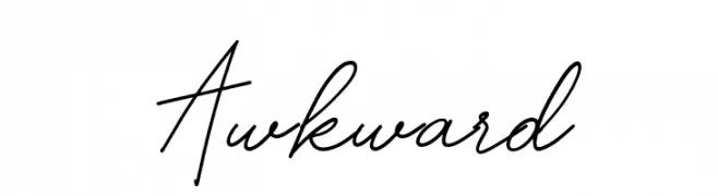
A fluid, cursive font with a handwritten style and consistent stroke thickness.
![Awkward Frei Schriftart Herunterladen]() Herunterladen 150 Downloads@WebFont
Herunterladen 150 Downloads@WebFont -
![LaMorte4 Frei Schriftart Herunterladen]() Herunterladen 150 Downloads@WebFont
Herunterladen 150 Downloads@WebFont -
( Fonts by Apostrophic Lab )
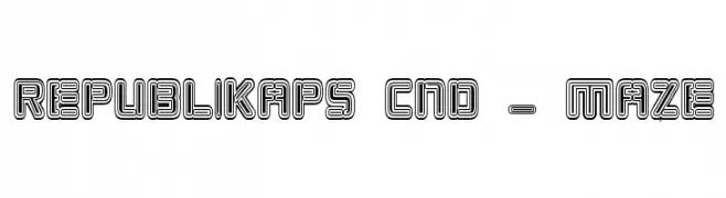
A bold, geometric font with a maze-like, three-dimensional effect.
![Republikaps Cnd - Maze Frei Schriftart Herunterladen]() Herunterladen 150 Downloads@WebFont
Herunterladen 150 Downloads@WebFont -
( Fonts by Wino S Kadir - weknow - www.revolge.com/shop/weknow/ - Personal-use only. For commercial use please contact owner. )
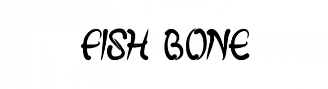
A bold, artistic font with flowing, fish bone-like curves.
![fish bone Frei Schriftart Herunterladen]() Herunterladen 150 Downloads@WebFont
Herunterladen 150 Downloads@WebFont -
( Fonts by Md Shohail Bhuian - Personal-use only. For commercial use please contact owner. )
A bold, brush-stroke font with a dynamic and artistic style.
![Hold On Frei Schriftart Herunterladen]() Herunterladen 150 Downloads@WebFont
Herunterladen 150 Downloads@WebFont -
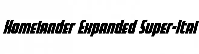
( Fonts by Daniel Zadorozny - www.iconian.com - Personal-use only. For commercial use please contact owner. )
A bold, expanded, and italicized font with a dynamic and modern style.
![Homelander Expanded Super-Ital Frei Schriftart Herunterladen]() Herunterladen 150 Downloads@WebFont
Herunterladen 150 Downloads@WebFont -
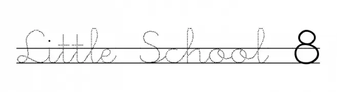
![Little School 8 Frei Schriftart Herunterladen]() Herunterladen 150 Downloads@WebFont
Herunterladen 150 Downloads@WebFont -
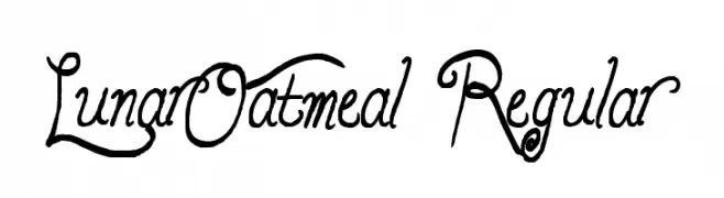
( Fonts by Alex Tomlinson - Skyhaven Fonts - shfonts.com )
A whimsical and decorative font with intricate curls and swirls.
![LunarOatmeal-Regular Frei Schriftart Herunterladen]() Herunterladen 150 Downloads@WebFont
Herunterladen 150 Downloads@WebFont -
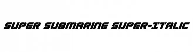
( Iconian Fonts - Daniel Zadorozny - www.iconian.com )
A bold, italicized font with a futuristic and dynamic style.
![Super Submarine Super-Italic Frei Schriftart Herunterladen]() Herunterladen 150 Downloads@WebFont
Herunterladen 150 Downloads@WebFont -
![Megaserif One Demo Frei Schriftart Herunterladen]() Herunterladen 150 Downloads@WebFont
Herunterladen 150 Downloads@WebFont -
( Fonts by Geronimo Fonts - Personal-use only. For commercial use please contact owner. )
A playful, bubble-like font with a retro vibe.
![WAFFLEBOY Regular Frei Schriftart Herunterladen]() Herunterladen 150 Downloads@WebFont
Herunterladen 150 Downloads@WebFont -
( Southype - Rodrigo Gonzalez - www.southype.com )
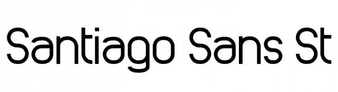
A modern, geometric sans-serif font with uniform strokes and clear readability.
![Santiago Sans St Frei Schriftart Herunterladen]() Herunterladen 150 Downloads@WebFont
Herunterladen 150 Downloads@WebFont -
( Woodcutter - woodcutter Manero - www.woodcutter.es )
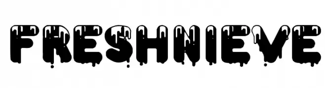
A bold, dripping font with a playful and artistic style.
![Fresh Nieve Frei Schriftart Herunterladen]() Herunterladen 150 Downloads@WebFont
Herunterladen 150 Downloads@WebFont -
![SA_Kiss Frei Schriftart Herunterladen]() Herunterladen 150 Downloads@WebFont
Herunterladen 150 Downloads@WebFont -
![Cornucopia od Dingbats Six Frei Schriftart Herunterladen]() Herunterladen 150 Downloads@WebFont
Herunterladen 150 Downloads@WebFont -
![Vintage Decorative Signs 6 Frei Schriftart Herunterladen]() Herunterladen 150 Downloads@WebFont
Herunterladen 150 Downloads@WebFont -
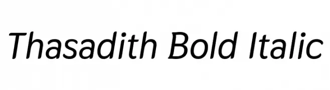
( Copyright 2018 The Thasadith Project Authors (https://github.com/cadsondemak/Thasadith) )
A modern, bold, and italicized font with a sleek and dynamic style.
![Thasadith Bold Italic Frei Schriftart Herunterladen]() Herunterladen 150 Downloads@WebFont
Herunterladen 150 Downloads@WebFont -
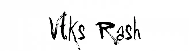
( Fonts by Douglas Vitkauskas - www.vtksdesign.com. Personal-use only. For commercial use please contact owner. )
A bold, expressive font with a hand-drawn, brush-like style.
![Vtks Rash Frei Schriftart Herunterladen]() Herunterladen 150 Downloads@WebFont
Herunterladen 150 Downloads@WebFont -
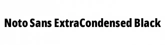
( Fonts by Google )
A bold, extra-condensed sans-serif font with high contrast and tight spacing.
![Noto Sans ExtraCondensed Black Frei Schriftart Herunterladen]() Herunterladen 150 Downloads@WebFont
Herunterladen 150 Downloads@WebFont -
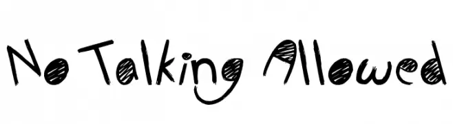
( Fonts by Jonathan S. Harris - www.tattoowoo.com. Personal-use only. For commercial use please contact owner. )
A playful, hand-drawn font with bold, irregular strokes and a whimsical style.
![No Talking Allowed Frei Schriftart Herunterladen]() Herunterladen 150 Downloads@WebFont
Herunterladen 150 Downloads@WebFont -
( Woodcutter - woodcutter Manero - www.woodcutter.es )
A bold, dripping font with a grunge and horror aesthetic.
![gypsyland Frei Schriftart Herunterladen]() Herunterladen 150 Downloads@WebFont
Herunterladen 150 Downloads@WebFont -
( Fonts by Daniel Zadorozny - www.iconian.com )
A bold, condensed font with a modern, geometric style.
![Subadai Baan Condensed Frei Schriftart Herunterladen]() Herunterladen 150 Downloads@WebFont
Herunterladen 150 Downloads@WebFont


Welche Schriften sind gerade am populärsten?
Poppins, Roboto, Montserrat, Open Sans und Lato sind wegen ihrer klaren Formen und breiten Einsetzbarkeit sehr gefragt – von Markenauftritt über Landingpages bis hin zu Postern.
Welche Fonts eignen sich für Logos?
Geometrische Sans‑Serifs (z. B. Poppins, Familien im Gotham‑Stil) sind ein häufiger Griff für sauberes, skalierbares Branding. Für eine persönlichere Note bleiben Scripts und Handschrift‑Stile beliebt. Kombinieren Sie einen prägnanten Headline‑Font mit einer neutralen Brotschrift für Wiedererkennung und Harmonie.
Wie oft wird die Top‑Liste aktualisiert?
Regelmäßig – basierend auf realen Downloads und Interaktionen. Schauen Sie öfter vorbei, um aufstrebende Favoriten früh zu entdecken.
💡 Tipp: Seite bookmarken – Trends wechseln schnell, und heutige Top‑Schriften inspirieren morgen vielleicht das Rebranding.