Willkommen bei den Top‑Schriften – hier treffen Beliebtheit und Qualität aufeinander. Das sind die in diesem Jahr am häufigsten heruntergeladenen und genutzten Fonts. Wenn Sie sichere Optionen für Logo, Web oder Social suchen, starten Sie hier.
Jeder Top‑Font überzeugt durch Balance, Lesbarkeit und Vielseitigkeit. Sie finden moderne Sans‑Serifs, elegante Scripts, Vintage‑Serifs und minimalistische Displays.
-
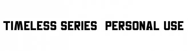
( Fonts by AlifRyanZulfikar - Personal-use only. For commercial use please contact owner. )
A bold, geometric font with a modern and impactful design.
 Herunterladen 149 Downloads@WebFont
 -
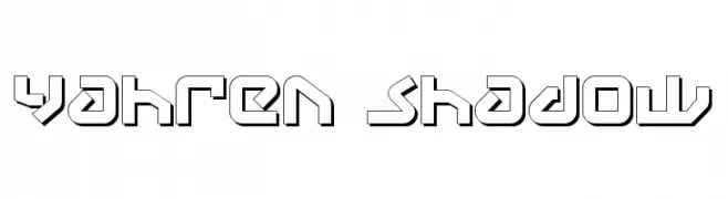
( Fonts by Daniel Zadorozny - www.iconian.com - Free for personal use )
A bold, geometric font with a shadow effect for a 3D appearance.
![Yahren Shadow Frei Schriftart Herunterladen]() Herunterladen 149 Downloads@WebFont
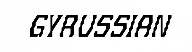
Herunterladen 149 Downloads@WebFont -
![Gyrussian Frei Schriftart Herunterladen]() Herunterladen 149 Downloads@WebFont
Herunterladen 149 Downloads@WebFont -
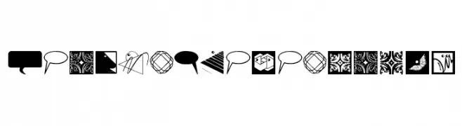
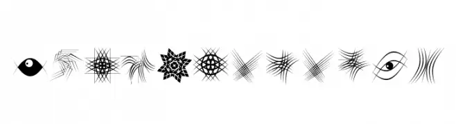
( Fonts by Manfred Klein. Free for private and charity use. Free for commercial with donation to organizations )
A decorative dingbat collection with abstract, geometric, and illustrative icons.
![DesignElementsTwo Frei Schriftart Herunterladen]() Herunterladen 149 Downloads@WebFont
Herunterladen 149 Downloads@WebFont -
![BambuC Frei Schriftart Herunterladen]() Herunterladen 149 Downloads@WebFont
Herunterladen 149 Downloads@WebFont -
( Fonts by Xerographer Fonts )
A playful, hand-drawn font with a sketch-like, dimensional appearance.
![BuDtendEr Frei Schriftart Herunterladen]() Herunterladen 149 Downloads@WebFont
Herunterladen 149 Downloads@WebFont -
( Fonts by Typodermic Fonts )
A classic serif font with elegant strokes and refined proportions.
![KingsbridgeExLt-Regular Frei Schriftart Herunterladen]() Herunterladen 149 Downloads@WebFont
Herunterladen 149 Downloads@WebFont -
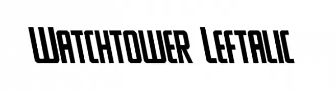
( Fonts by Daniel Zadorozny - www.iconian.com - Free for personal use )
A bold, slanted font with sharp angles and a modern, dynamic style.
![Watchtower Leftalic Frei Schriftart Herunterladen]() Herunterladen 149 Downloads@WebFont
Herunterladen 149 Downloads@WebFont -
( Copyright (c) 2011-2012, Jonathan Pinhorn (jonpinhorn.typedesign@gmail.com), with Reserved Font Names 'Karla' )
Bold, inclined font with a modern and clean appearance.
![Karla Tamil Bold Inclined Frei Schriftart Herunterladen]() Herunterladen 149 Downloads@WebFont
Herunterladen 149 Downloads@WebFont -
![KBSquirrelTracks Frei Schriftart Herunterladen]() Herunterladen 149 Downloads@WebFont
Herunterladen 149 Downloads@WebFont -
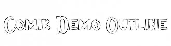
( Fonts by VinType )
A playful, bold outline font with a comic book style.
![Comik Demo Outline Frei Schriftart Herunterladen]() Herunterladen 149 Downloads@WebFont
Herunterladen 149 Downloads@WebFont -
![Soup Recipe Frei Schriftart Herunterladen]() Herunterladen 149 Downloads@WebFont
Herunterladen 149 Downloads@WebFont -
( Fonts by Manfred Klein. Free for private and charity use. Free for commercial with donation to organizations )
Highly decorative and abstract symbol set with geometric and illustrative motifs.
![TypoElements Frei Schriftart Herunterladen]() Herunterladen 149 Downloads@WebFont
Herunterladen 149 Downloads@WebFont -
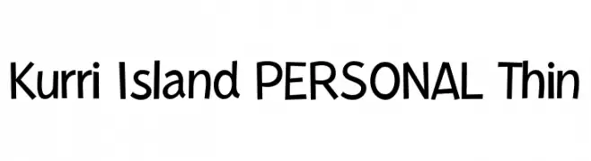
( Fonts by Måns Grebäck )
A playful, handwritten-style font with consistent stroke thickness and a whimsical touch.
![Kurri Island PERSONAL Thin Frei Schriftart Herunterladen]() Herunterladen 149 Downloads@WebFont
Herunterladen 149 Downloads@WebFont -
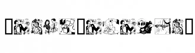
( Fonts by Daniel Gauthier )
Comic-style illustrated font with unique scenes in each character.
![MagicCatalog2 Frei Schriftart Herunterladen]() Herunterladen 149 Downloads@WebFont
Herunterladen 149 Downloads@WebFont -
![Fatso Frei Schriftart Herunterladen]() Herunterladen 149 Downloads@WebFont
Herunterladen 149 Downloads@WebFont -
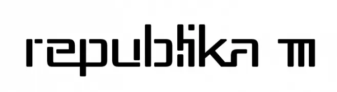
( Fonts by Apostrophic Lab )
A modern, geometric font with a futuristic and sleek design.
![Republika III Frei Schriftart Herunterladen]() Herunterladen 149 Downloads@WebFont
Herunterladen 149 Downloads@WebFont -
![Peikari Frei Schriftart Herunterladen]() Herunterladen 149 Downloads
Herunterladen 149 Downloads -
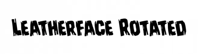
( Fonts by Daniel Zadorozny - www.iconian.com - Free for personal use )
A bold, jagged font with a distressed, energetic style.
![Leatherface Rotated Frei Schriftart Herunterladen]() Herunterladen 149 Downloads@WebFont
Herunterladen 149 Downloads@WebFont -
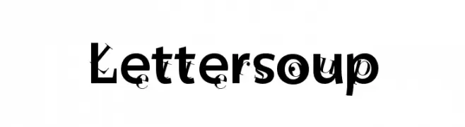
( Fonts by Manfred Klein. Free for private and charity use. Free for commercial with donation to organizations )
A playful and chaotic font with bold, eclectic characters.
![Lettersoup Frei Schriftart Herunterladen]() Herunterladen 149 Downloads@WebFont
Herunterladen 149 Downloads@WebFont -
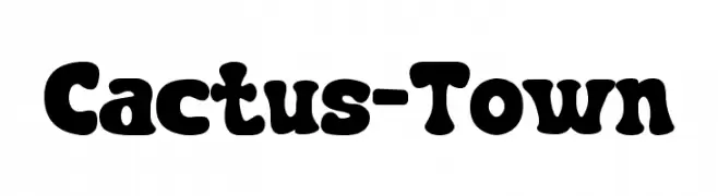
( Fonts by Pinisiart )
A bold, playful font with rounded strokes and a whimsical, friendly appearance.
![Cactus-Town Frei Schriftart Herunterladen]() Herunterladen 149 Downloads@WebFont
Herunterladen 149 Downloads@WebFont -
![BaronNeue-Italic Frei Schriftart Herunterladen]() Herunterladen 149 Downloads@WebFont
Herunterladen 149 Downloads@WebFont -
( Fonts by Iconian Fonts )
A bold, angular font with a dynamic slant and modern geometric style.
![Viceroy of Deacons Rotalic Frei Schriftart Herunterladen]() Herunterladen 149 Downloads@WebFont
Herunterladen 149 Downloads@WebFont -
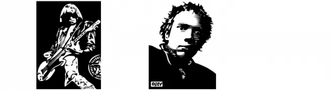
( Fonts by bob istheowl http://luc.devroye.org/bobistheowl.html )
Graphic-heavy, rock-inspired decorative font with illustrated characters.
![ObeyRockers Frei Schriftart Herunterladen]() Herunterladen 149 Downloads@WebFont
Herunterladen 149 Downloads@WebFont -
( Fonts by Arvn - Buminatha Arvin - Personal-use only. For commercial use please contact owner. )
A bold, decorative font with vintage flair and intricate details.
![BlackArcade Frei Schriftart Herunterladen]() Herunterladen 149 Downloads@WebFont
Herunterladen 149 Downloads@WebFont -
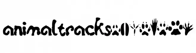
![animaltracksPQSEWVRZ Frei Schriftart Herunterladen]() Herunterladen 149 Downloads@WebFont
Herunterladen 149 Downloads@WebFont -
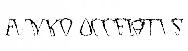
![Funko Occelatus Frei Schriftart Herunterladen]() Herunterladen 149 Downloads@WebFont
Herunterladen 149 Downloads@WebFont -
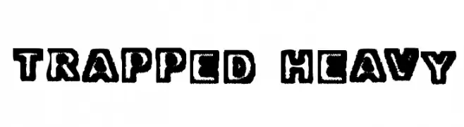
![Trapped Heavy Frei Schriftart Herunterladen]() Herunterladen 149 Downloads@WebFont
Herunterladen 149 Downloads@WebFont -
( Font by Eric Wirjanata. All of my font are donation based. You can support by buying something from here. http://society6.com/EricWirjanata )
A bold, pixelated font with a playful, retro digital aesthetic.
![PixelNoise Frei Schriftart Herunterladen]() Herunterladen 149 Downloads@WebFont
Herunterladen 149 Downloads@WebFont -
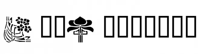
![ArtNouveau2 Frei Schriftart Herunterladen]() Herunterladen 149 Downloads@WebFont
Herunterladen 149 Downloads@WebFont -
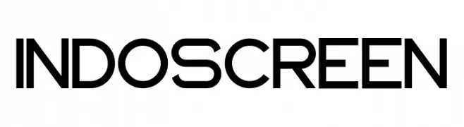
( Fonts by zulkhairilettering - Zulkhairi M Saleh - Personal-use only. For commercial use please contact owner. )
A modern, geometric sans-serif font with a clean and bold appearance.
![INDOSCREEN Frei Schriftart Herunterladen]() Herunterladen 149 Downloads@WebFont
Herunterladen 149 Downloads@WebFont -
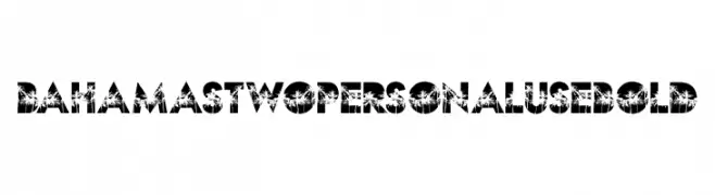
( Fonts by Billy Argel Fonts ® )
A bold, decorative font with palm tree silhouettes for a tropical theme.
![BAHAMAS TWO PERSONAL USE Bold Frei Schriftart Herunterladen]() Herunterladen 149 Downloads@WebFont
Herunterladen 149 Downloads@WebFont -
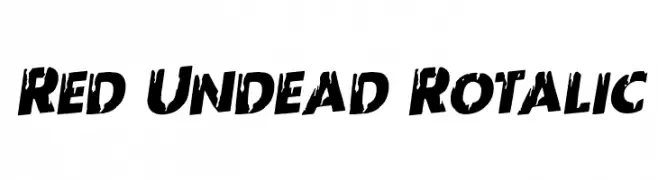
( Fonts by Iconian Fonts )
A bold, distressed font with a slanted, grunge-like appearance.
![Red Undead Rotalic Frei Schriftart Herunterladen]() Herunterladen 149 Downloads@WebFont
Herunterladen 149 Downloads@WebFont -
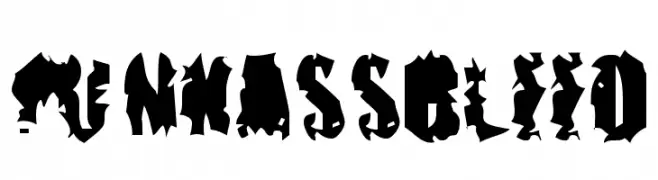
![pUNKASSBLEED Frei Schriftart Herunterladen]() Herunterladen 149 Downloads@WebFont
Herunterladen 149 Downloads@WebFont -
( Fonts by YonType Studio - Muhammad Yoni - Personal-use only. For commercial use please contact owner. )
A sophisticated script font with high contrast and elegant curves.
![Gerliya Frei Schriftart Herunterladen]() Herunterladen 149 Downloads@WebFont
Herunterladen 149 Downloads@WebFont


Welche Schriften sind gerade am populärsten?
Poppins, Roboto, Montserrat, Open Sans und Lato sind wegen ihrer klaren Formen und breiten Einsetzbarkeit sehr gefragt – von Markenauftritt über Landingpages bis hin zu Postern.
Welche Fonts eignen sich für Logos?
Geometrische Sans‑Serifs (z. B. Poppins, Familien im Gotham‑Stil) sind ein häufiger Griff für sauberes, skalierbares Branding. Für eine persönlichere Note bleiben Scripts und Handschrift‑Stile beliebt. Kombinieren Sie einen prägnanten Headline‑Font mit einer neutralen Brotschrift für Wiedererkennung und Harmonie.
Wie oft wird die Top‑Liste aktualisiert?
Regelmäßig – basierend auf realen Downloads und Interaktionen. Schauen Sie öfter vorbei, um aufstrebende Favoriten früh zu entdecken.
💡 Tipp: Seite bookmarken – Trends wechseln schnell, und heutige Top‑Schriften inspirieren morgen vielleicht das Rebranding.