Willkommen bei den Top‑Schriften – hier treffen Beliebtheit und Qualität aufeinander. Das sind die in diesem Jahr am häufigsten heruntergeladenen und genutzten Fonts. Wenn Sie sichere Optionen für Logo, Web oder Social suchen, starten Sie hier.
Jeder Top‑Font überzeugt durch Balance, Lesbarkeit und Vielseitigkeit. Sie finden moderne Sans‑Serifs, elegante Scripts, Vintage‑Serifs und minimalistische Displays.
-
( Fonts by Jamie Place [FontBlast Design] - Personal-use only. For commercial use please contact owner. )
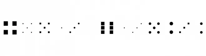
A playful, geometric font composed of dots and squares, ideal for creative projects.
 Herunterladen 149 Downloads@WebFont
 -
( Fonts by elharrak )
Uniform set of outlined social and tech brand icons.
![Icons 2019 Frei Schriftart Herunterladen]() Herunterladen 149 Downloads@WebFont
Herunterladen 149 Downloads@WebFont -
( Fonts by fortunes co - Ramandhani Nugraha - Personal-use only. For commercial use please contact owner. )
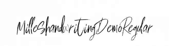
A dynamic, expressive handwritten font with a modern, artistic flair.
![Milles handwriting Demo Regular Frei Schriftart Herunterladen]() Herunterladen 149 Downloads@WebFont
Herunterladen 149 Downloads@WebFont -
( Fonts by Daniel Zadorozny - www.iconian.com - Personal-use only. For commercial use please contact owner. )
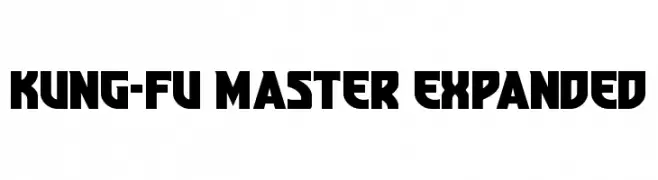
A bold, geometric font with an expanded width and strong visual impact.
![Kung-Fu Master Expanded Frei Schriftart Herunterladen]() Herunterladen 149 Downloads@WebFont
Herunterladen 149 Downloads@WebFont -
( Fonts by Impallari Type )
A modern, rounded sans-serif font with a clean and approachable design.
![Dosis-Regular Frei Schriftart Herunterladen]() Herunterladen 149 Downloads@WebFont
Herunterladen 149 Downloads@WebFont -
( Noto is a trademark of Google Inc. Noto fonts are open source. All Noto fonts are published under the SIL Open Font License, Version 1.1 )
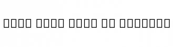
Not a valid font sample; only placeholder glyphs are visible.
![Noto Sans Thai UI Regular Frei Schriftart Herunterladen]() Herunterladen 149 Downloads@WebFont
Herunterladen 149 Downloads@WebFont -
( imagex - www.imagex-fonts.com )
A bold, distressed font with a vintage, rugged appearance.
![Outlaw Stars Frei Schriftart Herunterladen]() Herunterladen 149 Downloads@WebFont
Herunterladen 149 Downloads@WebFont -
![Serbian-Elegant-Bold Frei Schriftart Herunterladen]() Herunterladen 149 Downloads@WebFont
Herunterladen 149 Downloads@WebFont -
( Fonts by Inermedia Studio )
Expressive handwritten script with signature-like flair.
![Signatine Frei Schriftart Herunterladen]() Herunterladen 149 Downloads@WebFont
Herunterladen 149 Downloads@WebFont -
( Fonts by Apostrophic Lab )
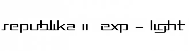
A modern, geometric font with a futuristic and sleek design.
![Republika II Exp - Light Frei Schriftart Herunterladen]() Herunterladen 149 Downloads@WebFont
Herunterladen 149 Downloads@WebFont -
( www.woodcutter.es )
A bold, eclectic font with a rebellious, punk-inspired aesthetic.
![DaPunk Frei Schriftart Herunterladen]() Herunterladen 149 Downloads@WebFont
Herunterladen 149 Downloads@WebFont -
( Fonts by a Neale Davidson - www.pixelsagas.com. Personal-use only. For commercial use please contact owner. )
A bold, pixelated font with a retro digital aesthetic.
![Pixel Musketeer Frei Schriftart Herunterladen]() Herunterladen 149 Downloads@WebFont
Herunterladen 149 Downloads@WebFont -
( Fonts by Miffies - mfs.jp.org - Personal-use only. For commercial use please contact owner. )
A pixelated, blocky font with a retro digital style.
![M40_BITLINE Frei Schriftart Herunterladen]() Herunterladen 149 Downloads@WebFont
Herunterladen 149 Downloads@WebFont -
( Fonts by Wahyu Eka Prasetya - wepfont.com - Personal-use only. For commercial use please contact owner. )
An ornate and decorative font with elaborate curves and flourishes.
![Dongeng Frei Schriftart Herunterladen]() Herunterladen 149 Downloads@WebFont
Herunterladen 149 Downloads@WebFont -
![Jason Statan Frei Schriftart Herunterladen]() Herunterladen 149 Downloads@WebFont
Herunterladen 149 Downloads@WebFont -
( Paul Lloyd Fonts )
A modern, bold, and condensed font with high contrast and tight spacing.
![NewStyleCondensed Bold Frei Schriftart Herunterladen]() Herunterladen 149 Downloads@WebFont
Herunterladen 149 Downloads@WebFont -
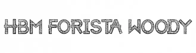
( Here Be Monsters - monsterswithin.com )
A decorative font with intricate wood-like textures in each character.
![HBM Forista Woody Frei Schriftart Herunterladen]() Herunterladen 149 Downloads@WebFont
Herunterladen 149 Downloads@WebFont -
( Fonts by Gilang Ternadho )
A playful, rounded font with a friendly and whimsical style.
![HAPPYMASS Frei Schriftart Herunterladen]() Herunterladen 149 Downloads@WebFont
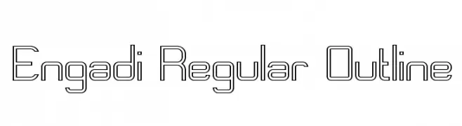
Herunterladen 149 Downloads@WebFont -
![Engadi Regular Outline Frei Schriftart Herunterladen]() Herunterladen 149 Downloads@WebFont
Herunterladen 149 Downloads@WebFont -
( Fonts by Digi Temply - Personal-use only. For commercial use please contact owner. )
A modern sans-serif font with clean, geometric letterforms and strong readability.
![Novus-Regular Frei Schriftart Herunterladen]() Herunterladen 149 Downloads@WebFont
Herunterladen 149 Downloads@WebFont -
( Fonts by Daniel Zadorozny - www.iconian.com )
A bold, geometric font with a futuristic and condensed style.
![Extechchop Condensed Frei Schriftart Herunterladen]() Herunterladen 149 Downloads@WebFont
Herunterladen 149 Downloads@WebFont -
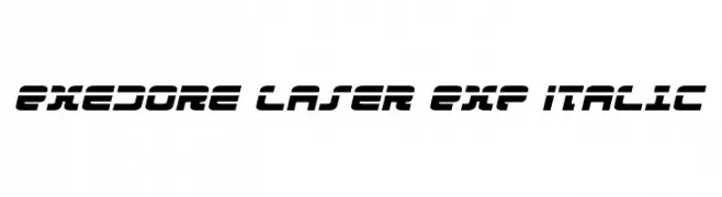
( Fonts by Daniel Zadorozny - www.iconian.com - Free for personal use )
A bold, italicized font with a futuristic and dynamic style, featuring geometric shapes and sharp angles.
![Exedore Laser Exp Italic Frei Schriftart Herunterladen]() Herunterladen 149 Downloads@WebFont
Herunterladen 149 Downloads@WebFont -
![Beorc Gothic Bold Frei Schriftart Herunterladen]() Herunterladen 149 Downloads@WebFont
Herunterladen 149 Downloads@WebFont -
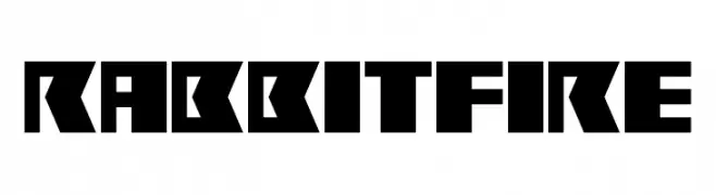
![Rabbit Fire Frei Schriftart Herunterladen]() Herunterladen 149 Downloads@WebFont
Herunterladen 149 Downloads@WebFont -
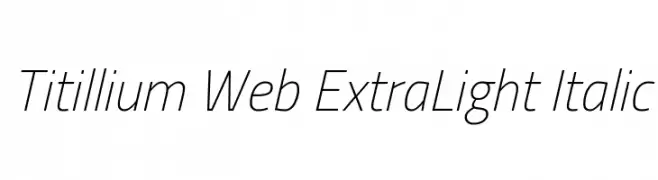
( Copyright (c) 2009-2011 by Accademia di Belle Arti di Urbino and students of MA course of Visual design. Some rights reserved. )
A sleek, modern, and extra light italic font with excellent readability.
![Titillium Web ExtraLight Italic Frei Schriftart Herunterladen]() Herunterladen 149 Downloads@WebFont
Herunterladen 149 Downloads@WebFont -
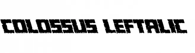
( Fonts by Daniel Zadorozny - www.iconian.com - Free for personal use )
A bold, textured font with a rugged, distressed appearance.
![Colossus Leftalic Frei Schriftart Herunterladen]() Herunterladen 149 Downloads@WebFont
Herunterladen 149 Downloads@WebFont -
![SoftOrnamentsFifteen Frei Schriftart Herunterladen]() Herunterladen 149 Downloads@WebFont
Herunterladen 149 Downloads@WebFont -
Schriftart von typotopia. For commercial use please contact the owner.
( Fonts by Typotopia - Typotopia.co - Personal Use Only, for Commercial Use, please contact us )
A sleek, modern font with clean lines and geometric structure.
![Skyline Regular Frei Schriftart Herunterladen]() Herunterladen 149 Downloads
Herunterladen 149 Downloads -
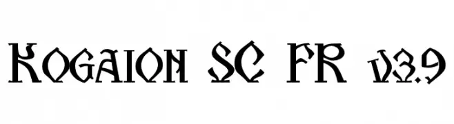
( Florin Florea - florin.reel.ro )
A bold, gothic-inspired font with sharp, angular characters.
![Kogaion SC FR v3.9 Frei Schriftart Herunterladen]() Herunterladen 149 Downloads@WebFont
Herunterladen 149 Downloads@WebFont -
( Paul Grosse - grosse.is-a-geek.com/paul/ttf01.htm )
A classic monospaced typewriter font with bold, clear characters and slight serifs.
![Typewriter PG Frei Schriftart Herunterladen]() Herunterladen 149 Downloads@WebFont
Herunterladen 149 Downloads@WebFont -
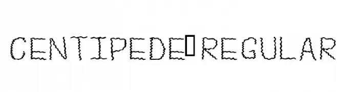
( Fonts by Alex Tomlinson - Skyhaven Fonts - shfonts.com )
A playful, wavy font with a segmented, centipede-like design.
![Centipede-Regular Frei Schriftart Herunterladen]() Herunterladen 149 Downloads@WebFont
Herunterladen 149 Downloads@WebFont -
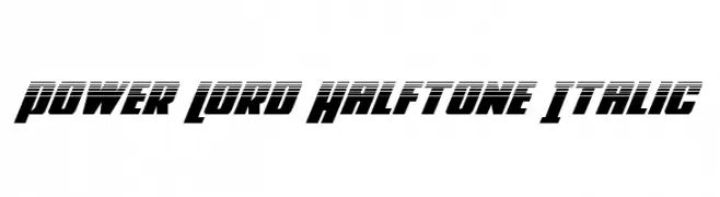
( Fonts by Daniel Zadorozny - www.iconian.com - Free for personal use )
A bold, italicized font with a halftone effect, exuding a futuristic and dynamic style.
![Power Lord Halftone Italic Frei Schriftart Herunterladen]() Herunterladen 149 Downloads@WebFont
Herunterladen 149 Downloads@WebFont -
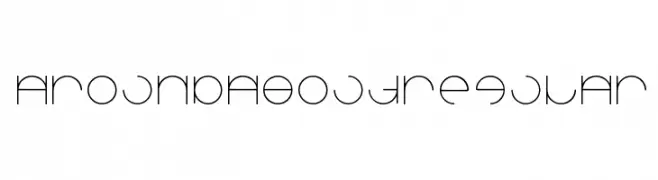
![Aroundabout-Regular Frei Schriftart Herunterladen]() Herunterladen 149 Downloads@WebFont
Herunterladen 149 Downloads@WebFont -
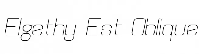
( Fonts by Graham Meade - GemFonts )
A modern, oblique font with thin, consistent strokes and a minimalist design.
![Elgethy Est Oblique Frei Schriftart Herunterladen]() Herunterladen 149 Downloads@WebFont
Herunterladen 149 Downloads@WebFont -
( Fonts by StringLabs - stringlabscreative.com - Personal-use only. For commercial use please contact owner. )
An elegant script font with fluid, cursive strokes and sophisticated loops.
![Geng Rimba Frei Schriftart Herunterladen]() Herunterladen 149 Downloads@WebFont
Herunterladen 149 Downloads@WebFont


Welche Schriften sind gerade am populärsten?
Poppins, Roboto, Montserrat, Open Sans und Lato sind wegen ihrer klaren Formen und breiten Einsetzbarkeit sehr gefragt – von Markenauftritt über Landingpages bis hin zu Postern.
Welche Fonts eignen sich für Logos?
Geometrische Sans‑Serifs (z. B. Poppins, Familien im Gotham‑Stil) sind ein häufiger Griff für sauberes, skalierbares Branding. Für eine persönlichere Note bleiben Scripts und Handschrift‑Stile beliebt. Kombinieren Sie einen prägnanten Headline‑Font mit einer neutralen Brotschrift für Wiedererkennung und Harmonie.
Wie oft wird die Top‑Liste aktualisiert?
Regelmäßig – basierend auf realen Downloads und Interaktionen. Schauen Sie öfter vorbei, um aufstrebende Favoriten früh zu entdecken.
💡 Tipp: Seite bookmarken – Trends wechseln schnell, und heutige Top‑Schriften inspirieren morgen vielleicht das Rebranding.