Willkommen bei den Top‑Schriften – hier treffen Beliebtheit und Qualität aufeinander. Das sind die in diesem Jahr am häufigsten heruntergeladenen und genutzten Fonts. Wenn Sie sichere Optionen für Logo, Web oder Social suchen, starten Sie hier.
Jeder Top‑Font überzeugt durch Balance, Lesbarkeit und Vielseitigkeit. Sie finden moderne Sans‑Serifs, elegante Scripts, Vintage‑Serifs und minimalistische Displays.
-
 Herunterladen 2401 Downloads@WebFont
 -
( Free for a personal use. For a commercial use please visit www.kevinandamanda.com )
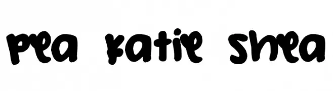
A bold, playful handwritten font with rounded strokes and a casual vibe.
![Pea Katie Shea Frei Schriftart Herunterladen]() Herunterladen 2400 Downloads@WebFont
Herunterladen 2400 Downloads@WebFont -
( Fonts by Jens R. Ziehn - www.filmhimmel.com )
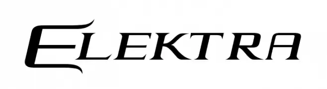
A dynamic, edgy font with sharp, angular strokes and a futuristic aesthetic.
![Elektra Frei Schriftart Herunterladen]() Herunterladen 2400 Downloads@WebFont
Herunterladen 2400 Downloads@WebFont -
( Fonts by Vladimir Nikolic - www.creativefabrica.com/designer/vladimirnikolic/ - Personal-use only. For commercial use please contact owner. )
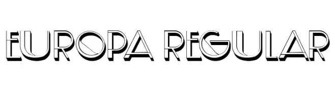
A modern, 3D-effect font with bold outlines and geometric shapes.
![Europa Regular Frei Schriftart Herunterladen]() Herunterladen 2399 Downloads@WebFont
Herunterladen 2399 Downloads@WebFont -
( Fonts by www.fugit-tempus.de )
A bold, dynamic script font with elegant, flowing letterforms.
![Holla Frei Schriftart Herunterladen]() Herunterladen 2399 Downloads@WebFont
Herunterladen 2399 Downloads@WebFont -
( !Exclamachine Type Foundry - exclamachine.com/ )
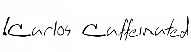
A dynamic, handwritten font with fluid and irregular strokes.
![!Carlos Caffeinated Frei Schriftart Herunterladen]() Herunterladen 2398 Downloads@WebFont
Herunterladen 2398 Downloads@WebFont -
![Qaskin Black Personal Use Frei Schriftart Herunterladen]() Herunterladen 2398 Downloads@WebFont
Herunterladen 2398 Downloads@WebFont -
( Fonts by Isaac K. Personal-use only. For commercial use please contact owner. )
A futuristic, geometric font with bold strokes and tight spacing.
![Android Frei Schriftart Herunterladen]() Herunterladen 2398 Downloads@WebFont
Herunterladen 2398 Downloads@WebFont -
( Fonts by Graham Meade - GemFonts )
A modern, oblique font with a sleek and dynamic design.
![Choktoff Oblique Frei Schriftart Herunterladen]() Herunterladen 2398 Downloads@WebFont
Herunterladen 2398 Downloads@WebFont -
( Fonts by Paul Miller )
A bold, italic font with smooth curves and a slightly slanted style.
![Bainsley Bold Italic Frei Schriftart Herunterladen]() Herunterladen 2397 Downloads@WebFont
Herunterladen 2397 Downloads@WebFont -
( Fonts by Castcraft Software - OPTI Fonts Archive - opti.netii.net - Personal-use only. For commercial use please contact owner. )
A classic serif font with elegant curves and medium contrast, ideal for formal and creative uses.
![OPTIPeach-CAP Frei Schriftart Herunterladen]() Herunterladen 2397 Downloads@WebFont
Herunterladen 2397 Downloads@WebFont -
![Secrets Frei Schriftart Herunterladen]() Herunterladen 2397 Downloads@WebFont
Herunterladen 2397 Downloads@WebFont -
( Magique Fonts - www.facebook.com/typesgal/ )
A bold, distressed font with a grunge, vintage appearance.
![Capture Smallz Frei Schriftart Herunterladen]() Herunterladen 2396 Downloads@WebFont
Herunterladen 2396 Downloads@WebFont -
![3ds-Condensed Frei Schriftart Herunterladen]() Herunterladen 2396 Downloads@WebFont
Herunterladen 2396 Downloads@WebFont -
![Shabrina Free Frei Schriftart Herunterladen]() Herunterladen 2395 Downloads@WebFont
Herunterladen 2395 Downloads@WebFont -
![RoadTrip Frei Schriftart Herunterladen]() Herunterladen 2395 Downloads@WebFont
Herunterladen 2395 Downloads@WebFont -
( Fonts by Jens R. Ziehn - www.filmhimmel.com )
A bold, playful font with a rugged, adventurous style.
![Goonies Frei Schriftart Herunterladen]() Herunterladen 2395 Downloads@WebFont
Herunterladen 2395 Downloads@WebFont -
( Fonts by Jacob Fisher - www.pizzadude.dk )
A bold, angular font with a geometric and modern style.
![Kitchen police Frei Schriftart Herunterladen]() Herunterladen 2395 Downloads@WebFont
Herunterladen 2395 Downloads@WebFont -
( Fonts by Florian Karsten - Personal-use only. For commercial use please contact owner. )
A bold, modern sans-serif font with clean lines and geometric structure.
![Space Grotesk Bold Frei Schriftart Herunterladen]() Herunterladen 2394 Downloads@WebFont
Herunterladen 2394 Downloads@WebFont -
( Fonts by Christopher Hansen )
A classic serif font with elegant, sharp serifs and subtle medieval influences.
![Sell Your Soul Frei Schriftart Herunterladen]() Herunterladen 2394 Downloads@WebFont
Herunterladen 2394 Downloads@WebFont -
( Fonts by Jester Font Studio )
A bold, decorative font with vintage circus-inspired detailing.
![JFRingmaster Frei Schriftart Herunterladen]() Herunterladen 2394 Downloads@WebFont
Herunterladen 2394 Downloads@WebFont -
![Masquerade Frei Schriftart Herunterladen]() Herunterladen 2394 Downloads@WebFont
Herunterladen 2394 Downloads@WebFont -
![BD Renaissance Frei Schriftart Herunterladen]() Herunterladen 2394 Downloads@WebFont
Herunterladen 2394 Downloads@WebFont -
( Fonts by www.fontalicious.com )
A playful, whimsical font with exaggerated serifs and a hand-drawn feel.
![Mandingo Frei Schriftart Herunterladen]() Herunterladen 2394 Downloads@WebFont
Herunterladen 2394 Downloads@WebFont -
( Font by http://home.luna.nl/~xino/ )
A futuristic, geometric font with clean lines and angular shapes.
![Xenotron Frei Schriftart Herunterladen]() Herunterladen 2394 Downloads@WebFont
Herunterladen 2394 Downloads@WebFont -
( Fonts by Situjuh Nazara - 7ntypes.com - Personal-use only. For commercial use please contact owner. )
A playful, handwritten font with rounded, irregular letterforms.
![Hastoler Frei Schriftart Herunterladen]() Herunterladen 2393 Downloads@WebFont
Herunterladen 2393 Downloads@WebFont -
![VI Quynh Mai Hoa Frei Schriftart Herunterladen]() Herunterladen 2393 Downloads@WebFont
Herunterladen 2393 Downloads@WebFont -
( Fonts by Nick Curtis - www.nicksfonts.com )
A bold, rounded font ideal for impactful and attention-grabbing designs.
![PhattPhreddy Frei Schriftart Herunterladen]() Herunterladen 2393 Downloads@WebFont
Herunterladen 2393 Downloads@WebFont -
( Fonts by MadeType - Personal-use only. For commercial use please contact owner. )
A bold, rounded font with a modern and friendly style.
![MADEWaffleSoft Frei Schriftart Herunterladen]() Herunterladen 2392 Downloads@WebFont
Herunterladen 2392 Downloads@WebFont -
( Copyright HanYang I&C Co.,Ltd. All rights reserved. )
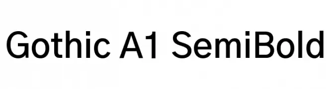
A modern sans-serif font with a semi-bold weight, offering clarity and versatility.
![Gothic A1 SemiBold Frei Schriftart Herunterladen]() Herunterladen 2392 Downloads@WebFont
Herunterladen 2392 Downloads@WebFont -
( Copyright (c) 2012, vernon adams (vern@newtypography.co.uk), with Reserved Font Names 'Anaheim' )
A modern, geometric sans-serif font with clean lines and excellent legibility.
![Anaheim Frei Schriftart Herunterladen]() Herunterladen 2392 Downloads@WebFont
Herunterladen 2392 Downloads@WebFont -
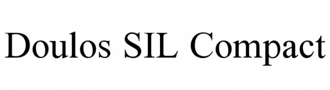
![Doulos SIL Compact Frei Schriftart Herunterladen]() Herunterladen 2392 Downloads@WebFont
Herunterladen 2392 Downloads@WebFont -
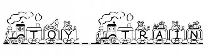
![Toy Train Frei Schriftart Herunterladen]() Herunterladen 2392 Downloads@WebFont
Herunterladen 2392 Downloads@WebFont -
( Fonts by uatype.faithweb.com - UnAuthorized Type )
A playful, casual handwritten font with bold, rounded characters.
![Another Frei Schriftart Herunterladen]() Herunterladen 2392 Downloads@WebFont
Herunterladen 2392 Downloads@WebFont -
( Fonts by Zetafonts - Personal-use only. For commercial use please contact owner. )
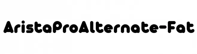
A bold, rounded font with a playful and modern style.
![AristaProAlternate-Fat Frei Schriftart Herunterladen]() Herunterladen 2391 Downloads@WebFont
Herunterladen 2391 Downloads@WebFont


Welche Schriften sind gerade am populärsten?
Poppins, Roboto, Montserrat, Open Sans und Lato sind wegen ihrer klaren Formen und breiten Einsetzbarkeit sehr gefragt – von Markenauftritt über Landingpages bis hin zu Postern.
Welche Fonts eignen sich für Logos?
Geometrische Sans‑Serifs (z. B. Poppins, Familien im Gotham‑Stil) sind ein häufiger Griff für sauberes, skalierbares Branding. Für eine persönlichere Note bleiben Scripts und Handschrift‑Stile beliebt. Kombinieren Sie einen prägnanten Headline‑Font mit einer neutralen Brotschrift für Wiedererkennung und Harmonie.
Wie oft wird die Top‑Liste aktualisiert?
Regelmäßig – basierend auf realen Downloads und Interaktionen. Schauen Sie öfter vorbei, um aufstrebende Favoriten früh zu entdecken.
💡 Tipp: Seite bookmarken – Trends wechseln schnell, und heutige Top‑Schriften inspirieren morgen vielleicht das Rebranding.