Willkommen bei den Top‑Schriften – hier treffen Beliebtheit und Qualität aufeinander. Das sind die in diesem Jahr am häufigsten heruntergeladenen und genutzten Fonts. Wenn Sie sichere Optionen für Logo, Web oder Social suchen, starten Sie hier.
Jeder Top‑Font überzeugt durch Balance, Lesbarkeit und Vielseitigkeit. Sie finden moderne Sans‑Serifs, elegante Scripts, Vintage‑Serifs und minimalistische Displays.
-
 Herunterladen 146 Downloads@WebFont
 -
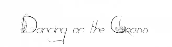
( Fonts by Maelle.K - Thomas Boucherie )
An elegant, whimsical font with vine-like embellishments and flowing lines.
![Dancing on the Grass Frei Schriftart Herunterladen]() Herunterladen 146 Downloads@WebFont
Herunterladen 146 Downloads@WebFont -
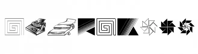
( Fonts by Manfred Klein. Free for private and charity use. Free for commercial with donation to organizations )
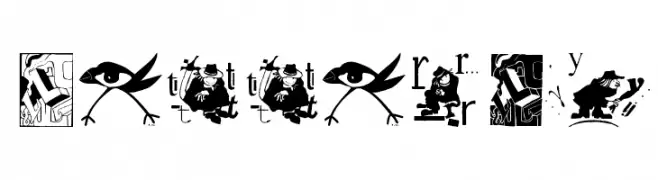
A diverse collection of decorative symbols and illustrations.
![SomeParts Frei Schriftart Herunterladen]() Herunterladen 146 Downloads@WebFont
Herunterladen 146 Downloads@WebFont -
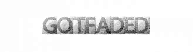
( Fonts by a Max Infeld - XEROGRAPHER FONTS - xerographer.blogspot.com . Personal-use only. For commercial use please contact owner. )
A bold, modern font with a unique halftone texture and consistent width.
![GOTFADED Frei Schriftart Herunterladen]() Herunterladen 146 Downloads@WebFont
Herunterladen 146 Downloads@WebFont -
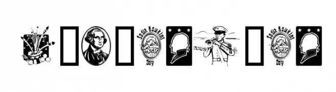
( Fonts by Graham Meade - GemFonts )
A decorative set of American-themed illustrations instead of a traditional font.
![Americanic Frei Schriftart Herunterladen]() Herunterladen 146 Downloads@WebFont
Herunterladen 146 Downloads@WebFont -
( Fonts by wep )
A bold, distressed font with rough, textured edges for a rugged look.
![IMBRO Frei Schriftart Herunterladen]() Herunterladen 146 Downloads@WebFont
Herunterladen 146 Downloads@WebFont -
![No Perfect People Dingbats Frei Schriftart Herunterladen]() Herunterladen 146 Downloads@WebFont
Herunterladen 146 Downloads@WebFont -
( Fonts by Daniel Zadorozny - www.iconian.com )
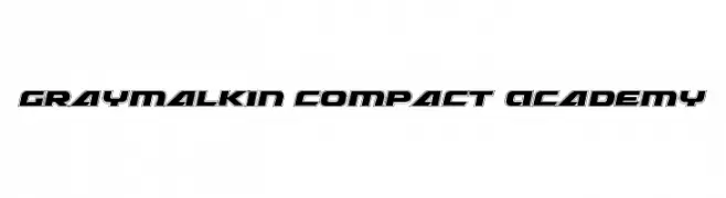
A bold, geometric font with a futuristic and three-dimensional style.
![Graymalkin Compact Academy Frei Schriftart Herunterladen]() Herunterladen 146 Downloads@WebFont
Herunterladen 146 Downloads@WebFont -
( Fonts by www.freakyfonts.de )
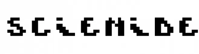
A pixelated, retro-style font with a bold, geometric design.
![Scienide Frei Schriftart Herunterladen]() Herunterladen 146 Downloads@WebFont
Herunterladen 146 Downloads@WebFont -
( Fonts by Manfred Klein. Free for private and charity use. Free for commercial with donation to organizations )
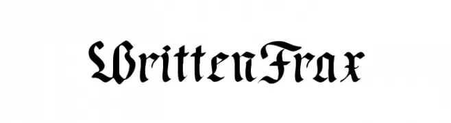
A bold, ornate blackletter font with intricate, angular strokes.
![WrittenFrax Frei Schriftart Herunterladen]() Herunterladen 146 Downloads@WebFont
Herunterladen 146 Downloads@WebFont -
![Type Icons Frei Schriftart Herunterladen]() Herunterladen 146 Downloads@WebFont
Herunterladen 146 Downloads@WebFont -
( Fonts by Manfred Klein. Free for private and charity use. Free for commercial with donation to organizations )
A decorative font with intricate, artistic designs within each character.
![Letterly Frei Schriftart Herunterladen]() Herunterladen 146 Downloads@WebFont
Herunterladen 146 Downloads@WebFont -
( Fonts by Makeda Joseph )
A decorative font with intricate, ornamental designs and artistic flair.
![Tightline Frei Schriftart Herunterladen]() Herunterladen 146 Downloads@WebFont
Herunterladen 146 Downloads@WebFont -
Schriftart von joorgemoron. For commercial use please contact the owner.
( Free for personal use )
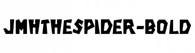
A bold, angular font with a geometric and modern design.
![JMHTHESPIDER-Bold Frei Schriftart Herunterladen]() Herunterladen 146 Downloads@WebFont
Herunterladen 146 Downloads@WebFont -
( Iconian Fonts - Daniel Zadorozny - www.iconian.com )
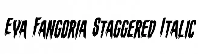
A bold, jagged, and italic font with a dynamic, edgy appearance.
![Eva Fangoria Staggered Italic Frei Schriftart Herunterladen]() Herunterladen 146 Downloads@WebFont
Herunterladen 146 Downloads@WebFont -
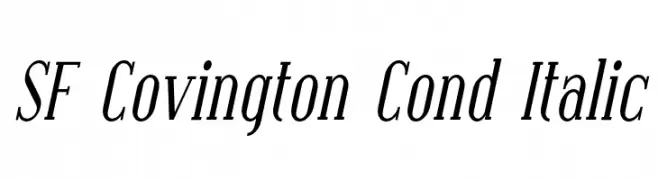
![SF Covington Cond Italic Frei Schriftart Herunterladen]() Herunterladen 146 Downloads@WebFont
Herunterladen 146 Downloads@WebFont -
( Rizalul Ammar )
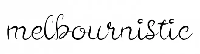
An elegant script font with graceful curves and ornate flourishes.
![melbournistic Frei Schriftart Herunterladen]() Herunterladen 146 Downloads@WebFont
Herunterladen 146 Downloads@WebFont -
( Fonts by Peter Wiegel - www.peter-wiegel.de - Personal-use only. For commercial use please contact owner. )
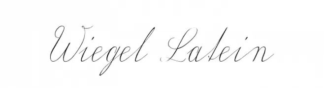
An elegant and sophisticated script font with flowing cursive letters and graceful flourishes.
![Wiegel Latein Frei Schriftart Herunterladen]() Herunterladen 146 Downloads@WebFont
Herunterladen 146 Downloads@WebFont -
( Fonts by Nabeel Khalid - Personal-use only. For commercial use please contact owner. )
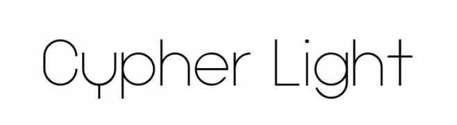
A modern, geometric font with thin, even strokes and a minimalist design.
![Cypher Light Frei Schriftart Herunterladen]() Herunterladen 145 Downloads@WebFont
Herunterladen 145 Downloads@WebFont -
( Fonts by maku )
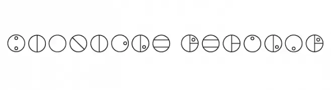
A futuristic, circular font with geometric patterns and lines.
![Bionicle Regular Frei Schriftart Herunterladen]() Herunterladen 145 Downloads@WebFont
Herunterladen 145 Downloads@WebFont -
( Fonts by dafontjaap - Personal-use only. For commercial use please contact owner. )
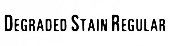
A bold, distressed font with a vintage, handmade feel.
![Degraded Stain Regular Frei Schriftart Herunterladen]() Herunterladen 145 Downloads@WebFont
Herunterladen 145 Downloads@WebFont -
( Fonts by madeDeduk )
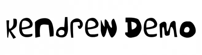
A playful and quirky font with irregular shapes and varying stroke thicknesses.
![Kendrew Demo Frei Schriftart Herunterladen]() Herunterladen 145 Downloads@WebFont
Herunterladen 145 Downloads@WebFont -
Schriftart von HammerBro101. For commercial use please contact the owner.
![LubalinGraphStd-BookOblique Frei Schriftart Herunterladen]() Herunterladen 145 Downloads@WebFont
Herunterladen 145 Downloads@WebFont -
( Fonts by Kong Font - https://fontkong.com/ - Personal-use only. For commercial use please contact owner. )
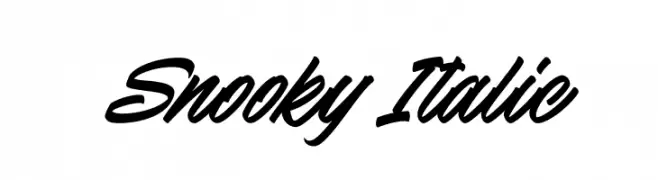
A bold, italic script font with a dynamic and fluid style.
![Snooky Italic Frei Schriftart Herunterladen]() Herunterladen 145 Downloads@WebFont
Herunterladen 145 Downloads@WebFont -
( Fonts by NubeFonts - nubefonts.blogspot.com - Personal-use only. For commercial use please contact owner. )
A modern, geometric font with sharp angles and a futuristic style.
![SYFYKrypton Frei Schriftart Herunterladen]() Herunterladen 145 Downloads@WebFont
Herunterladen 145 Downloads@WebFont -
![TomatoFlakes Frei Schriftart Herunterladen]() Herunterladen 145 Downloads@WebFont
Herunterladen 145 Downloads@WebFont -
( Fonts by Daniel Zadorozny - www.iconian.com - Free for personal use )
A bold, italicized font with a modern, edgy, and slightly distressed appearance.
![War Eagle Italic Frei Schriftart Herunterladen]() Herunterladen 145 Downloads@WebFont
Herunterladen 145 Downloads@WebFont -
![VTMeiOrnamentsOnBlack Frei Schriftart Herunterladen]() Herunterladen 145 Downloads@WebFont
Herunterladen 145 Downloads@WebFont -
( Parker Creative - Alan Parker - fontbundles.net/parker-creative )
A thin, modern sans-serif font with a clean and elegant design.
![PC Navita Thin Frei Schriftart Herunterladen]() Herunterladen 145 Downloads@WebFont
Herunterladen 145 Downloads@WebFont -
( Vladimir Fedotov )
A modern, geometric sans-serif font with rounded edges and a minimalist design.
![Pinchik Frei Schriftart Herunterladen]() Herunterladen 145 Downloads@WebFont
Herunterladen 145 Downloads@WebFont -
( Fonts by a Max Infeld - XEROGRAPHER FONTS - xerographer.blogspot.com . Personal-use only. For commercial use please contact owner. )
A playful, bubble-like font with a hand-drawn, cartoonish style.
![GetReal Frei Schriftart Herunterladen]() Herunterladen 145 Downloads@WebFont
Herunterladen 145 Downloads@WebFont -
( Fonts by Edric Studio - Personal-use only. For commercial use please contact owner. )
A modern, elegant font with high contrast and sharp serifs.
![Night Lover Demo Frei Schriftart Herunterladen]() Herunterladen 145 Downloads@WebFont
Herunterladen 145 Downloads@WebFont -
![Sild Italic Frei Schriftart Herunterladen]() Herunterladen 145 Downloads@WebFont
Herunterladen 145 Downloads@WebFont -
( Fonts by Muhammad Ahwal Bobby - Personal-use only. For commercial use please contact owner. )
A bold, elegant script font with flowing, cursive letterforms.
![Dugtane Frei Schriftart Herunterladen]() Herunterladen 145 Downloads@WebFont
Herunterladen 145 Downloads@WebFont -
( Fonts by Måns Grebäck )
A modern serif font with a light weight and elegant, readable design.
![Vacer Serif Personal Light Frei Schriftart Herunterladen]() Herunterladen 145 Downloads@WebFont
Herunterladen 145 Downloads@WebFont


Welche Schriften sind gerade am populärsten?
Poppins, Roboto, Montserrat, Open Sans und Lato sind wegen ihrer klaren Formen und breiten Einsetzbarkeit sehr gefragt – von Markenauftritt über Landingpages bis hin zu Postern.
Welche Fonts eignen sich für Logos?
Geometrische Sans‑Serifs (z. B. Poppins, Familien im Gotham‑Stil) sind ein häufiger Griff für sauberes, skalierbares Branding. Für eine persönlichere Note bleiben Scripts und Handschrift‑Stile beliebt. Kombinieren Sie einen prägnanten Headline‑Font mit einer neutralen Brotschrift für Wiedererkennung und Harmonie.
Wie oft wird die Top‑Liste aktualisiert?
Regelmäßig – basierend auf realen Downloads und Interaktionen. Schauen Sie öfter vorbei, um aufstrebende Favoriten früh zu entdecken.
💡 Tipp: Seite bookmarken – Trends wechseln schnell, und heutige Top‑Schriften inspirieren morgen vielleicht das Rebranding.