Willkommen bei den Top‑Schriften – hier treffen Beliebtheit und Qualität aufeinander. Das sind die in diesem Jahr am häufigsten heruntergeladenen und genutzten Fonts. Wenn Sie sichere Optionen für Logo, Web oder Social suchen, starten Sie hier.
Jeder Top‑Font überzeugt durch Balance, Lesbarkeit und Vielseitigkeit. Sie finden moderne Sans‑Serifs, elegante Scripts, Vintage‑Serifs und minimalistische Displays.
-
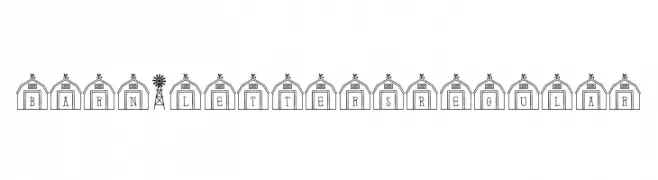
( Fonts by Brittney Murphy Design )
A decorative font with characters enclosed in barn-like structures, ideal for rustic themes.
 Herunterladen 146 Downloads@WebFont
 -
![SabrinaMorton Frei Schriftart Herunterladen]() Herunterladen 146 Downloads@WebFont
Herunterladen 146 Downloads@WebFont -
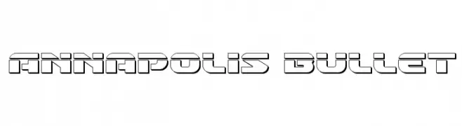
![Annapolis Bullet Frei Schriftart Herunterladen]() Herunterladen 146 Downloads@WebFont
Herunterladen 146 Downloads@WebFont -
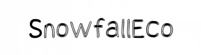
![Snowfall Eco Frei Schriftart Herunterladen]() Herunterladen 146 Downloads@WebFont
Herunterladen 146 Downloads@WebFont -
( Fonts by Iconian Fonts - Daniel Zadorozny - Personal-use only. For commercial use please contact owner. )
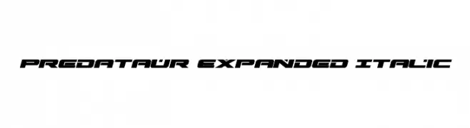
A bold, expanded, and italicized font with a futuristic and angular design.
![Predataur Expanded Italic Frei Schriftart Herunterladen]() Herunterladen 146 Downloads@WebFont
Herunterladen 146 Downloads@WebFont -
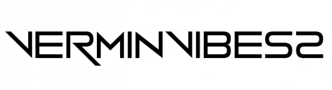
![Vermin Vibes 2 Frei Schriftart Herunterladen]() Herunterladen 146 Downloads@WebFont
Herunterladen 146 Downloads@WebFont -
( Fonts by Arkandis Digital Foundry )
A modern, condensed italic font with a sleek and dynamic appearance.
![GilliusADF-CondItalic Frei Schriftart Herunterladen]() Herunterladen 146 Downloads@WebFont
Herunterladen 146 Downloads@WebFont -
Schriftart von typotopia. For commercial use please contact the owner.
( Fonts by Typotopia - Typotopia.co - Personal Use Only, for Commercial Use, please contact us )
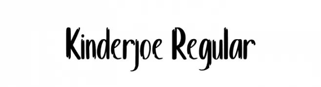
A playful, bold, handwritten-style font with a friendly and energetic appearance.
![Kinderjoe Regular Frei Schriftart Herunterladen]() Herunterladen 146 Downloads@WebFont
Herunterladen 146 Downloads@WebFont -
( Fonts by www.haroldsfonts.com )
A bold, geometric set of symbols inspired by maritime signal flags.
![Maritime Flags Black Frei Schriftart Herunterladen]() Herunterladen 146 Downloads@WebFont
Herunterladen 146 Downloads@WebFont -
( Fonts by auto_sprit )
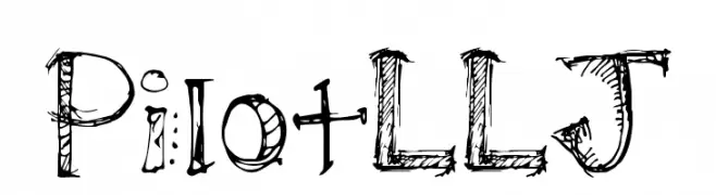
A decorative, hand-drawn font with a sketch-like, artistic style.
![PilotLLJ Frei Schriftart Herunterladen]() Herunterladen 146 Downloads@WebFont
Herunterladen 146 Downloads@WebFont -
( Fonts by Ronny Studio )
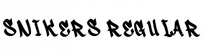
A bold, dynamic font with a graffiti-inspired style.
![Snikers Regular Frei Schriftart Herunterladen]() Herunterladen 146 Downloads@WebFont
Herunterladen 146 Downloads@WebFont -
( Fonts by Vladimir Nikolic - www.creativefabrica.com/designer/vladimirnikolic/ - Personal-use only. For commercial use please contact owner. )
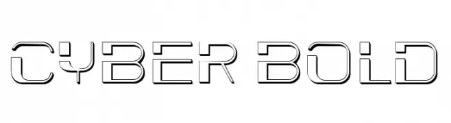
A futuristic, geometric font with bold, angular letterforms and a digital aesthetic.
![Cyber Bold Frei Schriftart Herunterladen]() Herunterladen 146 Downloads@WebFont
Herunterladen 146 Downloads@WebFont -
( Fonts by Wahyu Eka Prasetya - wepfont.com - Personal-use only. For commercial use please contact owner. )
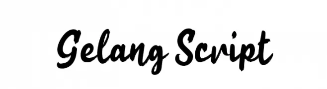
A bold, expressive script font with fluid, connected strokes.
![Gelang Script Frei Schriftart Herunterladen]() Herunterladen 146 Downloads@WebFont
Herunterladen 146 Downloads@WebFont -
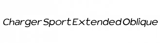
![Charger Sport Extended Oblique Frei Schriftart Herunterladen]() Herunterladen 146 Downloads@WebFont
Herunterladen 146 Downloads@WebFont -
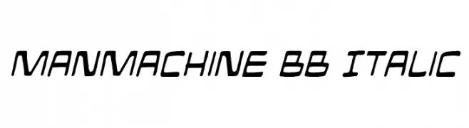
( Fonts by www.blambot.com )
A futuristic, italicized font with bold, angular lines and a dynamic style.
![ManMachine BB Italic Frei Schriftart Herunterladen]() Herunterladen 146 Downloads@WebFont
Herunterladen 146 Downloads@WebFont -
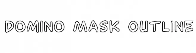
( Fonts by Iconian Fonts )
A playful, outlined font with a hand-drawn, whimsical style.
![Domino Mask Outline Frei Schriftart Herunterladen]() Herunterladen 146 Downloads@WebFont
Herunterladen 146 Downloads@WebFont -
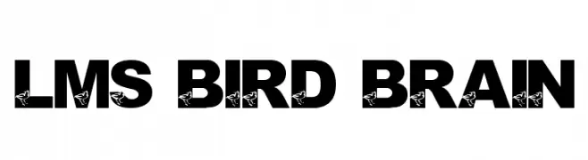
( London's Letters - www.londonsletters.com/ )
A bold, decorative font with integrated bird motifs for a whimsical touch.
![LMS Bird Brain Frei Schriftart Herunterladen]() Herunterladen 146 Downloads@WebFont
Herunterladen 146 Downloads@WebFont -
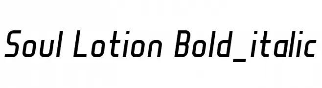
( Fonts by Manuel Viergutz - Typo Graphic Design - www.typographicdesign.de )
A modern, bold, italic font with a sleek and slightly condensed design.
![Soul Lotion Bold_italic Frei Schriftart Herunterladen]() Herunterladen 146 Downloads@WebFont
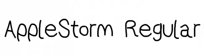
Herunterladen 146 Downloads@WebFont -
![AppleStorm Regular Frei Schriftart Herunterladen]() Herunterladen 146 Downloads@WebFont
Herunterladen 146 Downloads@WebFont -
( Fonts by Alpaprana Studio )
A playful, handwritten script font with rounded, flowing forms.
![Enigma Frei Schriftart Herunterladen]() Herunterladen 146 Downloads@WebFont
Herunterladen 146 Downloads@WebFont -
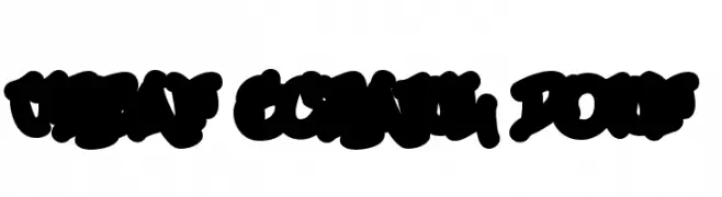
( Fonts by or from www.graffitifonts.net )
A bold, graffiti-inspired font with thick, rounded strokes and a dynamic, urban style.
![Urban Scrawl Down Frei Schriftart Herunterladen]() Herunterladen 146 Downloads
Herunterladen 146 Downloads -
( Fonts by Mans Greback - www.mansgreback.com - Personal-use only. For commercial use please contact owner. )
A playful, handwritten font with smooth, flowing lines and a casual style.
![Stick Cream Frei Schriftart Herunterladen]() Herunterladen 146 Downloads@WebFont
Herunterladen 146 Downloads@WebFont -
( Collection of Korean web fonts - Personal-use only. For commercial use please contact owner. )
A playful, rounded, and bold sans-serif font with a friendly appearance.
![BM JUA Frei Schriftart Herunterladen]() Herunterladen 146 Downloads@WebFont
Herunterladen 146 Downloads@WebFont -
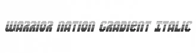
( Fonts by Daniel Zadorozny - www.iconian.com - Free for personal use )
A bold, italicized font with a gradient effect and dynamic, futuristic style.
![Warrior Nation Gradient Italic Frei Schriftart Herunterladen]() Herunterladen 146 Downloads@WebFont
Herunterladen 146 Downloads@WebFont -
( Fonts by a Neale Davidson - www.pixelsagas.com. Personal-use only. For commercial use please contact owner. )
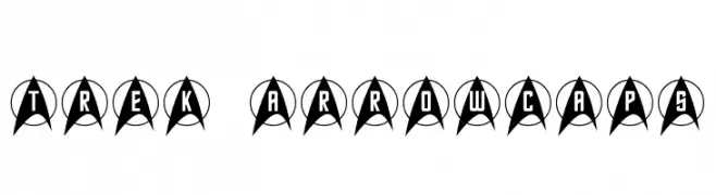
A bold, geometric font with characters enclosed in arrowhead shapes, perfect for futuristic themes.
![Trek Arrowcaps Frei Schriftart Herunterladen]() Herunterladen 146 Downloads@WebFont
Herunterladen 146 Downloads@WebFont -
( Fonts by Daniel Zadorozny - www.iconian.com - Free for personal use )
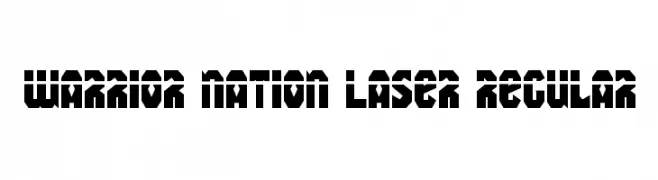
A bold, geometric font with a futuristic and stencil-like design.
![Warrior Nation Laser Regular Frei Schriftart Herunterladen]() Herunterladen 146 Downloads@WebFont
Herunterladen 146 Downloads@WebFont -
( Fonts by Nick Quintero - fresherthan.com. Personal-use only. For commercial use please contact owner. )
A playful, hand-drawn font with a whimsical and vintage feel.
![Leatherwork Regular Frei Schriftart Herunterladen]() Herunterladen 146 Downloads@WebFont
Herunterladen 146 Downloads@WebFont -
( Fonts by Carrois Type Design / Ralph du Carrois )
A modern, monospaced font with a technical and geometric design.
![Share-TechMonoExp Frei Schriftart Herunterladen]() Herunterladen 146 Downloads@WebFont
Herunterladen 146 Downloads@WebFont -
![Nepeta Frei Schriftart Herunterladen]() Herunterladen 146 Downloads@WebFont
Herunterladen 146 Downloads@WebFont -
( Fonts by Manfred Klein. Free for private and charity use. Free for commercial with donation to organizations )
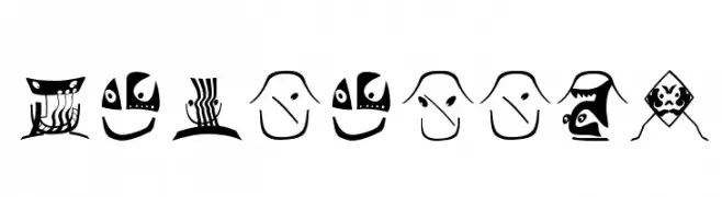
A decorative font featuring whimsical, mask-like characters with intricate designs.
![Facialish Frei Schriftart Herunterladen]() Herunterladen 146 Downloads@WebFont
Herunterladen 146 Downloads@WebFont -
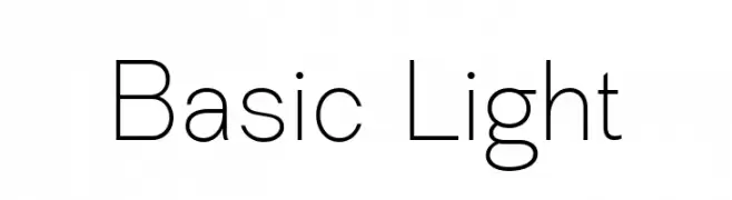
( Fonts by Levi Szekeres - Personal-use only. For commercial use please contact owner. )
A clean, minimalist font with thin, uniform strokes and a modern aesthetic.
![Basic Light Frei Schriftart Herunterladen]() Herunterladen 146 Downloads@WebFont
Herunterladen 146 Downloads@WebFont -
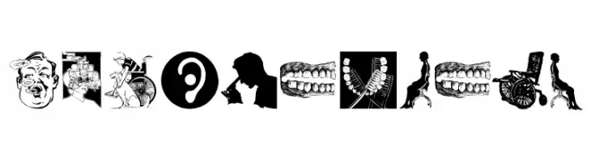
( Fonts by Manfred Klein. Free for private and charity use. Free for commercial with donation to organizations )
A decorative font with medical-themed icons and symbols.
![MedicalBats Frei Schriftart Herunterladen]() Herunterladen 146 Downloads@WebFont
Herunterladen 146 Downloads@WebFont -
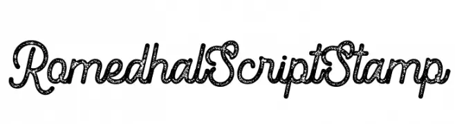
( Fonts by Farul Arjianto - creativemarket.com/typefar - Personal-use only. For commercial use please contact owner. )
A textured script font with a vintage, stamped appearance.
![Romedhal Script Stamp Frei Schriftart Herunterladen]() Herunterladen 146 Downloads@WebFont
Herunterladen 146 Downloads@WebFont -
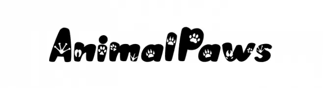
( Fonts by Bearytype )
A playful, bold font with animal paw prints on each character.
![AnimalPaws Frei Schriftart Herunterladen]() Herunterladen 146 Downloads@WebFont
Herunterladen 146 Downloads@WebFont -
( Fonts by Daniel Zadorozny - www.iconian.com )
A bold, geometric font with a futuristic and condensed style.
![Extechchop Condensed Frei Schriftart Herunterladen]() Herunterladen 146 Downloads@WebFont
Herunterladen 146 Downloads@WebFont


Welche Schriften sind gerade am populärsten?
Poppins, Roboto, Montserrat, Open Sans und Lato sind wegen ihrer klaren Formen und breiten Einsetzbarkeit sehr gefragt – von Markenauftritt über Landingpages bis hin zu Postern.
Welche Fonts eignen sich für Logos?
Geometrische Sans‑Serifs (z. B. Poppins, Familien im Gotham‑Stil) sind ein häufiger Griff für sauberes, skalierbares Branding. Für eine persönlichere Note bleiben Scripts und Handschrift‑Stile beliebt. Kombinieren Sie einen prägnanten Headline‑Font mit einer neutralen Brotschrift für Wiedererkennung und Harmonie.
Wie oft wird die Top‑Liste aktualisiert?
Regelmäßig – basierend auf realen Downloads und Interaktionen. Schauen Sie öfter vorbei, um aufstrebende Favoriten früh zu entdecken.
💡 Tipp: Seite bookmarken – Trends wechseln schnell, und heutige Top‑Schriften inspirieren morgen vielleicht das Rebranding.