Willkommen bei den Top‑Schriften – hier treffen Beliebtheit und Qualität aufeinander. Das sind die in diesem Jahr am häufigsten heruntergeladenen und genutzten Fonts. Wenn Sie sichere Optionen für Logo, Web oder Social suchen, starten Sie hier.
Jeder Top‑Font überzeugt durch Balance, Lesbarkeit und Vielseitigkeit. Sie finden moderne Sans‑Serifs, elegante Scripts, Vintage‑Serifs und minimalistische Displays.
-
( Fonts by Baka - Kyakirun - bakafonts.kyakirun.com )
A whimsical, hand-drawn font inspired by traditional Japanese hiragana.
 Herunterladen 145 Downloads@WebFont
 -
( Fonts by www.dcoxy.com )
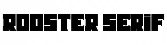
A bold, geometric font with sharp angles and a strong presence.
![Rooster Serif Frei Schriftart Herunterladen]() Herunterladen 145 Downloads@WebFont
Herunterladen 145 Downloads@WebFont -
( Fonts by a Neale Davidson - www.pixelsagas.com. Personal-use only. For commercial use please contact owner. )
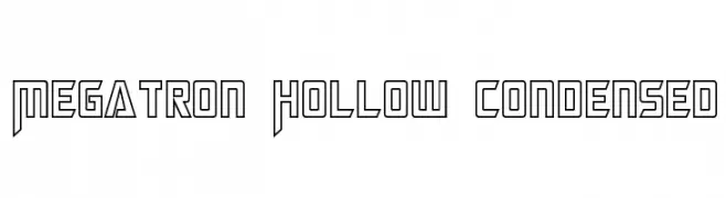
A bold, hollow, geometric font with a futuristic and condensed style.
![Megatron Hollow Condensed Frei Schriftart Herunterladen]() Herunterladen 145 Downloads@WebFont
Herunterladen 145 Downloads@WebFont -
( Fonts by Iconian Fonts )
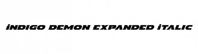
A bold, expanded italic font with high contrast and sharp angles.
![Indigo Demon Expanded Italic Frei Schriftart Herunterladen]() Herunterladen 145 Downloads@WebFont
Herunterladen 145 Downloads@WebFont -
![Selya Frei Schriftart Herunterladen]() Herunterladen 145 Downloads@WebFont
Herunterladen 145 Downloads@WebFont -
( Fonts by www.houseoflime.com )
A modern, geometric font with bold, rectangular frames around each character.
![Bizzy Frei Schriftart Herunterladen]() Herunterladen 145 Downloads@WebFont
Herunterladen 145 Downloads@WebFont -
( Fonts by FONTS BY LYAJKA - Personal-use only. For commercial use please contact owner. )
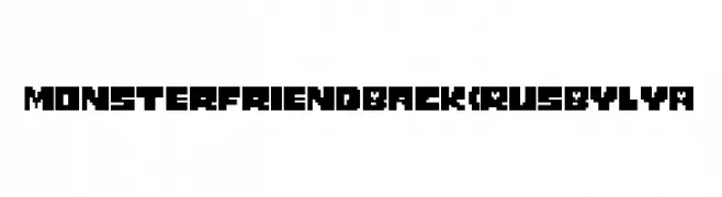
A bold, pixelated font with a retro, digital aesthetic.
![Monster Friend Back (RUS BY LYA Frei Schriftart Herunterladen]() Herunterladen 145 Downloads@WebFont
Herunterladen 145 Downloads@WebFont -
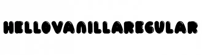
( Fonts by Fillo Graphic )
A playful, bold font with rounded, bubble-like characters perfect for fun and whimsical designs.
![HelloVanillaRegular Frei Schriftart Herunterladen]() Herunterladen 145 Downloads@WebFont
Herunterladen 145 Downloads@WebFont -
( Fonts by Octotype - www.foundmyfont.com - Personal-use only. For commercial use please contact owner. )
A cursive script font with elegant, flowing strokes and moderate contrast.
![Washington History Frei Schriftart Herunterladen]() Herunterladen 145 Downloads@WebFont
Herunterladen 145 Downloads@WebFont -
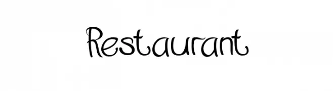
( Fonts by Wino S Kadir - weknow - www.revolge.com/shop/weknow/ - Personal-use only. For commercial use please contact owner. )
A playful, curly font with a whimsical, handwritten style.
![Restaurant Frei Schriftart Herunterladen]() Herunterladen 145 Downloads@WebFont
Herunterladen 145 Downloads@WebFont -
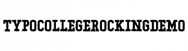
( Fonts by Studio Typo )
A bold, distressed collegiate-style font with a vintage, rugged appearance.
![Typo College Rocking Demo Frei Schriftart Herunterladen]() Herunterladen 145 Downloads@WebFont
Herunterladen 145 Downloads@WebFont -
( Chris Simpkins - github.com/chrissimpkins )
A bold and italic font with a modern, dynamic slant.
![Hack Bold Italic Frei Schriftart Herunterladen]() Herunterladen 145 Downloads@WebFont
Herunterladen 145 Downloads@WebFont -
![Kinishinai NBP Regular Frei Schriftart Herunterladen]() Herunterladen 145 Downloads@WebFont
Herunterladen 145 Downloads@WebFont -
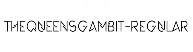
( Fonts by 177Studio )
A modern, geometric font with sharp angles and clean lines.
![TheQueensGambit-Regular Frei Schriftart Herunterladen]() Herunterladen 145 Downloads@WebFont
Herunterladen 145 Downloads@WebFont -
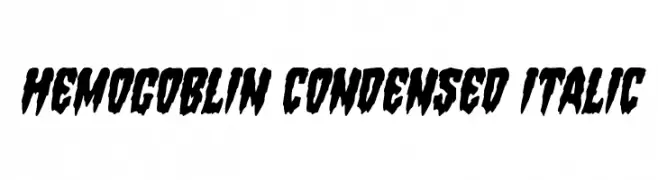
( Iconian Fonts - Daniel Zadorozny - www.iconian.com )
A bold, condensed, and italic font with a grunge-like, distressed style.
![Hemogoblin Condensed Italic Frei Schriftart Herunterladen]() Herunterladen 145 Downloads@WebFont
Herunterladen 145 Downloads@WebFont -
( Fonts by www.omniglot.com )
A classic serif font with elegant strokes and balanced proportions.
![Blokscript Frei Schriftart Herunterladen]() Herunterladen 145 Downloads@WebFont
Herunterladen 145 Downloads@WebFont -
( Fonts by Jeff Levine. FREEWARE )
Not a valid font sample; contains architectural drawings and labels.
![Walls, Fences & Doors JL Frei Schriftart Herunterladen]() Herunterladen 145 Downloads@WebFont
Herunterladen 145 Downloads@WebFont -
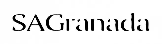
( Fonts by Artcoast Studio )
A modern, stencil-inspired font with bold, geometric characters.
![SA Granada Frei Schriftart Herunterladen]() Herunterladen 145 Downloads@WebFont
Herunterladen 145 Downloads@WebFont -
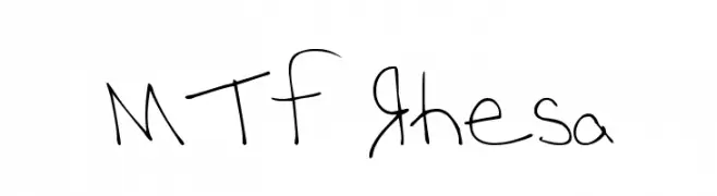
( Fonts by Miss Tiina at www.misstiina.com (please check the website before use) )
A playful, casual handwritten font with irregular, whimsical letterforms.
![MTF Rhesa Frei Schriftart Herunterladen]() Herunterladen 145 Downloads@WebFont
Herunterladen 145 Downloads@WebFont -
( Fonts by AminMario - Amin Mario - Personal-use only. For commercial use please contact owner. )
A modern, elegant handwritten font with fluid, dynamic strokes.
![Amatya Signature Frei Schriftart Herunterladen]() Herunterladen 145 Downloads@WebFont
Herunterladen 145 Downloads@WebFont -
![Kremlin Minister Black 3D Bold Frei Schriftart Herunterladen]() Herunterladen 145 Downloads@WebFont
Herunterladen 145 Downloads@WebFont -
( Fonts by Pinisiart )
A bold, playful display font with exaggerated, uneven shapes.
![Moghul Frei Schriftart Herunterladen]() Herunterladen 145 Downloads@WebFont
Herunterladen 145 Downloads@WebFont -
( گالری فانت فارسی پژوهش آريانا - only compatible with Farsi and Arabic )
A bold, modern font with thick, uniform strokes and a clean, geometric style.
![Decor Frei Schriftart Herunterladen]() Herunterladen 145 Downloads@WebFont
Herunterladen 145 Downloads@WebFont -
( Fonts by NJ Studio - Personal-use only. For commercial use please contact owner. )
A tall, slender, and playful font with consistent stroke width and artistic flair.
![APPLE BERRY Frei Schriftart Herunterladen]() Herunterladen 145 Downloads@WebFont
Herunterladen 145 Downloads@WebFont -
( Fonts by Balpirick Studio - https://www.creativefabrica.com/designer/balpirick/ref/308299/ - Personal-use only. For commercial use please contact owner. )
A lively, cursive script font with a playful, handwritten style.
![Almonade Frei Schriftart Herunterladen]() Herunterladen 145 Downloads@WebFont
Herunterladen 145 Downloads@WebFont -
( Fonts by Ramiro Baldivieso - behance.net/baldivieso. Personal-use only. For commercial use please contact owner. )
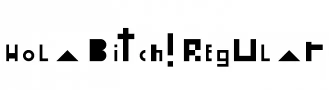
A bold, geometric font with angular letterforms and a modern style.
![Hola Bitch! Regular Frei Schriftart Herunterladen]() Herunterladen 145 Downloads@WebFont
Herunterladen 145 Downloads@WebFont -
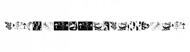
( Fonts by Manfred Klein. Free for private and charity use. Free for commercial with donation to organizations )
A collection of intricate vector drawings replacing traditional characters with artistic illustrations.
![VectorDrawingsOne Frei Schriftart Herunterladen]() Herunterladen 145 Downloads@WebFont
Herunterladen 145 Downloads@WebFont -
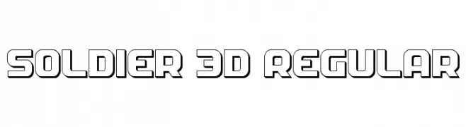
( Fonts by Daniel Zadorozny - www.iconian.com )
A bold, 3D geometric font with a futuristic and outlined style.
![Soldier 3D Regular Frei Schriftart Herunterladen]() Herunterladen 145 Downloads@WebFont
Herunterladen 145 Downloads@WebFont -
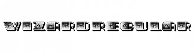
( Fonts by Vladimir Nikolic )
A bold, decorative font with star patterns and dotted textures.
![Wizard Regular Frei Schriftart Herunterladen]() Herunterladen 145 Downloads@WebFont
Herunterladen 145 Downloads@WebFont -
( Fonts by Mans Greback - Personal-use only. For commercial use please contact owner. )
A bold, elegant script font with flowing, interconnected characters.
![Baystar Script PERSONAL USE ONLY Bold PERSONAL USE ONLY Frei Schriftart Herunterladen]() Herunterladen 145 Downloads@WebFont
Herunterladen 145 Downloads@WebFont -
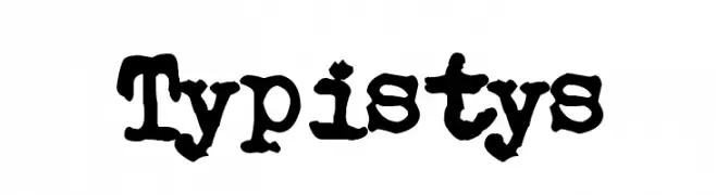
( Fonts by www.junkohanhero.com - Personal-use only. For commercial use please contact owner. )
A distressed, grunge-style font with a vintage, hand-crafted appearance.
![Typistys Frei Schriftart Herunterladen]() Herunterladen 145 Downloads@WebFont
Herunterladen 145 Downloads@WebFont -
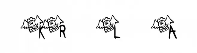
( Fonts by Kat`s Fun Fonts - Personal-use only. For commercial use please contact owner. )
A playful font with each character featuring a cute angel motif.
![KR Lil Angel Frei Schriftart Herunterladen]() Herunterladen 145 Downloads@WebFont
Herunterladen 145 Downloads@WebFont -
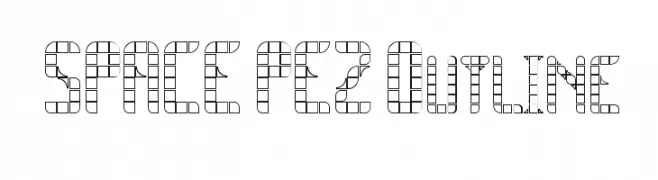
![SPACE PEZ Outline Frei Schriftart Herunterladen]() Herunterladen 145 Downloads@WebFont
Herunterladen 145 Downloads@WebFont -
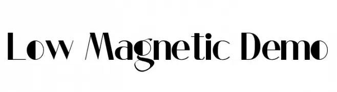
( Fonts by CalligraphyFonts - Personal-use only. For commercial use please contact owner. )
A bold, high-contrast font with geometric shapes and sharp angles.
![Low Magnetic Demo Frei Schriftart Herunterladen]() Herunterladen 145 Downloads@WebFont
Herunterladen 145 Downloads@WebFont -
( Fonts by Edric Studio - Personal-use only. For commercial use please contact owner. )
A modern sans-serif font with rounded edges and a geometric style.
![Wolf Rubeus Demo Sans Frei Schriftart Herunterladen]() Herunterladen 145 Downloads@WebFont
Herunterladen 145 Downloads@WebFont


Welche Schriften sind gerade am populärsten?
Poppins, Roboto, Montserrat, Open Sans und Lato sind wegen ihrer klaren Formen und breiten Einsetzbarkeit sehr gefragt – von Markenauftritt über Landingpages bis hin zu Postern.
Welche Fonts eignen sich für Logos?
Geometrische Sans‑Serifs (z. B. Poppins, Familien im Gotham‑Stil) sind ein häufiger Griff für sauberes, skalierbares Branding. Für eine persönlichere Note bleiben Scripts und Handschrift‑Stile beliebt. Kombinieren Sie einen prägnanten Headline‑Font mit einer neutralen Brotschrift für Wiedererkennung und Harmonie.
Wie oft wird die Top‑Liste aktualisiert?
Regelmäßig – basierend auf realen Downloads und Interaktionen. Schauen Sie öfter vorbei, um aufstrebende Favoriten früh zu entdecken.
💡 Tipp: Seite bookmarken – Trends wechseln schnell, und heutige Top‑Schriften inspirieren morgen vielleicht das Rebranding.