Willkommen bei den Top‑Schriften – hier treffen Beliebtheit und Qualität aufeinander. Das sind die in diesem Jahr am häufigsten heruntergeladenen und genutzten Fonts. Wenn Sie sichere Optionen für Logo, Web oder Social suchen, starten Sie hier.
Jeder Top‑Font überzeugt durch Balance, Lesbarkeit und Vielseitigkeit. Sie finden moderne Sans‑Serifs, elegante Scripts, Vintage‑Serifs und minimalistische Displays.
-
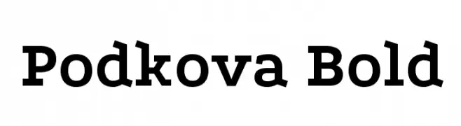
( Copyright 2011 The Podkova Project Authors (contact@cyreal.org) )
A bold, slab serif font with strong, thick strokes and prominent serifs.
 Herunterladen 2325 Downloads@WebFont
 -
( Copyright (c) 2011, Dan Sayers (i@iotic.com) )
A bold, rounded font with a friendly and modern style.
![Averia Sans Libre Bold Frei Schriftart Herunterladen]() Herunterladen 2325 Downloads@WebFont
Herunterladen 2325 Downloads@WebFont -
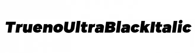
( Fonts by CannotIntoSpaceFonts - KineticPlasma Fonts - Personal-use only. For commercial use please contact owner. )
A bold, ultra-black italic font with a modern and dynamic style.
![Trueno UltraBlack Italic Frei Schriftart Herunterladen]() Herunterladen 2324 Downloads@WebFont
Herunterladen 2324 Downloads@WebFont -
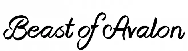
( Fonts by Jonathan S. Harris - www.tattoowoo.com. Personal-use only. For commercial use please contact owner. )
A bold, flowing script font with elegant curves and dynamic presence.
![Beast of Avalon Frei Schriftart Herunterladen]() Herunterladen 2324 Downloads@WebFont
Herunterladen 2324 Downloads@WebFont -
( Fonts by a Neale Davidson - www.pixelsagas.com. Personal-use only. For commercial use please contact owner. )
A bold, italicized font with a modern and dynamic style.
![Imaki Bold Italic Frei Schriftart Herunterladen]() Herunterladen 2324 Downloads@WebFont
Herunterladen 2324 Downloads@WebFont -
-
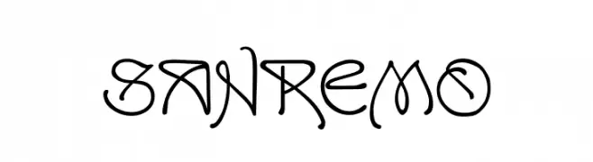
( Fonts by Dieter Steffmann )
An artistic and decorative font with intricate letterforms and a calligraphic influence.
![SanRemo Frei Schriftart Herunterladen]() Herunterladen 2324 Downloads@WebFont
Herunterladen 2324 Downloads@WebFont -
( Font by kingthingsfonts.co.uk )
A medieval-inspired calligraphic font with sharp, angular strokes and elegant curves.
![Kingthings Calligraphica 2 Frei Schriftart Herunterladen]() Herunterladen 2323 Downloads@WebFont
Herunterladen 2323 Downloads@WebFont -
( Fonts by Ingo Zimmermann - www.ingofonts.com )
A modern sans-serif font with balanced weight and excellent readability.
![FaberSansPro-Halbfett Frei Schriftart Herunterladen]() Herunterladen 2323 Downloads@WebFont
Herunterladen 2323 Downloads@WebFont -
( Fonts by LetterStuff Type - Personal-use only. For commercial use please contact owner. )
A playful, handwritten font with bold, rounded characters.
![Really Free Frei Schriftart Herunterladen]() Herunterladen 2322 Downloads@WebFont
Herunterladen 2322 Downloads@WebFont -
( Fonts by a Neale Davidson - www.pixelsagas.com. Personal-use only. For commercial use please contact owner. )
A bold, geometric font with angular shapes and a futuristic style.
![Convoy Bold Frei Schriftart Herunterladen]() Herunterladen 2322 Downloads@WebFont
Herunterladen 2322 Downloads@WebFont -
( Font by Jayvee D. Enaguas - grandchaos9000.deviantart.com )
A bold, modern font with clean lines and a slightly condensed style.
![Curse Casual Regular Frei Schriftart Herunterladen]() Herunterladen 2322 Downloads@WebFont
Herunterladen 2322 Downloads@WebFont -
( Copyright (c) 2012, Font Diner (www.fontdiner.com), with Reserved Font Name "Jolly Lodger". )
A playful, bold font with a hand-drawn, whimsical style.
![Jolly Lodger Frei Schriftart Herunterladen]() Herunterladen 2322 Downloads@WebFont
Herunterladen 2322 Downloads@WebFont -
( Fonts by Have Fun with Fonts )
A tall, narrow, and bold font with tight spacing and a modern aesthetic.
![HFF Jammed Pack Frei Schriftart Herunterladen]() Herunterladen 2322 Downloads@WebFont
Herunterladen 2322 Downloads@WebFont -
( Fonts by Nick Curtis - www.nicksfonts.com )
A bold, geometric font with strong, striking characters.
![East Market NF Frei Schriftart Herunterladen]() Herunterladen 2322 Downloads@WebFont
Herunterladen 2322 Downloads@WebFont -
( Fonts by www.tepidmonkey.net )
A bold, modern, and condensed font with uniform strokes and rounded edges.
![Qhytsdakx Frei Schriftart Herunterladen]() Herunterladen 2322 Downloads@WebFont
Herunterladen 2322 Downloads@WebFont -
![Wigga Wigga Bold Frei Schriftart Herunterladen]() Herunterladen 2321 Downloads@WebFont
Herunterladen 2321 Downloads@WebFont -
![Kelvinch Bold Frei Schriftart Herunterladen]() Herunterladen 2321 Downloads@WebFont
Herunterladen 2321 Downloads@WebFont -
( Font by Jonathan Harris - www.tattoowoo.com )
A bold, expressive brush-style font with dynamic strokes and artistic flair.
![A Brush No Frei Schriftart Herunterladen]() Herunterladen 2321 Downloads@WebFont
Herunterladen 2321 Downloads@WebFont -
( Copyright (c) 2011, Dario Manuel Muhafara (http://www.tipo.net.ar) )
A bold, italic font with rounded, dynamic characters and a playful style.
![Overlock-BlackItalic Frei Schriftart Herunterladen]() Herunterladen 2321 Downloads@WebFont
Herunterladen 2321 Downloads@WebFont -
![101! Clock Face Frei Schriftart Herunterladen]() Herunterladen 2321 Downloads@WebFont
Herunterladen 2321 Downloads@WebFont -
( Fonts by www.vicfieger.com )
A bold, geometric stencil font with a military-industrial aesthetic.
![Major Snafu Frei Schriftart Herunterladen]() Herunterladen 2321 Downloads@WebFont
Herunterladen 2321 Downloads@WebFont -
( Fonts by Mocha Frappuccino - Personal-use only. For commercial use please contact owner. )
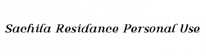
A dynamic and elegant script font with flowing, slightly slanted letterforms.
![Sachila Residance Personal Use Frei Schriftart Herunterladen]() Herunterladen 2320 Downloads@WebFont
Herunterladen 2320 Downloads@WebFont -
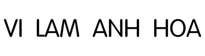
![VI Lam Anh Hoa Frei Schriftart Herunterladen]() Herunterladen 2320 Downloads@WebFont
Herunterladen 2320 Downloads@WebFont -
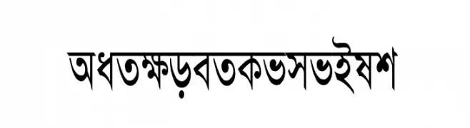
![AdarshaLipiCon Frei Schriftart Herunterladen]() Herunterladen 2320 Downloads@WebFont
Herunterladen 2320 Downloads@WebFont -
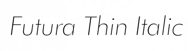
![Futura Thin Italic Frei Schriftart Herunterladen]() Herunterladen 2320 Downloads@WebFont
Herunterladen 2320 Downloads@WebFont -
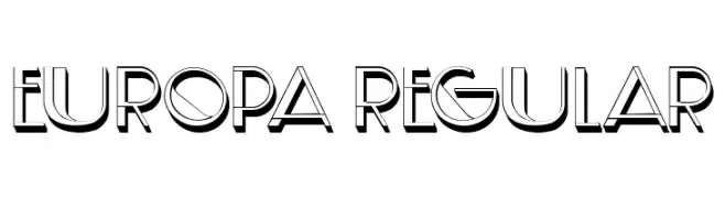
( Fonts by Vladimir Nikolic - www.creativefabrica.com/designer/vladimirnikolic/ - Personal-use only. For commercial use please contact owner. )
A modern, 3D-effect font with bold outlines and geometric shapes.
![Europa Regular Frei Schriftart Herunterladen]() Herunterladen 2319 Downloads@WebFont
Herunterladen 2319 Downloads@WebFont -
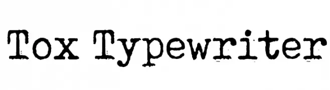
( Fonts by www.junkohanhero.com - Personal-use only. For commercial use please contact owner. )
A vintage, monospaced typewriter font with a distressed, textured appearance.
![Tox Typewriter Frei Schriftart Herunterladen]() Herunterladen 2319 Downloads@WebFont
Herunterladen 2319 Downloads@WebFont -
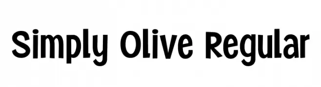
( Fonts by Niskala Huruf )
A playful, bold font with rounded edges and a whimsical style.
![Simply Olive Regular Frei Schriftart Herunterladen]() Herunterladen 2318 Downloads@WebFont
Herunterladen 2318 Downloads@WebFont -
![NFL Seattle Seahawks Flat Frei Schriftart Herunterladen]() Herunterladen 2318 Downloads@WebFont
Herunterladen 2318 Downloads@WebFont -
![Urban Sketch Frei Schriftart Herunterladen]() Herunterladen 2318 Downloads@WebFont
Herunterladen 2318 Downloads@WebFont -
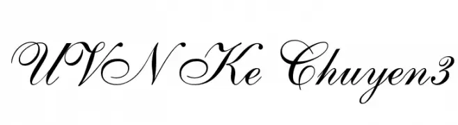
![UVN Ke Chuyen3 Frei Schriftart Herunterladen]() Herunterladen 2317 Downloads@WebFont
Herunterladen 2317 Downloads@WebFont -
![Libre Bodoni Bold Frei Schriftart Herunterladen]() Herunterladen 2317 Downloads@WebFont
Herunterladen 2317 Downloads@WebFont -
( Copyright 2014 Adobe Systems Incorporated (http://www.adobe.com/), with Reserved Font Name 'Source'. All Rights Reserved. Source is a trademark of Adobe Systems Incorporated in the United States and/or other countries. )
A classic serif typeface with a modern touch and semi-bold weight.
![Source Serif Pro Semibold Regular Frei Schriftart Herunterladen]() Herunterladen 2317 Downloads@WebFont
Herunterladen 2317 Downloads@WebFont -
( Fonts by www.Fontfabric.com )
A modern, geometric font with thin, continuous lines and a sleek design.
![Gota-Light Frei Schriftart Herunterladen]() Herunterladen 2317 Downloads@WebFont
Herunterladen 2317 Downloads@WebFont -
![Kruti Dev 080 Frei Schriftart Herunterladen]() Herunterladen 2317 Downloads@WebFont
Herunterladen 2317 Downloads@WebFont


Welche Schriften sind gerade am populärsten?
Poppins, Roboto, Montserrat, Open Sans und Lato sind wegen ihrer klaren Formen und breiten Einsetzbarkeit sehr gefragt – von Markenauftritt über Landingpages bis hin zu Postern.
Welche Fonts eignen sich für Logos?
Geometrische Sans‑Serifs (z. B. Poppins, Familien im Gotham‑Stil) sind ein häufiger Griff für sauberes, skalierbares Branding. Für eine persönlichere Note bleiben Scripts und Handschrift‑Stile beliebt. Kombinieren Sie einen prägnanten Headline‑Font mit einer neutralen Brotschrift für Wiedererkennung und Harmonie.
Wie oft wird die Top‑Liste aktualisiert?
Regelmäßig – basierend auf realen Downloads und Interaktionen. Schauen Sie öfter vorbei, um aufstrebende Favoriten früh zu entdecken.
💡 Tipp: Seite bookmarken – Trends wechseln schnell, und heutige Top‑Schriften inspirieren morgen vielleicht das Rebranding.