Willkommen bei den Top‑Schriften – hier treffen Beliebtheit und Qualität aufeinander. Das sind die in diesem Jahr am häufigsten heruntergeladenen und genutzten Fonts. Wenn Sie sichere Optionen für Logo, Web oder Social suchen, starten Sie hier.
Jeder Top‑Font überzeugt durch Balance, Lesbarkeit und Vielseitigkeit. Sie finden moderne Sans‑Serifs, elegante Scripts, Vintage‑Serifs und minimalistische Displays.
-
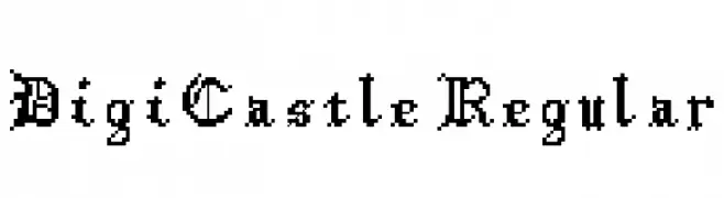
( Derek Shafer - derekshafer.myportfolio.com )
A pixelated, retro-style font with a digital, video game aesthetic.
 Herunterladen 143 Downloads@WebFont
 -
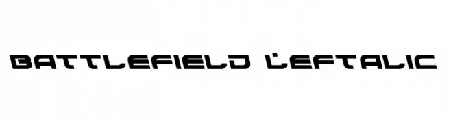
( Fonts by Daniel Zadorozny - www.iconian.com - Free for personal use )
A bold, futuristic font with angular, slanted characters.
![Battlefield Leftalic Frei Schriftart Herunterladen]() Herunterladen 143 Downloads@WebFont
Herunterladen 143 Downloads@WebFont -
( Fonts by Kurnia Setyadi - Personal-use only. For commercial use please contact owner. )
A sophisticated script font with flowing, interconnected characters and high contrast.
![Matterland Frei Schriftart Herunterladen]() Herunterladen 143 Downloads@WebFont
Herunterladen 143 Downloads@WebFont -
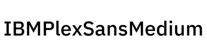
( Fonts by IBM )
A modern sans-serif font with clean lines and balanced proportions.
![IBM Plex Sans Medium Frei Schriftart Herunterladen]() Herunterladen 143 Downloads@WebFont
Herunterladen 143 Downloads@WebFont -
![Clono uno Frei Schriftart Herunterladen]() Herunterladen 143 Downloads@WebFont
Herunterladen 143 Downloads@WebFont -
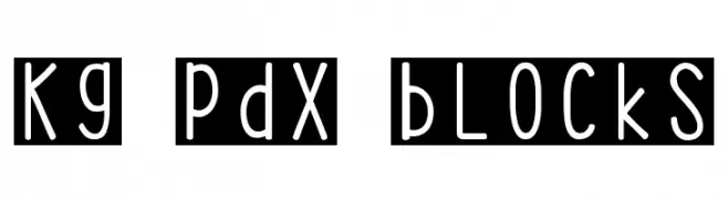
( Fonts by Kimberly Geswein - kimberlygeswein.com/ )
A playful, handwritten-style font with tall, narrow characters and rounded edges.
![KG PDX Blocks Frei Schriftart Herunterladen]() Herunterladen 143 Downloads@WebFont
Herunterladen 143 Downloads@WebFont -
![Curviness Frei Schriftart Herunterladen]() Herunterladen 143 Downloads@WebFont
Herunterladen 143 Downloads@WebFont -
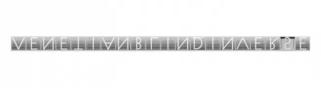
( Fonts by Manfred Klein - manfred-klein.ina-mar.com )
A modern, decorative font with a venetian blind effect and geometric structure.
![VenetianBlindInverse Frei Schriftart Herunterladen]() Herunterladen 143 Downloads@WebFont
Herunterladen 143 Downloads@WebFont -
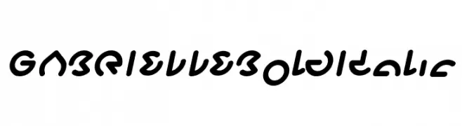
( weknow - Wino S Kadir - www.creativefabrica.com/designer/weknow/ )
A bold, italicized font with rounded, playful characters.
![GABRIELLE Bold Italic Frei Schriftart Herunterladen]() Herunterladen 143 Downloads@WebFont
Herunterladen 143 Downloads@WebFont -
![LiliusDEMO Frei Schriftart Herunterladen]() Herunterladen 143 Downloads@WebFont
Herunterladen 143 Downloads@WebFont -
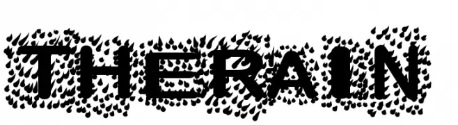
![TheRain Frei Schriftart Herunterladen]() Herunterladen 143 Downloads@WebFont
Herunterladen 143 Downloads@WebFont -
( Fonts by LittleWind Studio )
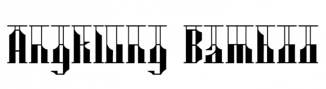
A bold, geometric font with a modern and decorative style.
![Angklung Bamboo Frei Schriftart Herunterladen]() Herunterladen 143 Downloads@WebFont
Herunterladen 143 Downloads@WebFont -
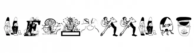
( Fonts by Manfred Klein. Free for private and charity use. Free for commercial with donation to organizations )
An artistic and decorative font with intricate illustrations within each character.
![MiszellMay Frei Schriftart Herunterladen]() Herunterladen 143 Downloads@WebFont
Herunterladen 143 Downloads@WebFont -
( Fonts by Din Studio - Donis Miftahudin - Personal-use only. For commercial use please contact owner. )
A bold, expressive handwritten font with dynamic strokes and a brush-like appearance.
![Best Quotes Personal Use Frei Schriftart Herunterladen]() Herunterladen 143 Downloads@WebFont
Herunterladen 143 Downloads@WebFont -
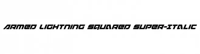
( Fonts by Iconian Fonts )
A bold, italicized font with a futuristic and angular design.
![Armed Lightning Squared Super-Italic Frei Schriftart Herunterladen]() Herunterladen 143 Downloads@WebFont
Herunterladen 143 Downloads@WebFont -
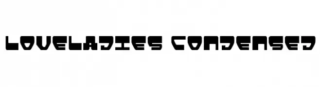
( Fonts by Daniel Zadorozny - www.iconian.com )
A bold, futuristic font with a condensed and geometric design.
![Loveladies Condensed Frei Schriftart Herunterladen]() Herunterladen 143 Downloads@WebFont
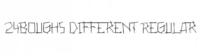
Herunterladen 143 Downloads@WebFont -
![24boughs Different Regular Frei Schriftart Herunterladen]() Herunterladen 143 Downloads@WebFont
Herunterladen 143 Downloads@WebFont -
![Bad Eyes Wireframe Italic Frei Schriftart Herunterladen]() Herunterladen 143 Downloads@WebFont
Herunterladen 143 Downloads@WebFont -
( Fonts by iamjoshuabrooks.co.uk - Joshua Brooks. Personal-use only. For commercial use please contact owner. )
A geometric, angular outline font with a futuristic and edgy style.
![Alpha Outline Frei Schriftart Herunterladen]() Herunterladen 143 Downloads@WebFont
Herunterladen 143 Downloads@WebFont -
( Fonts by NJ Studio - Personal-use only. For commercial use please contact owner. )
A playful, outlined font with a hand-drawn, whimsical style.
![Halloween outline Frei Schriftart Herunterladen]() Herunterladen 143 Downloads@WebFont
Herunterladen 143 Downloads@WebFont -
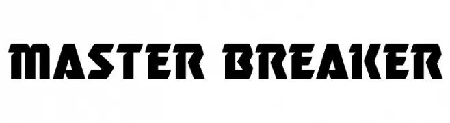
( Fonts by Iconian Fonts )
A bold, geometric font with a futuristic and industrial style.
![Master Breaker Frei Schriftart Herunterladen]() Herunterladen 143 Downloads@WebFont
Herunterladen 143 Downloads@WebFont -
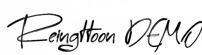
( Fonts by madeDeduk - Personal-use only. For commercial use please contact owner. )
A dynamic and expressive handwritten font with fluid strokes.
![Reingttoon DEMO Frei Schriftart Herunterladen]() Herunterladen 143 Downloads@WebFont
Herunterladen 143 Downloads@WebFont -
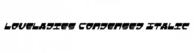
( Fonts by Daniel Zadorozny - www.iconian.com )
A bold, condensed italic font with a modern, geometric style.
![Loveladies Condensed Italic Frei Schriftart Herunterladen]() Herunterladen 143 Downloads@WebFont
Herunterladen 143 Downloads@WebFont -
( Fonts by Manfred Klein. Free for private and charity use. Free for commercial with donation to organizations )
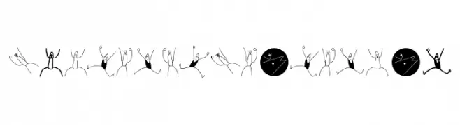
A playful, stick-figure inspired font with dynamic and expressive characters.
![SketchAsScatchCan Frei Schriftart Herunterladen]() Herunterladen 143 Downloads@WebFont
Herunterladen 143 Downloads@WebFont -
( Fonts by Chequered Ink - chequered.ink - Personal-use only. For commercial use please contact owner. )
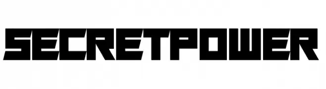
A bold, geometric font with a futuristic and industrial design.
![Secret Power Frei Schriftart Herunterladen]() Herunterladen 143 Downloads@WebFont
Herunterladen 143 Downloads@WebFont -
![Richa Condensed Frei Schriftart Herunterladen]() Herunterladen 143 Downloads
Herunterladen 143 Downloads -
( Fonts by WolfBainX - Personal-use only. For commercial use please contact owner. )
A rugged, distressed font with jagged edges and irregular strokes.
![VTCAllSkratchedUpOne Frei Schriftart Herunterladen]() Herunterladen 143 Downloads@WebFont
Herunterladen 143 Downloads@WebFont -
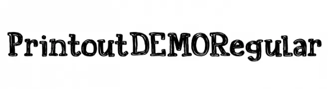
( Hanoded - David Kerkhoff - www.hanodedfonts.com )
A bold, textured font with a vintage, hand-drawn aesthetic.
![Printout DEMO Regular Frei Schriftart Herunterladen]() Herunterladen 143 Downloads@WebFont
Herunterladen 143 Downloads@WebFont -
( Fonts by Forberas Club )
A playful, hand-drawn font with tall, narrow characters and a modern feel.
![RocketPilot Frei Schriftart Herunterladen]() Herunterladen 143 Downloads@WebFont
Herunterladen 143 Downloads@WebFont -
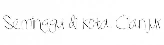
![Seminggu di kota Cianjur Frei Schriftart Herunterladen]() Herunterladen 143 Downloads@WebFont
Herunterladen 143 Downloads@WebFont -
( Nght's Place - www.crosswinds.net/~nghtmvs/font/fonts1.html )
A whimsical font with characters enclosed in heart shapes, perfect for romantic or playful designs.
![101! Cloudy HeartZ Frei Schriftart Herunterladen]() Herunterladen 143 Downloads@WebFont
Herunterladen 143 Downloads@WebFont -
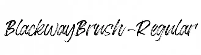
( Fonts by StringLabs - stringlabscreative.com - Personal-use only. For commercial use please contact owner. )
A dynamic brush-style font with bold, expressive strokes.
![BlackwayBrush-Regular Frei Schriftart Herunterladen]() Herunterladen 143 Downloads@WebFont
Herunterladen 143 Downloads@WebFont -
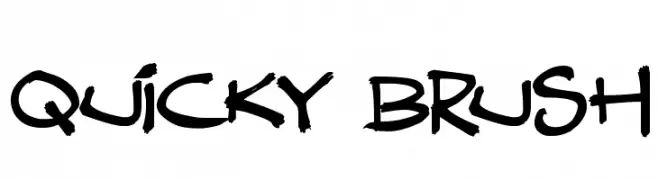
( Fonts by Darrell Flood - Personal-use only. For commercial use please contact owner. )
A bold, brush-style font with dynamic, handcrafted strokes.
![Quicky Brush Frei Schriftart Herunterladen]() Herunterladen 143 Downloads@WebFont
Herunterladen 143 Downloads@WebFont -
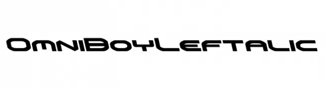
( Fonts by Daniel Zadorozny - www.iconian.com - Personal-use only. For commercial use please contact owner. )
A futuristic, angular font with a bold and dynamic style.
![Omni Boy Leftalic Frei Schriftart Herunterladen]() Herunterladen 143 Downloads@WebFont
Herunterladen 143 Downloads@WebFont -
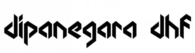
( Dexsar Harry Anugrah - majestype.com )
A bold, angular font with geometric shapes and sharp edges.
![dipanegara dhf Frei Schriftart Herunterladen]() Herunterladen 143 Downloads@WebFont
Herunterladen 143 Downloads@WebFont


Welche Schriften sind gerade am populärsten?
Poppins, Roboto, Montserrat, Open Sans und Lato sind wegen ihrer klaren Formen und breiten Einsetzbarkeit sehr gefragt – von Markenauftritt über Landingpages bis hin zu Postern.
Welche Fonts eignen sich für Logos?
Geometrische Sans‑Serifs (z. B. Poppins, Familien im Gotham‑Stil) sind ein häufiger Griff für sauberes, skalierbares Branding. Für eine persönlichere Note bleiben Scripts und Handschrift‑Stile beliebt. Kombinieren Sie einen prägnanten Headline‑Font mit einer neutralen Brotschrift für Wiedererkennung und Harmonie.
Wie oft wird die Top‑Liste aktualisiert?
Regelmäßig – basierend auf realen Downloads und Interaktionen. Schauen Sie öfter vorbei, um aufstrebende Favoriten früh zu entdecken.
💡 Tipp: Seite bookmarken – Trends wechseln schnell, und heutige Top‑Schriften inspirieren morgen vielleicht das Rebranding.