Willkommen bei den Top‑Schriften – hier treffen Beliebtheit und Qualität aufeinander. Das sind die in diesem Jahr am häufigsten heruntergeladenen und genutzten Fonts. Wenn Sie sichere Optionen für Logo, Web oder Social suchen, starten Sie hier.
Jeder Top‑Font überzeugt durch Balance, Lesbarkeit und Vielseitigkeit. Sie finden moderne Sans‑Serifs, elegante Scripts, Vintage‑Serifs und minimalistische Displays.
-
( Fonts by Noah Type - noahtype.com - Personal-use only. For commercial use please contact owner. )
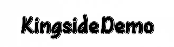
A bold, playful font with rounded strokes and a three-dimensional outline.
 Herunterladen 141 Downloads@WebFont
 -
( Betwixt Designs - betwixtdesigns.com )
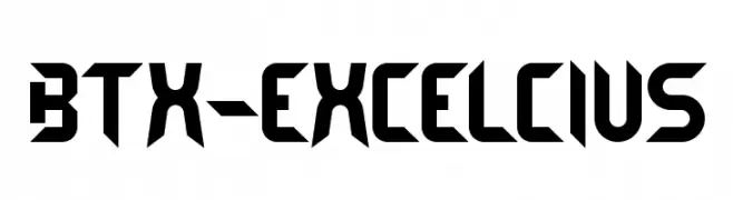
A bold, geometric font with a futuristic and angular design.
![BTX-EXCELCIUS Frei Schriftart Herunterladen]() Herunterladen 141 Downloads@WebFont
Herunterladen 141 Downloads@WebFont -
( Fonts by Noah Type - noahtype.com - Personal-use only. For commercial use please contact owner. )
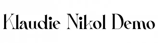
A high-contrast, modern-classic font with elegant elongated uppercase and creative lowercase letters.
![Klaudie Nikol Demo Frei Schriftart Herunterladen]() Herunterladen 141 Downloads@WebFont
Herunterladen 141 Downloads@WebFont -
( Fonts by Apostrophic Lab )
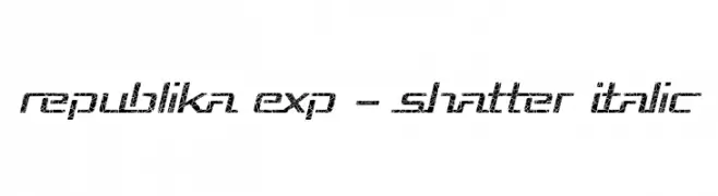
A bold, shattered, and italicized font with a modern and dynamic appearance.
![Republika Exp - Shatter Italic Frei Schriftart Herunterladen]() Herunterladen 141 Downloads@WebFont
Herunterladen 141 Downloads@WebFont -
![StarFont Capitals Regular Frei Schriftart Herunterladen]() Herunterladen 141 Downloads@WebFont
Herunterladen 141 Downloads@WebFont -
( Fonts by Geronimo Fonts - Personal-use only. For commercial use please contact owner. )
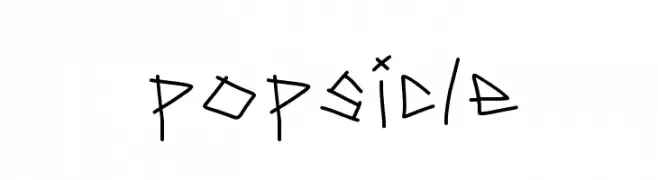
A playful, hand-drawn font with quirky, irregular strokes.
![popsicle Frei Schriftart Herunterladen]() Herunterladen 141 Downloads@WebFont
Herunterladen 141 Downloads@WebFont -
( Cotbada Studio - Isfani - creativemarket.com/Cotbada_studio )
A tall, narrow font with a modern and elegant style.
![Sophier Letties CAPITALE Frei Schriftart Herunterladen]() Herunterladen 141 Downloads@WebFont
Herunterladen 141 Downloads@WebFont -
( Jaduger Design Studio - www.jaduger.com )
A bold, vintage typewriter-style slab serif font with a rugged, mechanical feel.
![Silk Remington-SBold Frei Schriftart Herunterladen]() Herunterladen 141 Downloads@WebFont
Herunterladen 141 Downloads@WebFont -
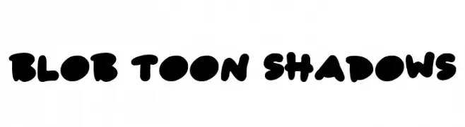
![Blob Toon Shadows Frei Schriftart Herunterladen]() Herunterladen 141 Downloads@WebFont
Herunterladen 141 Downloads@WebFont -
( Fonts by Ryul Davidson - Personal-use only. For commercial use please contact owner. )
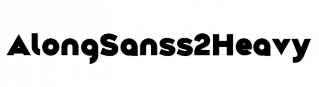
A bold, modern sans-serif font with geometric shapes and strong lines.
![Along Sans s2 Heavy Frei Schriftart Herunterladen]() Herunterladen 141 Downloads@WebFont
Herunterladen 141 Downloads@WebFont -
( Fonts by wep - Wahyu Eka Prasetya - Personal-use only. For commercial use please contact owner. )
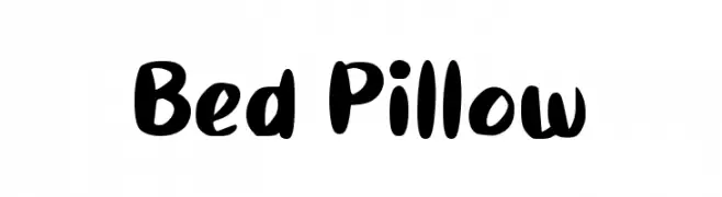
A playful, bold font with rounded, hand-drawn strokes.
![Bed Pillow Frei Schriftart Herunterladen]() Herunterladen 141 Downloads@WebFont
Herunterladen 141 Downloads@WebFont -
( Fonts by Iconian Fonts )
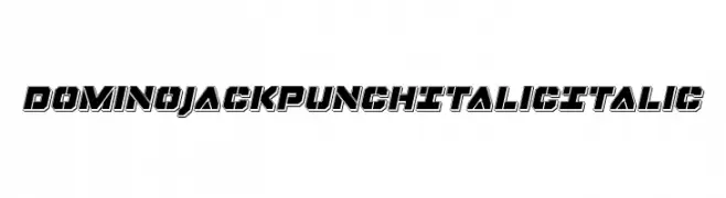
Bold, italicized font with a 3D outlined effect and geometric structure.
![Domino Jack Punch Italic Italic Frei Schriftart Herunterladen]() Herunterladen 141 Downloads@WebFont
Herunterladen 141 Downloads@WebFont -
( Fonts by Vladimir Nikolic - www.creativefabrica.com/designer/vladimirnikolic/ - Personal-use only. For commercial use please contact owner. )
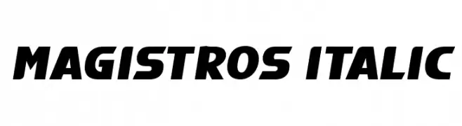
A bold, italic font with strong, angular lines and a modern, dynamic style.
![Magistros Italic Frei Schriftart Herunterladen]() Herunterladen 141 Downloads@WebFont
Herunterladen 141 Downloads@WebFont -
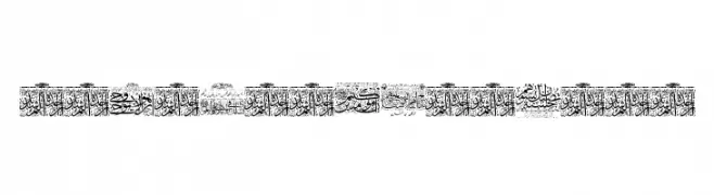
![Aayat Quraan 23 Frei Schriftart Herunterladen]() Herunterladen 141 Downloads@WebFont
Herunterladen 141 Downloads@WebFont -
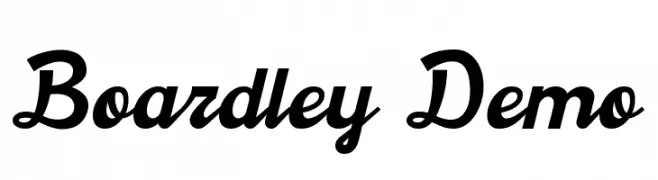
( Craft Supply Co. - creativemarket.com/craftsupplyco )
A bold, flowing script font with elegant curves and modern touches.
![Boardley Demo Frei Schriftart Herunterladen]() Herunterladen 141 Downloads@WebFont
Herunterladen 141 Downloads@WebFont -
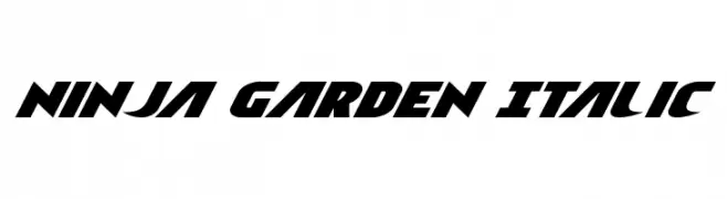
( Iconian Fonts - Daniel Zadorozny - www.iconian.com )
A bold, italic font with a dynamic and energetic style.
![Ninja Garden Italic Frei Schriftart Herunterladen]() Herunterladen 141 Downloads@WebFont
Herunterladen 141 Downloads@WebFont -
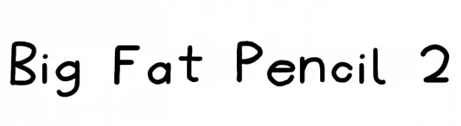
![Big Fat Pencil 2 Frei Schriftart Herunterladen]() Herunterladen 141 Downloads@WebFont
Herunterladen 141 Downloads@WebFont -
( Fonts by Docallisme HAS - Ryal - docallisme.blogspot.com - Personal-use only. For commercial use please contact owner. )
A whimsical, cartoon-style display font using a monkey face as its character.
![MOVE-ON Frei Schriftart Herunterladen]() Herunterladen 141 Downloads@WebFont
Herunterladen 141 Downloads@WebFont -
( Aleksey Mednov )
A bold, geometric font with sharp angles and a modern aesthetic.
![Kramola Frei Schriftart Herunterladen]() Herunterladen 141 Downloads@WebFont
Herunterladen 141 Downloads@WebFont -
( Fonts by a Des Gomez. Personal-use only. For commercial use please contact owner. )
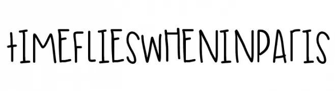
A playful, handwritten font with tall, narrow characters and a casual feel.
![TimeFliesWhenInParis Frei Schriftart Herunterladen]() Herunterladen 141 Downloads@WebFont
Herunterladen 141 Downloads@WebFont -
![PopticsOneExtras Frei Schriftart Herunterladen]() Herunterladen 141 Downloads@WebFont
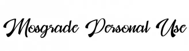
Herunterladen 141 Downloads@WebFont -
![Mosgrade Personal Use Frei Schriftart Herunterladen]() Herunterladen 141 Downloads@WebFont
Herunterladen 141 Downloads@WebFont -
( Fonts by Woodcutter Manero - http://www.woodcutter.es - Personal-use only. For commercial use please contact owner. )
A modern, elongated font with a textured, vintage feel.
![Trabello Frei Schriftart Herunterladen]() Herunterladen 141 Downloads@WebFont
Herunterladen 141 Downloads@WebFont -
![Delffo Frei Schriftart Herunterladen]() Herunterladen 141 Downloads@WebFont
Herunterladen 141 Downloads@WebFont -
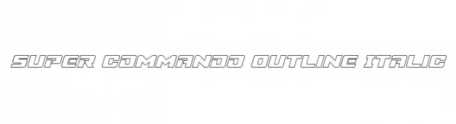
( Fonts by Daniel Zadorozny - www.iconian.com )
A bold, outlined, italicized font with a futuristic and dynamic style.
![Super Commando Outline Italic Frei Schriftart Herunterladen]() Herunterladen 141 Downloads@WebFont
Herunterladen 141 Downloads@WebFont -
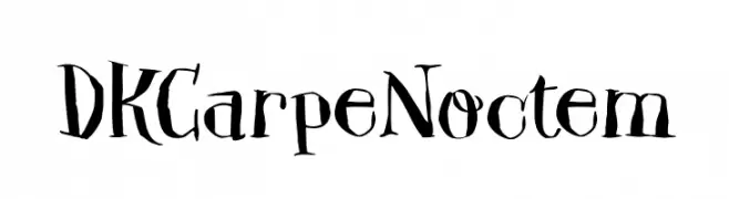
![DK Carpe Noctem Frei Schriftart Herunterladen]() Herunterladen 141 Downloads@WebFont
Herunterladen 141 Downloads@WebFont -
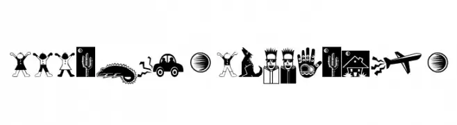
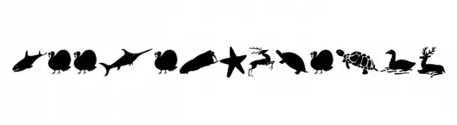
( Fonts by Manfred Klein. Free for private and charity use. Free for commercial with donation to organizations )
Animal silhouette font with each character as a distinct animal shape.
![ZooloVectoriA Frei Schriftart Herunterladen]() Herunterladen 141 Downloads@WebFont
Herunterladen 141 Downloads@WebFont -
![Vidas Secas Dingbats Frei Schriftart Herunterladen]() Herunterladen 141 Downloads@WebFont
Herunterladen 141 Downloads@WebFont -
( Fonts by a Max Infeld - XEROGRAPHER FONTS - xerographer.blogspot.com . Personal-use only. For commercial use please contact owner. )
A playful, handwritten font with smooth, flowing letterforms.
![LuxuryImport Frei Schriftart Herunterladen]() Herunterladen 141 Downloads@WebFont
Herunterladen 141 Downloads@WebFont -
![KR Barnyard Scraps Frei Schriftart Herunterladen]() Herunterladen 141 Downloads@WebFont
Herunterladen 141 Downloads@WebFont -
( Fonts by Daniel Zadorozny - www.iconian.com )
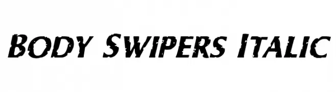
A bold, italicized font with a distressed, grunge texture.
![Body Swipers Italic Frei Schriftart Herunterladen]() Herunterladen 141 Downloads@WebFont
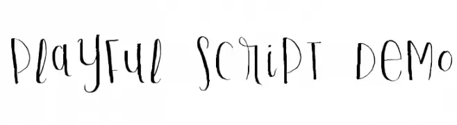
Herunterladen 141 Downloads@WebFont -
![Playful Script Demo Frei Schriftart Herunterladen]() Herunterladen 141 Downloads@WebFont
Herunterladen 141 Downloads@WebFont -
( Fonts by Tyler Finck - Personal-use only. For commercial use please contact owner. )
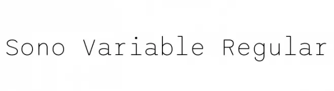
A modern, clean sans-serif font with uniform stroke width and balanced spacing.
![Sono Variable Regular Frei Schriftart Herunterladen]() Herunterladen 141 Downloads@WebFont
Herunterladen 141 Downloads@WebFont -
( Fonts by The Northern Block )
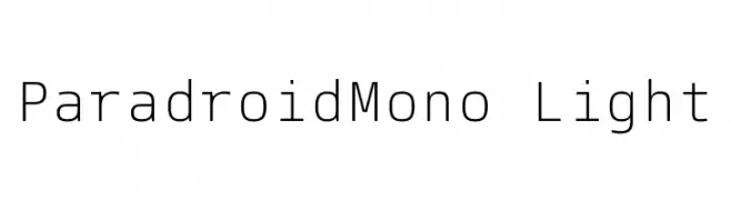
A clean, modern monospaced font with uniform character widths and low contrast.
![ParadroidMono Light Frei Schriftart Herunterladen]() Herunterladen 141 Downloads@WebFont
Herunterladen 141 Downloads@WebFont -
( Fonts by POSSIBLEGermany )
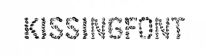
A decorative font with a textured, playful design.
![Kissingfont Frei Schriftart Herunterladen]() Herunterladen 141 Downloads@WebFont
Herunterladen 141 Downloads@WebFont


Welche Schriften sind gerade am populärsten?
Poppins, Roboto, Montserrat, Open Sans und Lato sind wegen ihrer klaren Formen und breiten Einsetzbarkeit sehr gefragt – von Markenauftritt über Landingpages bis hin zu Postern.
Welche Fonts eignen sich für Logos?
Geometrische Sans‑Serifs (z. B. Poppins, Familien im Gotham‑Stil) sind ein häufiger Griff für sauberes, skalierbares Branding. Für eine persönlichere Note bleiben Scripts und Handschrift‑Stile beliebt. Kombinieren Sie einen prägnanten Headline‑Font mit einer neutralen Brotschrift für Wiedererkennung und Harmonie.
Wie oft wird die Top‑Liste aktualisiert?
Regelmäßig – basierend auf realen Downloads und Interaktionen. Schauen Sie öfter vorbei, um aufstrebende Favoriten früh zu entdecken.
💡 Tipp: Seite bookmarken – Trends wechseln schnell, und heutige Top‑Schriften inspirieren morgen vielleicht das Rebranding.