Willkommen bei den Top‑Schriften – hier treffen Beliebtheit und Qualität aufeinander. Das sind die in diesem Jahr am häufigsten heruntergeladenen und genutzten Fonts. Wenn Sie sichere Optionen für Logo, Web oder Social suchen, starten Sie hier.
Jeder Top‑Font überzeugt durch Balance, Lesbarkeit und Vielseitigkeit. Sie finden moderne Sans‑Serifs, elegante Scripts, Vintage‑Serifs und minimalistische Displays.
-
( Fonts by Origin Type )
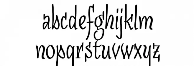
A bold, handwritten font with a playful and energetic style.
 Herunterladen 141 Downloads@WebFont
 -
( Free )
A bold, playful font with bottle-like shapes and a whimsical style.
![CotoCity Frei Schriftart Herunterladen]() Herunterladen 141 Downloads@WebFont
Herunterladen 141 Downloads@WebFont -
( Fonts by Daniel Zadorozny - www.iconian.com - Free for personal use )
A bold, angular, and condensed font with a striking geometric design.
![Opus Magnus Condensed Frei Schriftart Herunterladen]() Herunterladen 141 Downloads@WebFont
Herunterladen 141 Downloads@WebFont -
( Fonts by Loretta Aho )
A playful and humorous font using punctuation marks to create whimsical designs.
![Alphabutt Base A Frei Schriftart Herunterladen]() Herunterladen 141 Downloads@WebFont
Herunterladen 141 Downloads@WebFont -
( Fonts by DumadiStyle )
A bold, outlined font with a modern and playful aesthetic.
![FROS BOLD Line Frei Schriftart Herunterladen]() Herunterladen 141 Downloads@WebFont
Herunterladen 141 Downloads@WebFont -
![GalacticMini Frei Schriftart Herunterladen]() Herunterladen 140 Downloads
Herunterladen 140 Downloads -
( Font by Eric Wirjanata. All of my font are donation based. You can support by buying something from here. http://society6.com/EricWirjanata )
A playful, geometric font with a pixelated, digital style.
![Booblr by Thunderpanda Frei Schriftart Herunterladen]() Herunterladen 140 Downloads@WebFont
Herunterladen 140 Downloads@WebFont -
( Fonts by Mans Greback - Personal-use only. For commercial use please contact owner. )
A bold, flowing script font with elegant curves and smooth strokes.
![Quintal Script PERSONAL USE ONLY Regular Frei Schriftart Herunterladen]() Herunterladen 140 Downloads@WebFont
Herunterladen 140 Downloads@WebFont -
![PostageStamps Frei Schriftart Herunterladen]() Herunterladen 140 Downloads@WebFont
Herunterladen 140 Downloads@WebFont -
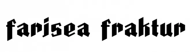
( Fonts by deFharo - Personal-use only. For commercial use please contact owner. )
A bold, gothic-inspired Blackletter font with sharp angles and thick strokes.
![Farisea Fraktur Frei Schriftart Herunterladen]() Herunterladen 140 Downloads@WebFont
Herunterladen 140 Downloads@WebFont -
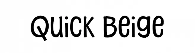
( Fonts by Khurasan™ )
A playful, rounded font with a hand-drawn, casual appearance.
![Quick Beige Frei Schriftart Herunterladen]() Herunterladen 140 Downloads@WebFont
Herunterladen 140 Downloads@WebFont -
![Fast Monk _ Ink Regular Frei Schriftart Herunterladen]() Herunterladen 140 Downloads@WebFont
Herunterladen 140 Downloads@WebFont -
( Adrián Flores )
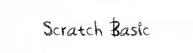
A scratchy, hand-drawn font with an edgy, artistic style.
![Scratch Basic Frei Schriftart Herunterladen]() Herunterladen 140 Downloads@WebFont
Herunterladen 140 Downloads@WebFont -
( Fonts by Manuel Viergutz - Typo Graphic Design - www.typographicdesign.de )
A bold, playful font with irregular, hand-drawn shapes and a unique, artistic flair.
![ripTRASHround Frei Schriftart Herunterladen]() Herunterladen 140 Downloads@WebFont
Herunterladen 140 Downloads@WebFont -
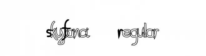
![SkyFanci-Regular Frei Schriftart Herunterladen]() Herunterladen 140 Downloads@WebFont
Herunterladen 140 Downloads@WebFont -
( Fonts by Manfred Klein. Free for private and charity use. Free for commercial with donation to organizations )
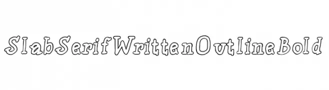
A bold, outlined, handwritten-style font with a playful and casual appearance.
![SlabSerifWrittenOutlineBold Frei Schriftart Herunterladen]() Herunterladen 140 Downloads@WebFont
Herunterladen 140 Downloads@WebFont -
( Fonts by Manfred Klein. Free for private and charity use. Free for commercial with donation to organizations )
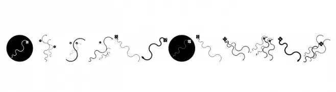
Abstract, organic font with wavy lines and playful forms.
![CurvedBeings Frei Schriftart Herunterladen]() Herunterladen 140 Downloads@WebFont
Herunterladen 140 Downloads@WebFont -
( Fonts by a Max Infeld - XEROGRAPHER FONTS - xerographer.blogspot.com . Personal-use only. For commercial use please contact owner. )
A bold, playful font with a hand-drawn, informal style.
![GreatEnding Frei Schriftart Herunterladen]() Herunterladen 140 Downloads@WebFont
Herunterladen 140 Downloads@WebFont -
Schriftart von spideraysfonts. For commercial use please contact the owner.
( Fonts by spideraysfonts - Personal-use only. For commercial use please contact owner. )
A playful, eerie font with irregular, hand-drawn letters and a spooky vibe.
![CHILDHOOD NIGHTMARE Frei Schriftart Herunterladen]() Herunterladen 140 Downloads@WebFont
Herunterladen 140 Downloads@WebFont -
![SudegnakNo3a Frei Schriftart Herunterladen]() Herunterladen 140 Downloads@WebFont
Herunterladen 140 Downloads@WebFont -
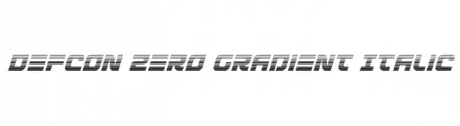
( Fonts by Iconian Fonts )
A futuristic, italicized font with a gradient stripe effect.
![Defcon Zero Gradient Italic Frei Schriftart Herunterladen]() Herunterladen 140 Downloads@WebFont
Herunterladen 140 Downloads@WebFont -
![Titus Manichean Frei Schriftart Herunterladen]() Herunterladen 140 Downloads@WebFont
Herunterladen 140 Downloads@WebFont -
![Vintage Decorative Signs 10 Frei Schriftart Herunterladen]() Herunterladen 140 Downloads@WebFont
Herunterladen 140 Downloads@WebFont -
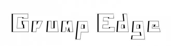
![Grump Edge Frei Schriftart Herunterladen]() Herunterladen 140 Downloads@WebFont
Herunterladen 140 Downloads@WebFont -
( Fonts by Jipatype - Anupap Jaichumnan - Personal-use only. For commercial use please contact owner. )
A modern, geometric font with rounded edges and uniform width.
![Honor Frei Schriftart Herunterladen]() Herunterladen 140 Downloads@WebFont
Herunterladen 140 Downloads@WebFont -
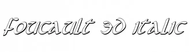
( Fonts by Daniel Zadorozny - www.iconian.com )
A bold, 3D italic font with angular lines and a modern, decorative style.
![Foucault 3D Italic Frei Schriftart Herunterladen]() Herunterladen 140 Downloads@WebFont
Herunterladen 140 Downloads@WebFont -
( Dani Foster Herring - dani3d.com/ )
Celestial-themed decorative dingbat font with sun, moon, and star icons.
![Sun, Moon & Stars Frei Schriftart Herunterladen]() Herunterladen 140 Downloads@WebFont
Herunterladen 140 Downloads@WebFont -
( Font by Sven Stuber - www.superlooper.de )
A geometric, angular font with a modern, digital aesthetic.
![Coastboyregular Frei Schriftart Herunterladen]() Herunterladen 140 Downloads@WebFont
Herunterladen 140 Downloads@WebFont -
( Fonts by Fajar Abdul Fattah - https://fontbundles.net/sibelumpagi-studio - Personal-use only. For commercial use please contact owner. )
A graceful, cursive script font with elegant loops and smooth transitions.
![Shantine Frei Schriftart Herunterladen]() Herunterladen 140 Downloads@WebFont
Herunterladen 140 Downloads@WebFont -
( Fonts by Sudar Moko )
A geometric, angular font with a modern and futuristic style.
![Rivesquare Frei Schriftart Herunterladen]() Herunterladen 140 Downloads@WebFont
Herunterladen 140 Downloads@WebFont -
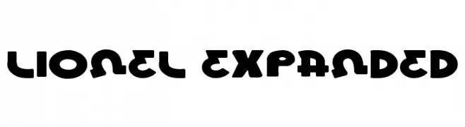
( Fonts by Daniel Zadorozny - www.iconian.com - Free for personal use )
A bold, expanded font with a playful and modern style.
![Lionel Expanded Frei Schriftart Herunterladen]() Herunterladen 140 Downloads@WebFont
Herunterladen 140 Downloads@WebFont -
( Fonts by Manfred Klein. Free for private and charity use. Free for commercial with donation to organizations )
Experimental, abstract font using lines and waves instead of standard glyphs.
![PoesieConcreteRound Frei Schriftart Herunterladen]() Herunterladen 140 Downloads@WebFont
Herunterladen 140 Downloads@WebFont -
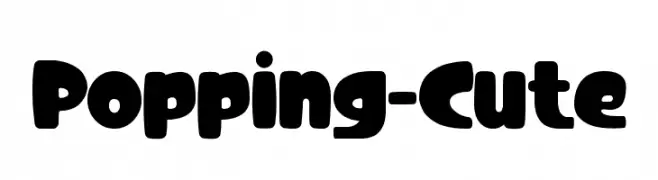
( Fonts by Modestype Studio )
A playful, bold font with rounded, bubbly characters.
![Popping-Cute Frei Schriftart Herunterladen]() Herunterladen 140 Downloads@WebFont
Herunterladen 140 Downloads@WebFont -
( Fonts by www.peter-wiegel.de. Personal-use only. For commercial use please contact owner. )
A dynamic italic font with a sleek, modern design.
![Quirkus Italic Frei Schriftart Herunterladen]() Herunterladen 140 Downloads@WebFont
Herunterladen 140 Downloads@WebFont -
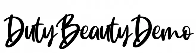
( Fonts by Rochart Studio )
A bold, handwritten font with a lively and dynamic cursive style.
![Duty Beauty Demo Frei Schriftart Herunterladen]() Herunterladen 140 Downloads@WebFont
Herunterladen 140 Downloads@WebFont


Welche Schriften sind gerade am populärsten?
Poppins, Roboto, Montserrat, Open Sans und Lato sind wegen ihrer klaren Formen und breiten Einsetzbarkeit sehr gefragt – von Markenauftritt über Landingpages bis hin zu Postern.
Welche Fonts eignen sich für Logos?
Geometrische Sans‑Serifs (z. B. Poppins, Familien im Gotham‑Stil) sind ein häufiger Griff für sauberes, skalierbares Branding. Für eine persönlichere Note bleiben Scripts und Handschrift‑Stile beliebt. Kombinieren Sie einen prägnanten Headline‑Font mit einer neutralen Brotschrift für Wiedererkennung und Harmonie.
Wie oft wird die Top‑Liste aktualisiert?
Regelmäßig – basierend auf realen Downloads und Interaktionen. Schauen Sie öfter vorbei, um aufstrebende Favoriten früh zu entdecken.
💡 Tipp: Seite bookmarken – Trends wechseln schnell, und heutige Top‑Schriften inspirieren morgen vielleicht das Rebranding.