Willkommen bei den Top‑Schriften – hier treffen Beliebtheit und Qualität aufeinander. Das sind die in diesem Jahr am häufigsten heruntergeladenen und genutzten Fonts. Wenn Sie sichere Optionen für Logo, Web oder Social suchen, starten Sie hier.
Jeder Top‑Font überzeugt durch Balance, Lesbarkeit und Vielseitigkeit. Sie finden moderne Sans‑Serifs, elegante Scripts, Vintage‑Serifs und minimalistische Displays.
-
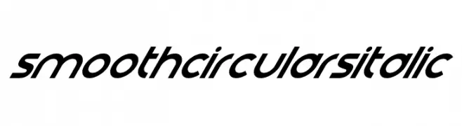
( Fonts by Darrell Flood )
A smooth, circular italic font with a modern and dynamic style.
 Herunterladen 138 Downloads@WebFont
 -
( Fonts by FatmaStudio )
A bold, playful handwritten font with smooth, rounded letters.
![Hello Penguin Frei Schriftart Herunterladen]() Herunterladen 138 Downloads@WebFont
Herunterladen 138 Downloads@WebFont -
![CornPopFour Frei Schriftart Herunterladen]() Herunterladen 138 Downloads@WebFont
Herunterladen 138 Downloads@WebFont -
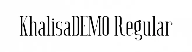
( Fonts by Mystical Type - Candi Erwanto - Personal-use only. For commercial use please contact owner. )
A tall, elegant font with high contrast and modern serifs.
![Khalisa_DEMO Regular Frei Schriftart Herunterladen]() Herunterladen 138 Downloads@WebFont
Herunterladen 138 Downloads@WebFont -
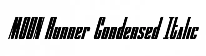
( Fonts by Iconian Fonts )
A dynamic, italic, and condensed font with a modern and edgy style.
![MOON Runner Condensed Italic Frei Schriftart Herunterladen]() Herunterladen 138 Downloads@WebFont
Herunterladen 138 Downloads@WebFont -
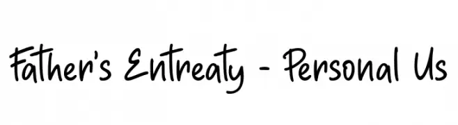
( Fonts by Haksen Studio - Sarwo Edhi Prayitno - Personal-use only. For commercial use please contact owner. )
A playful, casual handwritten font with smooth, flowing letterforms.
![Father's Entreaty - Personal Us Frei Schriftart Herunterladen]() Herunterladen 138 Downloads@WebFont
Herunterladen 138 Downloads@WebFont -
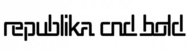
( Fonts by Apostrophic Lab )
A bold, condensed, and geometric font with a modern aesthetic.
![Republika Cnd Bold Frei Schriftart Herunterladen]() Herunterladen 138 Downloads@WebFont
Herunterladen 138 Downloads@WebFont -
( گالری فانت فارسی پژوهش آريانا - only compatible with Farsi and Arabic )
An artistic, calligraphic font with flowing curves and intricate details.
![Destkhat Morwaarid Frei Schriftart Herunterladen]() Herunterladen 138 Downloads@WebFont
Herunterladen 138 Downloads@WebFont -
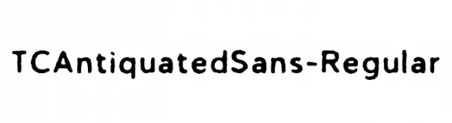
( Fonts by Tom Chalky )
A bold, hand-drawn font with a rustic, organic feel.
![TCAntiquatedSans-Regular Frei Schriftart Herunterladen]() Herunterladen 138 Downloads@WebFont
Herunterladen 138 Downloads@WebFont -
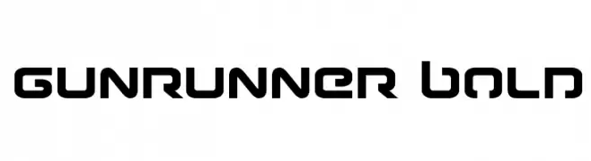
( Fonts by Iconian Fonts )
A bold, futuristic font with sharp angles and a geometric design.
![Gunrunner Bold Frei Schriftart Herunterladen]() Herunterladen 138 Downloads@WebFont
Herunterladen 138 Downloads@WebFont -
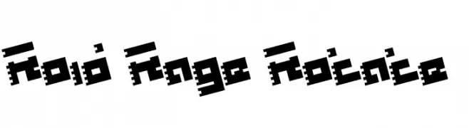
( Fonts by Daniel Zadorozny - www.iconian.com )
A bold, pixelated font with a retro, digital aesthetic.
![Roid Rage Rotate Frei Schriftart Herunterladen]() Herunterladen 138 Downloads@WebFont
Herunterladen 138 Downloads@WebFont -
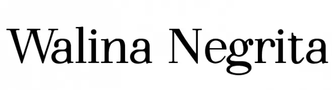
( Fonts by Adrián Yanes )
A classic serif font with bold, elegant curves and a modern touch.
![Walina Negrita Frei Schriftart Herunterladen]() Herunterladen 138 Downloads@WebFont
Herunterladen 138 Downloads@WebFont -
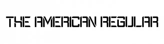
( Fonts by Geronimo Fonts - Personal-use only. For commercial use please contact owner. )
A bold, geometric font with a futuristic and structured design.
![The American Regular Frei Schriftart Herunterladen]() Herunterladen 138 Downloads@WebFont
Herunterladen 138 Downloads@WebFont -
![Kinkub flat Italic Frei Schriftart Herunterladen]() Herunterladen 138 Downloads@WebFont
Herunterladen 138 Downloads@WebFont -
![Federal Blue Condensed Frei Schriftart Herunterladen]() Herunterladen 138 Downloads@WebFont
Herunterladen 138 Downloads@WebFont -
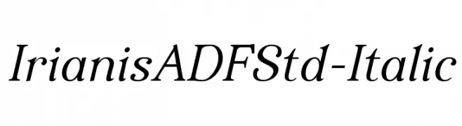
( Fonts by Arkandis Digital Foundry )
An elegant serif typeface with a classic italic style and smooth, flowing curves.
![IrianisADFStd-Italic Frei Schriftart Herunterladen]() Herunterladen 138 Downloads@WebFont
Herunterladen 138 Downloads@WebFont -
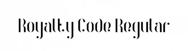
( Fonts by Geronimo Fonts - Personal-use only. For commercial use please contact owner. )
A modern, high-contrast decorative font with elegant and artistic elements.
![Royalty Code Regular Frei Schriftart Herunterladen]() Herunterladen 138 Downloads@WebFont
Herunterladen 138 Downloads@WebFont -
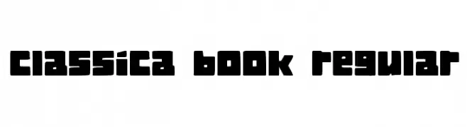
( Vladimir Nikolic - www.coroflot.com/vladimirnikolic )
A bold, blocky font with rounded corners and uniform thickness.
![Classica Book Regular Frei Schriftart Herunterladen]() Herunterladen 138 Downloads@WebFont
Herunterladen 138 Downloads@WebFont -
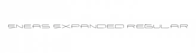
Schriftart von antipixel. For commercial use please contact the owner.
![Eneas Expanded Regular Frei Schriftart Herunterladen]() Herunterladen 138 Downloads@WebFont
Herunterladen 138 Downloads@WebFont -
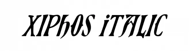
( Fonts by Daniel Zadorozny - www.iconian.com )
A bold, italic font with sharp serifs and a dynamic, modern style.
![Xiphos Italic Frei Schriftart Herunterladen]() Herunterladen 138 Downloads@WebFont
Herunterladen 138 Downloads@WebFont -
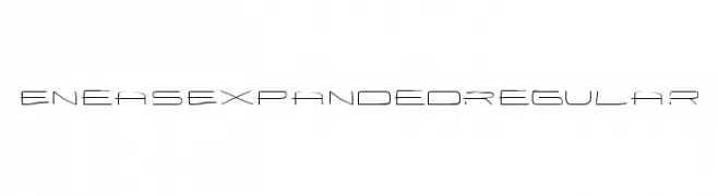
Schriftart von antipixel. For commercial use please contact the owner.
![EneasExpandedRegular Frei Schriftart Herunterladen]() Herunterladen 138 Downloads@WebFont
Herunterladen 138 Downloads@WebFont -
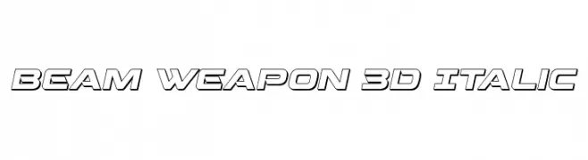
( Fonts by Iconian Fonts )
A bold, futuristic 3D italic font with geometric outlines.
![Beam Weapon 3D Italic Frei Schriftart Herunterladen]() Herunterladen 138 Downloads@WebFont
Herunterladen 138 Downloads@WebFont -
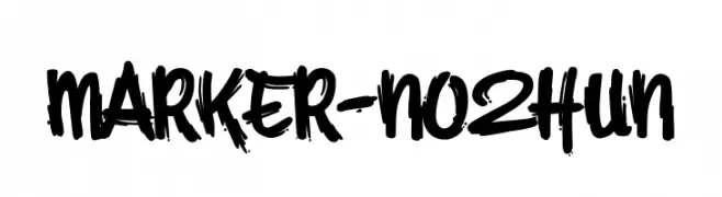
( Fonts by HighUpNorth LLC - Personal-use only. For commercial use please contact owner. )
A bold, hand-drawn font with a graffiti-like, energetic style.
![MARKER-NO2HUN Frei Schriftart Herunterladen]() Herunterladen 138 Downloads@WebFont
Herunterladen 138 Downloads@WebFont -
( Fonts by Adult Ramblings - Anastacia E. Zittel - Personal-use only. For commercial use please contact owner. )
A playful font with each character featuring a duck motif, offering a whimsical and creative style.
![AEZ ducks Frei Schriftart Herunterladen]() Herunterladen 138 Downloads@WebFont
Herunterladen 138 Downloads@WebFont -
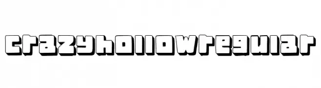
( Fonts by Vladimir Nikolic )
A bold, hollow, and playful font with a 3D effect and consistent geometric style.
![Crazy Hollow Regular Frei Schriftart Herunterladen]() Herunterladen 138 Downloads@WebFont
Herunterladen 138 Downloads@WebFont -
( Fonts by Kong Font )
A bold, dynamic script font with a handwritten style.
![Camprite PERSONAL USE ONLY! Frei Schriftart Herunterladen]() Herunterladen 138 Downloads@WebFont
Herunterladen 138 Downloads@WebFont -
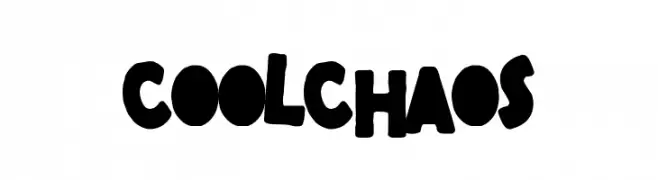
( Fonts by Woodcutter )
A bold, playful font with irregular, chunky letterforms and a hand-drawn appearance.
![Cool Chaos Frei Schriftart Herunterladen]() Herunterladen 138 Downloads@WebFont
Herunterladen 138 Downloads@WebFont -
![Antilles Platinum Frei Schriftart Herunterladen]() Herunterladen 138 Downloads@WebFont
Herunterladen 138 Downloads@WebFont -
![rzrarti Regular Frei Schriftart Herunterladen]() Herunterladen 138 Downloads@WebFont
Herunterladen 138 Downloads@WebFont -
( Pisto Casero - Gilberto Moya Perona - www.pistocasero.com )
A distressed, vintage-style serif font with a textured, handcrafted appearance.
![Sopadeletras-Regular Frei Schriftart Herunterladen]() Herunterladen 138 Downloads@WebFont
Herunterladen 138 Downloads@WebFont -
( Fonts by www.typodermicfonts.com - Ray Larabie )
A decorative, outline font with intricate, woven patterns and a handcrafted appearance.
![HomeSweetHomeOutline-Regular Frei Schriftart Herunterladen]() Herunterladen 138 Downloads@WebFont
Herunterladen 138 Downloads@WebFont -
( Fonts by Manfred Klein. Free for private and charity use. Free for commercial with donation to organizations )
A bold, modern font with a stencil-like, futuristic design.
![FriendlyFireDust Frei Schriftart Herunterladen]() Herunterladen 138 Downloads@WebFont
Herunterladen 138 Downloads@WebFont -
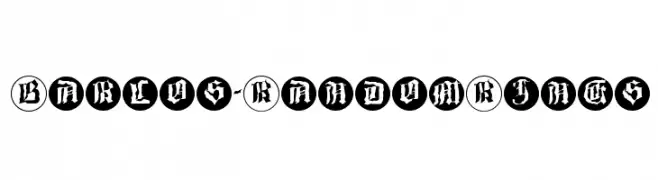
( Fonts by Manfred Klein. Free for private and charity use. Free for commercial with donation to organizations )
A decorative blackletter font with characters enclosed in circular borders.
![Barlos-RandomRings Frei Schriftart Herunterladen]() Herunterladen 138 Downloads@WebFont
Herunterladen 138 Downloads@WebFont -
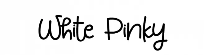
( Fonts by Syaf Rizal - Khurasan - Personal-use only. For commercial use please contact owner. )
A playful, handwritten font with rounded, whimsical characters and decorative elements.
![White Pinky Frei Schriftart Herunterladen]() Herunterladen 138 Downloads@WebFont
Herunterladen 138 Downloads@WebFont -
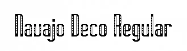
( Pixel Kitchen )
A bold, decorative font with geometric and art deco influences.
![Navajo Deco Regular Frei Schriftart Herunterladen]() Herunterladen 138 Downloads@WebFont
Herunterladen 138 Downloads@WebFont


Welche Schriften sind gerade am populärsten?
Poppins, Roboto, Montserrat, Open Sans und Lato sind wegen ihrer klaren Formen und breiten Einsetzbarkeit sehr gefragt – von Markenauftritt über Landingpages bis hin zu Postern.
Welche Fonts eignen sich für Logos?
Geometrische Sans‑Serifs (z. B. Poppins, Familien im Gotham‑Stil) sind ein häufiger Griff für sauberes, skalierbares Branding. Für eine persönlichere Note bleiben Scripts und Handschrift‑Stile beliebt. Kombinieren Sie einen prägnanten Headline‑Font mit einer neutralen Brotschrift für Wiedererkennung und Harmonie.
Wie oft wird die Top‑Liste aktualisiert?
Regelmäßig – basierend auf realen Downloads und Interaktionen. Schauen Sie öfter vorbei, um aufstrebende Favoriten früh zu entdecken.
💡 Tipp: Seite bookmarken – Trends wechseln schnell, und heutige Top‑Schriften inspirieren morgen vielleicht das Rebranding.