Willkommen bei den Top‑Schriften – hier treffen Beliebtheit und Qualität aufeinander. Das sind die in diesem Jahr am häufigsten heruntergeladenen und genutzten Fonts. Wenn Sie sichere Optionen für Logo, Web oder Social suchen, starten Sie hier.
Jeder Top‑Font überzeugt durch Balance, Lesbarkeit und Vielseitigkeit. Sie finden moderne Sans‑Serifs, elegante Scripts, Vintage‑Serifs und minimalistische Displays.
-
( Fonts by Andrey Font Design - Personal-use only. For commercial use please contact owner. )
An elegant, flowing script font with intricate loops and swashes.
 Herunterladen 703 Downloads@WebFont
 -
( Fonts by Khurasan )
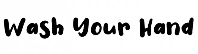
A bold, playful handwritten font with rounded strokes and a casual feel.
![Wash Your Hand Frei Schriftart Herunterladen]() Herunterladen 703 Downloads@WebFont
Herunterladen 703 Downloads@WebFont -
( SpideRaYsfoNtS - www.spideraysfonts.com )
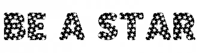
A bold, star-patterned decorative font ideal for playful designs.
![BE A STAR Frei Schriftart Herunterladen]() Herunterladen 703 Downloads@WebFont
Herunterladen 703 Downloads@WebFont -
( Fonts by CannotIntoSpaceFonts - KineticPlasma Fonts - Personal-use only. For commercial use please contact owner. )
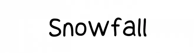
A playful, rounded handwritten font with a casual and friendly style.
![Snowfall Frei Schriftart Herunterladen]() Herunterladen 703 Downloads@WebFont
Herunterladen 703 Downloads@WebFont -
( Fonts by Clement Nicolle - www.stereo-type.fr - Personal-use only. For commercial use please contact owner. )
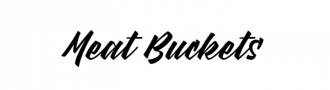
A bold, dynamic script font with fluid, connected strokes.
![Meat Buckets Frei Schriftart Herunterladen]() Herunterladen 703 Downloads@WebFont
Herunterladen 703 Downloads@WebFont -
-
( Fonts by BLKBK - https://blkbk.ink - Personal-use only. For commercial use please contact owner. Sponsoren Schriftart )
A bold, robust font with thick strokes and a slightly condensed style.
![Cold Crush Frei Schriftart Herunterladen]() Herunterladen 703 Downloads
Herunterladen 703 Downloads -
( Copyright (c) 2015, Cadson Demak (info@cadsondemak.com) )
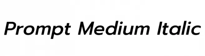
A modern, medium-weight italic sans-serif font with clean lines and balanced proportions.
![Prompt Medium Italic Frei Schriftart Herunterladen]() Herunterladen 703 Downloads@WebFont
Herunterladen 703 Downloads@WebFont -
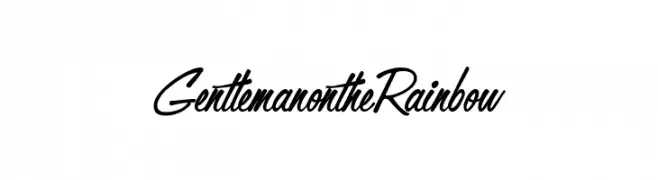
![GentlemanontheRainbow Frei Schriftart Herunterladen]() Herunterladen 703 Downloads@WebFont
Herunterladen 703 Downloads@WebFont -
( Fonts by a Neale Davidson - www.pixelsagas.com. Personal-use only. For commercial use please contact owner. )
A bold, geometric font with a strong, industrial style.
![Hauser Bold Frei Schriftart Herunterladen]() Herunterladen 703 Downloads@WebFont
Herunterladen 703 Downloads@WebFont -
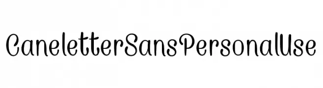
![CaneletterSansPersonalUse Frei Schriftart Herunterladen]() Herunterladen 703 Downloads@WebFont
Herunterladen 703 Downloads@WebFont


Welche Schriften sind gerade am populärsten?
Poppins, Roboto, Montserrat, Open Sans und Lato sind wegen ihrer klaren Formen und breiten Einsetzbarkeit sehr gefragt – von Markenauftritt über Landingpages bis hin zu Postern.
Welche Fonts eignen sich für Logos?
Geometrische Sans‑Serifs (z. B. Poppins, Familien im Gotham‑Stil) sind ein häufiger Griff für sauberes, skalierbares Branding. Für eine persönlichere Note bleiben Scripts und Handschrift‑Stile beliebt. Kombinieren Sie einen prägnanten Headline‑Font mit einer neutralen Brotschrift für Wiedererkennung und Harmonie.
Wie oft wird die Top‑Liste aktualisiert?
Regelmäßig – basierend auf realen Downloads und Interaktionen. Schauen Sie öfter vorbei, um aufstrebende Favoriten früh zu entdecken.
💡 Tipp: Seite bookmarken – Trends wechseln schnell, und heutige Top‑Schriften inspirieren morgen vielleicht das Rebranding.