Willkommen bei den Top‑Schriften – hier treffen Beliebtheit und Qualität aufeinander. Das sind die in diesem Jahr am häufigsten heruntergeladenen und genutzten Fonts. Wenn Sie sichere Optionen für Logo, Web oder Social suchen, starten Sie hier.
Jeder Top‑Font überzeugt durch Balance, Lesbarkeit und Vielseitigkeit. Sie finden moderne Sans‑Serifs, elegante Scripts, Vintage‑Serifs und minimalistische Displays.
-
( Fonts by VinType )
Elegant handwritten script font with dynamic strokes.
 Herunterladen 138 Downloads@WebFont
 -
( Fonts by Pinisiart )
Bold, playful font with irregular shapes.
![PANICKO Frei Schriftart Herunterladen]() Herunterladen 138 Downloads@WebFont
Herunterladen 138 Downloads@WebFont -
( Fonts by www.selawetype.com - Personal-use only. FOR DONATION https://www.paypal.me/selawe . For commercial use please contact owner. )
A dynamic and flowing cursive script font with elegant, connected letters.
![Semirang Frei Schriftart Herunterladen]() Herunterladen 138 Downloads@WebFont
Herunterladen 138 Downloads@WebFont -
( Fonts by StringLabs - stringlabscreative.com - Personal-use only. For commercial use please contact owner. )
A bold, dynamic script font with flowing, connected letterforms.
![Rayhue Frei Schriftart Herunterladen]() Herunterladen 138 Downloads@WebFont
Herunterladen 138 Downloads@WebFont -
( Fonts by Manfred Klein. Free for private and charity use. Free for commercial with donation to organizations )
A bold, modern font with thick strokes and geometric influences.
![FragmentBO4 Frei Schriftart Herunterladen]() Herunterladen 138 Downloads@WebFont
Herunterladen 138 Downloads@WebFont -
( Frogii`s Fonts )
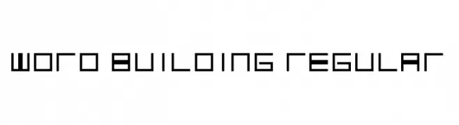
A modern, boxed font with bold lines and geometric characters.
![Santa's Gift Caps Frei Schriftart Herunterladen]() Herunterladen 138 Downloads@WebFont
Herunterladen 138 Downloads@WebFont -
( Fonts by Daniel Zadorozny - www.iconian.com - Free for personal use )
A bold, condensed, and italic handwritten font with dynamic strokes.
![Fantom Condensed Italic Frei Schriftart Herunterladen]() Herunterladen 138 Downloads@WebFont
Herunterladen 138 Downloads@WebFont -
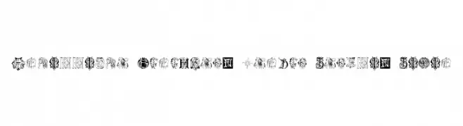
![Intellecta Monograms Random Samples Seven Frei Schriftart Herunterladen]() Herunterladen 138 Downloads@WebFont
Herunterladen 138 Downloads@WebFont -
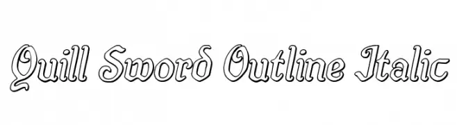
( Fonts by Iconian Fonts )
An elegant, italicized outline font with a decorative, calligraphic style.
![Quill Sword Outline Italic Frei Schriftart Herunterladen]() Herunterladen 138 Downloads@WebFont
Herunterladen 138 Downloads@WebFont -
( Fonts by Daniel Zadorozny - www.iconian.com - Free for personal use )
A bold, italicized font with dynamic and energetic strokes.
![Eskindar Rotalic Frei Schriftart Herunterladen]() Herunterladen 138 Downloads@WebFont
Herunterladen 138 Downloads@WebFont -
( Fonts by Mans Greback - Personal-use only. For commercial use please contact owner. )
An elegant and refined font with modern and classic elements, featuring subtle serifs and distinctive flourishes.
![Airium PERSONAL USE ONLY Regular Frei Schriftart Herunterladen]() Herunterladen 138 Downloads@WebFont
Herunterladen 138 Downloads@WebFont -
( Fonts by Darcy Baldwin - darcybaldwin.com. Free for personal use only )
A playful, outlined font with tall, narrow characters and rounded edges.
![DJB That Font I Saw on TV Frei Schriftart Herunterladen]() Herunterladen 138 Downloads@WebFont
Herunterladen 138 Downloads@WebFont -
( Fonts by Timothy Gao - Personal-use only. For commercial use please contact owner. )
A decorative design of crescent and circular shapes resembling moon phases.
![Moon Frei Schriftart Herunterladen]() Herunterladen 138 Downloads@WebFont
Herunterladen 138 Downloads@WebFont -
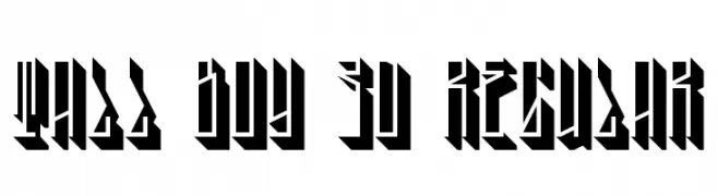
![Tall Boy 3D Regular Frei Schriftart Herunterladen]() Herunterladen 138 Downloads@WebFont
Herunterladen 138 Downloads@WebFont -
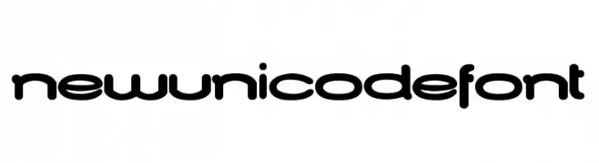
![NewUnicodeFont Frei Schriftart Herunterladen]() Herunterladen 138 Downloads@WebFont
Herunterladen 138 Downloads@WebFont -
( Fonts by Gassstype - Anang Fibriyanto - www.gassstype.com - Personal-use only. For commercial use please contact owner. )
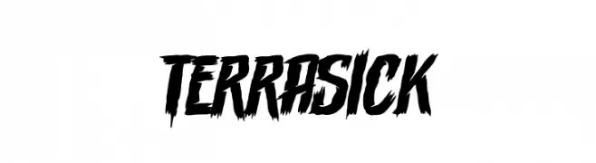
A bold, jagged font with a dynamic, brush-like texture.
![Terrasick Frei Schriftart Herunterladen]() Herunterladen 138 Downloads@WebFont
Herunterladen 138 Downloads@WebFont -
( Fonts by Din Studio )
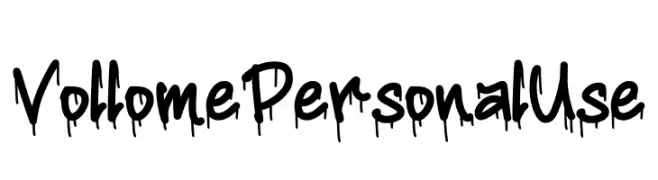
A bold, graffiti-style font with a dripping paint effect, perfect for urban-themed designs.
![Vollome Personal Use Frei Schriftart Herunterladen]() Herunterladen 138 Downloads@WebFont
Herunterladen 138 Downloads@WebFont -
![Glass Houses Frei Schriftart Herunterladen]() Herunterladen 138 Downloads@WebFont
Herunterladen 138 Downloads@WebFont -
( Fonts by a Max Infeld - XEROGRAPHER FONTS - xerographer.blogspot.com . Personal-use only. For commercial use please contact owner. )
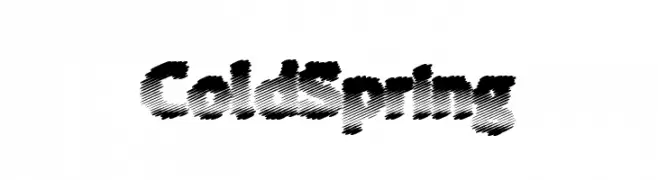
A bold, textured font with diagonal line patterns and high contrast.
![ColdSpring Frei Schriftart Herunterladen]() Herunterladen 138 Downloads@WebFont
Herunterladen 138 Downloads@WebFont -
![word building Regular Frei Schriftart Herunterladen]() Herunterladen 138 Downloads@WebFont
Herunterladen 138 Downloads@WebFont -
( Fonts by Kustomtype )
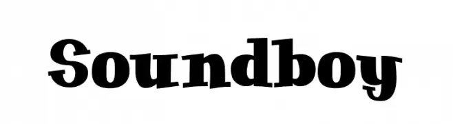
A bold, playful font with unique curvature and whimsical flair.
![Soundboy Frei Schriftart Herunterladen]() Herunterladen 138 Downloads@WebFont
Herunterladen 138 Downloads@WebFont -
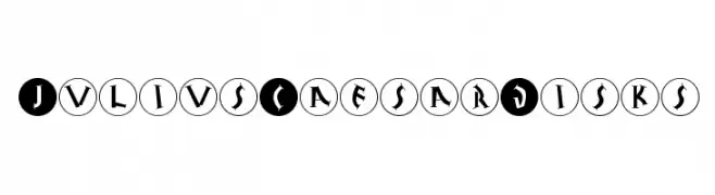
( Fonts by Manfred Klein. Free for private and charity use. Free for commercial with donation to organizations )
A bold, disk-enclosed font with a classical, ancient inscription style.
![JuliusCaesarDisks Frei Schriftart Herunterladen]() Herunterladen 138 Downloads@WebFont
Herunterladen 138 Downloads@WebFont -
( Fonts by Manfred Klein. Free for private and charity use. Free for commercial with donation to organizations )
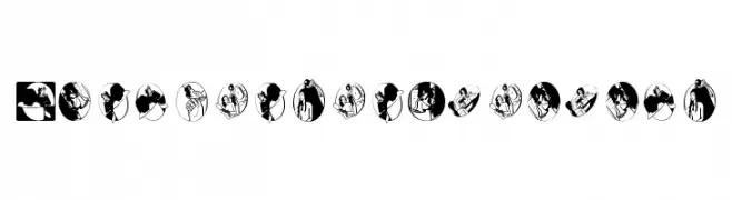
Illustrative, hand-drawn font with each character as a unique scene in a circle.
![RohrschachEtcetera Frei Schriftart Herunterladen]() Herunterladen 138 Downloads@WebFont
Herunterladen 138 Downloads@WebFont -
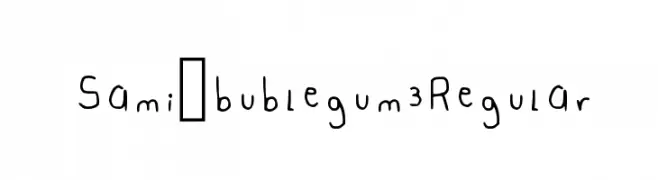
( Fonts by sami )
A playful, handwritten font with a casual and friendly style.
![Sami_bublegum 3 Regular Frei Schriftart Herunterladen]() Herunterladen 138 Downloads@WebFont
Herunterladen 138 Downloads@WebFont -
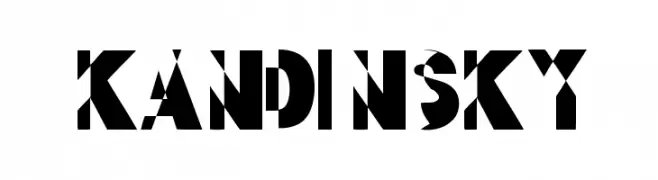
( Fonts by www.woodcutter.es - woodcutter Manero - Personal-use only. For commercial use please contact owner. )
A bold, geometric font with sharp angles and unique cutouts.
![kandinsky Frei Schriftart Herunterladen]() Herunterladen 138 Downloads@WebFont
Herunterladen 138 Downloads@WebFont -
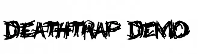
![Deathtrap DEMO Frei Schriftart Herunterladen]() Herunterladen 138 Downloads@WebFont
Herunterladen 138 Downloads@WebFont -
( Fonts by Moove Studio )
A casual, handwritten font with a flowing, cursive style.
![Cristy Frei Schriftart Herunterladen]() Herunterladen 138 Downloads@WebFont
Herunterladen 138 Downloads@WebFont -
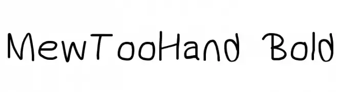
![MewTooHand Bold Frei Schriftart Herunterladen]() Herunterladen 138 Downloads@WebFont
Herunterladen 138 Downloads@WebFont -
![Pryma Demo Frei Schriftart Herunterladen]() Herunterladen 138 Downloads@WebFont
Herunterladen 138 Downloads@WebFont -
( Fonts by Alvaro Ariel - Personal-use only. For commercial use please contact owner. )
A delicate, handwritten font with thin, flowing lines and an artistic flair.
![Dark Saturday Frei Schriftart Herunterladen]() Herunterladen 138 Downloads@WebFont
Herunterladen 138 Downloads@WebFont -
( Fonts by Maelle.K - Thomas Boucherie )
A modern, defaced font with geometric shapes and distressed outlines.
![La Grosse Cochonne Defaced Frei Schriftart Herunterladen]() Herunterladen 138 Downloads@WebFont
Herunterladen 138 Downloads@WebFont -
( Fonts by www.selawetype.com - Personal-use only. FOR DONATION https://www.paypal.me/selawe . For commercial use please contact owner. )
A bold, brushstroke-style font with dynamic, uneven strokes and artistic flair.
![OneBrush Frei Schriftart Herunterladen]() Herunterladen 138 Downloads@WebFont
Herunterladen 138 Downloads@WebFont -
( Xerographer Fonts - Max Infeld - xerographer.blogspot.com )
A bold, geometric font with a modern and futuristic style.
![FonderianBold Bold Frei Schriftart Herunterladen]() Herunterladen 138 Downloads@WebFont
Herunterladen 138 Downloads@WebFont -
( Fonts by Manfred Klein - manfred-klein.ina-mar.com )
A bold blackletter font with sharp, angular lines and Gothic influences.
![ClaudiusImperator Frei Schriftart Herunterladen]() Herunterladen 138 Downloads@WebFont
Herunterladen 138 Downloads@WebFont -
( Fonts by Edric Studio www.creativefabrica.com/designer/edricstudio/ - Personal-use only. For commercial use please contact owner. )
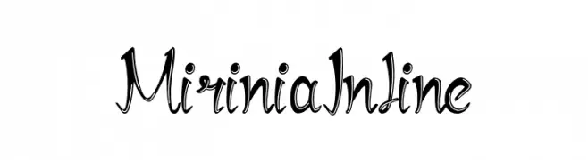
An elegant, decorative font with calligraphic swirls and flourishes.
![Mirinia Inline Frei Schriftart Herunterladen]() Herunterladen 138 Downloads@WebFont
Herunterladen 138 Downloads@WebFont


Welche Schriften sind gerade am populärsten?
Poppins, Roboto, Montserrat, Open Sans und Lato sind wegen ihrer klaren Formen und breiten Einsetzbarkeit sehr gefragt – von Markenauftritt über Landingpages bis hin zu Postern.
Welche Fonts eignen sich für Logos?
Geometrische Sans‑Serifs (z. B. Poppins, Familien im Gotham‑Stil) sind ein häufiger Griff für sauberes, skalierbares Branding. Für eine persönlichere Note bleiben Scripts und Handschrift‑Stile beliebt. Kombinieren Sie einen prägnanten Headline‑Font mit einer neutralen Brotschrift für Wiedererkennung und Harmonie.
Wie oft wird die Top‑Liste aktualisiert?
Regelmäßig – basierend auf realen Downloads und Interaktionen. Schauen Sie öfter vorbei, um aufstrebende Favoriten früh zu entdecken.
💡 Tipp: Seite bookmarken – Trends wechseln schnell, und heutige Top‑Schriften inspirieren morgen vielleicht das Rebranding.