Willkommen bei den Top‑Schriften – hier treffen Beliebtheit und Qualität aufeinander. Das sind die in diesem Jahr am häufigsten heruntergeladenen und genutzten Fonts. Wenn Sie sichere Optionen für Logo, Web oder Social suchen, starten Sie hier.
Jeder Top‑Font überzeugt durch Balance, Lesbarkeit und Vielseitigkeit. Sie finden moderne Sans‑Serifs, elegante Scripts, Vintage‑Serifs und minimalistische Displays.
-
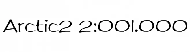
( Fonts by Sam Wang )
A playful, hand-drawn style font with rounded, flowing characters.
 Herunterladen 697 Downloads@WebFont
 -
( Fonts by Arkandis Digital Foundry )
A modern, condensed sans-serif font with a clean and professional look.
![GilliusADF-Cond Frei Schriftart Herunterladen]() Herunterladen 697 Downloads@WebFont
Herunterladen 697 Downloads@WebFont -
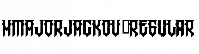
( Fonts by www.legacyofdefeat.com )
A bold, geometric font with sharp angles and a modern, gothic style.
![HMajorJackov-Regular Frei Schriftart Herunterladen]() Herunterladen 697 Downloads@WebFont
Herunterladen 697 Downloads@WebFont -
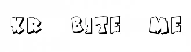
( Fonts by Kat`s Fun Fonts - Personal-use only. For commercial use please contact owner. )
A playful, bold font with a bitten, chipped design ideal for comic-style projects.
![KR Bite Me Frei Schriftart Herunterladen]() Herunterladen 697 Downloads@WebFont
Herunterladen 697 Downloads@WebFont -
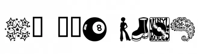
( Fonts by Blue Vinyl - Jess Latham - www.bvfonts.com )
A 1970s-themed decorative dingbat font with iconic retro illustrations.
![My 70s Ding Frei Schriftart Herunterladen]() Herunterladen 697 Downloads@WebFont
Herunterladen 697 Downloads@WebFont -
-
![Dash9812 Frei Schriftart Herunterladen]() Herunterladen 697 Downloads@WebFont
Herunterladen 697 Downloads@WebFont -
![skully Regular Frei Schriftart Herunterladen]() Herunterladen 697 Downloads@WebFont
Herunterladen 697 Downloads@WebFont -
( Fonts by Omega Font Labs )
A whimsical and decorative font with playful swirls and dots.
![Spahrty Girl Frei Schriftart Herunterladen]() Herunterladen 697 Downloads@WebFont
Herunterladen 697 Downloads@WebFont -
![SansLogique Frei Schriftart Herunterladen]() Herunterladen 697 Downloads@WebFont
Herunterladen 697 Downloads@WebFont -
( THESE ARE SHAREWARE FONTS ! NOT FREEWARE ! PLEASE VISIT www.fuelfonts.com )
A bold, playful font with thick, rounded strokes and a hand-drawn feel.
![Cake! Frei Schriftart Herunterladen]() Herunterladen 697 Downloads@WebFont
Herunterladen 697 Downloads@WebFont


Welche Schriften sind gerade am populärsten?
Poppins, Roboto, Montserrat, Open Sans und Lato sind wegen ihrer klaren Formen und breiten Einsetzbarkeit sehr gefragt – von Markenauftritt über Landingpages bis hin zu Postern.
Welche Fonts eignen sich für Logos?
Geometrische Sans‑Serifs (z. B. Poppins, Familien im Gotham‑Stil) sind ein häufiger Griff für sauberes, skalierbares Branding. Für eine persönlichere Note bleiben Scripts und Handschrift‑Stile beliebt. Kombinieren Sie einen prägnanten Headline‑Font mit einer neutralen Brotschrift für Wiedererkennung und Harmonie.
Wie oft wird die Top‑Liste aktualisiert?
Regelmäßig – basierend auf realen Downloads und Interaktionen. Schauen Sie öfter vorbei, um aufstrebende Favoriten früh zu entdecken.
💡 Tipp: Seite bookmarken – Trends wechseln schnell, und heutige Top‑Schriften inspirieren morgen vielleicht das Rebranding.