Willkommen bei den Top‑Schriften – hier treffen Beliebtheit und Qualität aufeinander. Das sind die in diesem Jahr am häufigsten heruntergeladenen und genutzten Fonts. Wenn Sie sichere Optionen für Logo, Web oder Social suchen, starten Sie hier.
Jeder Top‑Font überzeugt durch Balance, Lesbarkeit und Vielseitigkeit. Sie finden moderne Sans‑Serifs, elegante Scripts, Vintage‑Serifs und minimalistische Displays.
-
( madeDeduk )
A bold, angular font with a futuristic and edgy design.
 Herunterladen 135 Downloads@WebFont
 -
( Fonts by Aquariid Design )
Bold, playful handwritten script with connected letters.
![Before Christmas Frei Schriftart Herunterladen]() Herunterladen 135 Downloads@WebFont
Herunterladen 135 Downloads@WebFont -
( Fonts by Vladimir Nikolic - https://www.creativefabrica.com/product/educated-deers/ref/144265/ - Personal-use only. For commercial use please contact owner. )
A bold, textured italic font with a rugged, adventurous style.
![Driving Around Italic Frei Schriftart Herunterladen]() Herunterladen 135 Downloads@WebFont
Herunterladen 135 Downloads@WebFont -
( Fonts by Andrew McCluskey - nalgames.com )
A futuristic, line-based display font with angular and energetic characters.
![Vermin Vibes Out Of Ink Regular Frei Schriftart Herunterladen]() Herunterladen 135 Downloads@WebFont
Herunterladen 135 Downloads@WebFont -
( Fonts by Chequered Ink )
A playful, blocky font inspired by interlocking bricks, perfect for creative projects.
![Clicky Bricks 2 Regular Frei Schriftart Herunterladen]() Herunterladen 135 Downloads@WebFont
Herunterladen 135 Downloads@WebFont -
( Fonts by Kimberly Geswein - Personal-use only. For commercial use please contact owner. )
A playful, handwritten font with bold, rounded letters and a casual style.
![KG Take On The World Regular Frei Schriftart Herunterladen]() Herunterladen 135 Downloads@WebFont
Herunterladen 135 Downloads@WebFont -
( Fonts by Manfred Klein. Free for private and charity use. Free for commercial with donation to organizations )
A whimsical, decorative font with cartoon-like, hand-drawn characters.
![Kleinigkeiten Frei Schriftart Herunterladen]() Herunterladen 135 Downloads@WebFont
Herunterladen 135 Downloads@WebFont -
( Fonts by ingoFonts - Ingo Zimmermann - Personal-use only. For commercial use please contact owner. )
A pixelated, retro-style font with a digital, blocky appearance.
![DePixel Klein Frei Schriftart Herunterladen]() Herunterladen 135 Downloads@WebFont
Herunterladen 135 Downloads@WebFont -
( Fonts by fsuarez913 )
A playful, bold font with rounded, bubbly characters.
![Super Serene Frei Schriftart Herunterladen]() Herunterladen 135 Downloads@WebFont
Herunterladen 135 Downloads@WebFont -
( Fonts by Arterfak Project - Ahmad Ramzi Fahruddin - Personal-use only. For commercial use please contact owner. )
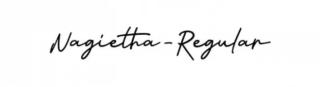
A flowing, cursive font with elegant, handwritten strokes.
![Nagietha-Regular Frei Schriftart Herunterladen]() Herunterladen 135 Downloads@WebFont
Herunterladen 135 Downloads@WebFont -
( FontGrube AH - Andreas Höfeld - www.fontgrube.de/en/ )
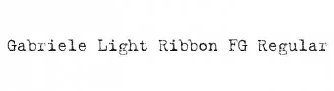
A distressed, textured serif font with a vintage, handcrafted appearance.
![Gabriele Light Ribbon FG Regular Frei Schriftart Herunterladen]() Herunterladen 135 Downloads@WebFont
Herunterladen 135 Downloads@WebFont -
( Fonts by Google )
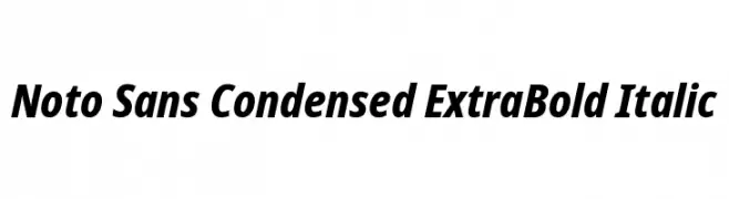
A bold, italic, and condensed typeface with a modern and assertive style.
![Noto Sans Condensed ExtraBold Italic Frei Schriftart Herunterladen]() Herunterladen 135 Downloads@WebFont
Herunterladen 135 Downloads@WebFont -
![CiviliteTails Frei Schriftart Herunterladen]() Herunterladen 135 Downloads@WebFont
Herunterladen 135 Downloads@WebFont -
( Fonts by RaisProject )
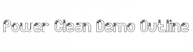
A modern decorative outline font with intricate detailing.
![Power Clean Demo Outline Frei Schriftart Herunterladen]() Herunterladen 135 Downloads@WebFont
Herunterladen 135 Downloads@WebFont -
( Iconian Fonts - Daniel Zadorozny - www.iconian.com )
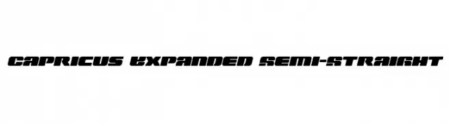
A bold, expanded font with semi-straight edges and a modern, futuristic style.
![Capricus Expanded Semi-Straight Frei Schriftart Herunterladen]() Herunterladen 135 Downloads@WebFont
Herunterladen 135 Downloads@WebFont -
( Fonts by David Rakowski )
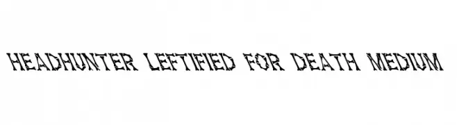
A bold, edgy font with sharp, angular lines and a distressed, dynamic appearance.
![Headhunter Leftified For Death Medium Frei Schriftart Herunterladen]() Herunterladen 135 Downloads@WebFont
Herunterladen 135 Downloads@WebFont -
( imagex - www.imagex-fonts.com )
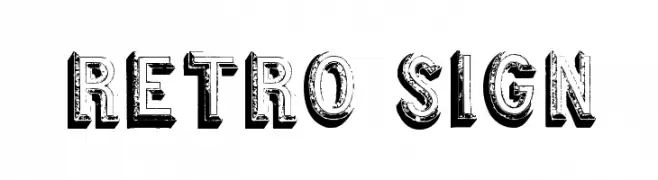
A bold, distressed 3D font with a vintage, retro vibe.
![Retro sign Frei Schriftart Herunterladen]() Herunterladen 135 Downloads@WebFont
Herunterladen 135 Downloads@WebFont -
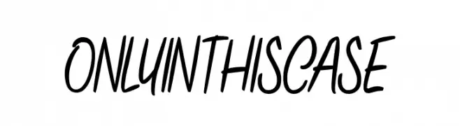
![ONLYINTHISCASE Frei Schriftart Herunterladen]() Herunterladen 135 Downloads@WebFont
Herunterladen 135 Downloads@WebFont -
( Fonts by Linecreative - ARI JUANDA - Personal-use only. For commercial use please contact owner. )
A tall, narrow font with a modern and sleek design.
![gello regular Frei Schriftart Herunterladen]() Herunterladen 135 Downloads@WebFont
Herunterladen 135 Downloads@WebFont -
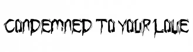
![Condemned to your love Frei Schriftart Herunterladen]() Herunterladen 135 Downloads@WebFont
Herunterladen 135 Downloads@WebFont -
( Fonts by Iconian Fonts )
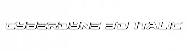
A futuristic 3D italic font with angular, outlined characters.
![Cyberdyne 3D Italic Frei Schriftart Herunterladen]() Herunterladen 135 Downloads@WebFont
Herunterladen 135 Downloads@WebFont -
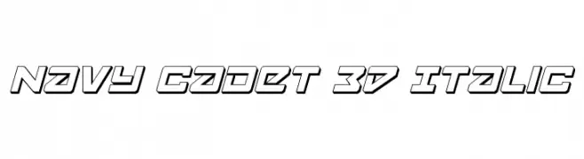
![Navy Cadet 3D Italic Frei Schriftart Herunterladen]() Herunterladen 135 Downloads@WebFont
Herunterladen 135 Downloads@WebFont -
![ErbosDraco Nova NBP Regular Frei Schriftart Herunterladen]() Herunterladen 135 Downloads@WebFont
Herunterladen 135 Downloads@WebFont -
( Fonts by Daniel Zadorozny - www.iconian.com - Free for personal use )
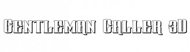
A bold, 3D effect font with strong, blocky uppercase letters and high contrast.
![Gentleman Caller 3D Frei Schriftart Herunterladen]() Herunterladen 135 Downloads@WebFont
Herunterladen 135 Downloads@WebFont -
( Fonts by Manfred Klein. Free for private and charity use. Free for commercial with donation to organizations )
Font made of fish and diver illustrations for each character.
![FischersFritzen Frei Schriftart Herunterladen]() Herunterladen 135 Downloads@WebFont
Herunterladen 135 Downloads@WebFont -
( Fonts by wsc - Personal-use only. For commercial use please contact owner. )
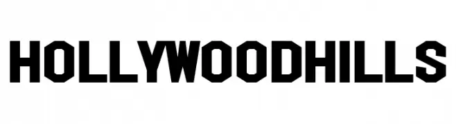
A bold, geometric font with sharp angles and a vintage-modern appeal.
![Hollywood Hills Frei Schriftart Herunterladen]() Herunterladen 135 Downloads@WebFont
Herunterladen 135 Downloads@WebFont -
( Fonts by Niskala Huruf )
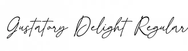
Elegant handwritten script font.
![Gustatory Delight Regular Frei Schriftart Herunterladen]() Herunterladen 135 Downloads@WebFont
Herunterladen 135 Downloads@WebFont -
![Proton Bold Extended Italic Frei Schriftart Herunterladen]() Herunterladen 135 Downloads@WebFont
Herunterladen 135 Downloads@WebFont -
( Fonts by Google )
A modern, extra-light sans-serif font with a semi-condensed style.
![Noto Sans SemiCondensed ExtraLight Frei Schriftart Herunterladen]() Herunterladen 135 Downloads@WebFont
Herunterladen 135 Downloads@WebFont -
( Fonts by Christopher Jackson )
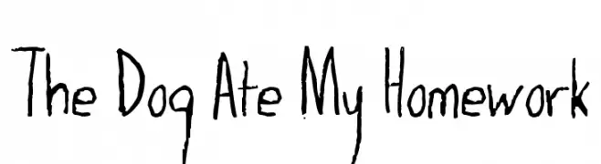
A playful, hand-drawn font with a whimsical, childlike style.
![The Dog Ate My Homework Frei Schriftart Herunterladen]() Herunterladen 135 Downloads@WebFont
Herunterladen 135 Downloads@WebFont -
( Fonts by Cannot Into Space Fonts )
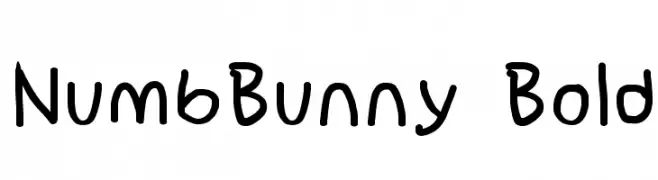
A playful, handwritten font with bold, rounded characters.
![NumbBunny Bold Frei Schriftart Herunterladen]() Herunterladen 135 Downloads@WebFont
Herunterladen 135 Downloads@WebFont -
( Fonts by Garisman Studio - Risman Ginarwan - Personal-use only. For commercial use please contact owner. )
A modern, condensed sans-serif font with a clean and geometric design.
![Highly Frei Schriftart Herunterladen]() Herunterladen 135 Downloads@WebFont
Herunterladen 135 Downloads@WebFont -
( Fonts by Daniel Zadorozny - www.iconian.com - Free for personal use )
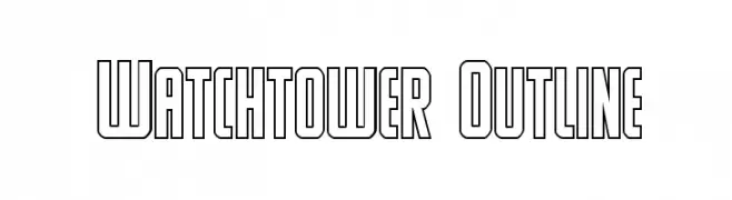
A bold, outlined font with a geometric and modern style.
![Watchtower Outline Frei Schriftart Herunterladen]() Herunterladen 135 Downloads@WebFont
Herunterladen 135 Downloads@WebFont -
( Fonts by a Max Infeld - XEROGRAPHER FONTS - xerographer.blogspot.com . Personal-use only. For commercial use please contact owner. )
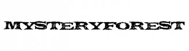
A rugged, textured font with a natural, wild aesthetic.
![MysteryForest Frei Schriftart Herunterladen]() Herunterladen 135 Downloads@WebFont
Herunterladen 135 Downloads@WebFont -
![speci.ALE Frei Schriftart Herunterladen]() Herunterladen 135 Downloads@WebFont
Herunterladen 135 Downloads@WebFont


Welche Schriften sind gerade am populärsten?
Poppins, Roboto, Montserrat, Open Sans und Lato sind wegen ihrer klaren Formen und breiten Einsetzbarkeit sehr gefragt – von Markenauftritt über Landingpages bis hin zu Postern.
Welche Fonts eignen sich für Logos?
Geometrische Sans‑Serifs (z. B. Poppins, Familien im Gotham‑Stil) sind ein häufiger Griff für sauberes, skalierbares Branding. Für eine persönlichere Note bleiben Scripts und Handschrift‑Stile beliebt. Kombinieren Sie einen prägnanten Headline‑Font mit einer neutralen Brotschrift für Wiedererkennung und Harmonie.
Wie oft wird die Top‑Liste aktualisiert?
Regelmäßig – basierend auf realen Downloads und Interaktionen. Schauen Sie öfter vorbei, um aufstrebende Favoriten früh zu entdecken.
💡 Tipp: Seite bookmarken – Trends wechseln schnell, und heutige Top‑Schriften inspirieren morgen vielleicht das Rebranding.