Willkommen bei den Top‑Schriften – hier treffen Beliebtheit und Qualität aufeinander. Das sind die in diesem Jahr am häufigsten heruntergeladenen und genutzten Fonts. Wenn Sie sichere Optionen für Logo, Web oder Social suchen, starten Sie hier.
Jeder Top‑Font überzeugt durch Balance, Lesbarkeit und Vielseitigkeit. Sie finden moderne Sans‑Serifs, elegante Scripts, Vintage‑Serifs und minimalistische Displays.
-
 Herunterladen 135 Downloads@WebFont
 -
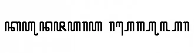
![KUNJARA Regular Frei Schriftart Herunterladen]() Herunterladen 135 Downloads@WebFont
Herunterladen 135 Downloads@WebFont -
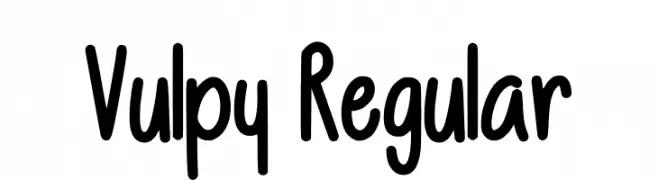
( Fonts by Vulpine - Personal-use only. For commercial use please contact owner. )
A playful, bold handwritten font with rounded strokes and a whimsical style.
![Vulpy Regular Frei Schriftart Herunterladen]() Herunterladen 135 Downloads@WebFont
Herunterladen 135 Downloads@WebFont -
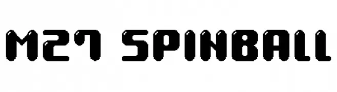
( Fonts by Miffies - mfs.jp.org - Personal-use only. For commercial use please contact owner. )
A bold, geometric font with rounded edges and a modern, playful style.
![M27_SPINBALL Frei Schriftart Herunterladen]() Herunterladen 135 Downloads@WebFont
Herunterladen 135 Downloads@WebFont -
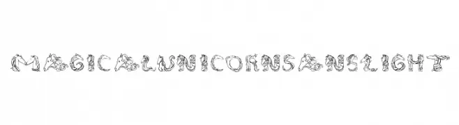
![MagicalUnicornSansLight Frei Schriftart Herunterladen]() Herunterladen 135 Downloads@WebFont
Herunterladen 135 Downloads@WebFont -
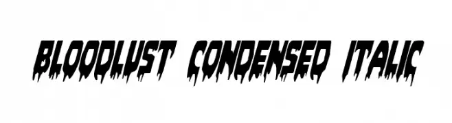
( Fonts by Daniel Zadorozny - www.iconian.com - Free for personal use )
A dramatic, horror-themed font with sharp, jagged edges and a condensed italic style.
![Bloodlust Condensed Italic Frei Schriftart Herunterladen]() Herunterladen 135 Downloads@WebFont
Herunterladen 135 Downloads@WebFont -
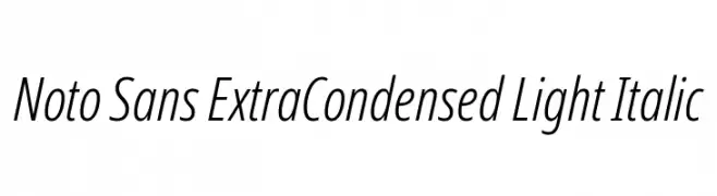
( Fonts by Google - Personal-use only. For commercial use please contact owner. )
A sleek, extra-condensed, light, and italic sans-serif font with a modern style.
![Noto Sans ExtraCondensed Light Italic Frei Schriftart Herunterladen]() Herunterladen 135 Downloads@WebFont
Herunterladen 135 Downloads@WebFont -
![Screech Frei Schriftart Herunterladen]() Herunterladen 135 Downloads@WebFont
Herunterladen 135 Downloads@WebFont -
![Artooh Frei Schriftart Herunterladen]() Herunterladen 135 Downloads@WebFont
Herunterladen 135 Downloads@WebFont -
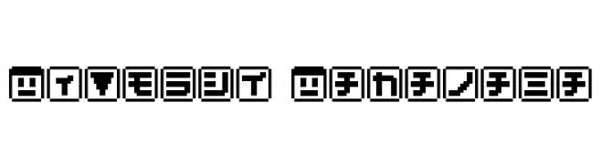
( These fonts are free to use in any private, recreational manner.For commercial go to www.flopdesign.com/fordesign/font.html )
A bold, pixelated font with a retro, digital aesthetic.
![KEYmode Katakana Frei Schriftart Herunterladen]() Herunterladen 135 Downloads@WebFont
Herunterladen 135 Downloads@WebFont -
( imagex - www.imagex-fonts.com )
A bold, textured font with a distressed, vintage appearance.
![Afro Add Frei Schriftart Herunterladen]() Herunterladen 135 Downloads@WebFont
Herunterladen 135 Downloads@WebFont -
( Fonts by Woodcutter Manero - http://www.woodcutter.es - Personal-use only. For commercial use please contact owner. )
A bold, decorative icon set themed around Brazilian culture and symbols.
![Brasil Icons Frei Schriftart Herunterladen]() Herunterladen 135 Downloads@WebFont
Herunterladen 135 Downloads@WebFont -
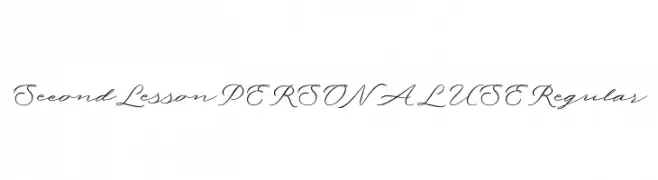
( Fonts by Mans Greback - Personal-use only. For commercial use please contact owner. )
An elegant script font with fluid, cursive strokes and a sophisticated style.
![Second Lesson PERSONAL USE Regular Frei Schriftart Herunterladen]() Herunterladen 135 Downloads@WebFont
Herunterladen 135 Downloads@WebFont -
( Fonts by Situjuh Nazara - 7ntypes.com - Personal-use only. For commercial use please contact owner. )
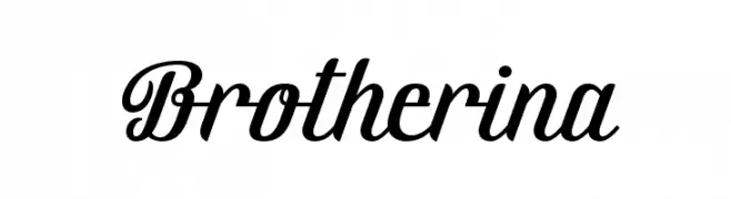
A modern, cursive script font with elegant, flowing lines.
![Brotherina Frei Schriftart Herunterladen]() Herunterladen 135 Downloads@WebFont
Herunterladen 135 Downloads@WebFont -
( Fonts by Emerald City Fontwerks - Steven J. Lundeen - www.speakeasy.org/~ecf/ )
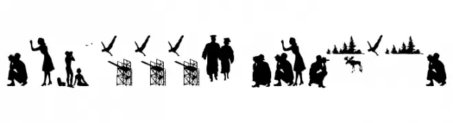
A pictorial silhouette font with narrative scenes for each character.
![stillframes Frei Schriftart Herunterladen]() Herunterladen 135 Downloads@WebFont
Herunterladen 135 Downloads@WebFont -
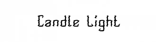
![Candle Light Frei Schriftart Herunterladen]() Herunterladen 135 Downloads@WebFont
Herunterladen 135 Downloads@WebFont -
( Fonts by Lafontype - Anugrah Pasau - Personal-use only. For commercial use please contact owner. )
A bold, modern sans-serif font with clean lines and balanced proportions.
![PelitaGrandeStd-Bold Frei Schriftart Herunterladen]() Herunterladen 135 Downloads@WebFont
Herunterladen 135 Downloads@WebFont -
( Fonts by Manfred Klein. Free for private and charity use. Free for commercial with donation to organizations )
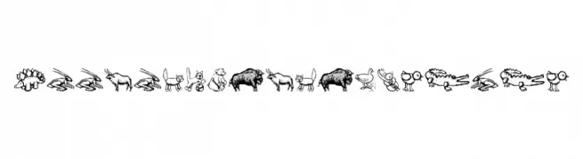
Hand-drawn animal doodle font with a playful, illustrative style.
![ZoologicalGardenOne Frei Schriftart Herunterladen]() Herunterladen 135 Downloads@WebFont
Herunterladen 135 Downloads@WebFont -
( cargocollective.com/mezarecabarren )
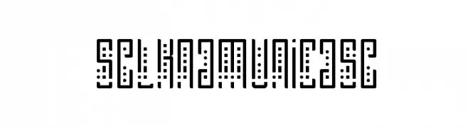
A geometric, modern font with a unicase style and dotted accents.
![SelknamUnicase Frei Schriftart Herunterladen]() Herunterladen 135 Downloads@WebFont
Herunterladen 135 Downloads@WebFont -
( Fonts by DLetters.Std )
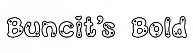
A playful, bold font with a bubble-like design and dotted pattern, ideal for fun projects.
![Buncit's Bold Frei Schriftart Herunterladen]() Herunterladen 135 Downloads@WebFont
Herunterladen 135 Downloads@WebFont -
( Fonts by Daniel Zadorozny - www.iconian.com )
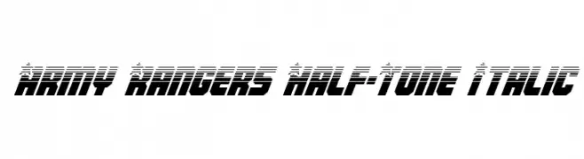
A bold, italicized font with a half-tone effect and dynamic, modern style.
![Army Rangers Half-Tone Italic Frei Schriftart Herunterladen]() Herunterladen 135 Downloads@WebFont
Herunterladen 135 Downloads@WebFont -
( Fonts by Billy Argel Fonts - www.billyargel.com - Personal-use only. For commercial use please contact owner. )
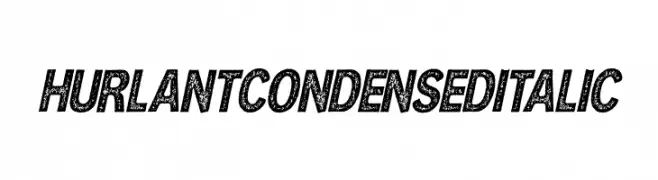
A bold, condensed italic font with a textured, vintage look.
![HURLANT CONDENSED ITALIC Frei Schriftart Herunterladen]() Herunterladen 135 Downloads@WebFont
Herunterladen 135 Downloads@WebFont -
( Fonts by StringLabs - stringlabscreative.com - Personal-use only. For commercial use please contact owner. )
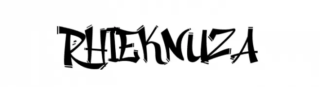
A bold, graffiti-inspired font with dynamic angles and curves.
![Rhieknuza Frei Schriftart Herunterladen]() Herunterladen 135 Downloads@WebFont
Herunterladen 135 Downloads@WebFont -
( Hazel Abbiati - diamondidiocy.tumblr.com )
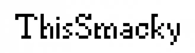
A pixelated, retro-style font with a blocky, digital appearance.
![ThisSmacky Frei Schriftart Herunterladen]() Herunterladen 135 Downloads@WebFont
Herunterladen 135 Downloads@WebFont -
( MGTheatrics )
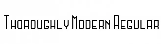
A modern, geometric font with clean lines and angular shapes.
![Thoroughly Modern Regular Frei Schriftart Herunterladen]() Herunterladen 135 Downloads@WebFont
Herunterladen 135 Downloads@WebFont -
( Fonts by a Andrew Hart Dirt2.com - SickCapital. Personal-use only. For commercial use please contact owner. )
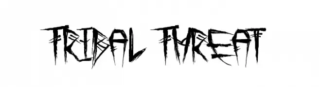
A bold, tribal-inspired font with sharp, jagged edges and a graffiti-like style.
![Tribal Threat Frei Schriftart Herunterladen]() Herunterladen 135 Downloads@WebFont
Herunterladen 135 Downloads@WebFont -
( Fonts by Scratchones )
A fluid and elegant script font with dynamic cursive letterforms.
![With Night Frei Schriftart Herunterladen]() Herunterladen 135 Downloads@WebFont
Herunterladen 135 Downloads@WebFont -
( Fonts by Daniel Zadorozny - www.iconian.com - Free for personal use )
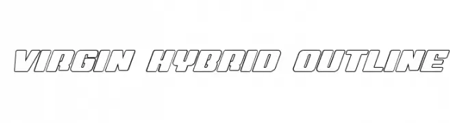
A bold, outlined font with a modern, geometric style.
![Virgin Hybrid Outline Frei Schriftart Herunterladen]() Herunterladen 135 Downloads@WebFont
Herunterladen 135 Downloads@WebFont -
( Fonts by www.peter-wiegel.de - Personal-use only. For commercial use please contact owner. )
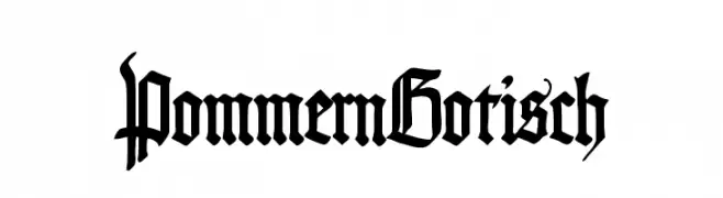
A decorative Gothic-style font with intricate, angular strokes and elaborate serifs.
![PommernGotisch Frei Schriftart Herunterladen]() Herunterladen 135 Downloads@WebFont
Herunterladen 135 Downloads@WebFont -
( Fonts by AlifRyanZulfikar - Personal-use only. For commercial use please contact owner. )
A modern, geometric sans-serif font with clean lines and a slightly condensed style.
![Alveru - Personal Use Frei Schriftart Herunterladen]() Herunterladen 135 Downloads@WebFont
Herunterladen 135 Downloads@WebFont -
( Fonts by Cannot Into Space Fonts )
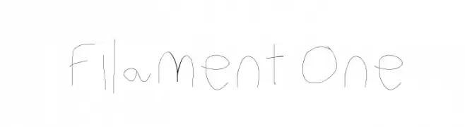
A delicate, hand-drawn font with thin, whimsical strokes and an organic feel.
![Filament One Frei Schriftart Herunterladen]() Herunterladen 135 Downloads@WebFont
Herunterladen 135 Downloads@WebFont -
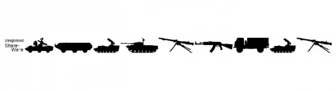
![Soviet-Kit Frei Schriftart Herunterladen]() Herunterladen 135 Downloads@WebFont
Herunterladen 135 Downloads@WebFont -
( Fonts by Vladimir Nikolic )
A modern, geometric font with bold, dynamic characters and integrated circular elements.
![Sparks Regular Frei Schriftart Herunterladen]() Herunterladen 135 Downloads@WebFont
Herunterladen 135 Downloads@WebFont -
( Fonts by Dondon Nillo - www.behance.net/dondon_nila056 - Personal-use only. For commercial use please contact owner. )
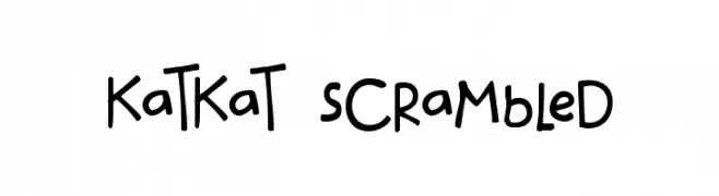
A playful, handwritten font with a casual and whimsical style.
![katkat_scrambled Frei Schriftart Herunterladen]() Herunterladen 135 Downloads@WebFont
Herunterladen 135 Downloads@WebFont -
( Fonts by Manfred Klein. Free for private and charity use. Free for commercial with donation to organizations )
A playful and artistic font featuring unique illustrative characters.
![FunBats Frei Schriftart Herunterladen]() Herunterladen 135 Downloads@WebFont
Herunterladen 135 Downloads@WebFont


Welche Schriften sind gerade am populärsten?
Poppins, Roboto, Montserrat, Open Sans und Lato sind wegen ihrer klaren Formen und breiten Einsetzbarkeit sehr gefragt – von Markenauftritt über Landingpages bis hin zu Postern.
Welche Fonts eignen sich für Logos?
Geometrische Sans‑Serifs (z. B. Poppins, Familien im Gotham‑Stil) sind ein häufiger Griff für sauberes, skalierbares Branding. Für eine persönlichere Note bleiben Scripts und Handschrift‑Stile beliebt. Kombinieren Sie einen prägnanten Headline‑Font mit einer neutralen Brotschrift für Wiedererkennung und Harmonie.
Wie oft wird die Top‑Liste aktualisiert?
Regelmäßig – basierend auf realen Downloads und Interaktionen. Schauen Sie öfter vorbei, um aufstrebende Favoriten früh zu entdecken.
💡 Tipp: Seite bookmarken – Trends wechseln schnell, und heutige Top‑Schriften inspirieren morgen vielleicht das Rebranding.