Willkommen bei den Top‑Schriften – hier treffen Beliebtheit und Qualität aufeinander. Das sind die in diesem Jahr am häufigsten heruntergeladenen und genutzten Fonts. Wenn Sie sichere Optionen für Logo, Web oder Social suchen, starten Sie hier.
Jeder Top‑Font überzeugt durch Balance, Lesbarkeit und Vielseitigkeit. Sie finden moderne Sans‑Serifs, elegante Scripts, Vintage‑Serifs und minimalistische Displays.
-
 Herunterladen 135 Downloads@WebFont
 -
( Fonts by Iconian Fonts )
A bold, italic font with a dynamic and energetic style.
![Ghoulish Intent Italic Frei Schriftart Herunterladen]() Herunterladen 135 Downloads@WebFont
Herunterladen 135 Downloads@WebFont -
( Fonts by wep - Wahyu Eka Prasetya - Personal-use only. For commercial use please contact owner. )
A bold, cursive font with elegant, flowing strokes.
![Alam Raya Frei Schriftart Herunterladen]() Herunterladen 135 Downloads@WebFont
Herunterladen 135 Downloads@WebFont -
![font_of_krewgz Frei Schriftart Herunterladen]() Herunterladen 135 Downloads@WebFont
Herunterladen 135 Downloads@WebFont -
![MaiLinh Frei Schriftart Herunterladen]() Herunterladen 135 Downloads@WebFont
Herunterladen 135 Downloads@WebFont -
( Fonts by Situjuh Nazara - 7ntypes.com - Personal-use only. For commercial use please contact owner. )
A bold, playful handwritten font with rounded edges and a casual style.
![Sotis Frei Schriftart Herunterladen]() Herunterladen 135 Downloads@WebFont
Herunterladen 135 Downloads@WebFont -
( Fonts by Manfred Klein. Free for private and charity use. Free for commercial with donation to organizations )
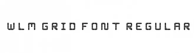
A grid-based, geometric font with a modern, technical aesthetic.
![SketchiquaC Frei Schriftart Herunterladen]() Herunterladen 135 Downloads@WebFont
Herunterladen 135 Downloads@WebFont -
( Fonts by Alex Slobzheninov - Personal-use only. For commercial use please contact owner. )
A modern, bold, and oblique sans-serif font with a dynamic style.
![FivoSansModern-BoldOblique Frei Schriftart Herunterladen]() Herunterladen 135 Downloads@WebFont
Herunterladen 135 Downloads@WebFont -
![CiSf OpenHand Bold Extended Oblique Frei Schriftart Herunterladen]() Herunterladen 135 Downloads@WebFont
Herunterladen 135 Downloads@WebFont -
( Fonts by Daniel Zadorozny - www.iconian.com - Free for personal use )
Decorative 3D font composed of detailed US Navy ship silhouettes.
![US Navy 3D Frei Schriftart Herunterladen]() Herunterladen 135 Downloads@WebFont
Herunterladen 135 Downloads@WebFont -
( Fonts by Inopatype )
An ornate, ribbon-inspired script font with elegant flourishes.
![Kaldevaderibbon Frei Schriftart Herunterladen]() Herunterladen 135 Downloads@WebFont
Herunterladen 135 Downloads@WebFont -
( Fonts by alphArtype )
A modern, elegant handwritten font with fluid, connected strokes.
![Relettered Frei Schriftart Herunterladen]() Herunterladen 135 Downloads@WebFont
Herunterladen 135 Downloads@WebFont -
![SplashBlobsnDots Frei Schriftart Herunterladen]() Herunterladen 135 Downloads@WebFont
Herunterladen 135 Downloads@WebFont -
( Fonts by Edric Studio - Personal-use only. For commercial use please contact owner. )
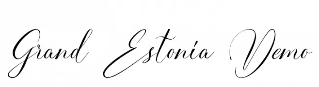
An elegant, cursive font with intricate, flowing strokes and ornate flourishes.
![Grand Estonia Demo Frei Schriftart Herunterladen]() Herunterladen 135 Downloads@WebFont
Herunterladen 135 Downloads@WebFont -
( Fonts by Rich Gast - www.greywolfwebworks.com Sponsoren Schriftart )
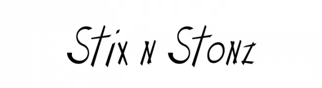
A playful, hand-drawn font with dynamic, tilted characters and varying stroke thickness.
![Stix n Stonz Frei Schriftart Herunterladen]() Herunterladen 135 Downloads
Herunterladen 135 Downloads -
![WLM Grid Font Regular Frei Schriftart Herunterladen]() Herunterladen 135 Downloads@WebFont
Herunterladen 135 Downloads@WebFont -
( Fonts by Almarkhatype - Abdul Malik Wisnu - Personal-use only. For commercial use please contact owner. )
A bold, modern serif font with elegant curves and strong strokes.
![Williesh Frei Schriftart Herunterladen]() Herunterladen 135 Downloads@WebFont
Herunterladen 135 Downloads@WebFont -
( Fonts by Iconian Fonts )
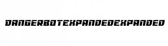
A bold, futuristic font with sharp angles and a mechanical aesthetic.
![Dangerbot Expanded Expanded Frei Schriftart Herunterladen]() Herunterladen 135 Downloads@WebFont
Herunterladen 135 Downloads@WebFont -
( Letterhend Studio - Hendry Juanda - creativemarket.com/letterhend )
A playful, bold handwritten font with rounded strokes and a casual style.
![Swiftone Frei Schriftart Herunterladen]() Herunterladen 135 Downloads@WebFont
Herunterladen 135 Downloads@WebFont -
( Free - fontstruct.fontshop.com/fontstructors/neoqueto )
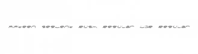
A segmented, digital-style font with a futuristic and technical appearance.
![Fifteen Segment Rush Regular LDR Regular Frei Schriftart Herunterladen]() Herunterladen 135 Downloads@WebFont
Herunterladen 135 Downloads@WebFont -
( Fonts by Graphix Line Studio - Personal-use only. For commercial use please contact owner. )
A lively, flowing script font with elegant curves and a handwritten style.
![Sunglow Frei Schriftart Herunterladen]() Herunterladen 135 Downloads@WebFont
Herunterladen 135 Downloads@WebFont -
( 010Bus )
A pixelated, blocky font with a retro digital style.
![7px4bus Frei Schriftart Herunterladen]() Herunterladen 135 Downloads@WebFont
Herunterladen 135 Downloads@WebFont -
( Fonts by Kat`s Fun Fonts - Personal-use only. For commercial use please contact owner. )
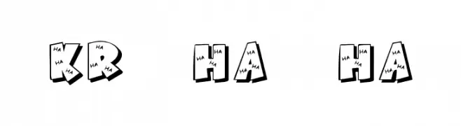
A playful, cartoonish font filled with 'HA' text and a 3D shadow effect.
![KR Ha Ha Frei Schriftart Herunterladen]() Herunterladen 135 Downloads@WebFont
Herunterladen 135 Downloads@WebFont -
( Ryan Williamson )
A modern, geometric font with a clean, monospaced appearance.
![Quota Regular Ext. Frei Schriftart Herunterladen]() Herunterladen 135 Downloads@WebFont
Herunterladen 135 Downloads@WebFont -
( Fonts by Quote-Unquote Apps - Personal-use only. For commercial use please contact owner. )
A monospaced, italic font with a clean, modern design ideal for coding.
![Courier Prime Code Italic Frei Schriftart Herunterladen]() Herunterladen 135 Downloads@WebFont
Herunterladen 135 Downloads@WebFont -
( Fonts by Blambot Comic Fonts - Personal-use only. For commercial use please contact owner. )
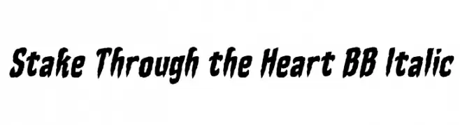
A bold, jagged, and italic font with a horror-themed aesthetic.
![Stake Through the Heart BB Italic Frei Schriftart Herunterladen]() Herunterladen 135 Downloads@WebFont
Herunterladen 135 Downloads@WebFont -
![Connor's Epic Font Regular Frei Schriftart Herunterladen]() Herunterladen 135 Downloads@WebFont
Herunterladen 135 Downloads@WebFont -
![SirinStencil Frei Schriftart Herunterladen]() Herunterladen 135 Downloads@WebFont
Herunterladen 135 Downloads@WebFont -
![Sughayer Separates 12 Frei Schriftart Herunterladen]() Herunterladen 135 Downloads@WebFont
Herunterladen 135 Downloads@WebFont -
( Fonts by Daniel Zadorozny - www.iconian.com )
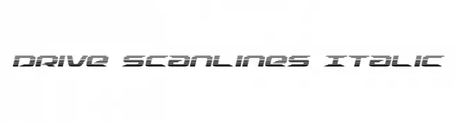
A futuristic, italic font with a scanline effect and sharp, clean lines.
![Drive Scanlines Italic Frei Schriftart Herunterladen]() Herunterladen 135 Downloads@WebFont
Herunterladen 135 Downloads@WebFont -
( Fonts by wep - Wahyu Eka Prasetya - Personal-use only. For commercial use please contact owner. )
A bold, distressed font with a rugged, textured appearance.
![Delman Frei Schriftart Herunterladen]() Herunterladen 135 Downloads@WebFont
Herunterladen 135 Downloads@WebFont -
( Fonts by Supersemar Letter )
A playful and whimsical font with tall, slender uppercase letters and rounded lowercase characters.
![Prettysally Frei Schriftart Herunterladen]() Herunterladen 135 Downloads@WebFont
Herunterladen 135 Downloads@WebFont -
( Fonts by www.junkohanhero.com - Personal-use only. For commercial use please contact owner. )
A hand-drawn, rustic font with a playful and organic style.
![Auribus tenere lupum Frei Schriftart Herunterladen]() Herunterladen 135 Downloads@WebFont
Herunterladen 135 Downloads@WebFont -
( www.siloseno.com )
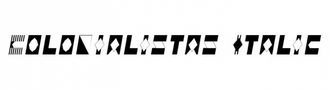
A bold, geometric font with diagonal lines and solid shapes, offering a modern and edgy look.
![Colonialistas Italic Frei Schriftart Herunterladen]() Herunterladen 135 Downloads@WebFont
Herunterladen 135 Downloads@WebFont -
( Fonts by Wahyu Eka Prasetya - wepfont.com - Personal-use only. For commercial use please contact owner. )
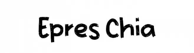
A playful, hand-drawn font with bold, irregular strokes and a rough texture.
![Epres Chia Frei Schriftart Herunterladen]() Herunterladen 135 Downloads@WebFont
Herunterladen 135 Downloads@WebFont


Welche Schriften sind gerade am populärsten?
Poppins, Roboto, Montserrat, Open Sans und Lato sind wegen ihrer klaren Formen und breiten Einsetzbarkeit sehr gefragt – von Markenauftritt über Landingpages bis hin zu Postern.
Welche Fonts eignen sich für Logos?
Geometrische Sans‑Serifs (z. B. Poppins, Familien im Gotham‑Stil) sind ein häufiger Griff für sauberes, skalierbares Branding. Für eine persönlichere Note bleiben Scripts und Handschrift‑Stile beliebt. Kombinieren Sie einen prägnanten Headline‑Font mit einer neutralen Brotschrift für Wiedererkennung und Harmonie.
Wie oft wird die Top‑Liste aktualisiert?
Regelmäßig – basierend auf realen Downloads und Interaktionen. Schauen Sie öfter vorbei, um aufstrebende Favoriten früh zu entdecken.
💡 Tipp: Seite bookmarken – Trends wechseln schnell, und heutige Top‑Schriften inspirieren morgen vielleicht das Rebranding.