Willkommen bei den Top‑Schriften – hier treffen Beliebtheit und Qualität aufeinander. Das sind die in diesem Jahr am häufigsten heruntergeladenen und genutzten Fonts. Wenn Sie sichere Optionen für Logo, Web oder Social suchen, starten Sie hier.
Jeder Top‑Font überzeugt durch Balance, Lesbarkeit und Vielseitigkeit. Sie finden moderne Sans‑Serifs, elegante Scripts, Vintage‑Serifs und minimalistische Displays.
-
( Fonts by Manfred Klein. Free for private and charity use. Free for commercial with donation to organizations )
Font made of fish and diver illustrations for each character.
 Herunterladen 135 Downloads@WebFont
 -
( Fonts by Google )
A modern, extra-light sans-serif font with a semi-condensed style.
![Noto Sans SemiCondensed ExtraLight Frei Schriftart Herunterladen]() Herunterladen 135 Downloads@WebFont
Herunterladen 135 Downloads@WebFont -
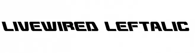
( Fonts by Daniel Zadorozny - www.iconian.com - Free for personal use )
A bold, futuristic font with a dynamic slant and geometric design.
![Livewired Leftalic Frei Schriftart Herunterladen]() Herunterladen 135 Downloads@WebFont
Herunterladen 135 Downloads@WebFont -
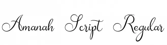
( Fonts by Alifinart Studio - Personal-use only. For commercial use please contact owner. )
An elegant script font with intricate loops and swashes, perfect for sophisticated designs.
![Amanah Script Regular Frei Schriftart Herunterladen]() Herunterladen 135 Downloads@WebFont
Herunterladen 135 Downloads@WebFont -
( Fonts by Garisman Studio - Risman Ginarwan - Personal-use only. For commercial use please contact owner. )
A modern, condensed sans-serif font with a clean and geometric design.
![Highly Frei Schriftart Herunterladen]() Herunterladen 135 Downloads@WebFont
Herunterladen 135 Downloads@WebFont -
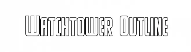
( Fonts by Daniel Zadorozny - www.iconian.com - Free for personal use )
A bold, outlined font with a geometric and modern style.
![Watchtower Outline Frei Schriftart Herunterladen]() Herunterladen 135 Downloads@WebFont
Herunterladen 135 Downloads@WebFont -
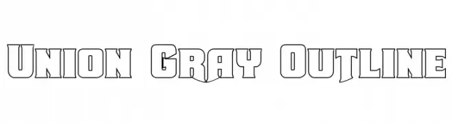
( Fonts by Daniel Zadorozny - www.iconian.com - Free for personal use )
A bold, outlined font with a geometric and angular design, perfect for impactful headlines.
![Union Gray Outline Frei Schriftart Herunterladen]() Herunterladen 135 Downloads@WebFont
Herunterladen 135 Downloads@WebFont -
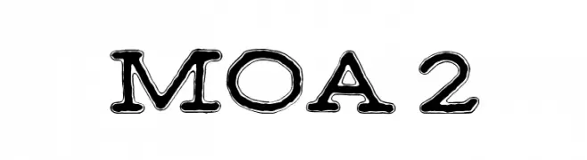
( Fonts by junkohanhero )
A bold, decorative font with outlined characters and a playful style.
![MOA 2 Frei Schriftart Herunterladen]() Herunterladen 135 Downloads@WebFont
Herunterladen 135 Downloads@WebFont -
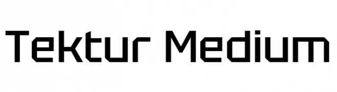
( Fonts by Adam Jagosz - Personal-use only. For commercial use please contact owner. )
A geometric, angular font with a modern and technical appearance.
![Tektur Medium Frei Schriftart Herunterladen]() Herunterladen 135 Downloads@WebFont
Herunterladen 135 Downloads@WebFont -
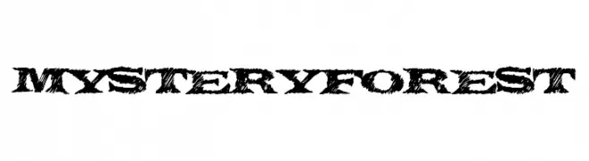
( Fonts by a Max Infeld - XEROGRAPHER FONTS - xerographer.blogspot.com . Personal-use only. For commercial use please contact owner. )
A rugged, textured font with a natural, wild aesthetic.
![MysteryForest Frei Schriftart Herunterladen]() Herunterladen 135 Downloads@WebFont
Herunterladen 135 Downloads@WebFont -
( Fonts by FreshtypeINK )
Playful handwritten script with tall, narrow, and whimsical letterforms.
![Staylife Frei Schriftart Herunterladen]() Herunterladen 135 Downloads@WebFont
Herunterladen 135 Downloads@WebFont -
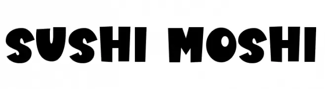
( Fonts by DM Studio )
A bold, playful font with chunky, whimsical characters.
![Sushi Moshi Frei Schriftart Herunterladen]() Herunterladen 135 Downloads@WebFont
Herunterladen 135 Downloads@WebFont -
( Fonts by a Max Infeld - XEROGRAPHER FONTS - xerographer.blogspot.com . Personal-use only. For commercial use please contact owner. )
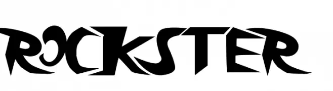
A bold, edgy font with sharp, angular lines and a modern, rebellious style.
![rockster Frei Schriftart Herunterladen]() Herunterladen 135 Downloads@WebFont
Herunterladen 135 Downloads@WebFont -
( Fonts by Woodcutter )
Bold, high-contrast tennis icon set with consistent silhouettes.
![Tennis Frei Schriftart Herunterladen]() Herunterladen 135 Downloads@WebFont
Herunterladen 135 Downloads@WebFont -
( Fonts by vladimirnikolic - Personal-use only. For commercial use please contact owner. )
A bold, italic, 3D font with outlined characters for a dynamic look.
![Aafia 3D Italic Frei Schriftart Herunterladen]() Herunterladen 135 Downloads@WebFont
Herunterladen 135 Downloads@WebFont -
![RRGemNStuff Frei Schriftart Herunterladen]() Herunterladen 135 Downloads@WebFont
Herunterladen 135 Downloads@WebFont -
( Fonts by ingoFonts. http://www.ingofonts.de )
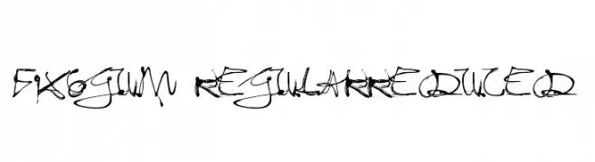
An expressive, brush-like font with dynamic strokes and a hand-drawn appearance.
![Fixogum-Regularreduced Frei Schriftart Herunterladen]() Herunterladen 135 Downloads@WebFont
Herunterladen 135 Downloads@WebFont -
( Fonts by Darrell Flood )
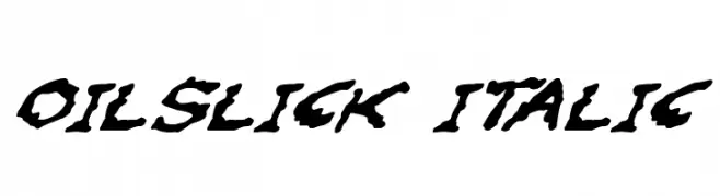
A bold, italic font with a textured, hand-drawn appearance.
![Oilslick Italic Frei Schriftart Herunterladen]() Herunterladen 135 Downloads@WebFont
Herunterladen 135 Downloads@WebFont -
( Fonts by Shara Weber )
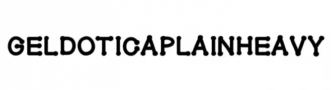
A bold, playful font with rounded, bubble-like characters.
![GelDoticaPlainHeavy Frei Schriftart Herunterladen]() Herunterladen 135 Downloads@WebFont
Herunterladen 135 Downloads@WebFont -
( Fonts by www.fenotype.com )
A decorative display font with botanical and nature-inspired elements.
![FT Kings Garden DEMO Frei Schriftart Herunterladen]() Herunterladen 135 Downloads@WebFont
Herunterladen 135 Downloads@WebFont -
( Fonts by Darrell Flood )
A bold, rugged font with an organic, ink-blot appearance.
![Oilslick Frei Schriftart Herunterladen]() Herunterladen 135 Downloads@WebFont
Herunterladen 135 Downloads@WebFont -
( Fonts by a Max Infeld - XEROGRAPHER FONTS - xerographer.blogspot.com . Personal-use only. For commercial use please contact owner. )
A dynamic, edgy handwritten font with sharp, angular strokes and a sense of movement.
![HighZombie Frei Schriftart Herunterladen]() Herunterladen 135 Downloads@WebFont
Herunterladen 135 Downloads@WebFont -
( Fonts by K_IN Studio )
A bold, playful handwritten font with dynamic curves and thick strokes.
![MINIMUM DEDLOCK Frei Schriftart Herunterladen]() Herunterladen 135 Downloads@WebFont
Herunterladen 135 Downloads@WebFont -
( Fonts by Emmanuel Thomassey - Personal-use only. For commercial use please contact owner. )
A modern, geometric font with bold lines and innovative use of negative space.
![Kiwi Frei Schriftart Herunterladen]() Herunterladen 135 Downloads@WebFont
Herunterladen 135 Downloads@WebFont -
( Fonts by Iconian Fonts )
A bold, distressed font with a rugged, eroded appearance.
![Red Undead Expanded Frei Schriftart Herunterladen]() Herunterladen 135 Downloads@WebFont
Herunterladen 135 Downloads@WebFont -
( Fonts by 7NTypes )
A playful, hollow decorative font with bold strokes and whimsical style.
![Gift Of Love Hollow Frei Schriftart Herunterladen]() Herunterladen 135 Downloads@WebFont
Herunterladen 135 Downloads@WebFont -
( Fonts by Shara Weber )
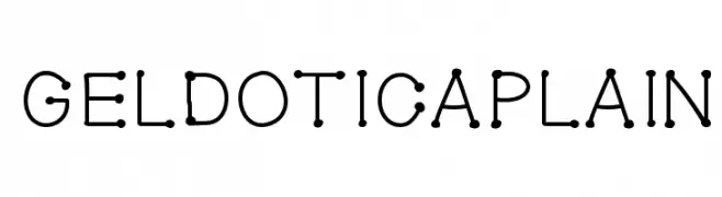
A playful dot-based font with rounded characters connected by thin lines.
![GelDoticaPlain Frei Schriftart Herunterladen]() Herunterladen 135 Downloads@WebFont
Herunterladen 135 Downloads@WebFont -
( Iconian Fonts - Daniel Zadorozny - www.iconian.com )
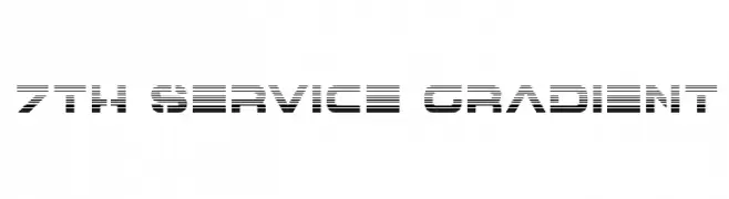
A futuristic, gradient-lined font with bold, geometric characters.
![7th Service Gradient Frei Schriftart Herunterladen]() Herunterladen 135 Downloads@WebFont
Herunterladen 135 Downloads@WebFont -
( Phitradesign - Philip Trautmann - www.phitradesign-fonts.com )
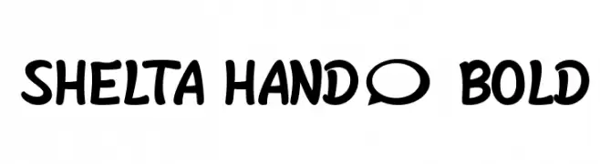
A bold, playful handwritten font with rounded, irregular letterforms.
![Shelta Hand* Bold Frei Schriftart Herunterladen]() Herunterladen 135 Downloads@WebFont
Herunterladen 135 Downloads@WebFont -
( Fonts by Woodcutter )
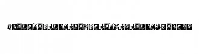
Portrait-based decorative font using U.S. presidents' faces as glyphs.
![Presidents of the United States of America Frei Schriftart Herunterladen]() Herunterladen 135 Downloads@WebFont
Herunterladen 135 Downloads@WebFont -
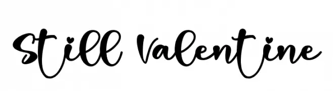
( Fonts by Letterara - Thomas Aradea - Personal-use only. For commercial use please contact owner. )
A playful, bold script font with a handwritten style.
![Still Valentine Frei Schriftart Herunterladen]() Herunterladen 135 Downloads@WebFont
Herunterladen 135 Downloads@WebFont -
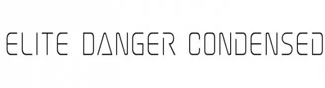
( Fonts by Iconian Fonts )
A modern, geometric, and condensed font with a sleek, minimalist design.
![Elite Danger Condensed Frei Schriftart Herunterladen]() Herunterladen 135 Downloads@WebFont
Herunterladen 135 Downloads@WebFont -
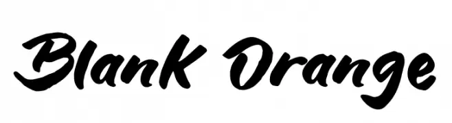
( Fonts by Syaf Rizal - Khurasan - Personal-use only. For commercial use please contact owner. )
A bold, expressive script font with a handwritten, cursive style.
![Blank Orange Frei Schriftart Herunterladen]() Herunterladen 135 Downloads@WebFont
Herunterladen 135 Downloads@WebFont -
( Fonts by www.blambot.com )
A bold, italicized font with a pixelated, digital aesthetic.
![DisposableDigiBB-BoldItalic Frei Schriftart Herunterladen]() Herunterladen 135 Downloads@WebFont
Herunterladen 135 Downloads@WebFont -
( Fonts by Manfred Klein. Free for private and charity use. Free for commercial with donation to organizations )
Intricate, abstract symbols with a futuristic and dynamic design.
![RosettaMutanta Frei Schriftart Herunterladen]() Herunterladen 135 Downloads@WebFont
Herunterladen 135 Downloads@WebFont


Welche Schriften sind gerade am populärsten?
Poppins, Roboto, Montserrat, Open Sans und Lato sind wegen ihrer klaren Formen und breiten Einsetzbarkeit sehr gefragt – von Markenauftritt über Landingpages bis hin zu Postern.
Welche Fonts eignen sich für Logos?
Geometrische Sans‑Serifs (z. B. Poppins, Familien im Gotham‑Stil) sind ein häufiger Griff für sauberes, skalierbares Branding. Für eine persönlichere Note bleiben Scripts und Handschrift‑Stile beliebt. Kombinieren Sie einen prägnanten Headline‑Font mit einer neutralen Brotschrift für Wiedererkennung und Harmonie.
Wie oft wird die Top‑Liste aktualisiert?
Regelmäßig – basierend auf realen Downloads und Interaktionen. Schauen Sie öfter vorbei, um aufstrebende Favoriten früh zu entdecken.
💡 Tipp: Seite bookmarken – Trends wechseln schnell, und heutige Top‑Schriften inspirieren morgen vielleicht das Rebranding.