Willkommen bei den Top‑Schriften – hier treffen Beliebtheit und Qualität aufeinander. Das sind die in diesem Jahr am häufigsten heruntergeladenen und genutzten Fonts. Wenn Sie sichere Optionen für Logo, Web oder Social suchen, starten Sie hier.
Jeder Top‑Font überzeugt durch Balance, Lesbarkeit und Vielseitigkeit. Sie finden moderne Sans‑Serifs, elegante Scripts, Vintage‑Serifs und minimalistische Displays.
-
( Fonts by Apostrophic Lab )
A futuristic, geometric font with angular lines and a modern aesthetic.
 Herunterladen 133 Downloads@WebFont
 -
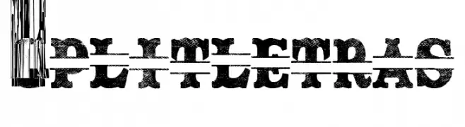
( Fonts by Woodcutter )
A bold, distressed font with a unique horizontal split effect, perfect for vintage and industrial designs.
![Split Letras Frei Schriftart Herunterladen]() Herunterladen 133 Downloads@WebFont
Herunterladen 133 Downloads@WebFont -
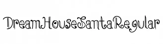
( Fonts by Eddy Goodboy )
A whimsical, curly font with playful loops and flourishes.
![DreamHouseSantaRegular Frei Schriftart Herunterladen]() Herunterladen 133 Downloads@WebFont
Herunterladen 133 Downloads@WebFont -
![ErbosDraco Nova NBP Regular Frei Schriftart Herunterladen]() Herunterladen 133 Downloads@WebFont
Herunterladen 133 Downloads@WebFont -
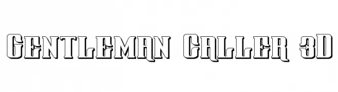
( Fonts by Daniel Zadorozny - www.iconian.com - Free for personal use )
A bold, 3D effect font with strong, blocky uppercase letters and high contrast.
![Gentleman Caller 3D Frei Schriftart Herunterladen]() Herunterladen 133 Downloads@WebFont
Herunterladen 133 Downloads@WebFont -
( Fonts by Display Studio )
A bold, italicized font with a playful and dynamic style.
![Sweet Creamy Italic Frei Schriftart Herunterladen]() Herunterladen 133 Downloads@WebFont
Herunterladen 133 Downloads@WebFont -
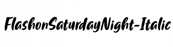
( Fonts by Situjuh Nazara - 7ntypes.com - Personal-use only. For commercial use please contact owner. )
A bold, italicized handwritten font with a lively and dynamic style.
![FlashonSaturdayNight-Italic Frei Schriftart Herunterladen]() Herunterladen 133 Downloads@WebFont
Herunterladen 133 Downloads@WebFont -
( Fonts by twinletter - Rozikan - Personal-use only. For commercial use please contact owner. )
A bold, rounded font with a distressed, vintage texture.
![Radugo Personal Use Frei Schriftart Herunterladen]() Herunterladen 133 Downloads@WebFont
Herunterladen 133 Downloads@WebFont -
( lizalawson.com )
A casual, handwritten font with a playful and informal style.
![ThumperThursday Frei Schriftart Herunterladen]() Herunterladen 133 Downloads@WebFont
Herunterladen 133 Downloads@WebFont -
( Fonts by a Max Infeld - XEROGRAPHER FONTS - xerographer.blogspot.com . Personal-use only. For commercial use please contact owner. )
An edgy, thorn-like decorative font with sharp, jagged strokes.
![QuickSlash Frei Schriftart Herunterladen]() Herunterladen 133 Downloads@WebFont
Herunterladen 133 Downloads@WebFont -
( Fonts by Alifinart Studio - Personal-use only. For commercial use please contact owner. )
An elegant script font with intricate loops and swashes, perfect for sophisticated designs.
![Amanah Script Regular Frei Schriftart Herunterladen]() Herunterladen 133 Downloads@WebFont
Herunterladen 133 Downloads@WebFont -
( Fonts by Font Bundles )
A playful, hand-drawn font with whimsical outlines and bold strokes.
![FB-MommaHero2 Frei Schriftart Herunterladen]() Herunterladen 133 Downloads@WebFont
Herunterladen 133 Downloads@WebFont -
( Fonts by junkohanhero )
A bold, decorative font with outlined characters and a playful style.
![MOA 2 Frei Schriftart Herunterladen]() Herunterladen 133 Downloads@WebFont
Herunterladen 133 Downloads@WebFont -
![ANDROMEDA Normal Frei Schriftart Herunterladen]() Herunterladen 133 Downloads@WebFont
Herunterladen 133 Downloads@WebFont -
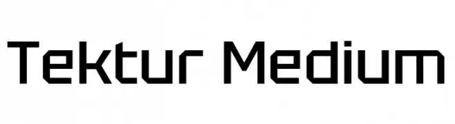
( Fonts by Adam Jagosz - Personal-use only. For commercial use please contact owner. )
A geometric, angular font with a modern and technical appearance.
![Tektur Medium Frei Schriftart Herunterladen]() Herunterladen 133 Downloads@WebFont
Herunterladen 133 Downloads@WebFont -
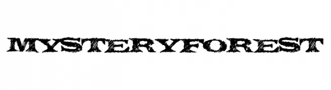
( Fonts by a Max Infeld - XEROGRAPHER FONTS - xerographer.blogspot.com . Personal-use only. For commercial use please contact owner. )
A rugged, textured font with a natural, wild aesthetic.
![MysteryForest Frei Schriftart Herunterladen]() Herunterladen 133 Downloads@WebFont
Herunterladen 133 Downloads@WebFont -
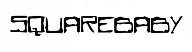
( www.leodsen.com )
A bold, geometric font with a blend of structured and handwritten elements.
![SQUAREBABY Frei Schriftart Herunterladen]() Herunterladen 133 Downloads@WebFont
Herunterladen 133 Downloads@WebFont -
( Fonts by a Max Infeld - XEROGRAPHER FONTS - xerographer.blogspot.com . Personal-use only. For commercial use please contact owner. )
A bold, stippled font with a playful and modern style.
![SpecialThird Frei Schriftart Herunterladen]() Herunterladen 133 Downloads@WebFont
Herunterladen 133 Downloads@WebFont -
![Higgledy Pigs Frei Schriftart Herunterladen]() Herunterladen 133 Downloads@WebFont
Herunterladen 133 Downloads@WebFont -
( Fonts by Beautypes )
A playful, bold font with a bubbly, cartoon-like appearance.
![mechababy Frei Schriftart Herunterladen]() Herunterladen 133 Downloads@WebFont
Herunterladen 133 Downloads@WebFont -
( Fonts by Hanken Design Co. - Personal-use only. For commercial use please contact owner. )
A sleek, minimalist font with thin, uniform lines and a modern aesthetic.
![NowAlt-Thin Frei Schriftart Herunterladen]() Herunterladen 133 Downloads@WebFont
Herunterladen 133 Downloads@WebFont -
( Fonts by Iconian Fonts )
A bold, 3D geometric font with outlined characters and a modern look.
![Viceroy of Deacons 3D Regular Frei Schriftart Herunterladen]() Herunterladen 133 Downloads@WebFont
Herunterladen 133 Downloads@WebFont -
( Fonts by zone108.main.jp - Personal-use only. For commercial use please contact owner. )
A bold, geometric font with a digital glitch effect, perfect for modern and edgy designs.
![Saikei Black Frei Schriftart Herunterladen]() Herunterladen 133 Downloads@WebFont
Herunterladen 133 Downloads@WebFont -
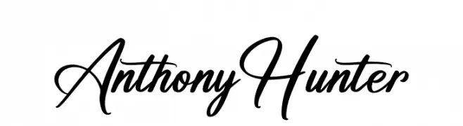
( Fonts by Letterena Studios - letterena.com - Personal-use only. For commercial use please contact owner. )
A flowing, cursive font with elegant curves and a sophisticated style.
![Anthony Hunter Frei Schriftart Herunterladen]() Herunterladen 133 Downloads@WebFont
Herunterladen 133 Downloads@WebFont -
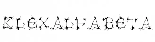
( Fonts by Manfred Klein. Free for private and charity use. Free for commercial with donation to organizations )
A decorative font with thorn-like embellishments, offering a gothic and organic appearance.
![Klexalfabeta Frei Schriftart Herunterladen]() Herunterladen 133 Downloads@WebFont
Herunterladen 133 Downloads@WebFont -
( Woodcutter - woodcutter Manero - www.woodcutter.es )
![Night Fever Again Frei Schriftart Herunterladen]() Herunterladen 133 Downloads@WebFont
Herunterladen 133 Downloads@WebFont -
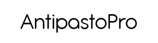
( Fonts by Zetafonts - Personal-use only. For commercial use please contact owner. )
A modern, geometric font with smooth, rounded edges and balanced spacing.
![Antipasto Pro Frei Schriftart Herunterladen]() Herunterladen 133 Downloads@WebFont
Herunterladen 133 Downloads@WebFont -
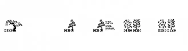
( Fonts by www.fenotype.com )
A decorative display font with botanical and nature-inspired elements.
![FT Kings Garden DEMO Frei Schriftart Herunterladen]() Herunterladen 133 Downloads@WebFont
Herunterladen 133 Downloads@WebFont -
( Fonts by Tigadestd )
A playful, bold font with a quirky, hand-drawn style.
![Romansa Frei Schriftart Herunterladen]() Herunterladen 133 Downloads@WebFont
Herunterladen 133 Downloads@WebFont -
( Fonts by a Max Infeld - XEROGRAPHER FONTS - xerographer.blogspot.com . Personal-use only. For commercial use please contact owner. )
A dynamic, edgy handwritten font with sharp, angular strokes and a sense of movement.
![HighZombie Frei Schriftart Herunterladen]() Herunterladen 133 Downloads@WebFont
Herunterladen 133 Downloads@WebFont -
( Fonts by Balpirick Studio - https://www.creativefabrica.com/designer/balpirick/ref/308299/ - Personal-use only. For commercial use please contact owner. )
A playful, casual handwritten font with flowing, irregular letterforms.
![Bridgestown Frei Schriftart Herunterladen]() Herunterladen 133 Downloads@WebFont
Herunterladen 133 Downloads@WebFont -
Schriftart von karaca. For commercial use please contact the owner.
( font )
A modern, geometric font with clean lines and balanced characters.
![Toreks Regular Frei Schriftart Herunterladen]() Herunterladen 133 Downloads
Herunterladen 133 Downloads -
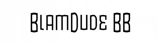
( Fonts by www.blambot.com )
A bold, geometric font with a modern, tech-inspired design.
![BlamDude BB Frei Schriftart Herunterladen]() Herunterladen 133 Downloads@WebFont
Herunterladen 133 Downloads@WebFont -
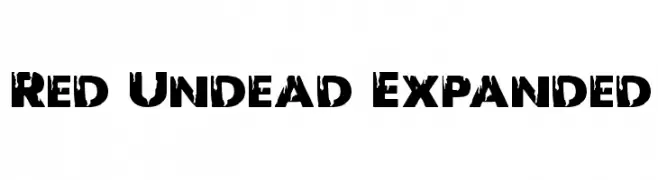
( Fonts by Iconian Fonts )
A bold, distressed font with a rugged, eroded appearance.
![Red Undead Expanded Frei Schriftart Herunterladen]() Herunterladen 133 Downloads@WebFont
Herunterladen 133 Downloads@WebFont -
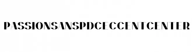
( Fonts by prescottdesignshop.com - Personal-use only. For commercial use please contact owner. )
A bold, high-contrast font with sharp angles and a modern, sophisticated style.
![PassionSansPDce-AccentCenter Frei Schriftart Herunterladen]() Herunterladen 133 Downloads@WebFont
Herunterladen 133 Downloads@WebFont


Welche Schriften sind gerade am populärsten?
Poppins, Roboto, Montserrat, Open Sans und Lato sind wegen ihrer klaren Formen und breiten Einsetzbarkeit sehr gefragt – von Markenauftritt über Landingpages bis hin zu Postern.
Welche Fonts eignen sich für Logos?
Geometrische Sans‑Serifs (z. B. Poppins, Familien im Gotham‑Stil) sind ein häufiger Griff für sauberes, skalierbares Branding. Für eine persönlichere Note bleiben Scripts und Handschrift‑Stile beliebt. Kombinieren Sie einen prägnanten Headline‑Font mit einer neutralen Brotschrift für Wiedererkennung und Harmonie.
Wie oft wird die Top‑Liste aktualisiert?
Regelmäßig – basierend auf realen Downloads und Interaktionen. Schauen Sie öfter vorbei, um aufstrebende Favoriten früh zu entdecken.
💡 Tipp: Seite bookmarken – Trends wechseln schnell, und heutige Top‑Schriften inspirieren morgen vielleicht das Rebranding.