Willkommen bei den Top‑Schriften – hier treffen Beliebtheit und Qualität aufeinander. Das sind die in diesem Jahr am häufigsten heruntergeladenen und genutzten Fonts. Wenn Sie sichere Optionen für Logo, Web oder Social suchen, starten Sie hier.
Jeder Top‑Font überzeugt durch Balance, Lesbarkeit und Vielseitigkeit. Sie finden moderne Sans‑Serifs, elegante Scripts, Vintage‑Serifs und minimalistische Displays.
-
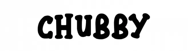
( Fonts by Darrell Flood )
A bold, playful font with rounded, chubby characters and a whimsical style.
 Herunterladen 134 Downloads@WebFont
 -
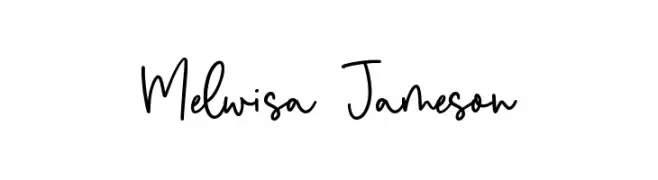
( Fonts by Balpirick Studio - https://www.creativefabrica.com/designer/balpirick/ref/308299/ - Personal-use only. For commercial use please contact owner. )
A playful, handwritten font with smooth, flowing strokes.
![Melwisa Jameson Frei Schriftart Herunterladen]() Herunterladen 134 Downloads@WebFont
Herunterladen 134 Downloads@WebFont -
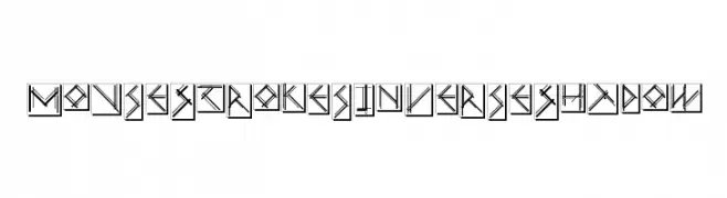
( Fonts by Manfred Klein. Free for private and charity use. Free for commercial with donation to organizations )
A modern, geometric font with inverse shadow effects and bold lines.
![MouseStrokesInverseShadow Frei Schriftart Herunterladen]() Herunterladen 134 Downloads@WebFont
Herunterladen 134 Downloads@WebFont -
( Fonts by Indian Type Foundry )
A modern, geometric font with consistent stroke width and balanced characters.
![Sarpanch Medium Frei Schriftart Herunterladen]() Herunterladen 134 Downloads@WebFont
Herunterladen 134 Downloads@WebFont -
( imagex - www.imagex-fonts.com )
A bold, rugged font with an organic, hand-drawn appearance.
![Swamp Black Frei Schriftart Herunterladen]() Herunterladen 134 Downloads@WebFont
Herunterladen 134 Downloads@WebFont -
( Fonts by IBM )
A modern, versatile sans-serif typeface with a clean and readable design.
![IBM Plex Sans SemiBold Frei Schriftart Herunterladen]() Herunterladen 134 Downloads@WebFont
Herunterladen 134 Downloads@WebFont -
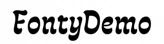
( Fonts by RodrigoTypo - Rodrigo Araya Salas - Personal-use only. For commercial use please contact owner. )
A bold, playful font with rounded edges and a whimsical style.
![Fonty Demo Frei Schriftart Herunterladen]() Herunterladen 134 Downloads@WebFont
Herunterladen 134 Downloads@WebFont -
( Fonts by Manfred Klein. Free for private and charity use. Free for commercial with donation to organizations )
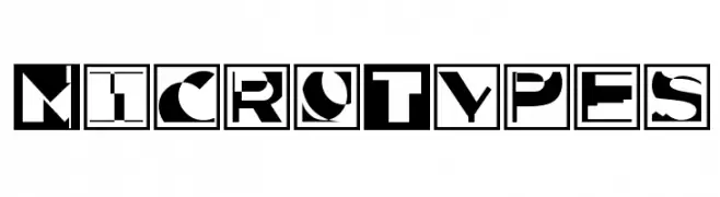
A bold, geometric font with high contrast and enclosed in square frames.
![MicroTypes Frei Schriftart Herunterladen]() Herunterladen 134 Downloads@WebFont
Herunterladen 134 Downloads@WebFont -
( Fonts by Font Environment - fontenvironment.com )
A decorative, playful font with a Latin American comic book style.
![FE-CheVivaBanana Frei Schriftart Herunterladen]() Herunterladen 134 Downloads@WebFont
Herunterladen 134 Downloads@WebFont -
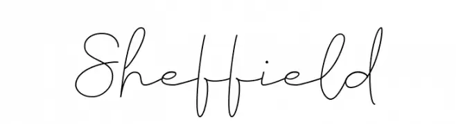
( Fonts by Fadlilah Studio - Personal-use only. For commercial use please contact owner. )
A delicate, handwritten script font with a smooth, flowing style.
![Sheffield Frei Schriftart Herunterladen]() Herunterladen 134 Downloads@WebFont
Herunterladen 134 Downloads@WebFont -
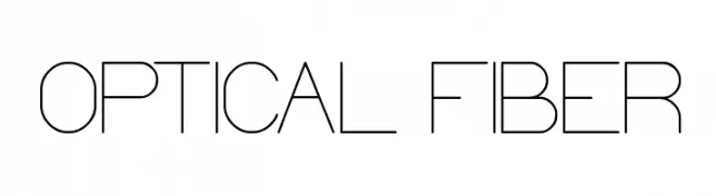
( Fonts by Wino S Kadir - weknow - www.revolge.com/shop/weknow/ - Personal-use only. For commercial use please contact owner. )
A sleek, modern font with geometric and minimalist design.
![OPTICAL FIBER Frei Schriftart Herunterladen]() Herunterladen 134 Downloads@WebFont
Herunterladen 134 Downloads@WebFont -
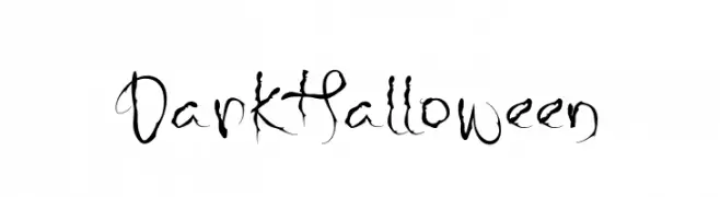
( Fonts by Reffan Suseno )
A spooky, decorative font with vine-like embellishments, perfect for Halloween themes.
![Dark Halloween Frei Schriftart Herunterladen]() Herunterladen 134 Downloads@WebFont
Herunterladen 134 Downloads@WebFont -
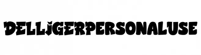
( Fonts by twinletter - Rozikan - Personal-use only. For commercial use please contact owner. )
A bold, playful font with chunky, dynamic characters and tight spacing.
![DELLIGER Personal Use Frei Schriftart Herunterladen]() Herunterladen 134 Downloads@WebFont
Herunterladen 134 Downloads@WebFont -
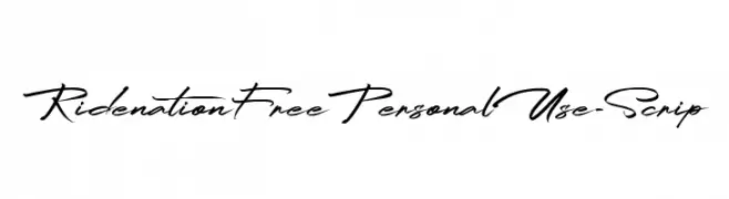
( Fonts by FHFont )
A dynamic cursive script font with fluid, interconnected letters.
![RidenationFreePersonalUse-Scrip Frei Schriftart Herunterladen]() Herunterladen 134 Downloads@WebFont
Herunterladen 134 Downloads@WebFont -
( www.woodcutter.es )
A playful, hand-drawn font with bold, irregular characters.
![woodcutter MMXII Frei Schriftart Herunterladen]() Herunterladen 134 Downloads@WebFont
Herunterladen 134 Downloads@WebFont -
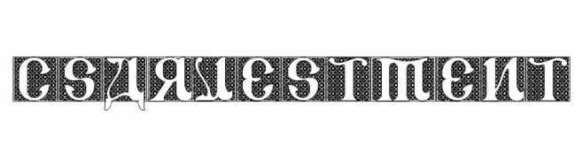
( Fonts by Bolt Cutter - www.boltcutterdesign.com - Personal-use only. For commercial use please contact owner. )
An ornate, decorative font with intricate geometric patterns and a historical aesthetic.
![CSAR VESTMENT Frei Schriftart Herunterladen]() Herunterladen 134 Downloads@WebFont
Herunterladen 134 Downloads@WebFont -
( Noto is a trademark of Google Inc. Noto fonts are open source. All Noto fonts are published under the SIL Open Font License, Version 1.1 )
A thin, modern sans-serif font with a clean and minimalist design.
![Noto Sans Symbols Thin Frei Schriftart Herunterladen]() Herunterladen 134 Downloads@WebFont
Herunterladen 134 Downloads@WebFont -
( Fonts by Des Gomez )
A playful, hand-drawn font with quirky, irregular shapes and a casual style.
![PancakesPlz Frei Schriftart Herunterladen]() Herunterladen 134 Downloads@WebFont
Herunterladen 134 Downloads@WebFont -
( Fonts by Iconian Fonts )
A bold, futuristic italic font with a three-dimensional effect.
![Oberon Deux Punch Italic Frei Schriftart Herunterladen]() Herunterladen 134 Downloads@WebFont
Herunterladen 134 Downloads@WebFont -
( Fonts by Paily Studio )
A bold, handwritten font with dynamic strokes and a playful vibe.
![Spicy Chicken Frei Schriftart Herunterladen]() Herunterladen 134 Downloads@WebFont
Herunterladen 134 Downloads@WebFont -
( Fonts by www.junkohanhero.com - Personal-use only. For commercial use please contact owner. )
A bold, brush-style font with an artistic and dynamic flair.
![It started here, again Frei Schriftart Herunterladen]() Herunterladen 134 Downloads@WebFont
Herunterladen 134 Downloads@WebFont -
( Fonts by Maulana Creative - Gilang Maulana - Personal-use only. For commercial use please contact owner. )
A bold, expressive script font with dynamic, flowing letterforms.
![Sunday Serve Free Regular Frei Schriftart Herunterladen]() Herunterladen 134 Downloads@WebFont
Herunterladen 134 Downloads@WebFont -
( Fonts by Daniel Zadorozny - www.iconian.com - Personal-use only. For commercial use please contact owner. )
A futuristic, italicized font with sharp, angular letterforms and a sci-fi aesthetic.
![Earth Orbiter Laser Italic Frei Schriftart Herunterladen]() Herunterladen 134 Downloads@WebFont
Herunterladen 134 Downloads@WebFont -
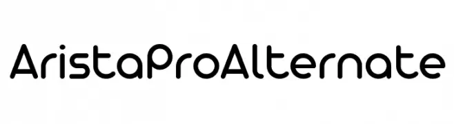
( Fonts by Zetafonts - Personal-use only. For commercial use please contact owner. )
A modern, rounded sans-serif font with a friendly and approachable style.
![AristaProAlternate Frei Schriftart Herunterladen]() Herunterladen 134 Downloads@WebFont
Herunterladen 134 Downloads@WebFont -
( Fonts by www.iconian.com - Personal-use only. For commercial use please contact owner. )
A bold, futuristic font with a halftone effect, ideal for dynamic designs.
![Edge Racer Halftone Frei Schriftart Herunterladen]() Herunterladen 134 Downloads@WebFont
Herunterladen 134 Downloads@WebFont -
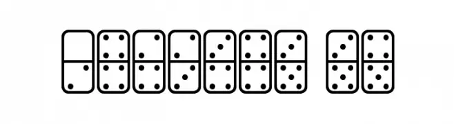
( www.southype.com )
Domino tile-inspired decorative font with dot patterns.
![Dominos St Frei Schriftart Herunterladen]() Herunterladen 134 Downloads@WebFont
Herunterladen 134 Downloads@WebFont -
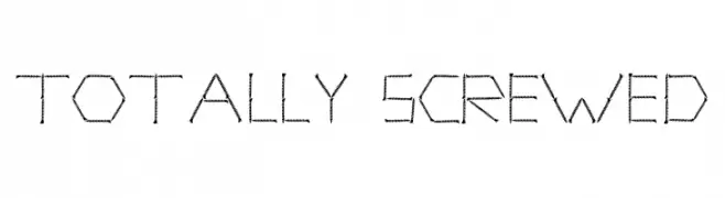
Schriftart von spideraysfonts. For commercial use please contact the owner.
( TOTALLY SCREWED )
A playful, mechanical font with characters resembling screws and bolts.
![TOTALLY SCREWED Frei Schriftart Herunterladen]() Herunterladen 134 Downloads@WebFont
Herunterladen 134 Downloads@WebFont -
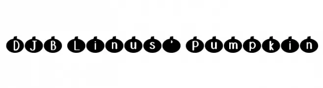
( Fonts by Darcy Baldwin {fontography} )
A playful font with characters enclosed in pumpkin shapes, perfect for seasonal themes.
![DJB Linus' Pumpkin Frei Schriftart Herunterladen]() Herunterladen 134 Downloads@WebFont
Herunterladen 134 Downloads@WebFont -
( Zetafonts - www.zetafonts.com )
A thin, elongated font with high contrast and a modern, sophisticated style.
![Cinematografica Thin Frei Schriftart Herunterladen]() Herunterladen 134 Downloads@WebFont
Herunterladen 134 Downloads@WebFont -
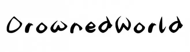
( Fonts by Graphics Bam )
A bold, expressive handwritten font with dynamic strokes.
![DrownedWorld Frei Schriftart Herunterladen]() Herunterladen 134 Downloads@WebFont
Herunterladen 134 Downloads@WebFont -
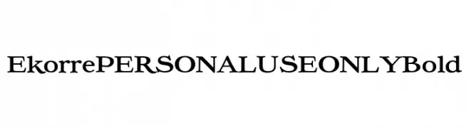
( Fonts by Mans Greback - Personal-use only. For commercial use please contact owner. )
A bold, classic serif font with high contrast and vintage appeal.
![Ekorre PERSONAL USE ONLY Bold Frei Schriftart Herunterladen]() Herunterladen 134 Downloads@WebFont
Herunterladen 134 Downloads@WebFont -
( Fonts by www.junkohanhero.com - Personal-use only. For commercial use please contact owner. )
A bold, distressed font with a textured, grunge effect.
![BORing Frei Schriftart Herunterladen]() Herunterladen 134 Downloads@WebFont
Herunterladen 134 Downloads@WebFont -
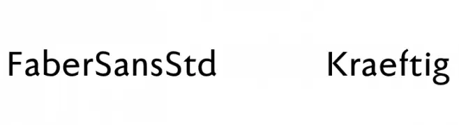
( Fonts by ingoFonts - Ingo Zimmermann - Personal-use only. For commercial use please contact owner. )
A modern sans-serif font with geometric shapes and balanced proportions.
![FaberSansStd-65Kraeftig Frei Schriftart Herunterladen]() Herunterladen 134 Downloads@WebFont
Herunterladen 134 Downloads@WebFont -
![Dispensations Frei Schriftart Herunterladen]() Herunterladen 134 Downloads@WebFont
Herunterladen 134 Downloads@WebFont -
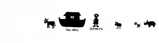
( Fonts by Font Environment - fontenvironment.com )
Hand-drawn, whimsical font with playful illustrations and casual, uneven letters.
![FE-Noah'sArk Frei Schriftart Herunterladen]() Herunterladen 134 Downloads@WebFont
Herunterladen 134 Downloads@WebFont


Welche Schriften sind gerade am populärsten?
Poppins, Roboto, Montserrat, Open Sans und Lato sind wegen ihrer klaren Formen und breiten Einsetzbarkeit sehr gefragt – von Markenauftritt über Landingpages bis hin zu Postern.
Welche Fonts eignen sich für Logos?
Geometrische Sans‑Serifs (z. B. Poppins, Familien im Gotham‑Stil) sind ein häufiger Griff für sauberes, skalierbares Branding. Für eine persönlichere Note bleiben Scripts und Handschrift‑Stile beliebt. Kombinieren Sie einen prägnanten Headline‑Font mit einer neutralen Brotschrift für Wiedererkennung und Harmonie.
Wie oft wird die Top‑Liste aktualisiert?
Regelmäßig – basierend auf realen Downloads und Interaktionen. Schauen Sie öfter vorbei, um aufstrebende Favoriten früh zu entdecken.
💡 Tipp: Seite bookmarken – Trends wechseln schnell, und heutige Top‑Schriften inspirieren morgen vielleicht das Rebranding.