Willkommen bei den Top‑Schriften – hier treffen Beliebtheit und Qualität aufeinander. Das sind die in diesem Jahr am häufigsten heruntergeladenen und genutzten Fonts. Wenn Sie sichere Optionen für Logo, Web oder Social suchen, starten Sie hier.
Jeder Top‑Font überzeugt durch Balance, Lesbarkeit und Vielseitigkeit. Sie finden moderne Sans‑Serifs, elegante Scripts, Vintage‑Serifs und minimalistische Displays.
-
( Fonts by a Neale Davidson - www.pixelsagas.com. Personal-use only. For commercial use please contact owner. )
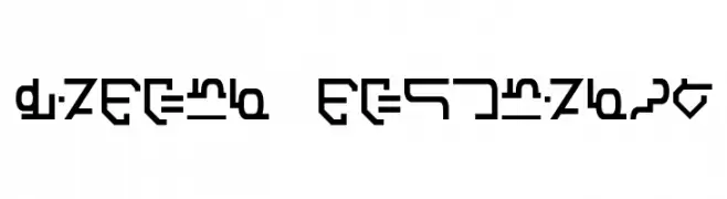
A futuristic, angular font with a digital, sci-fi aesthetic.
 Herunterladen 134 Downloads@WebFont
 -
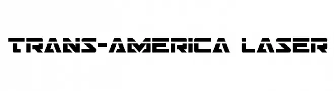
( Fonts by Daniel Zadorozny - www.iconian.com )
A bold, futuristic font with geometric shapes and a stencil-like design.
![Trans-America Laser Frei Schriftart Herunterladen]() Herunterladen 134 Downloads@WebFont
Herunterladen 134 Downloads@WebFont -
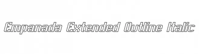
( Fonts by a Neale Davidson - www.pixelsagas.com. Personal-use only. For commercial use please contact owner. )
A modern, extended outline font with an italic slant, perfect for dynamic designs.
![Empanada Extended Outline Italic Frei Schriftart Herunterladen]() Herunterladen 134 Downloads@WebFont
Herunterladen 134 Downloads@WebFont -
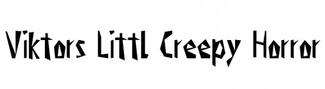
( Fonts by Manuel Viergutz - Typo Graphic Design - www.typographicdesign.de )
A jagged, eerie font perfect for horror-themed designs.
![Viktors Littl Creepy Horror Frei Schriftart Herunterladen]() Herunterladen 134 Downloads@WebFont
Herunterladen 134 Downloads@WebFont -
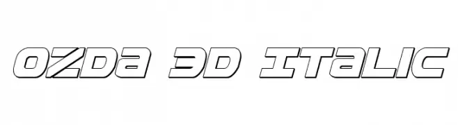
( Fonts by Daniel Zadorozny - www.iconian.com )
A bold, 3D italic font with a futuristic and dynamic style.
![Ozda 3D Italic Frei Schriftart Herunterladen]() Herunterladen 134 Downloads@WebFont
Herunterladen 134 Downloads@WebFont -
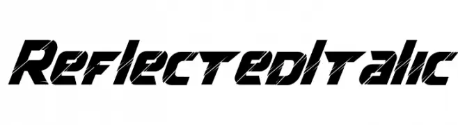
( Fonts by Kong Font - https://fontkong.com/ - Personal-use only. For commercial use please contact owner. )
A bold, italic font with sharp angles and a reflective, futuristic style.
![Reflected Italic Frei Schriftart Herunterladen]() Herunterladen 134 Downloads@WebFont
Herunterladen 134 Downloads@WebFont -
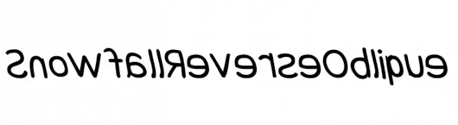
![Snowfall Reverse Oblique Frei Schriftart Herunterladen]() Herunterladen 134 Downloads@WebFont
Herunterladen 134 Downloads@WebFont -
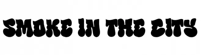
( Fonts by BlackFridayFont FMF )
Bold, playful font with a bubbly appearance.
![Smoke in the City Frei Schriftart Herunterladen]() Herunterladen 134 Downloads@WebFont
Herunterladen 134 Downloads@WebFont -
( Fonts by Lukas Krakora - Personal-use only. For commercial use please contact owner. )
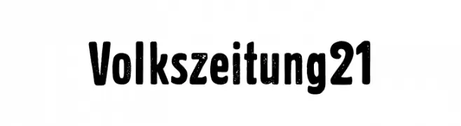
A bold, distressed font with a vintage, textured appearance.
![Volkszeitung 21 Frei Schriftart Herunterladen]() Herunterladen 134 Downloads@WebFont
Herunterladen 134 Downloads@WebFont -
( Eva Barabasne Olasz - www.etsy.com/ie/shop/digitaltypefaces )
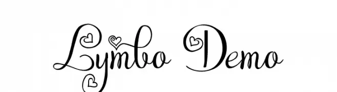
A whimsical script font with heart motifs and elegant, flowing letters.
![Lymbo Demo Frei Schriftart Herunterladen]() Herunterladen 134 Downloads@WebFont
Herunterladen 134 Downloads@WebFont -
( Fonts by Pablo Impallari, Rodrigo Fuenzalida (Modified by Dan O. Williams) - Personal-use only. For commercial use please contact owner. )
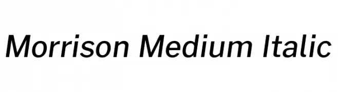
A modern, medium-weight italic font with sleek, dynamic characters.
![Morrison Medium Italic Frei Schriftart Herunterladen]() Herunterladen 134 Downloads@WebFont
Herunterladen 134 Downloads@WebFont -
![Rachel_Kate_Thick Frei Schriftart Herunterladen]() Herunterladen 134 Downloads@WebFont
Herunterladen 134 Downloads@WebFont -
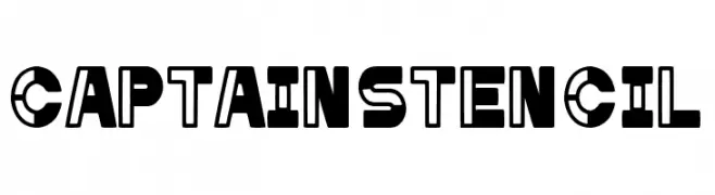
( Fonts by Woodcutter Manero - http://www.woodcutter.es - Personal-use only. For commercial use please contact owner. )
A bold, stencil-style font with geometric shapes and cut-out sections.
![Captain Stencil Frei Schriftart Herunterladen]() Herunterladen 134 Downloads@WebFont
Herunterladen 134 Downloads@WebFont -
( Thirtypath - www.thirtypath.com )
A decorative and handwritten font with playful curves and elegant swashes.
![serangkai Frei Schriftart Herunterladen]() Herunterladen 134 Downloads@WebFont
Herunterladen 134 Downloads@WebFont -
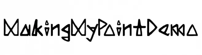
![Making My Point Demo Frei Schriftart Herunterladen]() Herunterladen 134 Downloads@WebFont
Herunterladen 134 Downloads@WebFont -
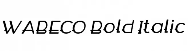
( Fonts by Paul Reis - Personal-use only. For commercial use please contact owner. )
A bold, italicized font with consistent stroke thickness and rounded edges.
![WABECO Bold Italic Frei Schriftart Herunterladen]() Herunterladen 134 Downloads@WebFont
Herunterladen 134 Downloads@WebFont -
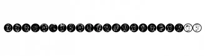
( Fonts by Manfred Klein. Free for private and charity use. Free for commercial with donation to organizations )
Expressive, hand-drawn faces and figures replace traditional letterforms in a playful, decorative style.
![DrawingWithTypefaces07 Frei Schriftart Herunterladen]() Herunterladen 134 Downloads@WebFont
Herunterladen 134 Downloads@WebFont -
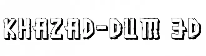
( Fonts by Daniel Zadorozny - www.iconian.com )
A bold, 3D stone-textured font with a rugged, angular design.
![Khazad-Dum 3D Frei Schriftart Herunterladen]() Herunterladen 134 Downloads@WebFont
Herunterladen 134 Downloads@WebFont -
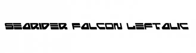
( Fonts by Daniel Zadorozny - www.iconian.com - Free for personal use )
A bold, futuristic font with angular, geometric shapes and consistent thickness.
![Searider Falcon Leftalic Frei Schriftart Herunterladen]() Herunterladen 134 Downloads@WebFont
Herunterladen 134 Downloads@WebFont -
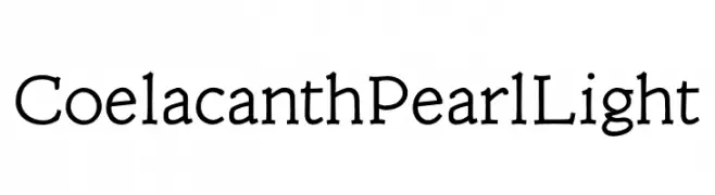
( Personal-use only. For commercial use please contact owner. )
A classic serif font with elegant, slightly flared serifs and a modern touch.
![Coelacanth Pearl Light Frei Schriftart Herunterladen]() Herunterladen 134 Downloads@WebFont
Herunterladen 134 Downloads@WebFont -
( Fonts by Xerographer Fonts )
A modern, geometric font with bold, angular characters.
![Ephemerian Frei Schriftart Herunterladen]() Herunterladen 134 Downloads@WebFont
Herunterladen 134 Downloads@WebFont -
( Fonts by Daniel Zadorozny - www.iconian.com - Free for personal use )
A bold, expanded, and italicized futuristic font with sharp angles.
![Searider Falcon Expanded Italic Frei Schriftart Herunterladen]() Herunterladen 134 Downloads@WebFont
Herunterladen 134 Downloads@WebFont -
( Fonts by Aqeela Studio - Muhammad Nasir - Personal-use only. For commercial use please contact owner. )
An elegant and flowing script font with intricate curves and sophisticated swashes.
![Mastura-Regular Frei Schriftart Herunterladen]() Herunterladen 134 Downloads@WebFont
Herunterladen 134 Downloads@WebFont -
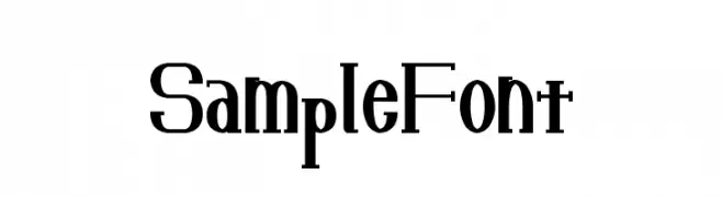
( Fonts by Baka - Kyakirun - bakafonts.kyakirun.com )
A high-contrast serif font with a blend of modern and vintage styles.
![SampleFont Frei Schriftart Herunterladen]() Herunterladen 134 Downloads@WebFont
Herunterladen 134 Downloads@WebFont -
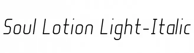
( Fonts by Manuel Viergutz - Typo Graphic Design - www.typographicdesign.de )
A sleek, modern, and italic font with a light, airy feel and low contrast.
![Soul Lotion Light-Italic Frei Schriftart Herunterladen]() Herunterladen 134 Downloads@WebFont
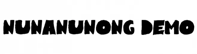
Herunterladen 134 Downloads@WebFont -
![Nunanunong Demo Frei Schriftart Herunterladen]() Herunterladen 134 Downloads@WebFont
Herunterladen 134 Downloads@WebFont -
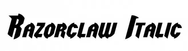
( Fonts by a Neale Davidson - www.pixelsagas.com. Personal-use only. For commercial use please contact owner. )
A bold, angular, and italicized font with a dynamic and edgy style.
![Razorclaw Italic Frei Schriftart Herunterladen]() Herunterladen 134 Downloads@WebFont
Herunterladen 134 Downloads@WebFont -
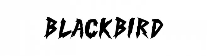
( Fonts by MaknaStudio - Yudis Tira - Personal-use only. For commercial use please contact owner. )
A bold, jagged font with sharp, angular edges for an aggressive look.
![Black Bird Frei Schriftart Herunterladen]() Herunterladen 134 Downloads@WebFont
Herunterladen 134 Downloads@WebFont -
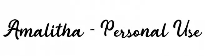
( Fonts by Attype Studio - Fadli Ramadhan Iskandar - Personal-use only. For commercial use please contact owner. )
A modern, cursive script font with interconnected letters and a dynamic style.
![Amalitha - Personal Use Frei Schriftart Herunterladen]() Herunterladen 134 Downloads@WebFont
Herunterladen 134 Downloads@WebFont -
![Icons Social Media 9 Frei Schriftart Herunterladen]() Herunterladen 134 Downloads@WebFont
Herunterladen 134 Downloads@WebFont -
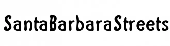
( Fonts by George Williams - Personal-use only. For commercial use please contact owner. )
A playful, hand-drawn style font with bold, rounded characters.
![Santa Barbara Streets Frei Schriftart Herunterladen]() Herunterladen 134 Downloads@WebFont
Herunterladen 134 Downloads@WebFont -
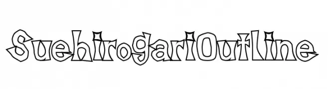
( Fonts by Baka - Kyakirun - bakafonts.kyakirun.com )
A bold, outlined font with a playful and artistic design.
![SuehirogariOutline Frei Schriftart Herunterladen]() Herunterladen 134 Downloads@WebFont
Herunterladen 134 Downloads@WebFont -
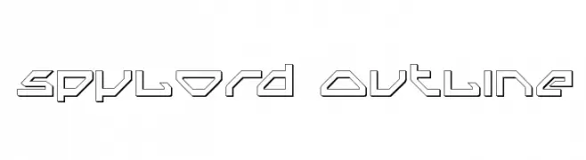
( Fonts by Daniel Zadorozny - www.iconian.com - Free for personal use )
A futuristic, geometric outline font with sharp angles and straight lines.
![Spylord Outline Frei Schriftart Herunterladen]() Herunterladen 134 Downloads@WebFont
Herunterladen 134 Downloads@WebFont -
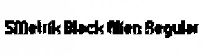
( Fonts by Winter Design Studio - winty5.wixsite.com/noahtheawesome/ - Personal-use only. For commercial use please contact owner. )
A bold, angular font with a futuristic, alien-like design.
![5Metrik Black Alien Regular Frei Schriftart Herunterladen]() Herunterladen 134 Downloads@WebFont
Herunterladen 134 Downloads@WebFont -
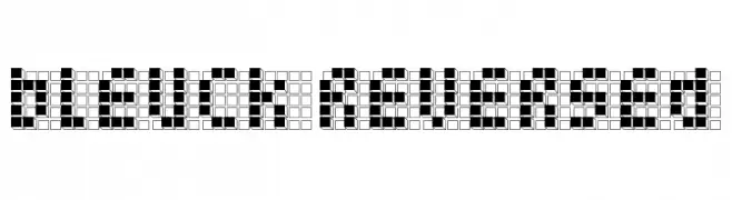
( Free - www.vnbc.fr )
A pixelated, retro-style font with a bold, geometric design.
![bleuck reversed Frei Schriftart Herunterladen]() Herunterladen 134 Downloads@WebFont
Herunterladen 134 Downloads@WebFont


Welche Schriften sind gerade am populärsten?
Poppins, Roboto, Montserrat, Open Sans und Lato sind wegen ihrer klaren Formen und breiten Einsetzbarkeit sehr gefragt – von Markenauftritt über Landingpages bis hin zu Postern.
Welche Fonts eignen sich für Logos?
Geometrische Sans‑Serifs (z. B. Poppins, Familien im Gotham‑Stil) sind ein häufiger Griff für sauberes, skalierbares Branding. Für eine persönlichere Note bleiben Scripts und Handschrift‑Stile beliebt. Kombinieren Sie einen prägnanten Headline‑Font mit einer neutralen Brotschrift für Wiedererkennung und Harmonie.
Wie oft wird die Top‑Liste aktualisiert?
Regelmäßig – basierend auf realen Downloads und Interaktionen. Schauen Sie öfter vorbei, um aufstrebende Favoriten früh zu entdecken.
💡 Tipp: Seite bookmarken – Trends wechseln schnell, und heutige Top‑Schriften inspirieren morgen vielleicht das Rebranding.