Willkommen bei den Top‑Schriften – hier treffen Beliebtheit und Qualität aufeinander. Das sind die in diesem Jahr am häufigsten heruntergeladenen und genutzten Fonts. Wenn Sie sichere Optionen für Logo, Web oder Social suchen, starten Sie hier.
Jeder Top‑Font überzeugt durch Balance, Lesbarkeit und Vielseitigkeit. Sie finden moderne Sans‑Serifs, elegante Scripts, Vintage‑Serifs und minimalistische Displays.
-
( Fonts by a kmzero font foundry - www.zetafonts.com. Personal-use only. For commercial use please contact owner. )
A bold, cursive font with flowing, interconnected strokes and high contrast.
 Herunterladen 2252 Downloads@WebFont
 -
( Fonts by www.peter-wiegel.de. Personal-use only. For commercial use please contact owner. )
A modern, rounded font with a sleek and futuristic style.
![SparTakusRound Frei Schriftart Herunterladen]() Herunterladen 2252 Downloads@WebFont
Herunterladen 2252 Downloads@WebFont -
( Fonts by Maelle.K - Thomas Boucherie )
A whimsical and decorative font with intricate loops and curls.
![Jack and the Beanstalk Frei Schriftart Herunterladen]() Herunterladen 2252 Downloads@WebFont
Herunterladen 2252 Downloads@WebFont -
( Fonts by SDFonts - Ritzy )
A classic serif font with sharp serifs and a strong, authoritative presence.
![Empiric Roman Frei Schriftart Herunterladen]() Herunterladen 2252 Downloads@WebFont
Herunterladen 2252 Downloads@WebFont -
( Fonts by Peter Rempel - www.prfonts.com )
A bold, angular font inspired by ancient Greek inscriptions.
![Herakles Frei Schriftart Herunterladen]() Herunterladen 2252 Downloads@WebFont
Herunterladen 2252 Downloads@WebFont -
( Fonts by RodrigoTypo - Rodrigo Araya Salas - Personal-use only. For commercial use please contact owner. )
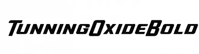
A bold, textured font with a rugged, industrial style.
![Tunning Oxide Bold Frei Schriftart Herunterladen]() Herunterladen 2251 Downloads@WebFont
Herunterladen 2251 Downloads@WebFont -
Schriftart von joorgemoron. For commercial use please contact the owner.
( free for personal use )
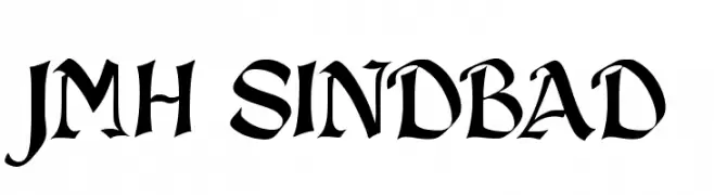
A bold, medieval-inspired font with sharp, angular edges and decorative elements.
![JMH Sindbad Frei Schriftart Herunterladen]() Herunterladen 2251 Downloads@WebFont
Herunterladen 2251 Downloads@WebFont -
![American Dream Frei Schriftart Herunterladen]() Herunterladen 2251 Downloads@WebFont
Herunterladen 2251 Downloads@WebFont -
( Fonts by Fachran Heit )
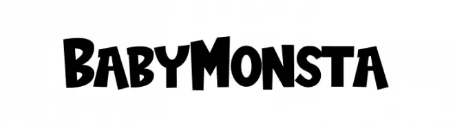
A playful, bold font with chunky, hand-drawn letters and high contrast.
![BabyMonsta Frei Schriftart Herunterladen]() Herunterladen 2250 Downloads@WebFont
Herunterladen 2250 Downloads@WebFont -
( Fonts by CannotIntoSpaceFonts - KineticPlasma Fonts - Personal-use only. For commercial use please contact owner. )
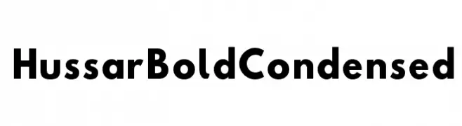
A bold, condensed font with strong strokes and compact design.
![Hussar Bold Condensed Frei Schriftart Herunterladen]() Herunterladen 2250 Downloads@WebFont
Herunterladen 2250 Downloads@WebFont -
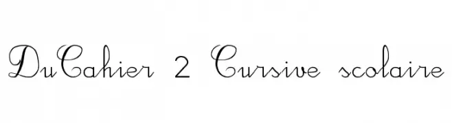
![DuCahier 2 Cursive scolaire Frei Schriftart Herunterladen]() Herunterladen 2250 Downloads@WebFont
Herunterladen 2250 Downloads@WebFont -
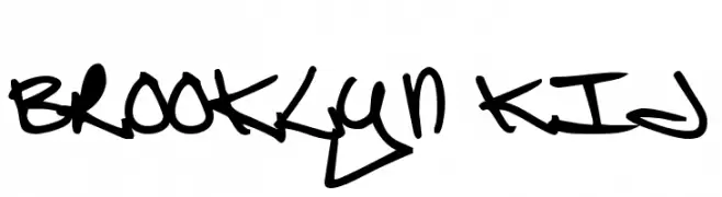
![Brooklyn Kid Frei Schriftart Herunterladen]() Herunterladen 2250 Downloads@WebFont
Herunterladen 2250 Downloads@WebFont -
( Fonts by Fonts by Rasmus Andersson / Changes by Cristiano Sobral with parts from Marc Monis - Personal-use only. For commercial use please contact owner. )
A clean, modern sans-serif font with balanced proportions and excellent readability.
![LinikSans-Regular Frei Schriftart Herunterladen]() Herunterladen 2249 Downloads@WebFont
Herunterladen 2249 Downloads@WebFont -
![Carson Frei Schriftart Herunterladen]() Herunterladen 2249 Downloads@WebFont
Herunterladen 2249 Downloads@WebFont -
( Copyright (c) 2012, vernon adams (vern@newtypography.co.uk), with Reserved Font Names "Oxygen" and "Oxygen Regular" )
A modern, geometric sans-serif font with clean lines and balanced proportions.
![Oxygen Frei Schriftart Herunterladen]() Herunterladen 2249 Downloads@WebFont
Herunterladen 2249 Downloads@WebFont -
( Free for non-commercial use. For commercial use please buy a license. http://www.cape-arcona.com )
A bold, 3D-effect font with strong shadows and a playful, modern style.
![CAGingerMint Frei Schriftart Herunterladen]() Herunterladen 2249 Downloads@WebFont
Herunterladen 2249 Downloads@WebFont -
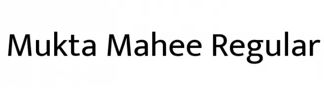
( Copyright (c) 2017, Ek Type. All rights reserved. )
A modern sans-serif typeface with clean lines and balanced proportions.
![Mukta Mahee Regular Frei Schriftart Herunterladen]() Herunterladen 2248 Downloads@WebFont
Herunterladen 2248 Downloads@WebFont -
![a]() Herunterladen 2248 Downloads@WebFont
Herunterladen 2248 Downloads@WebFont -
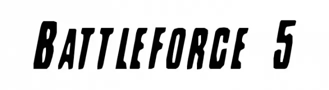
Schriftart von spideraysfonts. For commercial use please contact the owner.
![Battleforce 5 Frei Schriftart Herunterladen]() Herunterladen 2248 Downloads@WebFont
Herunterladen 2248 Downloads@WebFont -
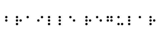
( Fonts by David Rakowski )
A tactile writing system using raised dots for visually impaired readers.
![Braille Regular Frei Schriftart Herunterladen]() Herunterladen 2248 Downloads@WebFont
Herunterladen 2248 Downloads@WebFont -
![Amrit-Lipi-Thick Regular Frei Schriftart Herunterladen]() Herunterladen 2248 Downloads@WebFont
Herunterladen 2248 Downloads@WebFont -
( Fonts by zulkhairilettering - Zulkhairi M Saleh - Personal-use only. For commercial use please contact owner. )
A cursive, handwritten-style font with elegant, flowing strokes.
![celia Frei Schriftart Herunterladen]() Herunterladen 2247 Downloads@WebFont
Herunterladen 2247 Downloads@WebFont -
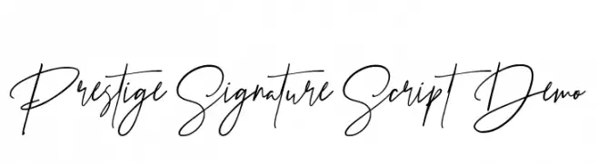
( Fontsgood - Ade Meiada )
An elegant, flowing script font with a sophisticated, handwritten style.
![Prestige Signature Script - Demo Frei Schriftart Herunterladen]() Herunterladen 2247 Downloads@WebFont
Herunterladen 2247 Downloads@WebFont -
![Cubic Game Frei Schriftart Herunterladen]() Herunterladen 2247 Downloads@WebFont
Herunterladen 2247 Downloads@WebFont -
![Unthrift First Personal Frei Schriftart Herunterladen]() Herunterladen 2247 Downloads@WebFont
Herunterladen 2247 Downloads@WebFont -
( Fonts by Andrew McCluskey - nalgames.com. Personal-use only. For commercial use please contact owner. )
A playful, casual handwritten font with rounded edges and moderate thickness.
![NAL Hand Frei Schriftart Herunterladen]() Herunterladen 2247 Downloads@WebFont
Herunterladen 2247 Downloads@WebFont -
( Copyright (c) 2011 Angel Koziupa (sudtipos@sudtipos.com) )
A bold, rugged font with a hand-carved appearance and irregular edges.
![Piedra Regular Frei Schriftart Herunterladen]() Herunterladen 2247 Downloads@WebFont
Herunterladen 2247 Downloads@WebFont -
( Fonts by Apostrophic Lab )
A bold, italicized font with a futuristic and dynamic style.
![Republika IV Exp - Ultra Italic Frei Schriftart Herunterladen]() Herunterladen 2247 Downloads@WebFont
Herunterladen 2247 Downloads@WebFont -
![Across The Stars Frei Schriftart Herunterladen]() Herunterladen 2247 Downloads@WebFont
Herunterladen 2247 Downloads@WebFont -
( Copyright (c) 2011, Jovanny Lemonad (http://www.jovanny.ru) )
A modern, clean sans-serif font with balanced spacing and consistent stroke width.
![Numans Frei Schriftart Herunterladen]() Herunterladen 2246 Downloads@WebFont
Herunterladen 2246 Downloads@WebFont -
![Matt Smith Doctor Who Regular Frei Schriftart Herunterladen]() Herunterladen 2246 Downloads@WebFont
Herunterladen 2246 Downloads@WebFont -
( Copyright (c) 2012-2015, Omnibus-Type (www.omnibus-type.com|omnibus.type@gmail.com) )
A modern, narrow sans-serif font with clean lines and uniform stroke width.
![Pragati Narrow Frei Schriftart Herunterladen]() Herunterladen 2245 Downloads@WebFont
Herunterladen 2245 Downloads@WebFont -
( www.fontgrube.de/ )
A traditional blackletter font with ornate, medieval-inspired letterforms.
![Traditio AH Frei Schriftart Herunterladen]() Herunterladen 2245 Downloads@WebFont
Herunterladen 2245 Downloads@WebFont -
( Fonts by Maelle.K - Thomas Boucherie )
A playful and whimsical font with bold, dynamic characters and a modern artistic style.
![Elephant Frei Schriftart Herunterladen]() Herunterladen 2245 Downloads@WebFont
Herunterladen 2245 Downloads@WebFont -
( Fonts by Indieground Design - Personal-use only. For commercial use please contact owner. )
A bold, modern sans-serif font with geometric shapes and uniform spacing.
![Radwave Demo Frei Schriftart Herunterladen]() Herunterladen 2244 Downloads@WebFont
Herunterladen 2244 Downloads@WebFont


Welche Schriften sind gerade am populärsten?
Poppins, Roboto, Montserrat, Open Sans und Lato sind wegen ihrer klaren Formen und breiten Einsetzbarkeit sehr gefragt – von Markenauftritt über Landingpages bis hin zu Postern.
Welche Fonts eignen sich für Logos?
Geometrische Sans‑Serifs (z. B. Poppins, Familien im Gotham‑Stil) sind ein häufiger Griff für sauberes, skalierbares Branding. Für eine persönlichere Note bleiben Scripts und Handschrift‑Stile beliebt. Kombinieren Sie einen prägnanten Headline‑Font mit einer neutralen Brotschrift für Wiedererkennung und Harmonie.
Wie oft wird die Top‑Liste aktualisiert?
Regelmäßig – basierend auf realen Downloads und Interaktionen. Schauen Sie öfter vorbei, um aufstrebende Favoriten früh zu entdecken.
💡 Tipp: Seite bookmarken – Trends wechseln schnell, und heutige Top‑Schriften inspirieren morgen vielleicht das Rebranding.