Willkommen bei den Top‑Schriften – hier treffen Beliebtheit und Qualität aufeinander. Das sind die in diesem Jahr am häufigsten heruntergeladenen und genutzten Fonts. Wenn Sie sichere Optionen für Logo, Web oder Social suchen, starten Sie hier.
Jeder Top‑Font überzeugt durch Balance, Lesbarkeit und Vielseitigkeit. Sie finden moderne Sans‑Serifs, elegante Scripts, Vintage‑Serifs und minimalistische Displays.
-
( Fonts by www.junkohanhero.com - Personal-use only. For commercial use please contact owner. )
A bold, distressed font with a textured, grunge effect.
 Herunterladen 134 Downloads@WebFont
 -
( Fonts by Polah Type )
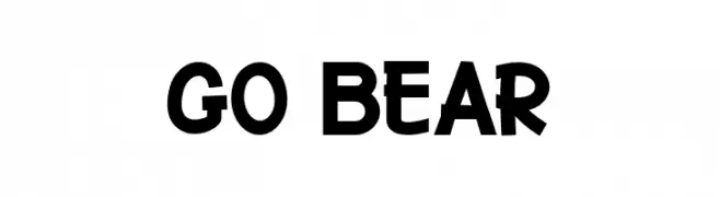
A playful, bold font with a hand-drawn, energetic style.
![Go Bear Frei Schriftart Herunterladen]() Herunterladen 134 Downloads@WebFont
Herunterladen 134 Downloads@WebFont -
( Fonts by Jonathan Pinhorn (font) & Cristiano Sobral (main changes) - Personal-use only. For commercial use please contact owner. )
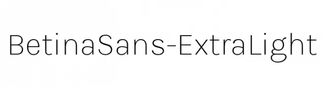
A clean, minimalist sans-serif font with an extra-light weight and modern appeal.
![BetinaSans-ExtraLight Frei Schriftart Herunterladen]() Herunterladen 134 Downloads@WebFont
Herunterladen 134 Downloads@WebFont -
( Fonts by Peter Wiegel - www.peter-wiegel.de - Personal-use only. For commercial use please contact owner. )
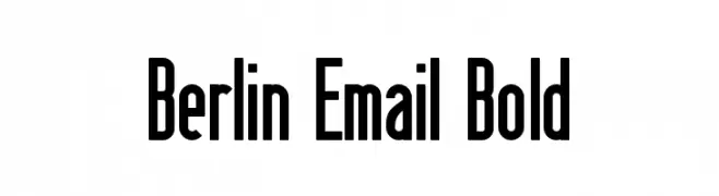
A bold, narrow font with a modern and impactful design.
![Berlin Email Bold Frei Schriftart Herunterladen]() Herunterladen 134 Downloads@WebFont
Herunterladen 134 Downloads@WebFont -
![Dispensations Frei Schriftart Herunterladen]() Herunterladen 134 Downloads@WebFont
Herunterladen 134 Downloads@WebFont -
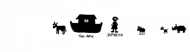
( Fonts by Font Environment - fontenvironment.com )
Hand-drawn, whimsical font with playful illustrations and casual, uneven letters.
![FE-Noah'sArk Frei Schriftart Herunterladen]() Herunterladen 134 Downloads@WebFont
Herunterladen 134 Downloads@WebFont -
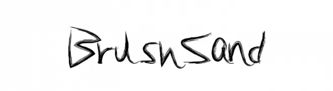
( Fonts by a Max Infeld - XEROGRAPHER FONTS - xerographer.blogspot.com . Personal-use only. For commercial use please contact owner. )
A dynamic, brush-stroke font with a hand-painted, artistic style.
![BrushSand Frei Schriftart Herunterladen]() Herunterladen 134 Downloads@WebFont
Herunterladen 134 Downloads@WebFont -
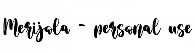
( Fonts by Letterara - Thomas Aradea - Personal-use only. For commercial use please contact owner. )
A bold, expressive handwritten font with dynamic strokes and lively movement.
![Merijola - personal use Frei Schriftart Herunterladen]() Herunterladen 134 Downloads@WebFont
Herunterladen 134 Downloads@WebFont -
( Fonts by Manfred Klein - manfred-klein.ina-mar.com )
A decorative, geometric font with uppercase letters in framed designs.
![RodgauerThree Frei Schriftart Herunterladen]() Herunterladen 134 Downloads@WebFont
Herunterladen 134 Downloads@WebFont -
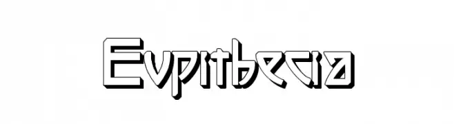
( Intellecta Design - new.myfonts.com/search/intellecta/fonts/?sort=sales?refby=paulow )
A bold, geometric font with a 3D shadow effect and sharp angles.
![Eupithecia Frei Schriftart Herunterladen]() Herunterladen 134 Downloads@WebFont
Herunterladen 134 Downloads@WebFont -
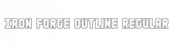
( Fonts by Daniel Zadorozny - www.iconian.com )
A bold, industrial outline font with a riveted, mechanical appearance.
![Iron Forge Outline Regular Frei Schriftart Herunterladen]() Herunterladen 134 Downloads@WebFont
Herunterladen 134 Downloads@WebFont -
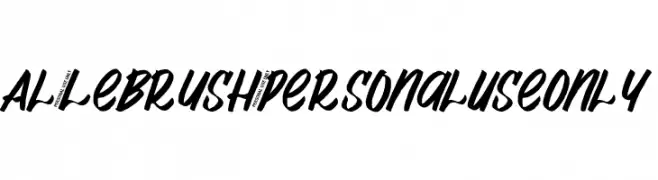
( Fonts by Aluyeah Studio - Personal-use only. For commercial use please contact owner. )
A bold, brush-style script font with dynamic and expressive strokes.
![Al_Lebrush_PersonalUseOnly Frei Schriftart Herunterladen]() Herunterladen 134 Downloads@WebFont
Herunterladen 134 Downloads@WebFont -
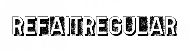
( Fonts by Vladimir Nikolic )
A bold, distressed font with a textured, grunge effect and strong outlines.
![Refait Regular Frei Schriftart Herunterladen]() Herunterladen 134 Downloads@WebFont
Herunterladen 134 Downloads@WebFont -
( Fonts by Iconian Fonts )
A bold, angular, and futuristic font with a dynamic slant.
![Capitol City Frei Schriftart Herunterladen]() Herunterladen 134 Downloads@WebFont
Herunterladen 134 Downloads@WebFont -
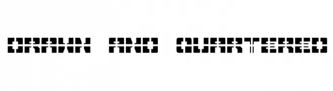
( Fonts by Rich Gast - www.greywolfwebworks.com Sponsoren Schriftart )
A bold, geometric stencil-style font with a modern, edgy look.
![Drawn And Quartered Frei Schriftart Herunterladen]() Herunterladen 134 Downloads
Herunterladen 134 Downloads -
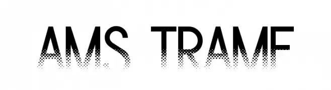
( Luc Mahler )
A modern font with a gradient dotted effect, perfect for creative designs.
![Ams Trame Frei Schriftart Herunterladen]() Herunterladen 134 Downloads@WebFont
Herunterladen 134 Downloads@WebFont -
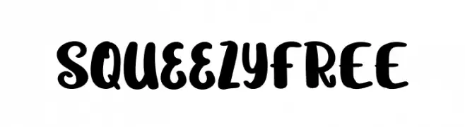
( Fonts by Vunira Design )
A playful, bold, and handwritten-style font with rounded characters.
![SqueezyFREE Frei Schriftart Herunterladen]() Herunterladen 134 Downloads@WebFont
Herunterladen 134 Downloads@WebFont -
( گالری فانت فارسی پژوهش آريانا - only compatible with Farsi and Arabic )
A bold, geometric font with blocky, angular letterforms.
![Elyaas Frei Schriftart Herunterladen]() Herunterladen 134 Downloads@WebFont
Herunterladen 134 Downloads@WebFont -
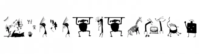
( Fonts by Manfred Klein. Free for private and charity use. Free for commercial with donation to organizations )
Primitive, cave-art inspired decorative font with hand-drawn figures.
![CaveBeings Frei Schriftart Herunterladen]() Herunterladen 134 Downloads@WebFont
Herunterladen 134 Downloads@WebFont -
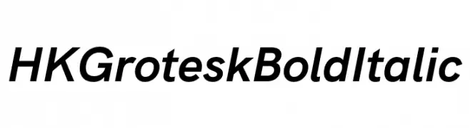
( Fonts by Hanken Design Co. )
A bold, italicized sans-serif font with a modern and dynamic style.
![HK Grotesk Bold Italic Frei Schriftart Herunterladen]() Herunterladen 134 Downloads@WebFont
Herunterladen 134 Downloads@WebFont -
( Copyright (c) 2015, Cadson Demak (info@cadsondemak.com) )
A thin, elegant italic font with a refined and sophisticated style.
![Taviraj Thin Italic Frei Schriftart Herunterladen]() Herunterladen 134 Downloads@WebFont
Herunterladen 134 Downloads@WebFont -
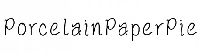
![PorcelainPaperPie Frei Schriftart Herunterladen]() Herunterladen 134 Downloads@WebFont
Herunterladen 134 Downloads@WebFont -
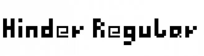
Schriftart von ArthurDiel. For commercial use please contact the owner.
![Hinder Regular Frei Schriftart Herunterladen]() Herunterladen 134 Downloads@WebFont
Herunterladen 134 Downloads@WebFont -
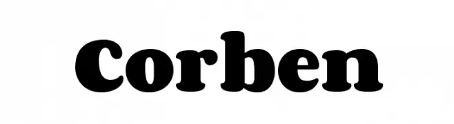
( Fonts by New Typography - Vernon Adams. Personal-use only. For commercial use please contact owner. )
A bold, rounded font with a playful and robust style.
![Corben Frei Schriftart Herunterladen]() Herunterladen 134 Downloads@WebFont
Herunterladen 134 Downloads@WebFont -
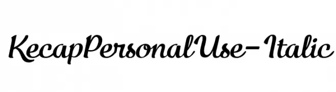
( Fonts by Eko Bimantara - Personal-use only. For commercial use please contact owner. )
A flowing, cursive italic font with interconnected characters and smooth curves.
![KecapPersonalUse-Italic Frei Schriftart Herunterladen]() Herunterladen 134 Downloads@WebFont
Herunterladen 134 Downloads@WebFont -
( Dan Roseman )
A bold, playful font with a cartoon-like, retro style.
![Baum Frei Schriftart Herunterladen]() Herunterladen 134 Downloads@WebFont
Herunterladen 134 Downloads@WebFont -
( Fonts by Vladimir Nikolic )
A bold, decorative font with a vintage gangster theme and 3D effect.
![Gangster Regular Frei Schriftart Herunterladen]() Herunterladen 134 Downloads@WebFont
Herunterladen 134 Downloads@WebFont -
( Fonts by Mariyana )
A fluid, cursive font with an elegant handwritten style.
![Salting Frei Schriftart Herunterladen]() Herunterladen 134 Downloads@WebFont
Herunterladen 134 Downloads@WebFont -
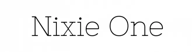
( Fonts by Jovanny Lemonad - typetype.ru - Personal-use only. For commercial use please contact owner. )
A modern, monospaced font with geometric, rounded characters.
![Nixie One Frei Schriftart Herunterladen]() Herunterladen 134 Downloads@WebFont
Herunterladen 134 Downloads@WebFont -
( Gartype Studio )
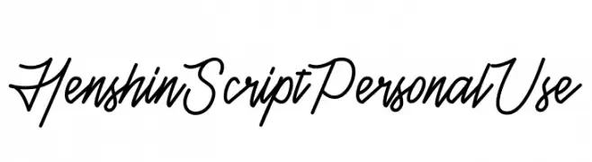
A fluid and elegant script font with dynamic cursive letterforms.
![Henshin Script Personal Use Frei Schriftart Herunterladen]() Herunterladen 134 Downloads@WebFont
Herunterladen 134 Downloads@WebFont -
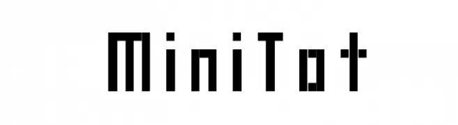
( Barmee - www.nowak.tv/fontoholic )
A bold, geometric font with a pixelated, digital aesthetic.
![MiniTot Frei Schriftart Herunterladen]() Herunterladen 134 Downloads@WebFont
Herunterladen 134 Downloads@WebFont -
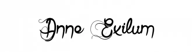
( Fonts by www.dcoxy.com )
A decorative and ornate font with intricate uppercase and cursive lowercase styles.
![Anne Exilum Frei Schriftart Herunterladen]() Herunterladen 134 Downloads@WebFont
Herunterladen 134 Downloads@WebFont -
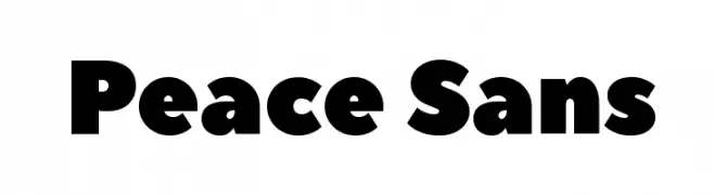
( Fonts by Jovanny Lemonad - typetype.ru - Personal-use only. For commercial use please contact owner. )
A bold, rounded font with a strong and friendly appearance.
![Peace Sans Frei Schriftart Herunterladen]() Herunterladen 134 Downloads@WebFont
Herunterladen 134 Downloads@WebFont -
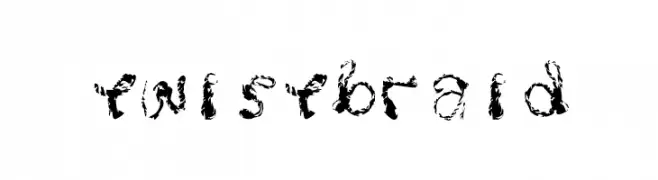
( https://www.facebook.com/ThebluebeekedDCK )
An artistic, braid-like decorative font with dynamic, textured strokes.
![Twistbraid Frei Schriftart Herunterladen]() Herunterladen 134 Downloads@WebFont
Herunterladen 134 Downloads@WebFont -
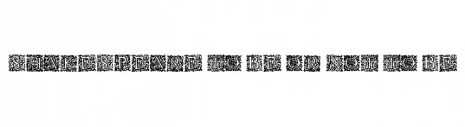
( www.davidpustansky.com/fonts )
An ornate, decorative font with intricate floral embellishments and a vintage feel.
![Shakespeare To Be Or Not To Be Frei Schriftart Herunterladen]() Herunterladen 134 Downloads@WebFont
Herunterladen 134 Downloads@WebFont


Welche Schriften sind gerade am populärsten?
Poppins, Roboto, Montserrat, Open Sans und Lato sind wegen ihrer klaren Formen und breiten Einsetzbarkeit sehr gefragt – von Markenauftritt über Landingpages bis hin zu Postern.
Welche Fonts eignen sich für Logos?
Geometrische Sans‑Serifs (z. B. Poppins, Familien im Gotham‑Stil) sind ein häufiger Griff für sauberes, skalierbares Branding. Für eine persönlichere Note bleiben Scripts und Handschrift‑Stile beliebt. Kombinieren Sie einen prägnanten Headline‑Font mit einer neutralen Brotschrift für Wiedererkennung und Harmonie.
Wie oft wird die Top‑Liste aktualisiert?
Regelmäßig – basierend auf realen Downloads und Interaktionen. Schauen Sie öfter vorbei, um aufstrebende Favoriten früh zu entdecken.
💡 Tipp: Seite bookmarken – Trends wechseln schnell, und heutige Top‑Schriften inspirieren morgen vielleicht das Rebranding.