Willkommen bei den Top‑Schriften – hier treffen Beliebtheit und Qualität aufeinander. Das sind die in diesem Jahr am häufigsten heruntergeladenen und genutzten Fonts. Wenn Sie sichere Optionen für Logo, Web oder Social suchen, starten Sie hier.
Jeder Top‑Font überzeugt durch Balance, Lesbarkeit und Vielseitigkeit. Sie finden moderne Sans‑Serifs, elegante Scripts, Vintage‑Serifs und minimalistische Displays.
-
( Fonts by Peax Webdesign - www.peax-webdesign.com. Personal-use only. For commercial use please contact owner. )
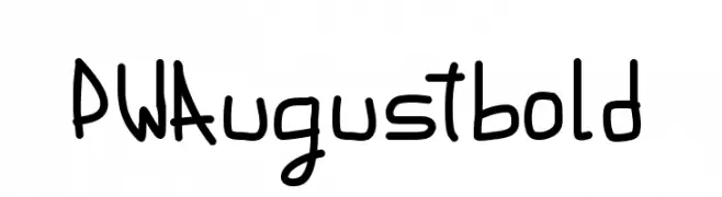
A bold, playful handwritten font with rounded edges and consistent thickness.
 Herunterladen 133 Downloads@WebFont
 -
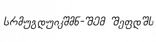
![Chveulebrivy-ITV Italic Frei Schriftart Herunterladen]() Herunterladen 133 Downloads
Herunterladen 133 Downloads -
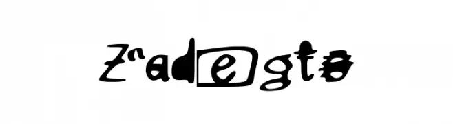
![Zadegto Frei Schriftart Herunterladen]() Herunterladen 133 Downloads@WebFont
Herunterladen 133 Downloads@WebFont -
( Riskiansyah Ilyas )
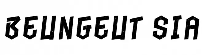
A bold, angular font with a distressed, grunge texture.
![Beungeut Sia Frei Schriftart Herunterladen]() Herunterladen 133 Downloads@WebFont
Herunterladen 133 Downloads@WebFont -
( Fonts by Darcy Baldwin )
A decorative font with characters inside bold star shapes.
![DJB Shape Up Stars Frei Schriftart Herunterladen]() Herunterladen 133 Downloads@WebFont
Herunterladen 133 Downloads@WebFont -
![BoxyRobo Frei Schriftart Herunterladen]() Herunterladen 133 Downloads@WebFont
Herunterladen 133 Downloads@WebFont -
( Fonts by Mike Abbink, Paul van der Laan, Pieter van Rosmalen - Personal-use only. For commercial use please contact owner. )
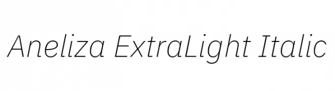
A sleek, extra-light italic font with a modern and elegant style.
![Aneliza ExtraLight Italic Frei Schriftart Herunterladen]() Herunterladen 133 Downloads@WebFont
Herunterladen 133 Downloads@WebFont -
( Fonts by Woodcutter )
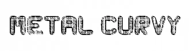
A bold, textured font with a metallic, industrial design and rounded, curvy letters.
![Metal Curvy Frei Schriftart Herunterladen]() Herunterladen 133 Downloads@WebFont
Herunterladen 133 Downloads@WebFont -
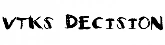
![Vtks Decision Frei Schriftart Herunterladen]() Herunterladen 133 Downloads@WebFont
Herunterladen 133 Downloads@WebFont -
( Fonts by Letterhanna Type Foundry - Rinaldo Hasibuan - Personal-use only. For commercial use please contact owner. )
A geometric, maze-like font with bold, interconnected lines and a futuristic aesthetic.
![Kufication Root Frei Schriftart Herunterladen]() Herunterladen 133 Downloads@WebFont
Herunterladen 133 Downloads@WebFont -
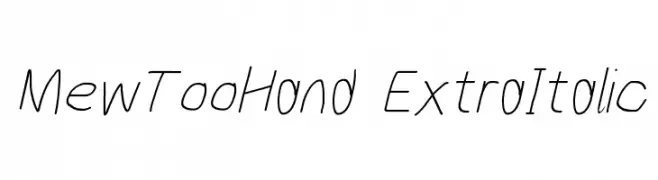
![MewTooHand ExtraItalic Frei Schriftart Herunterladen]() Herunterladen 133 Downloads@WebFont
Herunterladen 133 Downloads@WebFont -
( Fonts by perefect-schraub.jimdosite.com - Personal-use only. For commercial use please contact owner. )
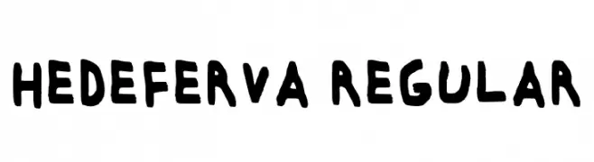
A bold, playful handwritten font with thick strokes and a casual style.
![Hedeferva Regular Frei Schriftart Herunterladen]() Herunterladen 132 Downloads@WebFont
Herunterladen 132 Downloads@WebFont -
( Fonts by Wino S Kadir - weknow - www.revolge.com/shop/weknow/ - Personal-use only. For commercial use please contact owner. )
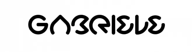
A futuristic, bold font with rounded edges and geometric design.
![Gabriele Frei Schriftart Herunterladen]() Herunterladen 132 Downloads@WebFont
Herunterladen 132 Downloads@WebFont -
( Pollem Studio - Muhammad Nur - www.creativefabrica.com/designer/polem/ref/2050/ )
An elegant script font with high contrast and flowing, cursive style.
![Greatfull Frei Schriftart Herunterladen]() Herunterladen 132 Downloads@WebFont
Herunterladen 132 Downloads@WebFont -
( Press Gang Studios - www.pressgang-studios.com.com )
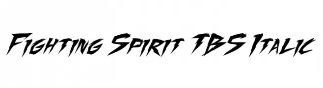
A bold, dynamic font with sharp, angular strokes and an italicized style.
![Fighting Spirit TBS Italic Frei Schriftart Herunterladen]() Herunterladen 132 Downloads@WebFont
Herunterladen 132 Downloads@WebFont -
( Fonts by Eddy Goodboy )
A playful, hand-drawn font with quirky embellishments and a casual style.
![Friday School Frei Schriftart Herunterladen]() Herunterladen 132 Downloads@WebFont
Herunterladen 132 Downloads@WebFont -
( Fonts by Wahyu Studio - Wahyu Setiyawan - Personal-use only. For commercial use please contact owner. )
A playful and elegant script font with flowing, connected letters.
![Shakila Frei Schriftart Herunterladen]() Herunterladen 132 Downloads@WebFont
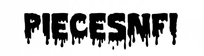
Herunterladen 132 Downloads@WebFont -
![Pieces NFI Frei Schriftart Herunterladen]() Herunterladen 132 Downloads@WebFont
Herunterladen 132 Downloads@WebFont -
( Darrell Flood )
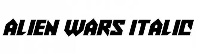
A bold, futuristic italic font with sharp angles and tight spacing.
![Alien Wars Italic Frei Schriftart Herunterladen]() Herunterladen 132 Downloads@WebFont
Herunterladen 132 Downloads@WebFont -
( Fonts by Manfred Klein. Free for private and charity use. Free for commercial with donation to organizations )
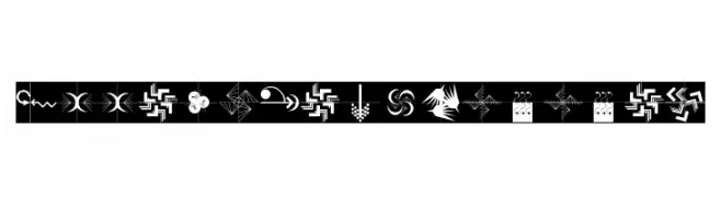
Abstract, decorative dingbat font with arrow and geometric motifs.
![ArrowsCompetition Frei Schriftart Herunterladen]() Herunterladen 132 Downloads@WebFont
Herunterladen 132 Downloads@WebFont -
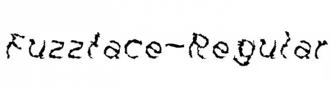
![Fuzzface-Regular Frei Schriftart Herunterladen]() Herunterladen 132 Downloads@WebFont
Herunterladen 132 Downloads@WebFont -
( Fonts by Manfred Klein. Free for private and charity use. Free for commercial with donation to organizations )
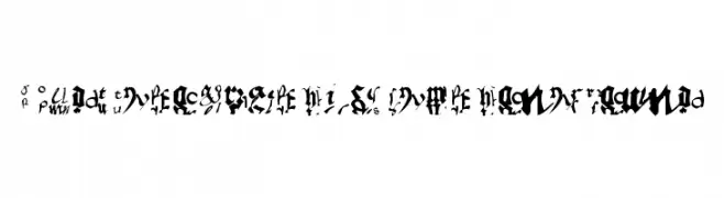
An ornate and intricate blackletter-style font with historical elegance.
![OldTypographicSymphony Round Frei Schriftart Herunterladen]() Herunterladen 132 Downloads@WebFont
Herunterladen 132 Downloads@WebFont -
( Fonts by Zetafonts - Personal-use only. For commercial use please contact owner. )
An elegant italic font with smooth, flowing letterforms and refined contrast.
![Calvino Grande Trial Italic Frei Schriftart Herunterladen]() Herunterladen 132 Downloads@WebFont
Herunterladen 132 Downloads@WebFont -
( Fonts by mightype - Personal-use only. For commercial use please contact owner. )
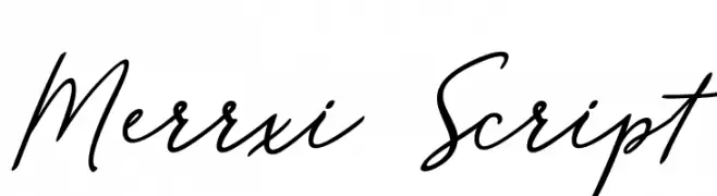
A graceful script font with flowing, cursive strokes and elegant flourishes.
![Merrxi Script Frei Schriftart Herunterladen]() Herunterladen 132 Downloads@WebFont
Herunterladen 132 Downloads@WebFont -
( Fonts by Sizimon.id )
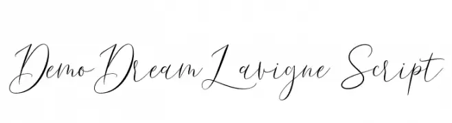
Elegant and flowing script font.
![DemoDreamLavigne-Script Frei Schriftart Herunterladen]() Herunterladen 132 Downloads@WebFont
Herunterladen 132 Downloads@WebFont -
( Fonts by Maulana Creative )
A fluid, cursive handwritten font with elegant, interconnected letters.
![Lenteras Frei Schriftart Herunterladen]() Herunterladen 132 Downloads@WebFont
Herunterladen 132 Downloads@WebFont -
( Genilson L. Santos )
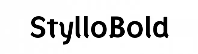
A bold, modern font with clean lines and rounded edges, perfect for impactful designs.
![Styllo Bold Frei Schriftart Herunterladen]() Herunterladen 132 Downloads@WebFont
Herunterladen 132 Downloads@WebFont -
( Fonts by www.studiotypo.com - Personal-use only. For commercial use please contact owner. )
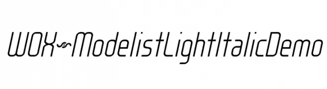
A sleek, modern, light italic font with elongated characters.
![WOX~Modelist Light Italic Demo Frei Schriftart Herunterladen]() Herunterladen 132 Downloads@WebFont
Herunterladen 132 Downloads@WebFont -
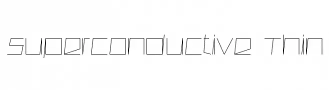
( Font by Sven Stuber - www.superlooper.de )
A thin, angular, and geometric font with a futuristic and technical style.
![Superconductive Thin Frei Schriftart Herunterladen]() Herunterladen 132 Downloads@WebFont
Herunterladen 132 Downloads@WebFont -
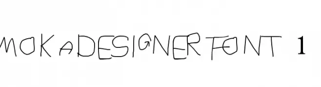
![MOKADESIGNER FONT 1 Frei Schriftart Herunterladen]() Herunterladen 132 Downloads@WebFont
Herunterladen 132 Downloads@WebFont -
( Personal-use only. For commercial use please contact owner. )
A bold and oblique font with a modern, dynamic style.
![Mothanna Bold Oblique Frei Schriftart Herunterladen]() Herunterladen 132 Downloads@WebFont
Herunterladen 132 Downloads@WebFont -
( Fonts by Al Ghul - Personal-use only. For commercial use please contact owner. )
A playful, handwritten font with rounded, bubbly characters.
![Boyish Frei Schriftart Herunterladen]() Herunterladen 132 Downloads@WebFont
Herunterladen 132 Downloads@WebFont -
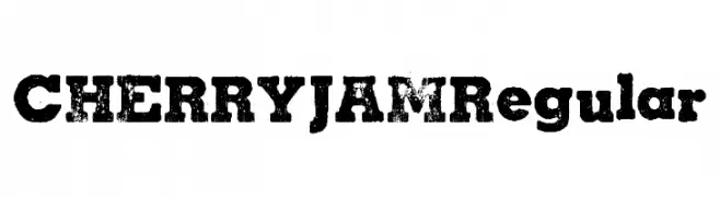
( Fonts by Billy Argel - www.billyargel.com - Personal-use only. For commercial use please contact owner. )
A bold, distressed font with a rugged, vintage texture.
![CHERRY JAM Regular Frei Schriftart Herunterladen]() Herunterladen 132 Downloads@WebFont
Herunterladen 132 Downloads@WebFont -
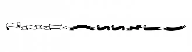
( Fonts by Misti's Fonts )
Intricately detailed decorative banners for elegant design projects.
![MF 26 Banners Frei Schriftart Herunterladen]() Herunterladen 132 Downloads@WebFont
Herunterladen 132 Downloads@WebFont -
( Fonts by Booga Letter )
A playful, bold font with rounded, bubbly characters.
![Oceans World Frei Schriftart Herunterladen]() Herunterladen 132 Downloads@WebFont
Herunterladen 132 Downloads@WebFont


Welche Schriften sind gerade am populärsten?
Poppins, Roboto, Montserrat, Open Sans und Lato sind wegen ihrer klaren Formen und breiten Einsetzbarkeit sehr gefragt – von Markenauftritt über Landingpages bis hin zu Postern.
Welche Fonts eignen sich für Logos?
Geometrische Sans‑Serifs (z. B. Poppins, Familien im Gotham‑Stil) sind ein häufiger Griff für sauberes, skalierbares Branding. Für eine persönlichere Note bleiben Scripts und Handschrift‑Stile beliebt. Kombinieren Sie einen prägnanten Headline‑Font mit einer neutralen Brotschrift für Wiedererkennung und Harmonie.
Wie oft wird die Top‑Liste aktualisiert?
Regelmäßig – basierend auf realen Downloads und Interaktionen. Schauen Sie öfter vorbei, um aufstrebende Favoriten früh zu entdecken.
💡 Tipp: Seite bookmarken – Trends wechseln schnell, und heutige Top‑Schriften inspirieren morgen vielleicht das Rebranding.