Willkommen bei den Top‑Schriften – hier treffen Beliebtheit und Qualität aufeinander. Das sind die in diesem Jahr am häufigsten heruntergeladenen und genutzten Fonts. Wenn Sie sichere Optionen für Logo, Web oder Social suchen, starten Sie hier.
Jeder Top‑Font überzeugt durch Balance, Lesbarkeit und Vielseitigkeit. Sie finden moderne Sans‑Serifs, elegante Scripts, Vintage‑Serifs und minimalistische Displays.
-
( Fonts by Alex Tomlinson - Skyhaven Fonts - shfonts.com )
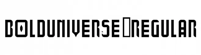
A bold, geometric font with angular lines and cut-out shapes, ideal for display use.
 Herunterladen 129 Downloads@WebFont
 -
( گالری فانت فارسی پژوهش آريانا - only compatible with Farsi and Arabic )
A playful, handwritten font with a creative and informal style.
![Destkhat V Frei Schriftart Herunterladen]() Herunterladen 129 Downloads@WebFont
Herunterladen 129 Downloads@WebFont -
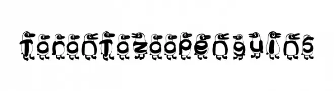
![Toronto Zoo Penguins Frei Schriftart Herunterladen]() Herunterladen 129 Downloads@WebFont
Herunterladen 129 Downloads@WebFont -
( Fonts by Taufik Tri Ariyanto - Personal-use only. For commercial use please contact owner. )
A bold, graffiti-inspired font with dynamic and angular characters.
![Aftershocks Demo Frei Schriftart Herunterladen]() Herunterladen 129 Downloads@WebFont
Herunterladen 129 Downloads@WebFont -
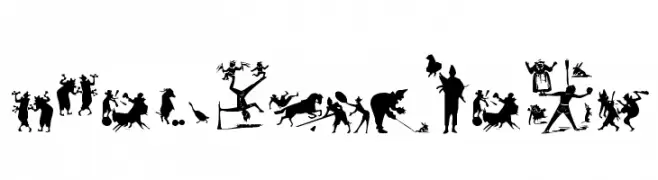
( Fonts by Manfred Klein. Free for private and charity use. Free for commercial with donation to organizations )
Circus-inspired display font featuring detailed silhouette illustrations.
![CircusEarth Frei Schriftart Herunterladen]() Herunterladen 129 Downloads@WebFont
Herunterladen 129 Downloads@WebFont -
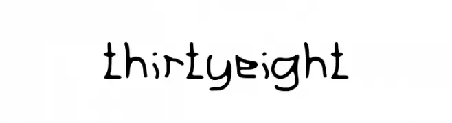
![thirtyeight Frei Schriftart Herunterladen]() Herunterladen 129 Downloads@WebFont
Herunterladen 129 Downloads@WebFont -
( Fonts by MaknaStudio - Yudis Tira - Personal-use only. For commercial use please contact owner. )
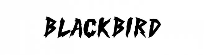
A bold, jagged font with sharp, angular edges for an aggressive look.
![Black Bird Frei Schriftart Herunterladen]() Herunterladen 129 Downloads@WebFont
Herunterladen 129 Downloads@WebFont -
( Fonts by Inermedia Studio )
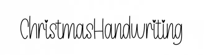
Playful handwritten font with tall, narrow letters.
![ChristmasHandwriting Frei Schriftart Herunterladen]() Herunterladen 129 Downloads@WebFont
Herunterladen 129 Downloads@WebFont -
![OppaGelaStyle Frei Schriftart Herunterladen]() Herunterladen 129 Downloads@WebFont
Herunterladen 129 Downloads@WebFont -
( Fonts by Manuel Ramos - www.infinitismo.com - Personal-use only. For commercial use please contact owner. )
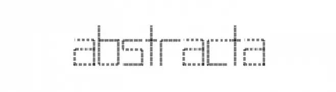
A modern, linear font with a digital, geometric design.
![Abstracta Frei Schriftart Herunterladen]() Herunterladen 129 Downloads@WebFont
Herunterladen 129 Downloads@WebFont -
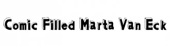
![Comic Filled Marta Van Eck Frei Schriftart Herunterladen]() Herunterladen 129 Downloads
Herunterladen 129 Downloads -
( Fonts by Daniel Zadorozny - www.iconian.com - Personal-use only. For commercial use please contact owner. )
A bold, wide font with a modern, geometric style.
![Homelander Wide Frei Schriftart Herunterladen]() Herunterladen 129 Downloads@WebFont
Herunterladen 129 Downloads@WebFont -
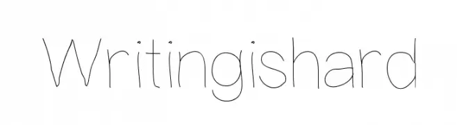
( Fonts by William Koch )
A playful, hand-drawn style with thin, uneven strokes and a whimsical feel.
![Writingishard Frei Schriftart Herunterladen]() Herunterladen 129 Downloads@WebFont
Herunterladen 129 Downloads@WebFont -
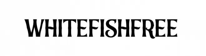
( Fonts by Vunira Design - Personal-use only. For commercial use please contact owner. )
A bold, decorative font with medieval-inspired elements and intricate detailing.
![WhitefishFREE Frei Schriftart Herunterladen]() Herunterladen 129 Downloads@WebFont
Herunterladen 129 Downloads@WebFont -
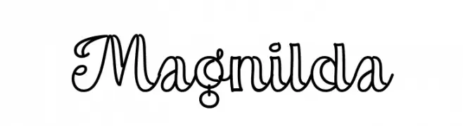
( Fonts by Misti Hammers - mistifonts.com - Personal-use only. For commercial use please contact owner. )
A playful and decorative script font with elegant, flowing lines.
![Magnilda Frei Schriftart Herunterladen]() Herunterladen 129 Downloads@WebFont
Herunterladen 129 Downloads@WebFont -
( Fonts by Feri Fauzi )
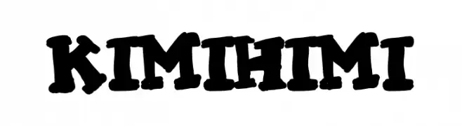
A bold, playful, and hand-drawn style font with a lively and energetic feel.
![KIMI HIMI Frei Schriftart Herunterladen]() Herunterladen 129 Downloads@WebFont
Herunterladen 129 Downloads@WebFont -
( Fonts by Manfred Klein. Free for private and charity use. Free for commercial with donation to organizations )
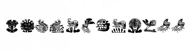
A decorative font with intricate, abstract animal designs inspired by tribal art.
![MyPrivateZoo Frei Schriftart Herunterladen]() Herunterladen 129 Downloads@WebFont
Herunterladen 129 Downloads@WebFont -
( Misti's Fonts - mistifonts.com/ )
A playful, modern font with rounded edges and a clean, minimalist aesthetic.
![We Are In Love [Heartless] Frei Schriftart Herunterladen]() Herunterladen 129 Downloads@WebFont
Herunterladen 129 Downloads@WebFont -
( Darrell Flood )
A playful and bold font with rounded, whimsical characters.
![Sushi Roll Frei Schriftart Herunterladen]() Herunterladen 129 Downloads@WebFont
Herunterladen 129 Downloads@WebFont -
( Fonts by a Neale Davidson - www.pixelsagas.com. Personal-use only. For commercial use please contact owner. )
A bold, angular font with a runic, stone-carved aesthetic.
![Dethek Stone Frei Schriftart Herunterladen]() Herunterladen 129 Downloads@WebFont
Herunterladen 129 Downloads@WebFont -
( Fonts by Manfred Klein. Free for private and charity use. Free for commercial with donation to organizations )
A decorative collection of fantastical creature illustrations with intricate details.
![FantasticCreationsTwo Frei Schriftart Herunterladen]() Herunterladen 129 Downloads@WebFont
Herunterladen 129 Downloads@WebFont -
( Fonts by Daniel Zadorozny - www.iconian.com - Free for personal use )
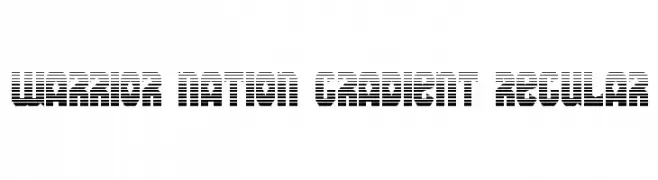
A bold, modern font with a unique gradient stripe effect.
![Warrior Nation Gradient Regular Frei Schriftart Herunterladen]() Herunterladen 129 Downloads@WebFont
Herunterladen 129 Downloads@WebFont -
( Fonts by Eleonora Spizzamiglio )
A bold, playful, and hand-drawn font with irregular, organic shapes.
![Lunazzi Frei Schriftart Herunterladen]() Herunterladen 129 Downloads@WebFont
Herunterladen 129 Downloads@WebFont -
( Fonts by Jamie Place [FontBlast Design] - Personal-use only. For commercial use please contact owner. )
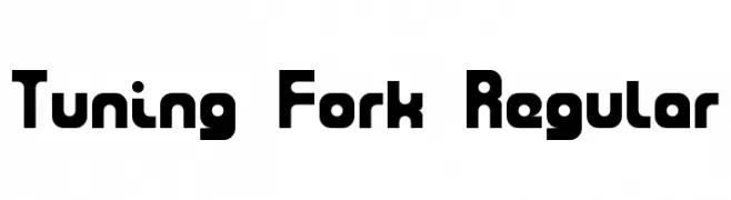
A bold, rounded, and geometric font with a modern style.
![Tuning Fork Regular Frei Schriftart Herunterladen]() Herunterladen 129 Downloads@WebFont
Herunterladen 129 Downloads@WebFont -
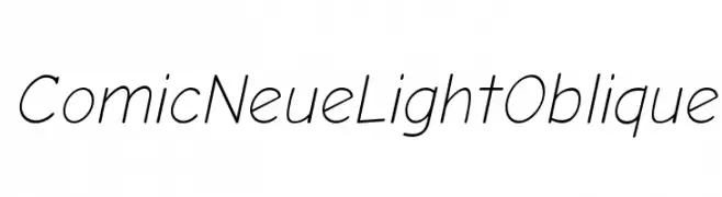
( Fonts by www.comicneue.com - Personal-use only. For commercial use please contact owner. )
A playful, modern font with a light, oblique slant and rounded characters.
![Comic Neue Light Oblique Frei Schriftart Herunterladen]() Herunterladen 129 Downloads@WebFont
Herunterladen 129 Downloads@WebFont -
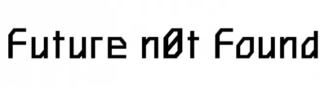
![Future n0t Found Frei Schriftart Herunterladen]() Herunterladen 129 Downloads@WebFont
Herunterladen 129 Downloads@WebFont -
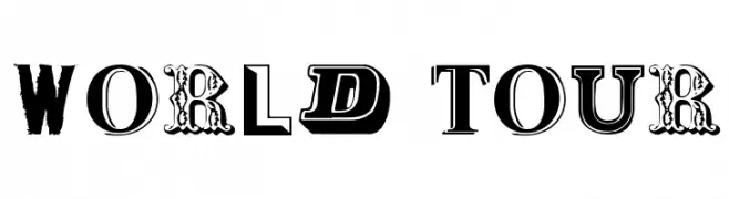
( Public domain / GPL / OFL - jlhfonts.blogspot.com/ )
A bold, eclectic display typeface with diverse styles and textures.
![World Tour Frei Schriftart Herunterladen]() Herunterladen 129 Downloads@WebFont
Herunterladen 129 Downloads@WebFont -
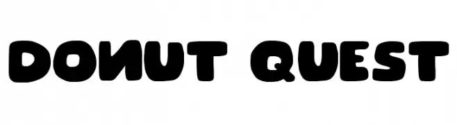
( Fonts by Joseph Dawson )
A playful, bold font with rounded, chunky letters perfect for fun and whimsical designs.
![Donut Quest Frei Schriftart Herunterladen]() Herunterladen 129 Downloads@WebFont
Herunterladen 129 Downloads@WebFont -
( Fonts by Edric Studio - Personal-use only. For commercial use please contact owner. )
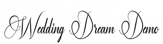
An elegant script font with intricate swirls, ideal for formal and romantic occasions.
![Wedding Dream Demo Frei Schriftart Herunterladen]() Herunterladen 129 Downloads@WebFont
Herunterladen 129 Downloads@WebFont -
( Fonts by Winter Design Studio - winty5.wixsite.com/noahtheawesome/ - Personal-use only. For commercial use please contact owner. )
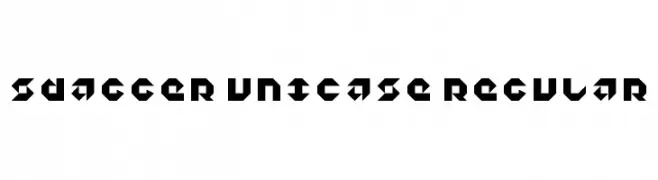
A bold, geometric font with sharp angles and a futuristic style.
![5Dagger Unicase Regular Frei Schriftart Herunterladen]() Herunterladen 129 Downloads@WebFont
Herunterladen 129 Downloads@WebFont -
( Fonts by Dafne Salvatori )
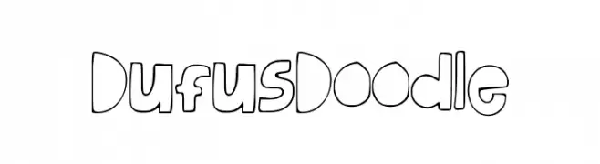
A playful, hand-drawn font with bold, rounded characters.
![DufusDoodle Frei Schriftart Herunterladen]() Herunterladen 129 Downloads@WebFont
Herunterladen 129 Downloads@WebFont -
( Fonts by Vladimir Nikolic - www.creativefabrica.com/designer/vladimirnikolic/ - Personal-use only. For commercial use please contact owner. )
A bold, decorative font with a three-dimensional, embossed appearance.
![Jewelry Regular Frei Schriftart Herunterladen]() Herunterladen 129 Downloads@WebFont
Herunterladen 129 Downloads@WebFont -
( Fonts by Apostrophic Lab )
A geometric, pixelated font with a retro digital style.
![So Sue Me Frei Schriftart Herunterladen]() Herunterladen 129 Downloads@WebFont
Herunterladen 129 Downloads@WebFont -
( Rachel San )
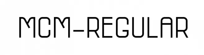
A modern, geometric font with uniform stroke widths and high legibility.
![MCM-Regular Frei Schriftart Herunterladen]() Herunterladen 129 Downloads@WebFont
Herunterladen 129 Downloads@WebFont -
![Charger Sport Narrow Oblique Frei Schriftart Herunterladen]() Herunterladen 129 Downloads@WebFont
Herunterladen 129 Downloads@WebFont


![We Are In Love [Heartless] Frei Schriftart Herunterladen](https://d144mzi0q5mijx.cloudfront.net/img/W/E/We-Are-In-Love-Heartless.webp)


Welche Schriften sind gerade am populärsten?
Poppins, Roboto, Montserrat, Open Sans und Lato sind wegen ihrer klaren Formen und breiten Einsetzbarkeit sehr gefragt – von Markenauftritt über Landingpages bis hin zu Postern.
Welche Fonts eignen sich für Logos?
Geometrische Sans‑Serifs (z. B. Poppins, Familien im Gotham‑Stil) sind ein häufiger Griff für sauberes, skalierbares Branding. Für eine persönlichere Note bleiben Scripts und Handschrift‑Stile beliebt. Kombinieren Sie einen prägnanten Headline‑Font mit einer neutralen Brotschrift für Wiedererkennung und Harmonie.
Wie oft wird die Top‑Liste aktualisiert?
Regelmäßig – basierend auf realen Downloads und Interaktionen. Schauen Sie öfter vorbei, um aufstrebende Favoriten früh zu entdecken.
💡 Tipp: Seite bookmarken – Trends wechseln schnell, und heutige Top‑Schriften inspirieren morgen vielleicht das Rebranding.