Willkommen bei den Top‑Schriften – hier treffen Beliebtheit und Qualität aufeinander. Das sind die in diesem Jahr am häufigsten heruntergeladenen und genutzten Fonts. Wenn Sie sichere Optionen für Logo, Web oder Social suchen, starten Sie hier.
Jeder Top‑Font überzeugt durch Balance, Lesbarkeit und Vielseitigkeit. Sie finden moderne Sans‑Serifs, elegante Scripts, Vintage‑Serifs und minimalistische Displays.
-
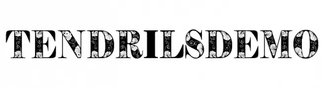
( Eva Barabasne Olasz - www.etsy.com/ie/shop/digitaltypefaces )
A decorative font with intricate tendril patterns and bold uppercase letters.
 Herunterladen 129 Downloads@WebFont
 -
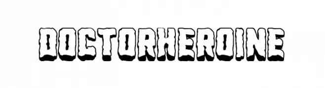
( Fonts by Woodcutter )
A bold, playful font with a 3D effect and comic book style.
![Doctor Heroine Frei Schriftart Herunterladen]() Herunterladen 129 Downloads@WebFont
Herunterladen 129 Downloads@WebFont -
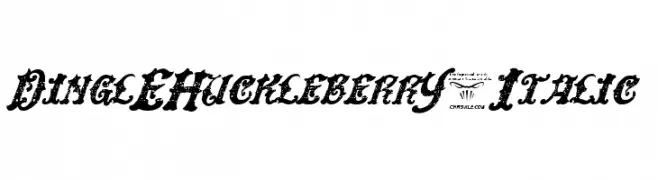
( Fonts by Chris Vile - fontmonger.com - Personal-use only. For commercial use please contact owner. )
A bold, decorative, and distressed italic font with a vintage flair.
![DinglEHuckleberrY-Italic Frei Schriftart Herunterladen]() Herunterladen 129 Downloads@WebFont
Herunterladen 129 Downloads@WebFont -
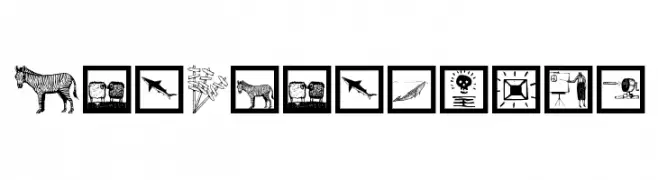
( Fonts by Manfred Klein. Free for private and charity use. Free for commercial with donation to organizations )
A pictogram dingbat font with hand-drawn illustrations and landmarks.
![ArtParticles Frei Schriftart Herunterladen]() Herunterladen 129 Downloads@WebFont
Herunterladen 129 Downloads@WebFont -
( Fonts by Mans Greback - www.mansgreback.com - Personal-use only. For commercial use please contact owner. )
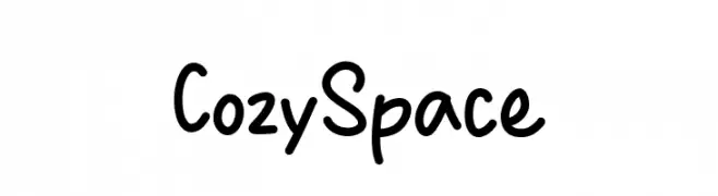
A playful, handwritten font with rounded, irregular characters.
![Cozy Space Frei Schriftart Herunterladen]() Herunterladen 129 Downloads@WebFont
Herunterladen 129 Downloads@WebFont -
( Fonts by www.chequered.ink - Chequered Ink - Personal-use only. For commercial use please contact owner. )
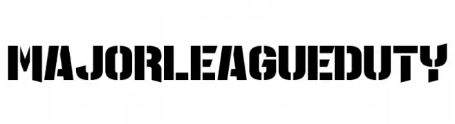
A bold, stencil-style font with a strong, industrial look.
![Major League Duty Frei Schriftart Herunterladen]() Herunterladen 129 Downloads@WebFont
Herunterladen 129 Downloads@WebFont -
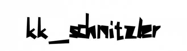
![kk_schnitzler Frei Schriftart Herunterladen]() Herunterladen 129 Downloads@WebFont
Herunterladen 129 Downloads@WebFont -
( Fonts by Joseph Dawson )
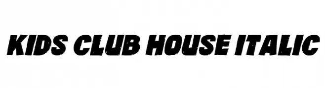
A bold, italicized font with a distressed, playful style.
![Kids Club House Italic Frei Schriftart Herunterladen]() Herunterladen 129 Downloads@WebFont
Herunterladen 129 Downloads@WebFont -
( Fonts by Vladimir Nikolic - www.creativefabrica.com/designer/vladimirnikolic/ - Personal-use only. For commercial use please contact owner. )
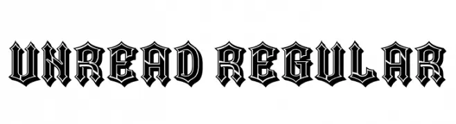
A bold, decorative font with a gothic, blackletter style.
![Unread Regular Frei Schriftart Herunterladen]() Herunterladen 129 Downloads@WebFont
Herunterladen 129 Downloads@WebFont -
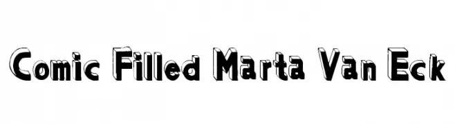
![Comic Filled Marta Van Eck Frei Schriftart Herunterladen]() Herunterladen 129 Downloads
Herunterladen 129 Downloads -
( Fonts by a Max Infeld - XEROGRAPHER FONTS - xerographer.blogspot.com . Personal-use only. For commercial use please contact owner. )
An intricate and artistic font with swirling, elongated strokes and decorative flourishes.
![AnotherParty Frei Schriftart Herunterladen]() Herunterladen 129 Downloads@WebFont
Herunterladen 129 Downloads@WebFont -
( Fonts by Nyek! Pinoy Komik Fonts - Personal-use only. For commercial use please contact owner. )
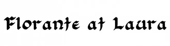
A bold, decorative blackletter font with intricate, medieval-inspired letterforms.
![Florante at Laura Frei Schriftart Herunterladen]() Herunterladen 129 Downloads@WebFont
Herunterladen 129 Downloads@WebFont -
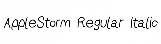
![AppleStorm Regular Italic Frei Schriftart Herunterladen]() Herunterladen 129 Downloads@WebFont
Herunterladen 129 Downloads@WebFont -
( Fonts by Manfred Klein - manfred-klein.ina-mar.com )
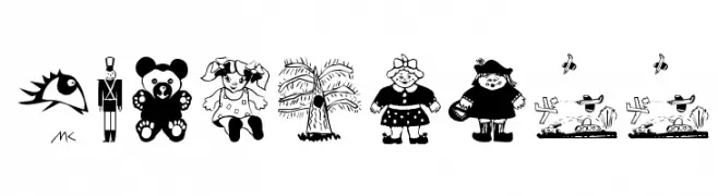
A whimsical, cartoon-style font featuring playful illustrations perfect for children's projects.
![KidsStuff Frei Schriftart Herunterladen]() Herunterladen 129 Downloads@WebFont
Herunterladen 129 Downloads@WebFont -
( Fonts by Manfred Klein. Free for private and charity use. Free for commercial with donation to organizations )
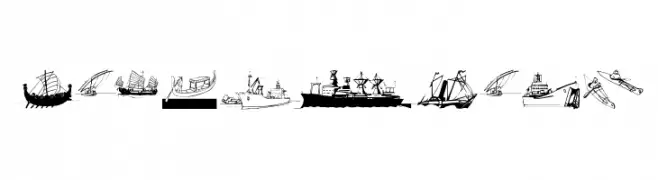
A display font composed of ship and boat illustrations as characters.
![MarineBats Frei Schriftart Herunterladen]() Herunterladen 129 Downloads@WebFont
Herunterladen 129 Downloads@WebFont -
( Josiah Werning - www.josiahwerning.com )
An organic, nature-inspired font with intricate, branch-like detailing.
![Forestry Frei Schriftart Herunterladen]() Herunterladen 129 Downloads@WebFont
Herunterladen 129 Downloads@WebFont -
( Noto is a trademark of Google Inc. Noto fonts are open source. All Noto fonts are published under the SIL Open Font License, Version 1.1 )
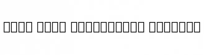
A geometric and structured font inspired by the historical Glagolitic script.
![Noto Sans Glagolitic Regular Frei Schriftart Herunterladen]() Herunterladen 129 Downloads@WebFont
Herunterladen 129 Downloads@WebFont -
( Fonts by DumadiStyle )
A bold, handwritten font with a playful and casual style.
![Hipster Hatch Frei Schriftart Herunterladen]() Herunterladen 129 Downloads@WebFont
Herunterladen 129 Downloads@WebFont -
( Fonts by Handpik - Personal-use only. For commercial use please contact owner. )
A high-contrast serif font with elegant, dramatic strokes and a refined aesthetic.
![Meiland Gorgeous Regular Frei Schriftart Herunterladen]() Herunterladen 129 Downloads@WebFont
Herunterladen 129 Downloads@WebFont -
( Fonts by wep - Wahyu Eka Prasetya - Personal-use only. For commercial use please contact owner. )
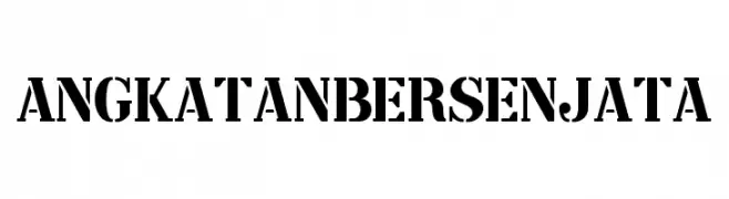
A bold, stencil-like font with a military or industrial aesthetic.
![Angkatan Bersenjata Frei Schriftart Herunterladen]() Herunterladen 129 Downloads@WebFont
Herunterladen 129 Downloads@WebFont -
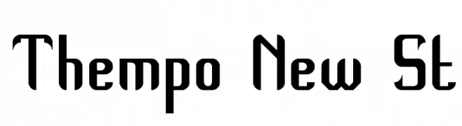
![Thempo New St Frei Schriftart Herunterladen]() Herunterladen 129 Downloads@WebFont
Herunterladen 129 Downloads@WebFont -
( Free for a personal use. For a commercial use please visit www.kevinandamanda.com )
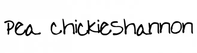
A playful, handwritten font with a casual and friendly vibe.
![Pea ChickieShannon Frei Schriftart Herunterladen]() Herunterladen 129 Downloads@WebFont
Herunterladen 129 Downloads@WebFont -
( Fonts by Vladimir Nikolic )
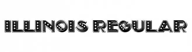
A bold, decorative font with stars and stripes, ideal for standout designs.
![Illinois Regular Frei Schriftart Herunterladen]() Herunterladen 129 Downloads@WebFont
Herunterladen 129 Downloads@WebFont -
![Sughayer Separates 3 Frei Schriftart Herunterladen]() Herunterladen 129 Downloads@WebFont
Herunterladen 129 Downloads@WebFont -
( Fonts by Iordanis Passas )
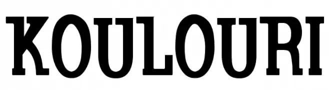
A bold, serif font with strong strokes and a classic yet modern style.
![Koulouri Frei Schriftart Herunterladen]() Herunterladen 129 Downloads@WebFont
Herunterladen 129 Downloads@WebFont -
![LaMorte10 Frei Schriftart Herunterladen]() Herunterladen 129 Downloads@WebFont
Herunterladen 129 Downloads@WebFont -
( Fonts by Manfred Klein. Free for private and charity use. Free for commercial with donation to organizations )
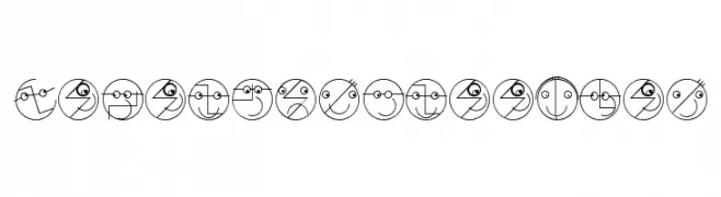
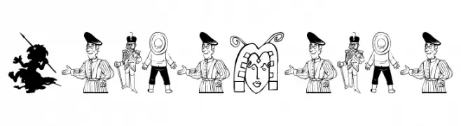
A playful and creative font with each character designed as a unique face within a circle.
![LogoFacesToolbox Frei Schriftart Herunterladen]() Herunterladen 129 Downloads@WebFont
Herunterladen 129 Downloads@WebFont -
![Raundi Regular Frei Schriftart Herunterladen]() Herunterladen 129 Downloads@WebFont
Herunterladen 129 Downloads@WebFont -
( www.indernik.com )
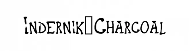
A bold, hand-drawn font with a charcoal sketch style.
![Indernik_Charcoal Frei Schriftart Herunterladen]() Herunterladen 129 Downloads@WebFont
Herunterladen 129 Downloads@WebFont -
( Fonts by Manfred Klein. Free for private and charity use. Free for commercial with donation to organizations )
Cartoonish, illustrated font with each letter as a unique character.
![LeuteHeute Frei Schriftart Herunterladen]() Herunterladen 129 Downloads@WebFont
Herunterladen 129 Downloads@WebFont -
( Woodcutter - woodcutter Manero - www.woodcutter.es )
A bold, hand-drawn font with jagged edges and a dynamic style.
![FINOLIS Frei Schriftart Herunterladen]() Herunterladen 129 Downloads@WebFont
Herunterladen 129 Downloads@WebFont -
( Fonts by Daniel Zadorozny - www.iconian.com - Free for personal use )
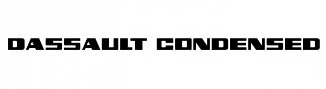
A bold, geometric, and condensed font with a modern, futuristic style.
![Dassault Condensed Frei Schriftart Herunterladen]() Herunterladen 129 Downloads@WebFont
Herunterladen 129 Downloads@WebFont -
( Fonts by Alex Tomlinson - Skyhaven Fonts - shfonts.com )
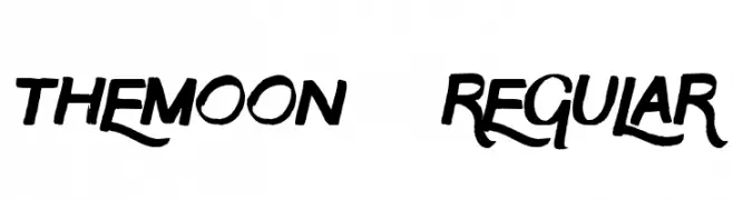
A bold, expressive font with dynamic curves and sharp edges.
![TheMoon-Regular Frei Schriftart Herunterladen]() Herunterladen 129 Downloads@WebFont
Herunterladen 129 Downloads@WebFont -
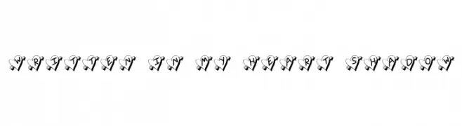
![Written In My Heart Shadow Frei Schriftart Herunterladen]() Herunterladen 129 Downloads@WebFont
Herunterladen 129 Downloads@WebFont -
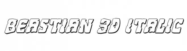
( Fonts by Daniel Zadorozny - www.iconian.com )
A bold, 3D italic font with outlined characters and a playful style.
![Beastian 3D Italic Frei Schriftart Herunterladen]() Herunterladen 129 Downloads@WebFont
Herunterladen 129 Downloads@WebFont


Welche Schriften sind gerade am populärsten?
Poppins, Roboto, Montserrat, Open Sans und Lato sind wegen ihrer klaren Formen und breiten Einsetzbarkeit sehr gefragt – von Markenauftritt über Landingpages bis hin zu Postern.
Welche Fonts eignen sich für Logos?
Geometrische Sans‑Serifs (z. B. Poppins, Familien im Gotham‑Stil) sind ein häufiger Griff für sauberes, skalierbares Branding. Für eine persönlichere Note bleiben Scripts und Handschrift‑Stile beliebt. Kombinieren Sie einen prägnanten Headline‑Font mit einer neutralen Brotschrift für Wiedererkennung und Harmonie.
Wie oft wird die Top‑Liste aktualisiert?
Regelmäßig – basierend auf realen Downloads und Interaktionen. Schauen Sie öfter vorbei, um aufstrebende Favoriten früh zu entdecken.
💡 Tipp: Seite bookmarken – Trends wechseln schnell, und heutige Top‑Schriften inspirieren morgen vielleicht das Rebranding.