Willkommen bei den Top‑Schriften – hier treffen Beliebtheit und Qualität aufeinander. Das sind die in diesem Jahr am häufigsten heruntergeladenen und genutzten Fonts. Wenn Sie sichere Optionen für Logo, Web oder Social suchen, starten Sie hier.
Jeder Top‑Font überzeugt durch Balance, Lesbarkeit und Vielseitigkeit. Sie finden moderne Sans‑Serifs, elegante Scripts, Vintage‑Serifs und minimalistische Displays.
-
 Herunterladen 128 Downloads@WebFont
 -
( Fonts by Galdino Otten )
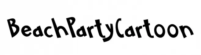
A playful, hand-drawn font with bold, irregular characters and a cartoonish style.
![BeachPartyCartoon Frei Schriftart Herunterladen]() Herunterladen 128 Downloads@WebFont
Herunterladen 128 Downloads@WebFont -
( Fonts by JOEBOB graphics - Joe vanderHam - Personal-use only. For commercial use please contact owner. )
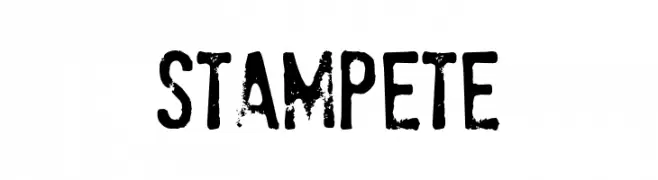
A bold, distressed font with a rugged, vintage style.
![StamPete Frei Schriftart Herunterladen]() Herunterladen 128 Downloads@WebFont
Herunterladen 128 Downloads@WebFont -
( Fonts by HastaType - Salman Mashudi - Personal-use only. For commercial use please contact owner. )
A playful and elegant script font with a handwritten style.
![Selaras Frei Schriftart Herunterladen]() Herunterladen 128 Downloads@WebFont
Herunterladen 128 Downloads@WebFont -
( Fonts by Situjuh Nazara - 7ntypes.com - Personal-use only. For commercial use please contact owner. )
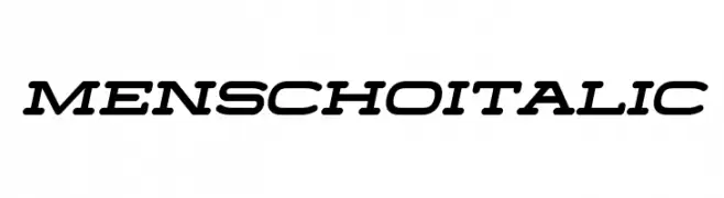
A modern, bold italic font with rounded edges and a dynamic style.
![Menscho Italic Frei Schriftart Herunterladen]() Herunterladen 128 Downloads@WebFont
Herunterladen 128 Downloads@WebFont -
( Fonts by Manfred Klein - manfred-klein.ina-mar.com )
A playful and whimsical cartoon-style font with detailed illustrations.
![OurLittleDarlings-One Frei Schriftart Herunterladen]() Herunterladen 128 Downloads@WebFont
Herunterladen 128 Downloads@WebFont -
( Fonts by Mohamed Gaber - Personal-use only. For commercial use please contact owner. )
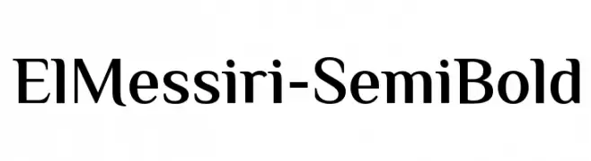
A modern, semi-bold font with elegant proportions and slight stroke contrast.
![ElMessiri-SemiBold Frei Schriftart Herunterladen]() Herunterladen 128 Downloads@WebFont
Herunterladen 128 Downloads@WebFont -
( Fonts by Typodermic Fonts )
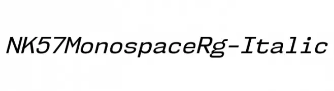
A modern monospaced italic font with uniform spacing and a sleek, dynamic style.
![NK57MonospaceRg-Italic Frei Schriftart Herunterladen]() Herunterladen 128 Downloads@WebFont
Herunterladen 128 Downloads@WebFont -
( Fonts by Daniel Zadorozny - www.iconian.com )
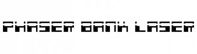
A futuristic, pixelated font with blocky, geometric shapes.
![Phaser Bank Laser Frei Schriftart Herunterladen]() Herunterladen 128 Downloads@WebFont
Herunterladen 128 Downloads@WebFont -
( Iconian Fonts - Daniel Zadorozny - www.iconian.com )
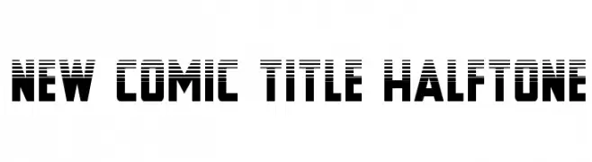
A bold, comic-inspired font with a halftone effect and dynamic style.
![New Comic Title Halftone Frei Schriftart Herunterladen]() Herunterladen 128 Downloads@WebFont
Herunterladen 128 Downloads@WebFont -
( Fonts by Manfred Klein. Free for private and charity use. Free for commercial with donation to organizations )
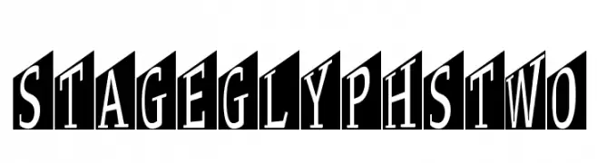
A bold, shadowed font with a modern, three-dimensional style.
![StageGlyphsTwo Frei Schriftart Herunterladen]() Herunterladen 128 Downloads@WebFont
Herunterladen 128 Downloads@WebFont -
![SubiktoTwo beta Frei Schriftart Herunterladen]() Herunterladen 128 Downloads@WebFont
Herunterladen 128 Downloads@WebFont -
![EllaineDemo Frei Schriftart Herunterladen]() Herunterladen 128 Downloads@WebFont
Herunterladen 128 Downloads@WebFont -
( Fonts by MJType )
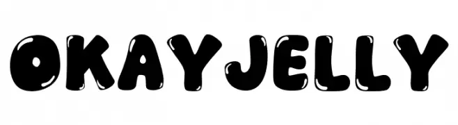
A playful, bold font with a bubbly, rounded style and glossy appearance.
![Okay Jelly Frei Schriftart Herunterladen]() Herunterladen 128 Downloads@WebFont
Herunterladen 128 Downloads@WebFont -
( Fonts by Daniel Zadorozny - www.iconian.com - Free for personal use )
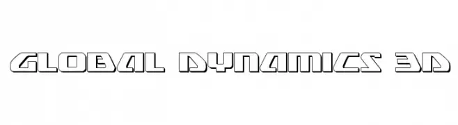
A bold, geometric font with a futuristic, three-dimensional style.
![Global Dynamics 3D Frei Schriftart Herunterladen]() Herunterladen 128 Downloads@WebFont
Herunterladen 128 Downloads@WebFont -
( Fonts by Daniel Zadorozny - www.iconian.com )
Bold, expanded, and italic with a futuristic, geometric style.
![Anakefka Expanded Italic Frei Schriftart Herunterladen]() Herunterladen 128 Downloads@WebFont
Herunterladen 128 Downloads@WebFont -
( Fonts by Creakokun Studio )
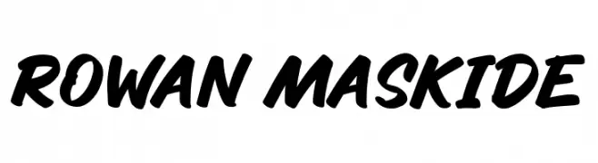
A bold, dynamic script font with a handwritten appearance.
![Rowan Maskide Frei Schriftart Herunterladen]() Herunterladen 128 Downloads@WebFont
Herunterladen 128 Downloads@WebFont -
( Fonts by Daniel Zadorozny - www.iconian.com )
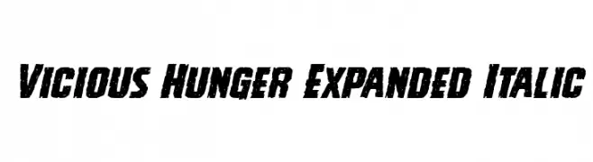
A bold, distressed, and italic typeface with a grunge aesthetic.
![Vicious Hunger Expanded Italic Frei Schriftart Herunterladen]() Herunterladen 128 Downloads@WebFont
Herunterladen 128 Downloads@WebFont -
( Fonts by Lafontype - Anugrah Pasau - Personal-use only. For commercial use please contact owner. )
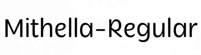
A modern, rounded sans-serif font with a clean and approachable style.
![Mithella-Regular Frei Schriftart Herunterladen]() Herunterladen 128 Downloads@WebFont
Herunterladen 128 Downloads@WebFont -
![YOzFontAP97 Bold Italic Frei Schriftart Herunterladen]() Herunterladen 128 Downloads@WebFont
Herunterladen 128 Downloads@WebFont -
( Nadhira Felani )
A graceful, flowing script font with elegant, connected characters.
![West Side Frei Schriftart Herunterladen]() Herunterladen 128 Downloads@WebFont
Herunterladen 128 Downloads@WebFont -
( Fonts by Morice Kastoun )
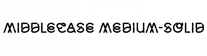
A bold, geometric font with a modern and futuristic style.
![Middlecase Medium-Solid Frei Schriftart Herunterladen]() Herunterladen 128 Downloads@WebFont
Herunterladen 128 Downloads@WebFont -
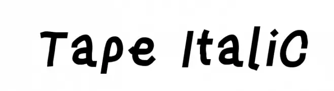
![Tape Italic Frei Schriftart Herunterladen]() Herunterladen 128 Downloads@WebFont
Herunterladen 128 Downloads@WebFont -
( Fonts by Cloutierfontes - Steve Cloutier - Personal-use only. For commercial use please contact owner. )
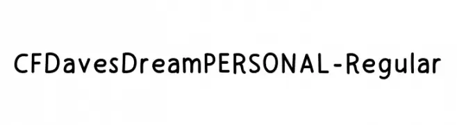
A playful, hand-drawn font with rounded edges and a friendly style.
![CFDavesDreamPERSONAL-Regular Frei Schriftart Herunterladen]() Herunterladen 128 Downloads@WebFont
Herunterladen 128 Downloads@WebFont -
( Fonts by Daniel Zadorozny - www.iconian.com )
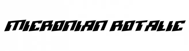
A bold, angular, and futuristic font with a dynamic slant.
![Micronian Rotalic Frei Schriftart Herunterladen]() Herunterladen 128 Downloads@WebFont
Herunterladen 128 Downloads@WebFont -
( Fonts by Woodcutter )
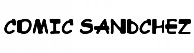
A playful, bold font with a cartoonish, hand-drawn style.
![Comic Sandchez Frei Schriftart Herunterladen]() Herunterladen 128 Downloads@WebFont
Herunterladen 128 Downloads@WebFont -
( Vladimir Nikolic - www.coroflot.com/vladimirnikolic )
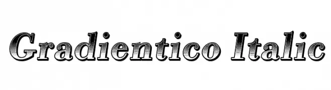
A bold, italic serif font with a gradient texture, offering a dynamic and modern look.
![Gradientico Italic Frei Schriftart Herunterladen]() Herunterladen 128 Downloads@WebFont
Herunterladen 128 Downloads@WebFont -
( Fonts by Manfred Klein. Free for private and charity use. Free for commercial with donation to organizations )
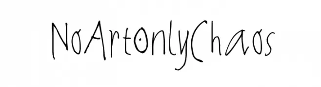
A playful, whimsical handwritten font with irregular strokes and a casual style.
![NoArtOnlyChaos Frei Schriftart Herunterladen]() Herunterladen 128 Downloads@WebFont
Herunterladen 128 Downloads@WebFont -
( Fonts by Attype Studio - Fadli Ramadhan Iskandar - Personal-use only. For commercial use please contact owner. )
A playful, handwritten font with smooth, rounded edges and a friendly style.
![Hearty Chintya Personal Use Frei Schriftart Herunterladen]() Herunterladen 128 Downloads@WebFont
Herunterladen 128 Downloads@WebFont -
( Fonts by alphArtype - Agung Rohmat - Personal-use only. For commercial use please contact owner. )
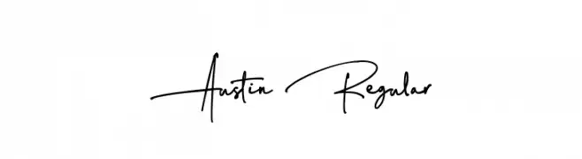
A fluid, handwritten font with a casual and personal touch.
![Austin Regular Frei Schriftart Herunterladen]() Herunterladen 128 Downloads@WebFont
Herunterladen 128 Downloads@WebFont -
( Fonts by or from www.graffitifonts.net )
A playful, bold font with thick strokes and rounded edges, ideal for comic-style designs.
![WBXKomik Frei Schriftart Herunterladen]() Herunterladen 128 Downloads@WebFont
Herunterladen 128 Downloads@WebFont -
( Fonts by Manfred Klein. Free for private and charity use. Free for commercial with donation to organizations )
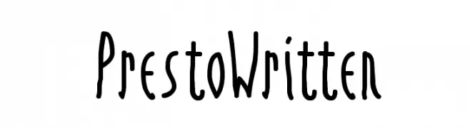
A playful, handwritten font with tall, narrow letters and uneven strokes.
![PrestoWritten Frei Schriftart Herunterladen]() Herunterladen 128 Downloads@WebFont
Herunterladen 128 Downloads@WebFont -
( Fonts by Vladimir Nikolic - https://www.creativefabrica.com/product/educated-deers/ref/144265/ - Personal-use only. For commercial use please contact owner. )
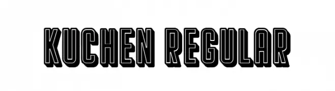
A bold, decorative font with a strong outline and three-dimensional appearance.
![Kuchen Regular Frei Schriftart Herunterladen]() Herunterladen 128 Downloads@WebFont
Herunterladen 128 Downloads@WebFont -
( Fonts by DmLetter31 - Dimas Prasetyo - Personal-use only. For commercial use please contact owner. )
A playful, handwritten script font with a whimsical and friendly style.
![Aloha March Frei Schriftart Herunterladen]() Herunterladen 128 Downloads@WebFont
Herunterladen 128 Downloads@WebFont -
( Fonts by Astigmatic One Eye Typographic Institute - Brian J. Bonislawsky - astigmatic.com )
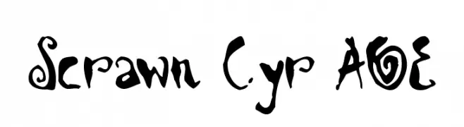
A whimsical, hand-drawn font with playful, irregular characters.
![Scrawn Cyr AOE Frei Schriftart Herunterladen]() Herunterladen 128 Downloads@WebFont
Herunterladen 128 Downloads@WebFont


Welche Schriften sind gerade am populärsten?
Poppins, Roboto, Montserrat, Open Sans und Lato sind wegen ihrer klaren Formen und breiten Einsetzbarkeit sehr gefragt – von Markenauftritt über Landingpages bis hin zu Postern.
Welche Fonts eignen sich für Logos?
Geometrische Sans‑Serifs (z. B. Poppins, Familien im Gotham‑Stil) sind ein häufiger Griff für sauberes, skalierbares Branding. Für eine persönlichere Note bleiben Scripts und Handschrift‑Stile beliebt. Kombinieren Sie einen prägnanten Headline‑Font mit einer neutralen Brotschrift für Wiedererkennung und Harmonie.
Wie oft wird die Top‑Liste aktualisiert?
Regelmäßig – basierend auf realen Downloads und Interaktionen. Schauen Sie öfter vorbei, um aufstrebende Favoriten früh zu entdecken.
💡 Tipp: Seite bookmarken – Trends wechseln schnell, und heutige Top‑Schriften inspirieren morgen vielleicht das Rebranding.