Willkommen bei den Top‑Schriften – hier treffen Beliebtheit und Qualität aufeinander. Das sind die in diesem Jahr am häufigsten heruntergeladenen und genutzten Fonts. Wenn Sie sichere Optionen für Logo, Web oder Social suchen, starten Sie hier.
Jeder Top‑Font überzeugt durch Balance, Lesbarkeit und Vielseitigkeit. Sie finden moderne Sans‑Serifs, elegante Scripts, Vintage‑Serifs und minimalistische Displays.
-
( Fonts by Fernando Carvente - serifdechocolate.wordpress.com )
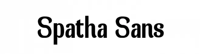
A modern sans-serif font with a slightly condensed style and medium contrast.
 Herunterladen 665 Downloads@WebFont
 -
( Fonts by Manfred Klein. Free for private and charity use. Free for commercial with donation to organizations )
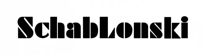
A bold, geometric font with high contrast and unique cutouts.
![SchabLonski Frei Schriftart Herunterladen]() Herunterladen 665 Downloads@WebFont
Herunterladen 665 Downloads@WebFont -
![ESRI Crime Analysis Frei Schriftart Herunterladen]() Herunterladen 665 Downloads@WebFont
Herunterladen 665 Downloads@WebFont -
( Fonts by Koczman Balint - magiquefonts.gportal.hu )
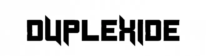
A bold, geometric font with a futuristic, angular design.
![Duplexide Frei Schriftart Herunterladen]() Herunterladen 665 Downloads@WebFont
Herunterladen 665 Downloads@WebFont -
![Lines Frei Schriftart Herunterladen]() Herunterladen 665 Downloads@WebFont
Herunterladen 665 Downloads@WebFont -
-
![alien crop circles Regular Frei Schriftart Herunterladen]() Herunterladen 665 Downloads@WebFont
Herunterladen 665 Downloads@WebFont -
( Fonts by Pi Luo Chiu - thisisallenchiu.tumblr.com )
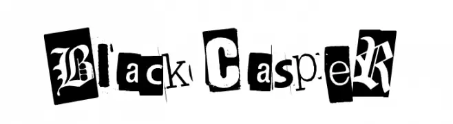
A distressed, eclectic font with a cut-out, grungy aesthetic.
![BlackCasper Frei Schriftart Herunterladen]() Herunterladen 665 Downloads@WebFont
Herunterladen 665 Downloads@WebFont -
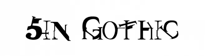
![Sin Gothic Frei Schriftart Herunterladen]() Herunterladen 665 Downloads
Herunterladen 665 Downloads -
( Fonts by dartcanada.tripod.com - Darren Rigby )
A modern, bold sans-serif font with clean lines and excellent readability.
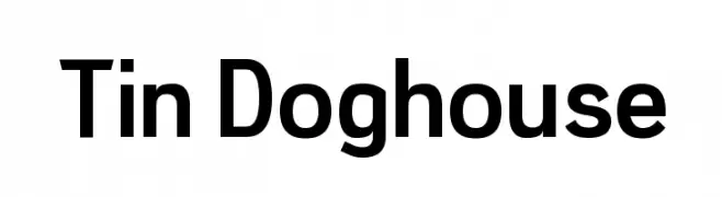
![Tin Doghouse Frei Schriftart Herunterladen]() Herunterladen 665 Downloads@WebFont
Herunterladen 665 Downloads@WebFont -
( Fonts by TarmSaft Font Factory - http://www.aska.nu/tarmsaft/ )
A bold, playful font with rounded edges and a hand-drawn style.
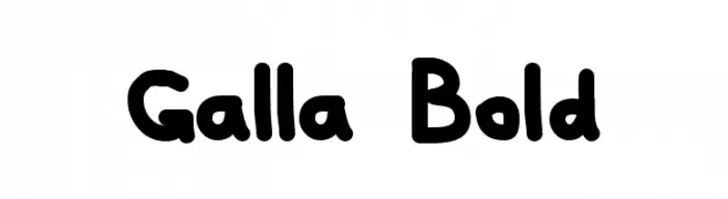
![Galla Bold Frei Schriftart Herunterladen]() Herunterladen 665 Downloads@WebFont
Herunterladen 665 Downloads@WebFont


Welche Schriften sind gerade am populärsten?
Poppins, Roboto, Montserrat, Open Sans und Lato sind wegen ihrer klaren Formen und breiten Einsetzbarkeit sehr gefragt – von Markenauftritt über Landingpages bis hin zu Postern.
Welche Fonts eignen sich für Logos?
Geometrische Sans‑Serifs (z. B. Poppins, Familien im Gotham‑Stil) sind ein häufiger Griff für sauberes, skalierbares Branding. Für eine persönlichere Note bleiben Scripts und Handschrift‑Stile beliebt. Kombinieren Sie einen prägnanten Headline‑Font mit einer neutralen Brotschrift für Wiedererkennung und Harmonie.
Wie oft wird die Top‑Liste aktualisiert?
Regelmäßig – basierend auf realen Downloads und Interaktionen. Schauen Sie öfter vorbei, um aufstrebende Favoriten früh zu entdecken.
💡 Tipp: Seite bookmarken – Trends wechseln schnell, und heutige Top‑Schriften inspirieren morgen vielleicht das Rebranding.