Willkommen bei den Top‑Schriften – hier treffen Beliebtheit und Qualität aufeinander. Das sind die in diesem Jahr am häufigsten heruntergeladenen und genutzten Fonts. Wenn Sie sichere Optionen für Logo, Web oder Social suchen, starten Sie hier.
Jeder Top‑Font überzeugt durch Balance, Lesbarkeit und Vielseitigkeit. Sie finden moderne Sans‑Serifs, elegante Scripts, Vintage‑Serifs und minimalistische Displays.
-
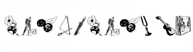
( Fonts by Manfred Klein. Free for private and charity use. Free for commercial with donation to organizations )
A display font made from hand-drawn musical instrument illustrations.
 Herunterladen 125 Downloads@WebFont
 -
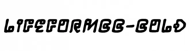
( Fonts by www.blambot.com )
A bold, playful font with a futuristic and retro vibe.
![LifeFormBB-Bold Frei Schriftart Herunterladen]() Herunterladen 125 Downloads@WebFont
Herunterladen 125 Downloads@WebFont -
![CRU-Pharit-Hand-Written v2 Bold Frei Schriftart Herunterladen]() Herunterladen 125 Downloads@WebFont
Herunterladen 125 Downloads@WebFont -
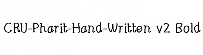
( Fonts by Fakhruddin Kagzi - Personal-use only. For commercial use please contact owner. )
A modern, geometric sans-serif font with uniform stroke width.
![Initia Sans Regular Frei Schriftart Herunterladen]() Herunterladen 125 Downloads@WebFont
Herunterladen 125 Downloads@WebFont -
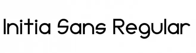
( Fonts by Han Lee )
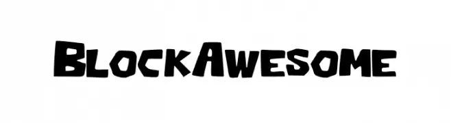
A bold, playful, and blocky font with rounded edges.
![Block_Awesome Frei Schriftart Herunterladen]() Herunterladen 125 Downloads@WebFont
Herunterladen 125 Downloads@WebFont -
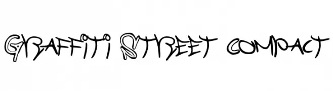
![Graffiti Street Compact Frei Schriftart Herunterladen]() Herunterladen 125 Downloads@WebFont
Herunterladen 125 Downloads@WebFont -
( Fonts by Font Environment - fontenvironment.com )
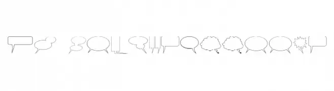
Outlined comic speech and thought balloon glyphs.
![FE-ComixxBalloons Frei Schriftart Herunterladen]() Herunterladen 125 Downloads@WebFont
Herunterladen 125 Downloads@WebFont -
( Fonts by Jovanny Lemonad - typetype.ru - Personal-use only. For commercial use please contact owner. )
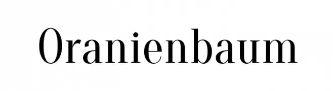
A classic serif font with elegant strokes and moderate contrast.
![Oranienbaum Frei Schriftart Herunterladen]() Herunterladen 125 Downloads@WebFont
Herunterladen 125 Downloads@WebFont -
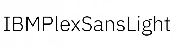
( Fonts by IBM )
A modern, light sans-serif font with excellent legibility and a clean, professional look.
![IBM Plex Sans Light Frei Schriftart Herunterladen]() Herunterladen 125 Downloads@WebFont
Herunterladen 125 Downloads@WebFont -
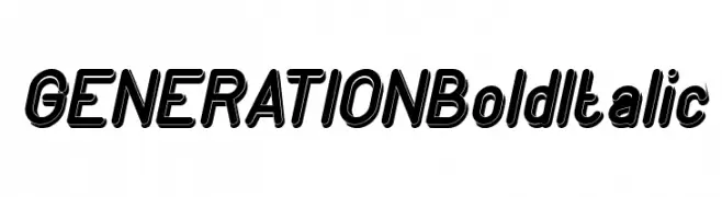
( weknow - Wino S Kadir - www.creativefabrica.com/designer/weknow/ )
A bold, italicized font with a strong, dynamic presence and shadow effect.
![GENERATION Bold Italic Frei Schriftart Herunterladen]() Herunterladen 125 Downloads@WebFont
Herunterladen 125 Downloads@WebFont -
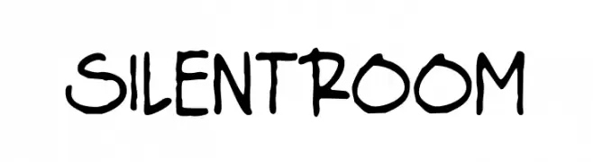
( Fonts by Origin Type )
Handwritten, playful font with irregular strokes.
![Silent Room Frei Schriftart Herunterladen]() Herunterladen 125 Downloads@WebFont
Herunterladen 125 Downloads@WebFont -
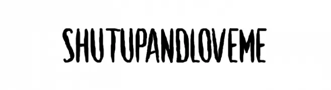
( Fonts by www.chequered.ink - Chequered Ink - Personal-use only. For commercial use please contact owner. )
A bold, hand-drawn font with an expressive and playful style.
![Shut Up and Love Me Frei Schriftart Herunterladen]() Herunterladen 125 Downloads@WebFont
Herunterladen 125 Downloads@WebFont -
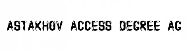
( Fonts by Dmitry Astakhov - www.behance.net/adonis-abe1e - Personal-use only. For commercial use please contact owner. )
A bold, playful font with high contrast and organic shapes, ideal for creative projects.
![Astakhov Access Degree AG Frei Schriftart Herunterladen]() Herunterladen 125 Downloads@WebFont
Herunterladen 125 Downloads@WebFont -
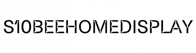
( Fonts by The Bee Home Project Authors - bakkenbaeck.com - Personal-use only. For commercial use please contact owner. )
A modern, geometric font with bold, angular characters.
![S10 Beehome Display Frei Schriftart Herunterladen]() Herunterladen 125 Downloads@WebFont
Herunterladen 125 Downloads@WebFont -
( Fonts by New Typography - Vernon Adams. Personal-use only. For commercial use please contact owner. )
A classic slab serif font with strong serifs and moderate contrast, ideal for authoritative and readable text.
![Rokkitt Frei Schriftart Herunterladen]() Herunterladen 125 Downloads@WebFont
Herunterladen 125 Downloads@WebFont -
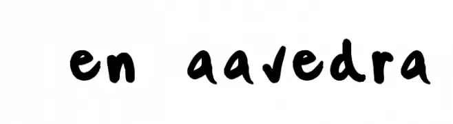
![KenSaavedra Frei Schriftart Herunterladen]() Herunterladen 125 Downloads@WebFont
Herunterladen 125 Downloads@WebFont -
![dog_csp Frei Schriftart Herunterladen]() Herunterladen 125 Downloads@WebFont
Herunterladen 125 Downloads@WebFont -
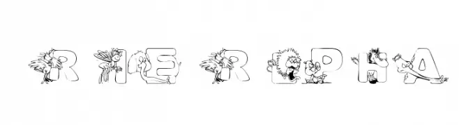
( Nght's Place - www.crosswinds.net/~nghtmvs/font/fonts1.html )
A playful decorative font with critter-themed illustrations in each letter.
![101! CriTTerZ Alpha Frei Schriftart Herunterladen]() Herunterladen 125 Downloads@WebFont
Herunterladen 125 Downloads@WebFont -
( Fonts by Perspectype Studio )
A playful, handwritten font with fluid, flowing strokes and artistic flair.
![Dangella Frei Schriftart Herunterladen]() Herunterladen 125 Downloads@WebFont
Herunterladen 125 Downloads@WebFont -
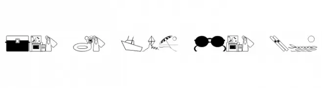
( Fonts by Jeff Levine. FREEWARE )
Summer and beach-themed pictogram dingbat font.
![Fun In The Sun JL Frei Schriftart Herunterladen]() Herunterladen 125 Downloads@WebFont
Herunterladen 125 Downloads@WebFont -
( Fonts by nomlimofont - Personal-use only. For commercial use please contact owner. )
A lively, handwritten font with bold, fluid strokes and a modern appeal.
![Water dolphin Frei Schriftart Herunterladen]() Herunterladen 125 Downloads@WebFont
Herunterladen 125 Downloads@WebFont -
( Nght's Place - www.crosswinds.net/~nghtmvs/font/fonts1.html )
A decorative font with floral embellishments on each character.
![101! DaffYDilZ Frei Schriftart Herunterladen]() Herunterladen 125 Downloads@WebFont
Herunterladen 125 Downloads@WebFont -
Schriftart von danny91194. For commercial use please contact the owner.
( l )
A decorative and artistic font with geometric and abstract letterforms.
![yacuzzi Frei Schriftart Herunterladen]() Herunterladen 125 Downloads@WebFont
Herunterladen 125 Downloads@WebFont -
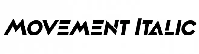
( Fonts by Vladimir Nikolic - www.creativefabrica.com/designer/vladimirnikolic/ - Personal-use only. For commercial use please contact owner. )
A bold, italic, and geometric font with a modern, dynamic style.
![Movement Italic Frei Schriftart Herunterladen]() Herunterladen 125 Downloads@WebFont
Herunterladen 125 Downloads@WebFont -
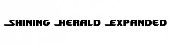
( Fonts by Daniel Zadorozny - www.iconian.com - Free for personal use )
A bold, geometric font with a futuristic and expanded style.
![Shining Herald Expanded Frei Schriftart Herunterladen]() Herunterladen 125 Downloads@WebFont
Herunterladen 125 Downloads@WebFont -
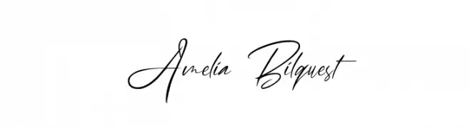
( Fonts by zamjump )
Elegant handwritten script font.
![Amelia Bilquest Frei Schriftart Herunterladen]() Herunterladen 125 Downloads@WebFont
Herunterladen 125 Downloads@WebFont -
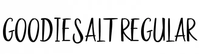
( Fonts by Font Bundles )
A playful, hand-drawn font with tall, narrow letters and a whimsical style.
![Goodies Alt2 Regular Frei Schriftart Herunterladen]() Herunterladen 125 Downloads@WebFont
Herunterladen 125 Downloads@WebFont -
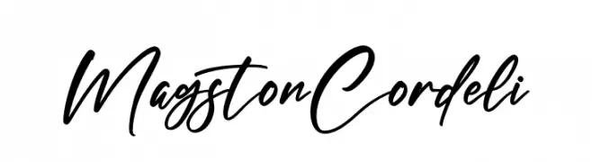
( Fonts by Letterena Studios )
A dynamic, cursive script font with a natural handwriting style.
![Magston Cordeli Frei Schriftart Herunterladen]() Herunterladen 125 Downloads@WebFont
Herunterladen 125 Downloads@WebFont -
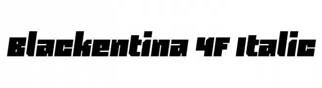
( Fonts by 4th february - Personal-use only. For commercial use please contact owner. )
A bold, angular, and italic font with high contrast and geometric shapes.
![Blackentina 4F Italic Frei Schriftart Herunterladen]() Herunterladen 125 Downloads@WebFont
Herunterladen 125 Downloads@WebFont -
( Fonts by a Max Infeld - XEROGRAPHER FONTS - xerographer.blogspot.com . Personal-use only. For commercial use please contact owner. )
A distressed, edgy font with a hand-drawn, dynamic style.
![FinalDays Frei Schriftart Herunterladen]() Herunterladen 125 Downloads@WebFont
Herunterladen 125 Downloads@WebFont -
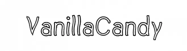
( Fonts by www.woodcutter.es - woodcutter Manero - Personal-use only. For commercial use please contact owner. )
A playful, candy-like font with dotted outlines and rounded characters.
![Vanilla Candy Frei Schriftart Herunterladen]() Herunterladen 125 Downloads@WebFont
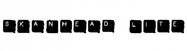
Herunterladen 125 Downloads@WebFont -
![SkanHead Lite Frei Schriftart Herunterladen]() Herunterladen 125 Downloads@WebFont
Herunterladen 125 Downloads@WebFont -
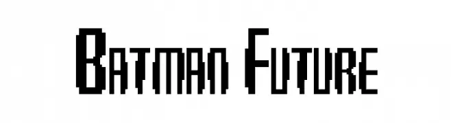
![Batman Future Frei Schriftart Herunterladen]() Herunterladen 125 Downloads@WebFont
Herunterladen 125 Downloads@WebFont -
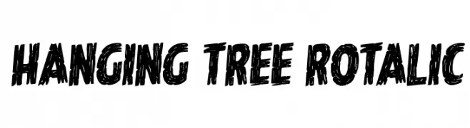
( Fonts by Daniel Zadorozny - www.iconian.com - Personal-use only. For commercial use please contact owner. )
A bold, textured, hand-drawn font with a dynamic and edgy style.
![Hanging Tree Rotalic Frei Schriftart Herunterladen]() Herunterladen 125 Downloads@WebFont
Herunterladen 125 Downloads@WebFont -
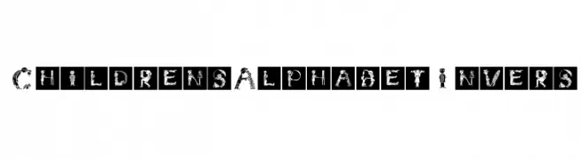
( Fonts by Manfred Klein. Free for private and charity use. Free for commercial with donation to organizations )
A playful font with letters formed by illustrations of children in various activities.
![ChildrensAlphabetInvers Frei Schriftart Herunterladen]() Herunterladen 125 Downloads@WebFont
Herunterladen 125 Downloads@WebFont


Welche Schriften sind gerade am populärsten?
Poppins, Roboto, Montserrat, Open Sans und Lato sind wegen ihrer klaren Formen und breiten Einsetzbarkeit sehr gefragt – von Markenauftritt über Landingpages bis hin zu Postern.
Welche Fonts eignen sich für Logos?
Geometrische Sans‑Serifs (z. B. Poppins, Familien im Gotham‑Stil) sind ein häufiger Griff für sauberes, skalierbares Branding. Für eine persönlichere Note bleiben Scripts und Handschrift‑Stile beliebt. Kombinieren Sie einen prägnanten Headline‑Font mit einer neutralen Brotschrift für Wiedererkennung und Harmonie.
Wie oft wird die Top‑Liste aktualisiert?
Regelmäßig – basierend auf realen Downloads und Interaktionen. Schauen Sie öfter vorbei, um aufstrebende Favoriten früh zu entdecken.
💡 Tipp: Seite bookmarken – Trends wechseln schnell, und heutige Top‑Schriften inspirieren morgen vielleicht das Rebranding.