Willkommen bei den Top‑Schriften – hier treffen Beliebtheit und Qualität aufeinander. Das sind die in diesem Jahr am häufigsten heruntergeladenen und genutzten Fonts. Wenn Sie sichere Optionen für Logo, Web oder Social suchen, starten Sie hier.
Jeder Top‑Font überzeugt durch Balance, Lesbarkeit und Vielseitigkeit. Sie finden moderne Sans‑Serifs, elegante Scripts, Vintage‑Serifs und minimalistische Displays.
-
 Herunterladen 656 Downloads@WebFont
 -
( Fonts by Steve Ferrera )
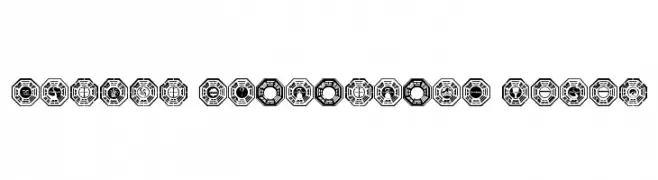
A bold, geometric display font with octagonal emblem motifs and strong contrast.
![Dharma Initiative Logos Frei Schriftart Herunterladen]() Herunterladen 656 Downloads@WebFont
Herunterladen 656 Downloads@WebFont -
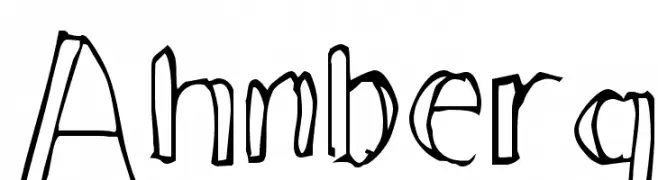
![Ahnberg Frei Schriftart Herunterladen]() Herunterladen 656 Downloads@WebFont
Herunterladen 656 Downloads@WebFont -
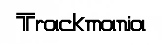
![Trackmania Frei Schriftart Herunterladen]() Herunterladen 656 Downloads@WebFont
Herunterladen 656 Downloads@WebFont -
( Fonts by Fabrika De Typos - Marcio Hirosse - fabrikadetypos.blogspot.com )
A bold, geometric font with a modern and futuristic style.
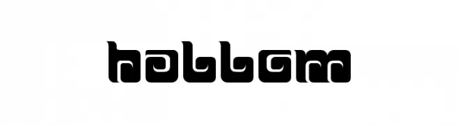
![BALLOM Frei Schriftart Herunterladen]() Herunterladen 656 Downloads@WebFont
Herunterladen 656 Downloads@WebFont -
-
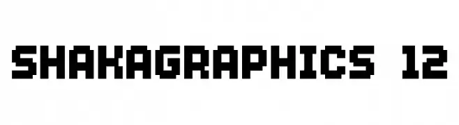
![SHAKAGRAPHICS 12 Frei Schriftart Herunterladen]() Herunterladen 656 Downloads@WebFont
Herunterladen 656 Downloads@WebFont -
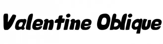
![Valentine Oblique Frei Schriftart Herunterladen]() Herunterladen 656 Downloads@WebFont
Herunterladen 656 Downloads@WebFont -
( Fonts by www.fontalicious.com )
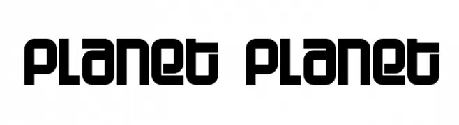
A bold, geometric font with a modern, futuristic style.
![Planet Planet Frei Schriftart Herunterladen]() Herunterladen 656 Downloads@WebFont
Herunterladen 656 Downloads@WebFont -
( Fonts by Nick Curtis - www.nicksfonts.com )
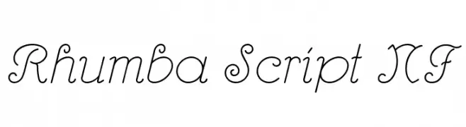
An elegant script font with flowing curves and decorative swashes.
![Rhumba Script NF Frei Schriftart Herunterladen]() Herunterladen 656 Downloads@WebFont
Herunterladen 656 Downloads@WebFont -
![Bilibin Frei Schriftart Herunterladen]() Herunterladen 656 Downloads@WebFont
Herunterladen 656 Downloads@WebFont
Welche Schriften sind gerade am populärsten?
Poppins, Roboto, Montserrat, Open Sans und Lato sind wegen ihrer klaren Formen und breiten Einsetzbarkeit sehr gefragt – von Markenauftritt über Landingpages bis hin zu Postern.
Welche Fonts eignen sich für Logos?
Geometrische Sans‑Serifs (z. B. Poppins, Familien im Gotham‑Stil) sind ein häufiger Griff für sauberes, skalierbares Branding. Für eine persönlichere Note bleiben Scripts und Handschrift‑Stile beliebt. Kombinieren Sie einen prägnanten Headline‑Font mit einer neutralen Brotschrift für Wiedererkennung und Harmonie.
Wie oft wird die Top‑Liste aktualisiert?
Regelmäßig – basierend auf realen Downloads und Interaktionen. Schauen Sie öfter vorbei, um aufstrebende Favoriten früh zu entdecken.
💡 Tipp: Seite bookmarken – Trends wechseln schnell, und heutige Top‑Schriften inspirieren morgen vielleicht das Rebranding.