Willkommen bei den Top‑Schriften – hier treffen Beliebtheit und Qualität aufeinander. Das sind die in diesem Jahr am häufigsten heruntergeladenen und genutzten Fonts. Wenn Sie sichere Optionen für Logo, Web oder Social suchen, starten Sie hier.
Jeder Top‑Font überzeugt durch Balance, Lesbarkeit und Vielseitigkeit. Sie finden moderne Sans‑Serifs, elegante Scripts, Vintage‑Serifs und minimalistische Displays.
-
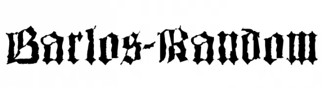
( Fonts by Manfred Klein - manfred-klein.ina-mar.com )
A bold, gothic Blackletter font with intricate, angular designs and pronounced serifs.
 Herunterladen 654 Downloads@WebFont
 -
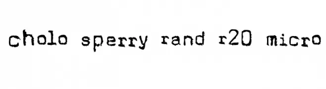
![Cholo Sperry Rand R20 Micro Frei Schriftart Herunterladen]() Herunterladen 654 Downloads@WebFont
Herunterladen 654 Downloads@WebFont -
( Fonts by Dieter Schumacher )
A sleek, modern font with elongated, narrow characters and a minimalist style.
![Slimania2 Frei Schriftart Herunterladen]() Herunterladen 654 Downloads@WebFont
Herunterladen 654 Downloads@WebFont -
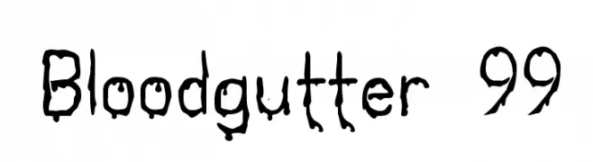
![Bloodgutter 99 Frei Schriftart Herunterladen]() Herunterladen 654 Downloads@WebFont
Herunterladen 654 Downloads@WebFont -
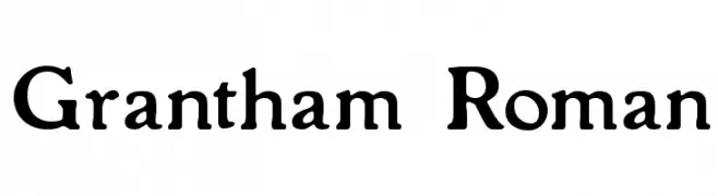
( Fonts by Paul Lloyd )
A classic serif font with elegant, bold characters and traditional serifs.
![Grantham Roman Frei Schriftart Herunterladen]() Herunterladen 654 Downloads
Herunterladen 654 Downloads -
-
( Fonts by Mike Hind - Stick Fonts )
A bold, playful font with chunky, rounded letterforms and a whimsical style.
![Fatty Bombatty Frei Schriftart Herunterladen]() Herunterladen 654 Downloads@WebFont
Herunterladen 654 Downloads@WebFont -
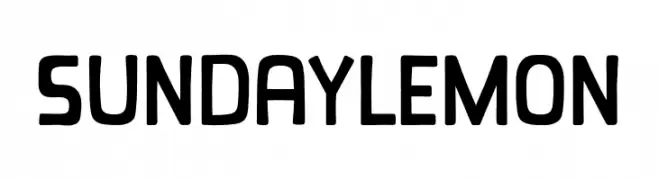
( Fonts by Khurasan )
A playful, rounded font with bold, consistent strokes and a friendly appearance.
![Sunday Lemon Frei Schriftart Herunterladen]() Herunterladen 653 Downloads@WebFont
Herunterladen 653 Downloads@WebFont -
( Fonts by nomlimofont - Personal-use only. For commercial use please contact owner. )
A lively and flowing script font with elegant, connected letterforms.
![Blinking Frei Schriftart Herunterladen]() Herunterladen 653 Downloads@WebFont
Herunterladen 653 Downloads@WebFont -
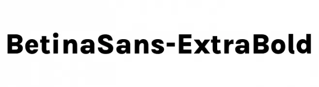
( Fonts by Jonathan Pinhorn (font) & Cristiano Sobral (main changes) - Personal-use only. For commercial use please contact owner. )
A bold, modern sans-serif font ideal for headlines and impactful text.
![BetinaSans-ExtraBold Frei Schriftart Herunterladen]() Herunterladen 653 Downloads@WebFont
Herunterladen 653 Downloads@WebFont -
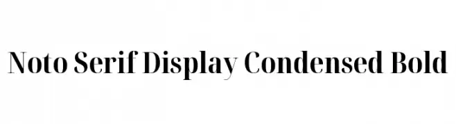
( Noto is a trademark of Google Inc. Noto fonts are open source. All Noto fonts are published under the SIL Open Font License, Version 1.1 )
A bold, condensed serif typeface with high contrast and elegant style.
![Noto Serif Display Condensed Bold Frei Schriftart Herunterladen]() Herunterladen 653 Downloads@WebFont
Herunterladen 653 Downloads@WebFont


Welche Schriften sind gerade am populärsten?
Poppins, Roboto, Montserrat, Open Sans und Lato sind wegen ihrer klaren Formen und breiten Einsetzbarkeit sehr gefragt – von Markenauftritt über Landingpages bis hin zu Postern.
Welche Fonts eignen sich für Logos?
Geometrische Sans‑Serifs (z. B. Poppins, Familien im Gotham‑Stil) sind ein häufiger Griff für sauberes, skalierbares Branding. Für eine persönlichere Note bleiben Scripts und Handschrift‑Stile beliebt. Kombinieren Sie einen prägnanten Headline‑Font mit einer neutralen Brotschrift für Wiedererkennung und Harmonie.
Wie oft wird die Top‑Liste aktualisiert?
Regelmäßig – basierend auf realen Downloads und Interaktionen. Schauen Sie öfter vorbei, um aufstrebende Favoriten früh zu entdecken.
💡 Tipp: Seite bookmarken – Trends wechseln schnell, und heutige Top‑Schriften inspirieren morgen vielleicht das Rebranding.