Willkommen bei den Top‑Schriften – hier treffen Beliebtheit und Qualität aufeinander. Das sind die in diesem Jahr am häufigsten heruntergeladenen und genutzten Fonts. Wenn Sie sichere Optionen für Logo, Web oder Social suchen, starten Sie hier.
Jeder Top‑Font überzeugt durch Balance, Lesbarkeit und Vielseitigkeit. Sie finden moderne Sans‑Serifs, elegante Scripts, Vintage‑Serifs und minimalistische Displays.
-
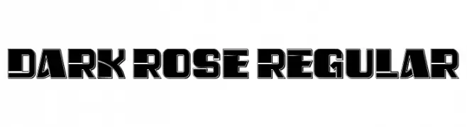
( Fonts by Vladimir Nikolic - www.creativefabrica.com/designer/vladimirnikolic/ - Personal-use only. For commercial use please contact owner. )
A bold, geometric font with a three-dimensional effect.
 Herunterladen 123 Downloads@WebFont
 -
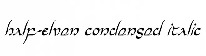
( Fonts by Daniel Zadorozny - www.iconian.com )
A condensed, italicized font with a flowing, fantasy-inspired style.
![Half-Elven Condensed Italic Frei Schriftart Herunterladen]() Herunterladen 123 Downloads@WebFont
Herunterladen 123 Downloads@WebFont -
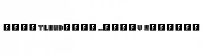
![heavyLOUDedge_lineV Regular Frei Schriftart Herunterladen]() Herunterladen 123 Downloads@WebFont
Herunterladen 123 Downloads@WebFont -
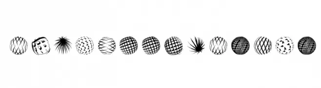
( Fonts by Manfred Klein. Free for private and charity use. Free for commercial with donation to organizations )
Abstract, hand-drawn geometric display font with spherical motifs.
![BlueMoonsByDay Frei Schriftart Herunterladen]() Herunterladen 123 Downloads@WebFont
Herunterladen 123 Downloads@WebFont -
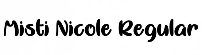
( Fonts by Misti Hammers - mistifonts.com - Personal-use only. For commercial use please contact owner. )
A bold, playful handwritten font with smooth, rounded edges.
![Misti Nicole Regular Frei Schriftart Herunterladen]() Herunterladen 123 Downloads@WebFont
Herunterladen 123 Downloads@WebFont -
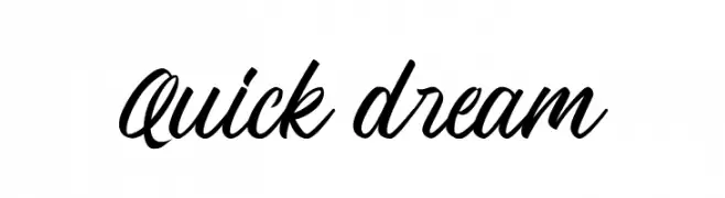
( Fonts by Andika Fez - Personal-use only. For commercial use please contact owner. )
A bold, cursive script font with a fluid, handwritten style.
![Quick dream Frei Schriftart Herunterladen]() Herunterladen 123 Downloads@WebFont
Herunterladen 123 Downloads@WebFont -
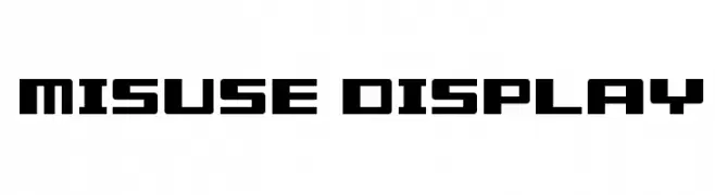
( Archetype )
A bold, geometric font with a futuristic and structured appearance.
![Misuse Display Frei Schriftart Herunterladen]() Herunterladen 123 Downloads@WebFont
Herunterladen 123 Downloads@WebFont -
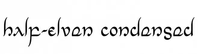
( Fonts by Daniel Zadorozny - www.iconian.com )
A decorative, fantasy-inspired font with elegant curves and a condensed style.
![Half-Elven Condensed Frei Schriftart Herunterladen]() Herunterladen 123 Downloads@WebFont
Herunterladen 123 Downloads@WebFont -
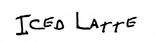
( Fonts by www.fontpanda.com. Personal-use only. For commercial use please contact owner. )
A casual, playful handwritten font with an organic, freeform style.
![Iced Latte Frei Schriftart Herunterladen]() Herunterladen 123 Downloads@WebFont
Herunterladen 123 Downloads@WebFont -
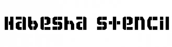
( Fonts by yoniX - Personal-use only. For commercial use please contact owner. )
A bold, geometric stencil font with a rugged, industrial style.
![Habesha stencil Frei Schriftart Herunterladen]() Herunterladen 123 Downloads@WebFont
Herunterladen 123 Downloads@WebFont -
( Fonts by Bathara )
A bold, playful font with decorative swirls and curls.
![hot chili Frei Schriftart Herunterladen]() Herunterladen 123 Downloads@WebFont
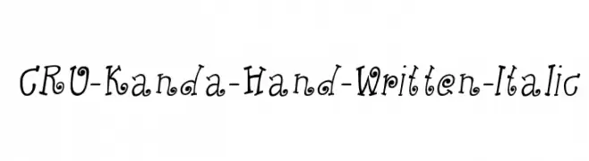
Herunterladen 123 Downloads@WebFont -
![CRU-Kanda-Hand-Written-Italic Frei Schriftart Herunterladen]() Herunterladen 123 Downloads@WebFont
Herunterladen 123 Downloads@WebFont -
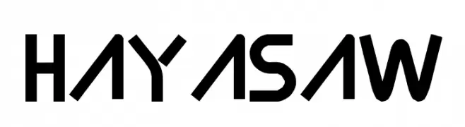
( FOD - www.geocities.co.jp/siliconvalley/1286/ )
A futuristic, geometric font with bold, angular letterforms and consistent stroke width.
![Hayasaw Frei Schriftart Herunterladen]() Herunterladen 123 Downloads@WebFont
Herunterladen 123 Downloads@WebFont -
( Fonts by Daniel Zadorozny - www.iconian.com )
A bold, angular, and italicized font with a futuristic style.
![Gunner Storm Drop Italic Frei Schriftart Herunterladen]() Herunterladen 123 Downloads@WebFont
Herunterladen 123 Downloads@WebFont -
( Fonts by Maulana Creative - Gilang Maulana - Personal-use only. For commercial use please contact owner. )
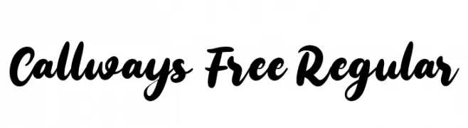
A bold, flowing script font with elegant, interconnected characters.
![Callways Free Regular Frei Schriftart Herunterladen]() Herunterladen 123 Downloads@WebFont
Herunterladen 123 Downloads@WebFont -
( Fonts by Darrell Flood - Personal-use only. For commercial use please contact owner. )
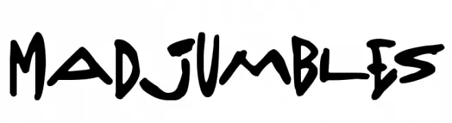
A bold, playful, hand-drawn font with dynamic, irregular characters.
![Madjumbles Frei Schriftart Herunterladen]() Herunterladen 123 Downloads@WebFont
Herunterladen 123 Downloads@WebFont -
![Icons Social Media 3 Frei Schriftart Herunterladen]() Herunterladen 123 Downloads@WebFont
Herunterladen 123 Downloads@WebFont -
( Fonts by 7NTypes - Personal-use only. For commercial use please contact owner. )
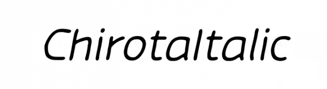
A modern italic font with smooth curves and consistent stroke thickness.
![Chirota Italic Frei Schriftart Herunterladen]() Herunterladen 123 Downloads@WebFont
Herunterladen 123 Downloads@WebFont -
( Fonts by Font Monger - Chris Vile - Personal-use only. For commercial use please contact owner. )
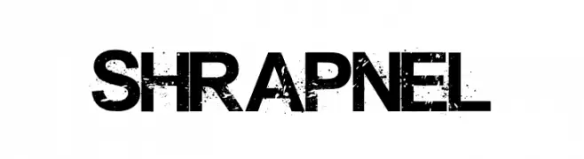
A bold, distressed font with a gritty, weathered texture.
![Shrapnel Frei Schriftart Herunterladen]() Herunterladen 123 Downloads@WebFont
Herunterladen 123 Downloads@WebFont -
![See You Nightmare Regular Frei Schriftart Herunterladen]() Herunterladen 123 Downloads@WebFont
Herunterladen 123 Downloads@WebFont -
( Fonts by Alit Design )
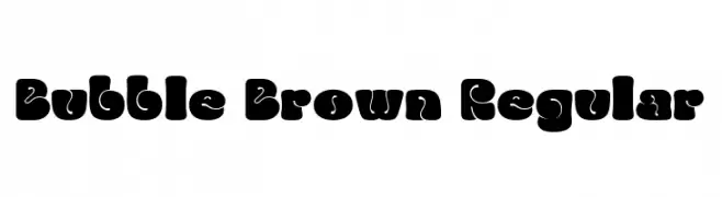
A playful, bold font with a bubbly, retro style.
![Bubble Brown Regular Frei Schriftart Herunterladen]() Herunterladen 123 Downloads@WebFont
Herunterladen 123 Downloads@WebFont -
( Fonts by Vladimir Nikolic )
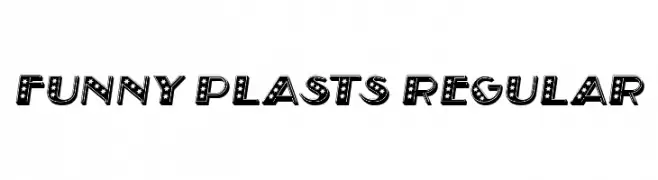
A playful, star-patterned decorative font with bold, blocky letters.
![Funny Plasts Regular Frei Schriftart Herunterladen]() Herunterladen 123 Downloads@WebFont
Herunterladen 123 Downloads@WebFont -
( Fonts by a Max Infeld - XEROGRAPHER FONTS - xerographer.blogspot.com . Personal-use only. For commercial use please contact owner. )
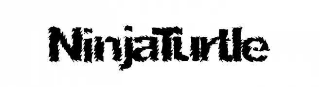
A bold, jagged font with a torn paper effect, perfect for dramatic designs.
![NinjaTurtle Frei Schriftart Herunterladen]() Herunterladen 123 Downloads@WebFont
Herunterladen 123 Downloads@WebFont -
( Fonts by Misti Hammers - mistifonts.com - Personal-use only. For commercial use please contact owner. )
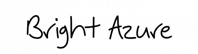
A playful, casual handwritten font with smooth, flowing lines.
![Bright Azure Frei Schriftart Herunterladen]() Herunterladen 123 Downloads@WebFont
Herunterladen 123 Downloads@WebFont -
( Britt Douglas - galleryeight.blogspot.ca/ )
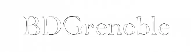
A classic serif font with modern elegance and refined letterforms.
![BDGrenoble Frei Schriftart Herunterladen]() Herunterladen 123 Downloads@WebFont
Herunterladen 123 Downloads@WebFont -
( Marta van Eck Designs - www.polish-your-art.com/boutique/index.php?main_page=index&cpath=9_14 )
A bold, playful font with thick, rounded characters.
![Fat Lady by Marta van Eck Frei Schriftart Herunterladen]() Herunterladen 123 Downloads@WebFont
Herunterladen 123 Downloads@WebFont -
( Fonts by Quote-Unquote Apps - Personal-use only. For commercial use please contact owner. )
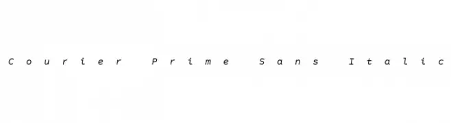
A clean, monospaced italic font with low contrast and modern style.
![Courier Prime Sans Italic Frei Schriftart Herunterladen]() Herunterladen 123 Downloads@WebFont
Herunterladen 123 Downloads@WebFont -
( Fonts by Manuel Ramos - www.infinitismo.com - Personal-use only. For commercial use please contact owner. )
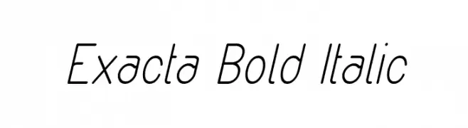
A sleek, italicized font with a modern and streamlined appearance.
![Exacta Bold Italic Frei Schriftart Herunterladen]() Herunterladen 123 Downloads@WebFont
Herunterladen 123 Downloads@WebFont -
( Vladimir Nikolic - www.coroflot.com/vladimirnikolic )
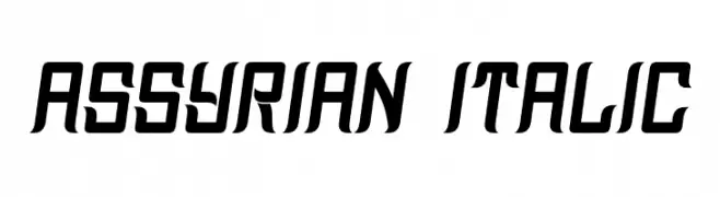
A bold, italic font with sharp angles and a modern, dynamic style.
![Assyrian Italic Frei Schriftart Herunterladen]() Herunterladen 123 Downloads@WebFont
Herunterladen 123 Downloads@WebFont -
( Fonts by Daniel Zadorozny - www.iconian.com - Free for personal use )
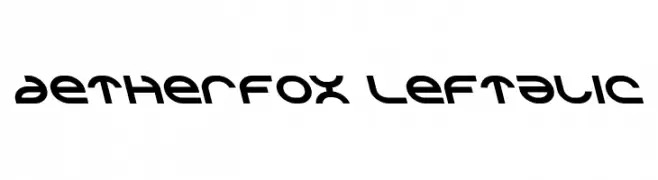
A futuristic, geometric font with bold strokes and angular cuts.
![Aetherfox Leftalic Frei Schriftart Herunterladen]() Herunterladen 123 Downloads@WebFont
Herunterladen 123 Downloads@WebFont -
( Fonts by Balibilly Design - Bill Natih - Personal-use only. For commercial use please contact owner. )
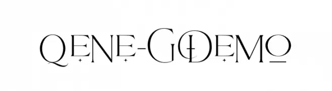
A modern, elegant font with high contrast and decorative elements.
![Qene-G Demo Frei Schriftart Herunterladen]() Herunterladen 123 Downloads@WebFont
Herunterladen 123 Downloads@WebFont -
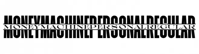
( Fonts by Mans Greback - Personal-use only. For commercial use please contact owner. )
A bold, condensed font with high contrast and a modern, impactful style.
![Moneymachine PERSONAL Regular Frei Schriftart Herunterladen]() Herunterladen 123 Downloads@WebFont
Herunterladen 123 Downloads@WebFont -
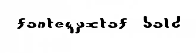
![FonteZyxTof Bold Frei Schriftart Herunterladen]() Herunterladen 123 Downloads@WebFont
Herunterladen 123 Downloads@WebFont -
( Fonts by Manfred Klein. Free for private and charity use. Free for commercial with donation to organizations )
Whimsical illustrated character-based decorative font.
![TrainWhatVectorMeans Frei Schriftart Herunterladen]() Herunterladen 123 Downloads@WebFont
Herunterladen 123 Downloads@WebFont -
( Fonts by Soolid Comunicazione - www.soolid.it )
A bold, angular font with a Gothic and futuristic style.
![Spigulus Frei Schriftart Herunterladen]() Herunterladen 123 Downloads@WebFont
Herunterladen 123 Downloads@WebFont


Welche Schriften sind gerade am populärsten?
Poppins, Roboto, Montserrat, Open Sans und Lato sind wegen ihrer klaren Formen und breiten Einsetzbarkeit sehr gefragt – von Markenauftritt über Landingpages bis hin zu Postern.
Welche Fonts eignen sich für Logos?
Geometrische Sans‑Serifs (z. B. Poppins, Familien im Gotham‑Stil) sind ein häufiger Griff für sauberes, skalierbares Branding. Für eine persönlichere Note bleiben Scripts und Handschrift‑Stile beliebt. Kombinieren Sie einen prägnanten Headline‑Font mit einer neutralen Brotschrift für Wiedererkennung und Harmonie.
Wie oft wird die Top‑Liste aktualisiert?
Regelmäßig – basierend auf realen Downloads und Interaktionen. Schauen Sie öfter vorbei, um aufstrebende Favoriten früh zu entdecken.
💡 Tipp: Seite bookmarken – Trends wechseln schnell, und heutige Top‑Schriften inspirieren morgen vielleicht das Rebranding.