Willkommen bei den Top‑Schriften – hier treffen Beliebtheit und Qualität aufeinander. Das sind die in diesem Jahr am häufigsten heruntergeladenen und genutzten Fonts. Wenn Sie sichere Optionen für Logo, Web oder Social suchen, starten Sie hier.
Jeder Top‑Font überzeugt durch Balance, Lesbarkeit und Vielseitigkeit. Sie finden moderne Sans‑Serifs, elegante Scripts, Vintage‑Serifs und minimalistische Displays.
-
 Herunterladen 638 Downloads@WebFont
 -
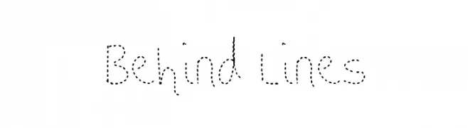
( Fonts by Jacob Fisher - www.pizzadude.dk )
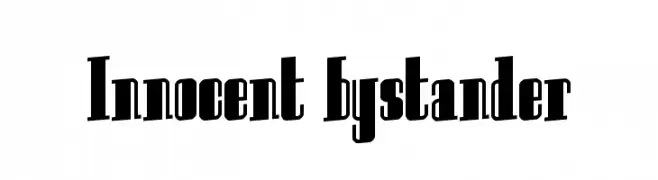
A bold, narrow font with high contrast and a modern, vintage-inspired style.
![Innocent bystander Frei Schriftart Herunterladen]() Herunterladen 638 Downloads@WebFont
Herunterladen 638 Downloads@WebFont -
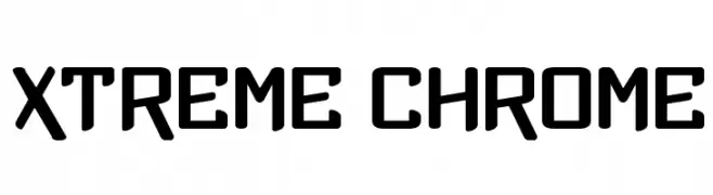
( Fonts by www.vicfieger.com )
A bold, geometric font with a futuristic and industrial style.
![Xtreme Chrome Frei Schriftart Herunterladen]() Herunterladen 638 Downloads@WebFont
Herunterladen 638 Downloads@WebFont -
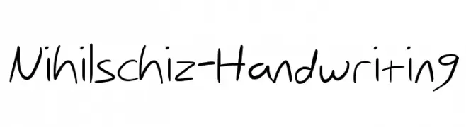
![Nihilschiz-Handwriting Frei Schriftart Herunterladen]() Herunterladen 638 Downloads@WebFont
Herunterladen 638 Downloads@WebFont -
( Fonts by Fenny Wiryani - Personal-use only. For commercial use please contact owner. )
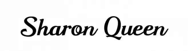
A classic script font with elegant, flowing curves and a sophisticated appearance.
![Sharon Queen Frei Schriftart Herunterladen]() Herunterladen 638 Downloads@WebFont
Herunterladen 638 Downloads@WebFont -
-
![Rockout Frei Schriftart Herunterladen]() Herunterladen 638 Downloads@WebFont
Herunterladen 638 Downloads@WebFont -
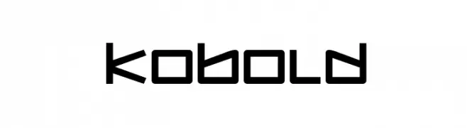
( Fonts by Daniel Zadorozny - www.iconian.com )
A bold, geometric font with a futuristic and angular design.
![Kobold Frei Schriftart Herunterladen]() Herunterladen 638 Downloads@WebFont
Herunterladen 638 Downloads@WebFont -
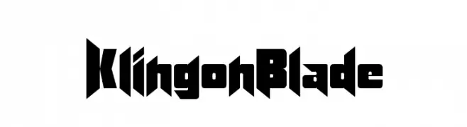
( Fonts by Altsys Metamorphosis )
A bold, angular font with a futuristic, sci-fi aesthetic.
![KlingonBlade Frei Schriftart Herunterladen]() Herunterladen 638 Downloads@WebFont
Herunterladen 638 Downloads@WebFont -
( Fonts by Lena Hesse {manolena} )
A bold, playful font with a hand-drawn, whimsical style.
![MLmonstrolino-Regular Frei Schriftart Herunterladen]() Herunterladen 638 Downloads@WebFont
Herunterladen 638 Downloads@WebFont -
( Fonts by Daniel Zadorozny - www.iconian.com - Free for personal use )
A bold, geometric font with a modern and futuristic design.
![Montroc Frei Schriftart Herunterladen]() Herunterladen 638 Downloads@WebFont
Herunterladen 638 Downloads@WebFont

Welche Schriften sind gerade am populärsten?
Poppins, Roboto, Montserrat, Open Sans und Lato sind wegen ihrer klaren Formen und breiten Einsetzbarkeit sehr gefragt – von Markenauftritt über Landingpages bis hin zu Postern.
Welche Fonts eignen sich für Logos?
Geometrische Sans‑Serifs (z. B. Poppins, Familien im Gotham‑Stil) sind ein häufiger Griff für sauberes, skalierbares Branding. Für eine persönlichere Note bleiben Scripts und Handschrift‑Stile beliebt. Kombinieren Sie einen prägnanten Headline‑Font mit einer neutralen Brotschrift für Wiedererkennung und Harmonie.
Wie oft wird die Top‑Liste aktualisiert?
Regelmäßig – basierend auf realen Downloads und Interaktionen. Schauen Sie öfter vorbei, um aufstrebende Favoriten früh zu entdecken.
💡 Tipp: Seite bookmarken – Trends wechseln schnell, und heutige Top‑Schriften inspirieren morgen vielleicht das Rebranding.