Willkommen bei den Top‑Schriften – hier treffen Beliebtheit und Qualität aufeinander. Das sind die in diesem Jahr am häufigsten heruntergeladenen und genutzten Fonts. Wenn Sie sichere Optionen für Logo, Web oder Social suchen, starten Sie hier.
Jeder Top‑Font überzeugt durch Balance, Lesbarkeit und Vielseitigkeit. Sie finden moderne Sans‑Serifs, elegante Scripts, Vintage‑Serifs und minimalistische Displays.
-
( Fonts by Rick Mueller )
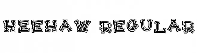
A playful, bold font with a unique outlined, hand-drawn style.
 Herunterladen 631 Downloads@WebFont
 -
( Font by Jayvee D. Enaguas - grandchaos9000.deviantart.com )
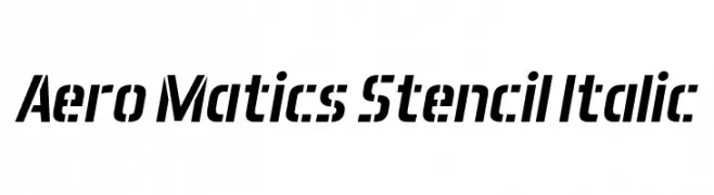
A bold, italic stencil font with a modern, industrial look.
![Aero Matics Stencil Italic Frei Schriftart Herunterladen]() Herunterladen 631 Downloads@WebFont
Herunterladen 631 Downloads@WebFont -
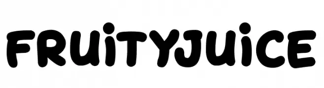
( Fonts by Darrell Flood )
A playful, bold font with rounded, bubbly characters and a hand-drawn feel.
![Fruity Juice Frei Schriftart Herunterladen]() Herunterladen 631 Downloads@WebFont
Herunterladen 631 Downloads@WebFont -
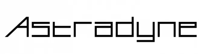
( Fonts by www.feorag.com )
A futuristic, geometric font with sharp angles and clean lines.
![Astradyne Frei Schriftart Herunterladen]() Herunterladen 631 Downloads@WebFont
Herunterladen 631 Downloads@WebFont -
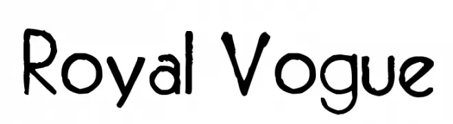
( Fonts by site.xavier.edu/polt/typewriters/ - Richard Polt )
A hand-drawn, artistic font with a bold, textured appearance.
![Royal Vogue Frei Schriftart Herunterladen]() Herunterladen 631 Downloads@WebFont
Herunterladen 631 Downloads@WebFont -
-
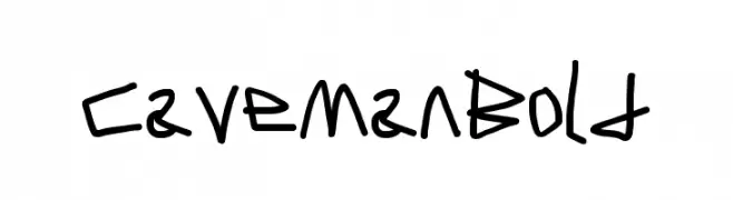
( Fonts by CannotIntoSpaceFonts - KineticPlasma Fonts - Personal-use only. For commercial use please contact owner. )
A bold, hand-drawn font with a primitive and playful style.
![Caveman Bold Frei Schriftart Herunterladen]() Herunterladen 631 Downloads@WebFont
Herunterladen 631 Downloads@WebFont -
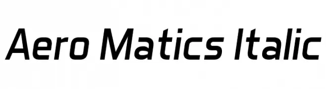
( Font by Jayvee D. Enaguas - grandchaos9000.deviantart.com )
A sleek, modern italic font with a streamlined and dynamic appearance.
![Aero Matics Italic Frei Schriftart Herunterladen]() Herunterladen 631 Downloads@WebFont
Herunterladen 631 Downloads@WebFont -
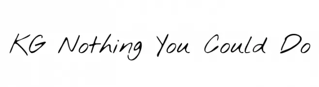
( Fonts by www.kimberlygeswein.com - Kimberly Geswein )
A casual, handwritten font with fluid and natural strokes.
![KG Nothing You Could Do Frei Schriftart Herunterladen]() Herunterladen 631 Downloads@WebFont
Herunterladen 631 Downloads@WebFont -
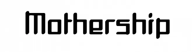
![Mothership Frei Schriftart Herunterladen]() Herunterladen 631 Downloads@WebFont
Herunterladen 631 Downloads@WebFont -
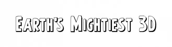
( Fonts by Daniel Zadorozny - www.iconian.com - Free for personal use )
A bold, 3D outlined font with a playful and dynamic style.
![Earth's Mightiest 3D Frei Schriftart Herunterladen]() Herunterladen 631 Downloads@WebFont
Herunterladen 631 Downloads@WebFont
Welche Schriften sind gerade am populärsten?
Poppins, Roboto, Montserrat, Open Sans und Lato sind wegen ihrer klaren Formen und breiten Einsetzbarkeit sehr gefragt – von Markenauftritt über Landingpages bis hin zu Postern.
Welche Fonts eignen sich für Logos?
Geometrische Sans‑Serifs (z. B. Poppins, Familien im Gotham‑Stil) sind ein häufiger Griff für sauberes, skalierbares Branding. Für eine persönlichere Note bleiben Scripts und Handschrift‑Stile beliebt. Kombinieren Sie einen prägnanten Headline‑Font mit einer neutralen Brotschrift für Wiedererkennung und Harmonie.
Wie oft wird die Top‑Liste aktualisiert?
Regelmäßig – basierend auf realen Downloads und Interaktionen. Schauen Sie öfter vorbei, um aufstrebende Favoriten früh zu entdecken.
💡 Tipp: Seite bookmarken – Trends wechseln schnell, und heutige Top‑Schriften inspirieren morgen vielleicht das Rebranding.