Willkommen bei den Top‑Schriften – hier treffen Beliebtheit und Qualität aufeinander. Das sind die in diesem Jahr am häufigsten heruntergeladenen und genutzten Fonts. Wenn Sie sichere Optionen für Logo, Web oder Social suchen, starten Sie hier.
Jeder Top‑Font überzeugt durch Balance, Lesbarkeit und Vielseitigkeit. Sie finden moderne Sans‑Serifs, elegante Scripts, Vintage‑Serifs und minimalistische Displays.
-
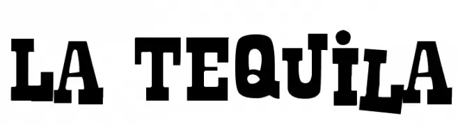
( Fonts by Leonard Posavec - leosupply.co - Personal-use only. For commercial use please contact owner. )
A bold slab serif font with a vintage Western style.
 Herunterladen 632 Downloads@WebFont
 -
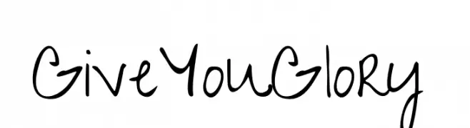
( Copyright (c) 2010, Kimberly Geswein (kimberlygeswein.com) )
A playful, casual handwritten font with fluid strokes and rounded edges.
![GiveYouGlory Frei Schriftart Herunterladen]() Herunterladen 632 Downloads@WebFont
Herunterladen 632 Downloads@WebFont -
![Firebug Caps SSi Frei Schriftart Herunterladen]() Herunterladen 632 Downloads
Herunterladen 632 Downloads -
![Juxtaposer Frei Schriftart Herunterladen]() Herunterladen 632 Downloads@WebFont
Herunterladen 632 Downloads@WebFont -
( Fonts by www.typodermicfonts.com - Ray Larabie )
A bold serif font with sharp serifs and a commanding presence.
![Goodfish-Bold Frei Schriftart Herunterladen]() Herunterladen 632 Downloads@WebFont
Herunterladen 632 Downloads@WebFont -
-
( Fonts by wep )
A playful, bold, and cartoonish font with rounded, hand-drawn characters.
![Cakep Frei Schriftart Herunterladen]() Herunterladen 632 Downloads@WebFont
Herunterladen 632 Downloads@WebFont -
( Fonts by Patrick Broderick )
A bold, playful font with rounded, irregular strokes and a handcrafted feel.
![Bootleg Frei Schriftart Herunterladen]() Herunterladen 632 Downloads@WebFont
Herunterladen 632 Downloads@WebFont -
( Fonts by DM Studio )
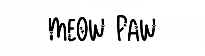
A playful, paw-print adorned font with a bold, rounded style.
![Meow Paw Frei Schriftart Herunterladen]() Herunterladen 632 Downloads@WebFont
Herunterladen 632 Downloads@WebFont -
( Fonts by Paul Flo Williams - Personal-use only. For commercial use please contact owner. )
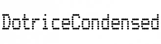
A modern, dotted font with a geometric and digital appearance.
![Dotrice Condensed Frei Schriftart Herunterladen]() Herunterladen 632 Downloads@WebFont
Herunterladen 632 Downloads@WebFont -
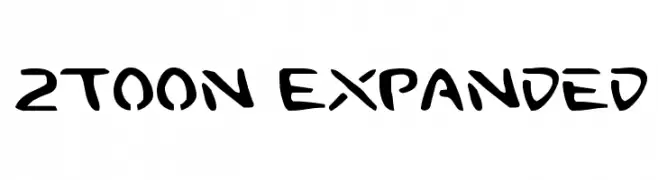
![2Toon Expanded Frei Schriftart Herunterladen]() Herunterladen 632 Downloads@WebFont
Herunterladen 632 Downloads@WebFont


Welche Schriften sind gerade am populärsten?
Poppins, Roboto, Montserrat, Open Sans und Lato sind wegen ihrer klaren Formen und breiten Einsetzbarkeit sehr gefragt – von Markenauftritt über Landingpages bis hin zu Postern.
Welche Fonts eignen sich für Logos?
Geometrische Sans‑Serifs (z. B. Poppins, Familien im Gotham‑Stil) sind ein häufiger Griff für sauberes, skalierbares Branding. Für eine persönlichere Note bleiben Scripts und Handschrift‑Stile beliebt. Kombinieren Sie einen prägnanten Headline‑Font mit einer neutralen Brotschrift für Wiedererkennung und Harmonie.
Wie oft wird die Top‑Liste aktualisiert?
Regelmäßig – basierend auf realen Downloads und Interaktionen. Schauen Sie öfter vorbei, um aufstrebende Favoriten früh zu entdecken.
💡 Tipp: Seite bookmarken – Trends wechseln schnell, und heutige Top‑Schriften inspirieren morgen vielleicht das Rebranding.