Willkommen bei den Top‑Schriften – hier treffen Beliebtheit und Qualität aufeinander. Das sind die in diesem Jahr am häufigsten heruntergeladenen und genutzten Fonts. Wenn Sie sichere Optionen für Logo, Web oder Social suchen, starten Sie hier.
Jeder Top‑Font überzeugt durch Balance, Lesbarkeit und Vielseitigkeit. Sie finden moderne Sans‑Serifs, elegante Scripts, Vintage‑Serifs und minimalistische Displays.
-
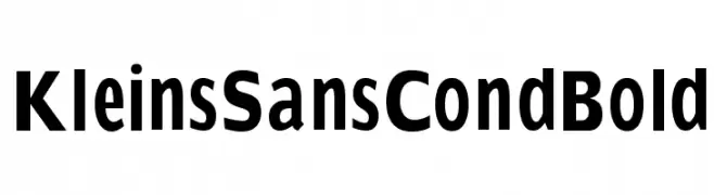
( Fonts by Manfred Klein. Free for private and charity use. Free for commercial with donation to organizations )
A bold, modern sans-serif font with a clean and impactful style.
 Herunterladen 2084 Downloads@WebFont
 -
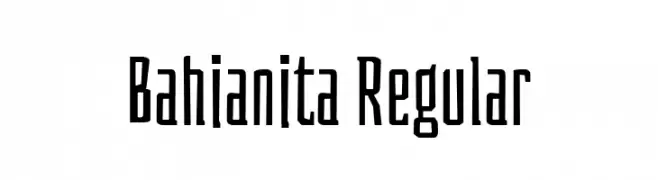
( Copyright 2018 The Bahianita Project Authors (https://github.com/Omnibus-Type/Bahiana/Bahianita) )
A playful, narrow font with moderate contrast and unique character designs.
![Bahianita Regular Frei Schriftart Herunterladen]() Herunterladen 2083 Downloads@WebFont
Herunterladen 2083 Downloads@WebFont -
( Fonts by Typographer Mediengestaltung - Personal-use only. For commercial use please contact owner. )
A classic serif font with bold strokes and high contrast, exuding elegance and tradition.
![Long Island Antiqua Frei Schriftart Herunterladen]() Herunterladen 2083 Downloads@WebFont
Herunterladen 2083 Downloads@WebFont -
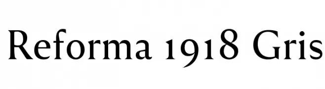
( Fonts by PampaType - Personal-use only. For commercial use please contact owner. )
A classic serif typeface with elegant strokes and balanced proportions.
![Reforma 1918 Gris Frei Schriftart Herunterladen]() Herunterladen 2083 Downloads@WebFont
Herunterladen 2083 Downloads@WebFont -
( Fonts by Dan P. Lyons - Personal-use only. For commercial use please contact owner. )
A bold, playful font with a hand-drawn, dynamic style.
![Inside Out Frei Schriftart Herunterladen]() Herunterladen 2083 Downloads@WebFont
Herunterladen 2083 Downloads@WebFont -
( Copyright (c) 2012 by Carolina Giovagnoli (huertatipografica.com.ar). All rights reserved. )
A classic serif font with modern elegance and medium contrast.
![Andada SC Frei Schriftart Herunterladen]() Herunterladen 2083 Downloads@WebFont
Herunterladen 2083 Downloads@WebFont -
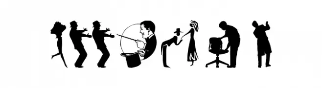
( Fonts by Manfred Klein. Free for private and charity use. Free for commercial with donation to organizations )
A display font made from human silhouette illustrations.
![Humans Frei Schriftart Herunterladen]() Herunterladen 2083 Downloads@WebFont
Herunterladen 2083 Downloads@WebFont -
![imagine font Regular Frei Schriftart Herunterladen]() Herunterladen 2083 Downloads@WebFont
Herunterladen 2083 Downloads@WebFont -
( Digital Type Foundry - www.digitaltypefoundry.com/ )
The image contains non-standard symbols or runes.
![Turkish Frei Schriftart Herunterladen]() Herunterladen 2082 Downloads@WebFont
Herunterladen 2082 Downloads@WebFont -
![M+ 1c regular Frei Schriftart Herunterladen]() Herunterladen 2082 Downloads@WebFont
Herunterladen 2082 Downloads@WebFont -
![HelenaScript ES Frei Schriftart Herunterladen]() Herunterladen 2082 Downloads@WebFont
Herunterladen 2082 Downloads@WebFont -
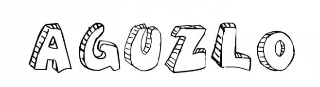
( Fonts by A L )
A bold, playful display font with a hand-drawn, energetic style.
![aguzlo Frei Schriftart Herunterladen]() Herunterladen 2082 Downloads@WebFont
Herunterladen 2082 Downloads@WebFont -
![Partridge Frei Schriftart Herunterladen]() Herunterladen 2082 Downloads@WebFont
Herunterladen 2082 Downloads@WebFont -
( Fonts by BLKBK - https://blkbk.ink - Personal-use only. For commercial use please contact owner. Sponsoren Schriftart )
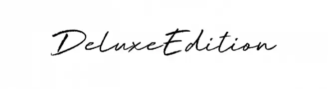
A cursive, handwritten font with elegant and fluid strokes.
![Deluxe Edition Frei Schriftart Herunterladen]() Herunterladen 2081 Downloads
Herunterladen 2081 Downloads -
( Fonts by Google - Personal-use only. For commercial use please contact owner. )
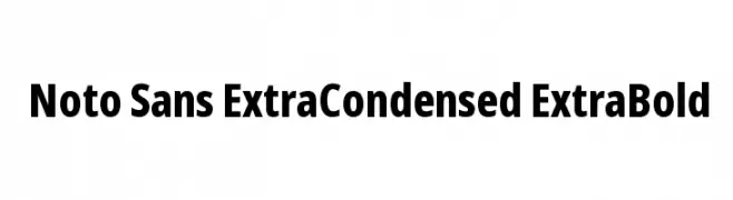
A bold, extra condensed sans-serif typeface with a modern, clean design.
![Noto Sans ExtraCondensed ExtraBold Frei Schriftart Herunterladen]() Herunterladen 2081 Downloads@WebFont
Herunterladen 2081 Downloads@WebFont -
( Copyright 2014 Pria Ravichandran (pria.ravichandran@gmail.com) )
A bold, modern sans-serif font with clean, geometric lines.
![Palanquin Dark Bold Frei Schriftart Herunterladen]() Herunterladen 2081 Downloads@WebFont
Herunterladen 2081 Downloads@WebFont -
( Fonts by Daniel Zadorozny - www.iconian.com - Free for personal use )
A bold, futuristic font with a geometric and modern design.
![Future Forces Frei Schriftart Herunterladen]() Herunterladen 2081 Downloads@WebFont
Herunterladen 2081 Downloads@WebFont -
( Copyright (c) 2012, Font Diner (www.fontdiner.com) )
A lively and energetic script font with bold, flowing cursive letterforms.
![Seaweed Script Frei Schriftart Herunterladen]() Herunterladen 2081 Downloads@WebFont
Herunterladen 2081 Downloads@WebFont -
![NFL Bears Throwback Frei Schriftart Herunterladen]() Herunterladen 2081 Downloads@WebFont
Herunterladen 2081 Downloads@WebFont -
( Fonts by Typography in Decay )
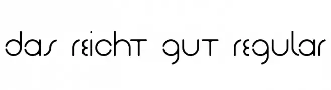
A modern, geometric font with rounded edges and consistent stroke width.
![Das Reicht Gut Regular Frei Schriftart Herunterladen]() Herunterladen 2081 Downloads@WebFont
Herunterladen 2081 Downloads@WebFont -
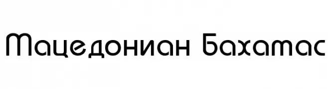
![Macedonian Bahamas Frei Schriftart Herunterladen]() Herunterladen 2081 Downloads@WebFont
Herunterladen 2081 Downloads@WebFont -
( Fonts by Syaf Rizal - Khurasan - Personal-use only. For commercial use please contact owner. )
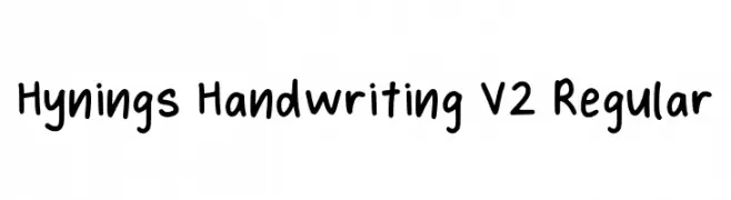
A playful, casual handwritten font with smooth, rounded letterforms.
![Hynings Handwriting V2 Regular Frei Schriftart Herunterladen]() Herunterladen 2080 Downloads@WebFont
Herunterladen 2080 Downloads@WebFont -
( Fonts by BLKBK - https://blkbk.ink - Personal-use only. For commercial use please contact owner. Sponsoren Schriftart )
A bold, fluid script font with elegant, interconnected letters.
![Painted Paradise Frei Schriftart Herunterladen]() Herunterladen 2080 Downloads
Herunterladen 2080 Downloads -
( Fonts by Tom Oetken - Ash Pikachu Font )
A tall, narrow font with a modern and sleek design.
![Seattle Sans Frei Schriftart Herunterladen]() Herunterladen 2080 Downloads@WebFont
Herunterladen 2080 Downloads@WebFont -
![16th_Arabesques Frei Schriftart Herunterladen]() Herunterladen 2080 Downloads@WebFont
Herunterladen 2080 Downloads@WebFont -
![Christians United Frei Schriftart Herunterladen]() Herunterladen 2079 Downloads@WebFont
Herunterladen 2079 Downloads@WebFont -
( Fonts by ARRF Designs )
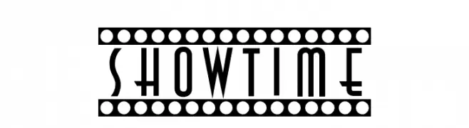
An Art Deco-inspired font with geometric shapes and elegant embellishments.
![Showtime Frei Schriftart Herunterladen]() Herunterladen 2079 Downloads@WebFont
Herunterladen 2079 Downloads@WebFont -
![Medusa Gothic Frei Schriftart Herunterladen]() Herunterladen 2078 Downloads@WebFont
Herunterladen 2078 Downloads@WebFont -
( Fonts by www.gust.org.pl )
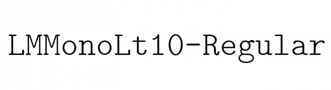
A clean, monospaced typeface ideal for coding and data presentation.
![LMMonoLt10-Regular Frei Schriftart Herunterladen]() Herunterladen 2078 Downloads@WebFont
Herunterladen 2078 Downloads@WebFont -
![Arasan Frei Schriftart Herunterladen]() Herunterladen 2078 Downloads@WebFont
Herunterladen 2078 Downloads@WebFont -
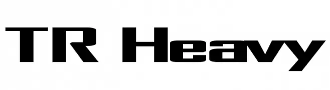
![TR Heavy Frei Schriftart Herunterladen]() Herunterladen 2077 Downloads@WebFont
Herunterladen 2077 Downloads@WebFont -
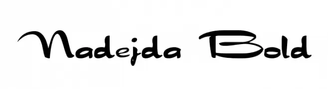
![Nadejda Bold Frei Schriftart Herunterladen]() Herunterladen 2077 Downloads@WebFont
Herunterladen 2077 Downloads@WebFont -
( Fonts by Divide By Zero! - fonts.tom7.com )
A pixelated, retro-style font with a digital, grid-like appearance.
![snoot.org pixel10 Frei Schriftart Herunterladen]() Herunterladen 2077 Downloads@WebFont
Herunterladen 2077 Downloads@WebFont -
Schriftart von typotopia. For commercial use please contact the owner.
( Fonts bt Typotopia - Typotopia.co - Personal Use Only, for Commercial Use, please contact us )
A dynamic, handwritten font with expressive strokes and a casual aesthetic.
![Sansa Regular Frei Schriftart Herunterladen]() Herunterladen 2076 Downloads@WebFont
Herunterladen 2076 Downloads@WebFont -
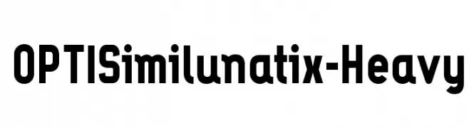
( Fonts by Castcraft Software - OPTI Fonts Archive - opti.netii.net - Personal-use only. For commercial use please contact owner. )
A bold, modern font with thick strokes and strong presence.
![OPTISimilunatix-Heavy Frei Schriftart Herunterladen]() Herunterladen 2076 Downloads@WebFont
Herunterladen 2076 Downloads@WebFont


Welche Schriften sind gerade am populärsten?
Poppins, Roboto, Montserrat, Open Sans und Lato sind wegen ihrer klaren Formen und breiten Einsetzbarkeit sehr gefragt – von Markenauftritt über Landingpages bis hin zu Postern.
Welche Fonts eignen sich für Logos?
Geometrische Sans‑Serifs (z. B. Poppins, Familien im Gotham‑Stil) sind ein häufiger Griff für sauberes, skalierbares Branding. Für eine persönlichere Note bleiben Scripts und Handschrift‑Stile beliebt. Kombinieren Sie einen prägnanten Headline‑Font mit einer neutralen Brotschrift für Wiedererkennung und Harmonie.
Wie oft wird die Top‑Liste aktualisiert?
Regelmäßig – basierend auf realen Downloads und Interaktionen. Schauen Sie öfter vorbei, um aufstrebende Favoriten früh zu entdecken.
💡 Tipp: Seite bookmarken – Trends wechseln schnell, und heutige Top‑Schriften inspirieren morgen vielleicht das Rebranding.