Willkommen bei den Top‑Schriften – hier treffen Beliebtheit und Qualität aufeinander. Das sind die in diesem Jahr am häufigsten heruntergeladenen und genutzten Fonts. Wenn Sie sichere Optionen für Logo, Web oder Social suchen, starten Sie hier.
Jeder Top‑Font überzeugt durch Balance, Lesbarkeit und Vielseitigkeit. Sie finden moderne Sans‑Serifs, elegante Scripts, Vintage‑Serifs und minimalistische Displays.
-
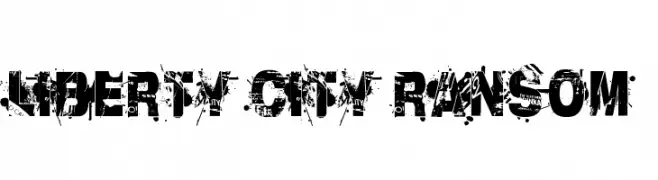
( Fonts by Andrew McCluskey - nalgames.com. Personal-use only. For commercial use please contact owner. )
A bold, distressed font with a grunge aesthetic and chaotic texture.
 Herunterladen 626 Downloads@WebFont
 -
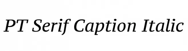
( Copyright (c) 2010, ParaType Ltd. (http://www.paratype.com/public) )
Elegant serif font with a subtle italic slant and medium contrast.
![PT Serif Caption Italic Frei Schriftart Herunterladen]() Herunterladen 626 Downloads@WebFont
Herunterladen 626 Downloads@WebFont -
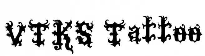
( Fonts by Douglas Vitkauskas - www.vtksdesign.com. Personal-use only. For commercial use please contact owner. )
An ornate and bold decorative font with intricate flourishes.
![VTKS Tattoo Frei Schriftart Herunterladen]() Herunterladen 625 Downloads@WebFont
Herunterladen 625 Downloads@WebFont -
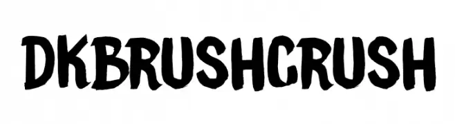
( Fonts by Hanoded )
A bold, brush-stroke font with an energetic and artistic style.
![DKBrushCrush Frei Schriftart Herunterladen]() Herunterladen 625 Downloads@WebFont
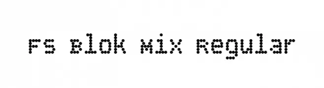
Herunterladen 625 Downloads@WebFont -
![FS Blok Mix Regular Frei Schriftart Herunterladen]() Herunterladen 625 Downloads@WebFont
Herunterladen 625 Downloads@WebFont -
-
( Fonts by Vladimir Nikolic - www.creativefabrica.com/designer/vladimirnikolic/ - Personal-use only. For commercial use please contact owner. )
A bold, elegant serif font with high contrast and classic appeal.
![Best Vibes Regular Frei Schriftart Herunterladen]() Herunterladen 625 Downloads@WebFont
Herunterladen 625 Downloads@WebFont -
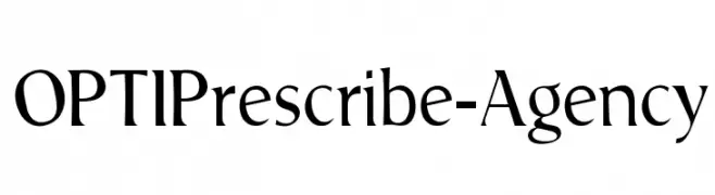
( Fonts by Castcraft Software - OPTI Fonts Archive - opti.netii.net - Personal-use only. For commercial use please contact owner. )
A classic serif font with a modern twist, offering elegance and readability.
![OPTIPrescribe-Agency Frei Schriftart Herunterladen]() Herunterladen 625 Downloads@WebFont
Herunterladen 625 Downloads@WebFont -
![bubba Frei Schriftart Herunterladen]() Herunterladen 625 Downloads@WebFont
Herunterladen 625 Downloads@WebFont -
Schriftart von onne. For commercial use please contact the owner.
( This version is free for personal use, for the full version can be found here https://www.creativefabrica.com/product/comebro-2/ref/185557/ )
A dynamic and elegant script font with a handwritten appearance.
![Comebro Frei Schriftart Herunterladen]() Herunterladen 625 Downloads@WebFont
Herunterladen 625 Downloads@WebFont -
( Fonts by Apostrophic Lab )
A modern, geometric sans-serif font with uniform width and clear readability.
![Florencesans Comp Frei Schriftart Herunterladen]() Herunterladen 625 Downloads@WebFont
Herunterladen 625 Downloads@WebFont


Welche Schriften sind gerade am populärsten?
Poppins, Roboto, Montserrat, Open Sans und Lato sind wegen ihrer klaren Formen und breiten Einsetzbarkeit sehr gefragt – von Markenauftritt über Landingpages bis hin zu Postern.
Welche Fonts eignen sich für Logos?
Geometrische Sans‑Serifs (z. B. Poppins, Familien im Gotham‑Stil) sind ein häufiger Griff für sauberes, skalierbares Branding. Für eine persönlichere Note bleiben Scripts und Handschrift‑Stile beliebt. Kombinieren Sie einen prägnanten Headline‑Font mit einer neutralen Brotschrift für Wiedererkennung und Harmonie.
Wie oft wird die Top‑Liste aktualisiert?
Regelmäßig – basierend auf realen Downloads und Interaktionen. Schauen Sie öfter vorbei, um aufstrebende Favoriten früh zu entdecken.
💡 Tipp: Seite bookmarken – Trends wechseln schnell, und heutige Top‑Schriften inspirieren morgen vielleicht das Rebranding.