Willkommen bei den Top‑Schriften – hier treffen Beliebtheit und Qualität aufeinander. Das sind die in diesem Jahr am häufigsten heruntergeladenen und genutzten Fonts. Wenn Sie sichere Optionen für Logo, Web oder Social suchen, starten Sie hier.
Jeder Top‑Font überzeugt durch Balance, Lesbarkeit und Vielseitigkeit. Sie finden moderne Sans‑Serifs, elegante Scripts, Vintage‑Serifs und minimalistische Displays.
-
 Herunterladen 621 Downloads
 -
![Jones Frei Schriftart Herunterladen]() Herunterladen 621 Downloads@WebFont
Herunterladen 621 Downloads@WebFont -
( Fonts by Johan Holmdahl - www.free-typewriter-fonts.com )
A vintage, typewriter-style font with a distressed, handcrafted look.
![My Old Remington Frei Schriftart Herunterladen]() Herunterladen 621 Downloads@WebFont
Herunterladen 621 Downloads@WebFont -
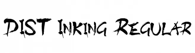
![DIST Inking Regular Frei Schriftart Herunterladen]() Herunterladen 621 Downloads@WebFont
Herunterladen 621 Downloads@WebFont -
( Fonts by a Typeface Leone - www.tipografialeone.net. Personal-use only. For commercial use please contact owner. )
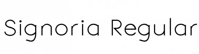
A modern, geometric sans-serif font with clean lines and balanced spacing.
![Signoria Regular Frei Schriftart Herunterladen]() Herunterladen 621 Downloads@WebFont
Herunterladen 621 Downloads@WebFont -
( Fonts by Laurent Mouy )
A playful, cartoonish font with character-like uppercase and fluid lowercase letters.
![Gloutix Frei Schriftart Herunterladen]() Herunterladen 621 Downloads@WebFont
Herunterladen 621 Downloads@WebFont -
( Fonts by David Kerkhoff - www.hanodedphotography.com )
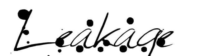
An artistic, ink-splattered handwritten font with dynamic flair.
![Leakage Frei Schriftart Herunterladen]() Herunterladen 621 Downloads@WebFont
Herunterladen 621 Downloads@WebFont -
( Fonts by Manfred Klein. Free for private and charity use. Free for commercial with donation to organizations )
A monospaced font with underlined characters, offering a bold and structured look.
![UnderlineMonospace Frei Schriftart Herunterladen]() Herunterladen 621 Downloads@WebFont
Herunterladen 621 Downloads@WebFont -
( Fonts by FatmaStudio )
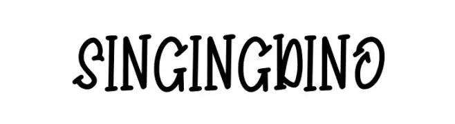
A playful, handwritten font with a whimsical and energetic style.
![Singing Dino Frei Schriftart Herunterladen]() Herunterladen 621 Downloads@WebFont
Herunterladen 621 Downloads@WebFont -
( Fonts by Mike Hind - Stick Fonts )
A bold, impactful font with thick strokes and a modern style.
![Slamming Frei Schriftart Herunterladen]() Herunterladen 621 Downloads@WebFont
Herunterladen 621 Downloads@WebFont


Welche Schriften sind gerade am populärsten?
Poppins, Roboto, Montserrat, Open Sans und Lato sind wegen ihrer klaren Formen und breiten Einsetzbarkeit sehr gefragt – von Markenauftritt über Landingpages bis hin zu Postern.
Welche Fonts eignen sich für Logos?
Geometrische Sans‑Serifs (z. B. Poppins, Familien im Gotham‑Stil) sind ein häufiger Griff für sauberes, skalierbares Branding. Für eine persönlichere Note bleiben Scripts und Handschrift‑Stile beliebt. Kombinieren Sie einen prägnanten Headline‑Font mit einer neutralen Brotschrift für Wiedererkennung und Harmonie.
Wie oft wird die Top‑Liste aktualisiert?
Regelmäßig – basierend auf realen Downloads und Interaktionen. Schauen Sie öfter vorbei, um aufstrebende Favoriten früh zu entdecken.
💡 Tipp: Seite bookmarken – Trends wechseln schnell, und heutige Top‑Schriften inspirieren morgen vielleicht das Rebranding.