Willkommen bei den Top‑Schriften – hier treffen Beliebtheit und Qualität aufeinander. Das sind die in diesem Jahr am häufigsten heruntergeladenen und genutzten Fonts. Wenn Sie sichere Optionen für Logo, Web oder Social suchen, starten Sie hier.
Jeder Top‑Font überzeugt durch Balance, Lesbarkeit und Vielseitigkeit. Sie finden moderne Sans‑Serifs, elegante Scripts, Vintage‑Serifs und minimalistische Displays.
-
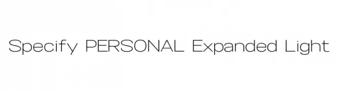
( Måns Grebäck - www.mansgreback.com )
A modern, expanded sans-serif font with light weight and low contrast.
 Herunterladen 619 Downloads@WebFont
 -
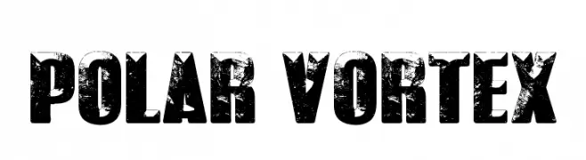
( Fonts by Castcraft Software - opti.netii.net - check the website before use )
A bold, distressed font with a rugged, vintage texture.
![POLAR VORTEX Frei Schriftart Herunterladen]() Herunterladen 618 Downloads@WebFont
Herunterladen 618 Downloads@WebFont -
( Fonts by Nick Curtis - www.nicksfonts.com )
A bold, geometric font with a double-line structure and Art Deco influences.
![Ginger Peachy NF Frei Schriftart Herunterladen]() Herunterladen 618 Downloads@WebFont
Herunterladen 618 Downloads@WebFont -
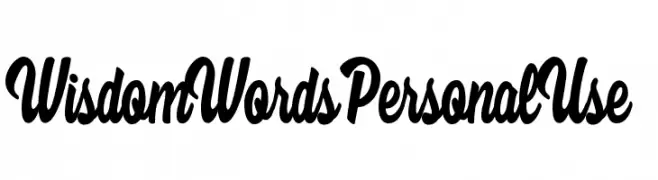
( Billy Argel - billyargel.com/ )
A bold, cursive font with flowing lines and elegant slant.
![Wisdom Words Personal Use Frei Schriftart Herunterladen]() Herunterladen 618 Downloads@WebFont
Herunterladen 618 Downloads@WebFont -
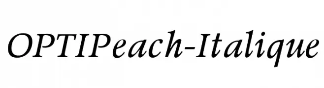
( Fonts by Castcraft Software - OPTI Fonts Archive - opti.netii.net - Personal-use only. For commercial use please contact owner. )
An elegant italic font with classic curves and refined style.
![OPTIPeach-Italique Frei Schriftart Herunterladen]() Herunterladen 618 Downloads@WebFont
Herunterladen 618 Downloads@WebFont -
-
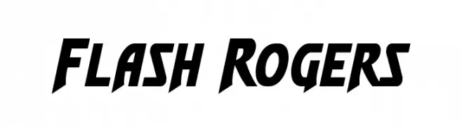
( Iconian Fonts - Daniel Zadorozny - www.iconian.com )
A bold, angular font with a dynamic, forward-leaning style.
![Flash Rogers Frei Schriftart Herunterladen]() Herunterladen 618 Downloads@WebFont
Herunterladen 618 Downloads@WebFont -
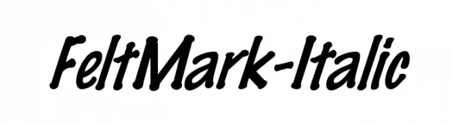
![FeltMark-Italic Frei Schriftart Herunterladen]() Herunterladen 618 Downloads
Herunterladen 618 Downloads -
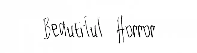
( sanzclouds.blogspot.com )
A jagged, hand-drawn font with a horror-inspired aesthetic.
![Beautiful Horror Frei Schriftart Herunterladen]() Herunterladen 618 Downloads@WebFont
Herunterladen 618 Downloads@WebFont -
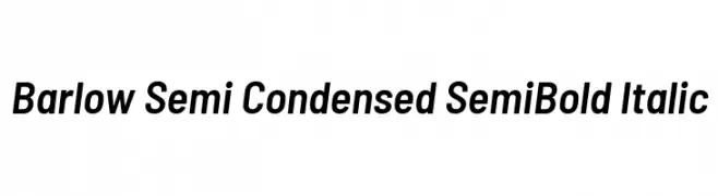
( Copyright 2017 The Barlow Project Authors (https://github.com/jpt/barlow) )
A modern, semi-condensed, semi-bold italic typeface with medium contrast and normal spacing.
![Barlow Semi Condensed SemiBold Italic Frei Schriftart Herunterladen]() Herunterladen 618 Downloads@WebFont
Herunterladen 618 Downloads@WebFont -
![Quinto Frei Schriftart Herunterladen]() Herunterladen 618 Downloads@WebFont
Herunterladen 618 Downloads@WebFont


Welche Schriften sind gerade am populärsten?
Poppins, Roboto, Montserrat, Open Sans und Lato sind wegen ihrer klaren Formen und breiten Einsetzbarkeit sehr gefragt – von Markenauftritt über Landingpages bis hin zu Postern.
Welche Fonts eignen sich für Logos?
Geometrische Sans‑Serifs (z. B. Poppins, Familien im Gotham‑Stil) sind ein häufiger Griff für sauberes, skalierbares Branding. Für eine persönlichere Note bleiben Scripts und Handschrift‑Stile beliebt. Kombinieren Sie einen prägnanten Headline‑Font mit einer neutralen Brotschrift für Wiedererkennung und Harmonie.
Wie oft wird die Top‑Liste aktualisiert?
Regelmäßig – basierend auf realen Downloads und Interaktionen. Schauen Sie öfter vorbei, um aufstrebende Favoriten früh zu entdecken.
💡 Tipp: Seite bookmarken – Trends wechseln schnell, und heutige Top‑Schriften inspirieren morgen vielleicht das Rebranding.