Willkommen bei den Top‑Schriften – hier treffen Beliebtheit und Qualität aufeinander. Das sind die in diesem Jahr am häufigsten heruntergeladenen und genutzten Fonts. Wenn Sie sichere Optionen für Logo, Web oder Social suchen, starten Sie hier.
Jeder Top‑Font überzeugt durch Balance, Lesbarkeit und Vielseitigkeit. Sie finden moderne Sans‑Serifs, elegante Scripts, Vintage‑Serifs und minimalistische Displays.
-
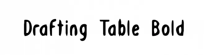
( Fonts by Daniel Zadorozny - www.iconian.com )
A bold, playful font with a hand-drawn, whimsical style.
 Herunterladen 611 Downloads@WebFont
 -
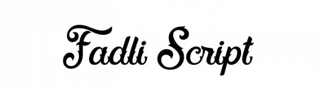
( Fonts by Mikrojihad Inc - www.behance.net/mikrojihad - Personal-use only. For commercial use please contact owner. )
An elegant and decorative script font with intricate loops and swirls.
![Fadli Script Frei Schriftart Herunterladen]() Herunterladen 611 Downloads@WebFont
Herunterladen 611 Downloads@WebFont -
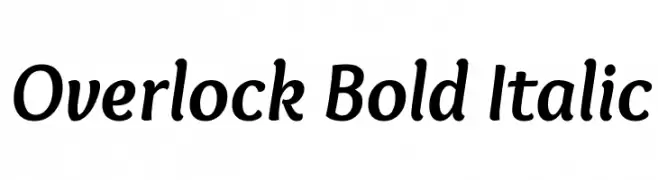
( Copyright (c) 2011, Dario Manuel Muhafara (http://www.tipo.net.ar) )
A bold, italic font with smooth curves and a dynamic slant.
![Overlock Bold Italic Frei Schriftart Herunterladen]() Herunterladen 611 Downloads@WebFont
Herunterladen 611 Downloads@WebFont -
![D'ni Script Standard Frei Schriftart Herunterladen]() Herunterladen 611 Downloads@WebFont
Herunterladen 611 Downloads@WebFont -
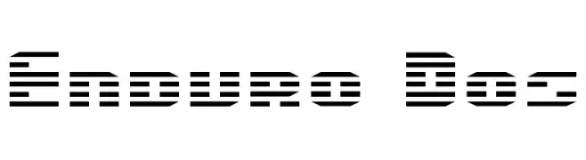
( Fonts by Daniel Zadorozny - www.iconian.com - Free for personal use )
A futuristic, striped font with a digital and high-tech appearance.
![Enduro Dos Frei Schriftart Herunterladen]() Herunterladen 611 Downloads
Herunterladen 611 Downloads -
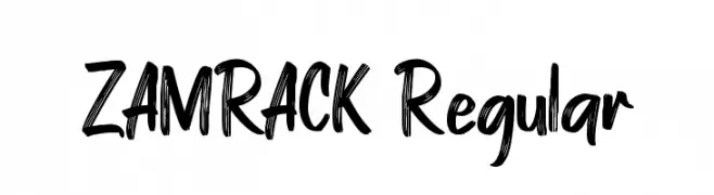
-
![ZAMRACK Regular Frei Schriftart Herunterladen]() Herunterladen 611 Downloads@WebFont
Herunterladen 611 Downloads@WebFont -
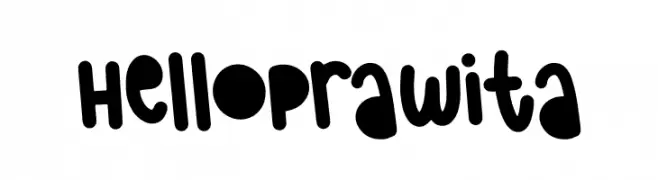
( Fonts by The Docallisme )
A playful, bold font with rounded, thick strokes and a whimsical style.
![Hello Prawita Frei Schriftart Herunterladen]() Herunterladen 611 Downloads@WebFont
Herunterladen 611 Downloads@WebFont -
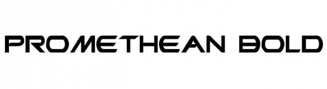
( Fonts by Daniel Zadorozny - www.iconian.com - Free for personal use )
A bold, futuristic font with angular, geometric shapes.
![Promethean Bold Frei Schriftart Herunterladen]() Herunterladen 610 Downloads@WebFont
Herunterladen 610 Downloads@WebFont -
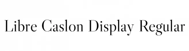
( Copyright 2012 The Libre Caslon Display Authors (https://github.com/impallari/Libre-Caslon-Display) )
A classic serif typeface with elegant detailing and balanced proportions.
![Libre Caslon Display Regular Frei Schriftart Herunterladen]() Herunterladen 610 Downloads@WebFont
Herunterladen 610 Downloads@WebFont -
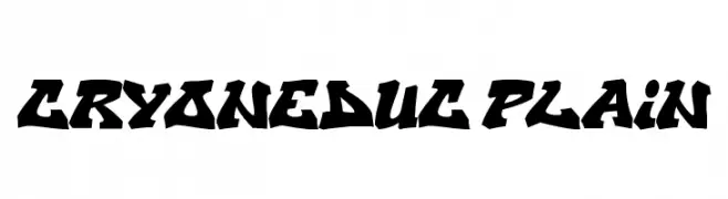
![CryOneDUC Plain Frei Schriftart Herunterladen]() Herunterladen 610 Downloads@WebFont
Herunterladen 610 Downloads@WebFont
Welche Schriften sind gerade am populärsten?
Poppins, Roboto, Montserrat, Open Sans und Lato sind wegen ihrer klaren Formen und breiten Einsetzbarkeit sehr gefragt – von Markenauftritt über Landingpages bis hin zu Postern.
Welche Fonts eignen sich für Logos?
Geometrische Sans‑Serifs (z. B. Poppins, Familien im Gotham‑Stil) sind ein häufiger Griff für sauberes, skalierbares Branding. Für eine persönlichere Note bleiben Scripts und Handschrift‑Stile beliebt. Kombinieren Sie einen prägnanten Headline‑Font mit einer neutralen Brotschrift für Wiedererkennung und Harmonie.
Wie oft wird die Top‑Liste aktualisiert?
Regelmäßig – basierend auf realen Downloads und Interaktionen. Schauen Sie öfter vorbei, um aufstrebende Favoriten früh zu entdecken.
💡 Tipp: Seite bookmarken – Trends wechseln schnell, und heutige Top‑Schriften inspirieren morgen vielleicht das Rebranding.